Flip! Magazine for Penguin Michael Joseph
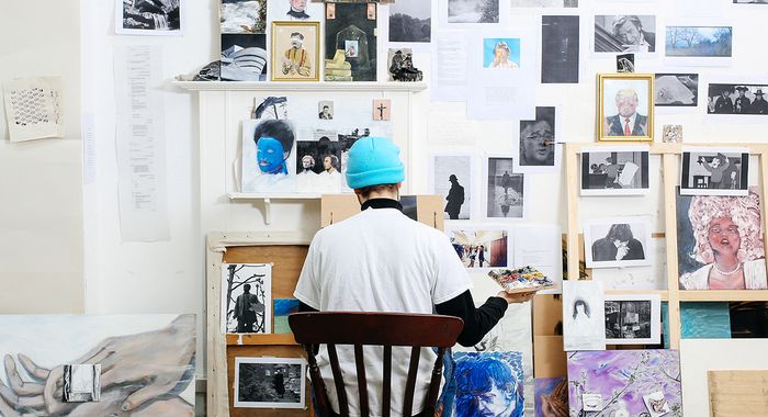
Flip! is a collaborative project between Penguin Michael Joseph and BA Magazine Journalism and Publishing students from UAL. It is a multi media platform which showcases content featuring the diverse communities of South London, aiming to inspire creativity in the capital. Breaking convention in its unique print format, Flip! echoes the individuality and distinctive voice of South London and the stories that are born there.
I focused on the the design of the front cover, the name and the initial branding, I came up
with a few ideas:
Oswin Tickler worked with me using the new software he created called "HP Spark" and we liked the idea of using that to create a very colourful and abstract cover. HP Spark can generate new images based on variables entered into it.
We’ve discussed the idea of overlapping colours after looking at Risograph printing methods where we mixed complimentary colours and produced an A5 sample of our work.
We made the cover have more variety with patterns weaved through the letters.
This brings us onto the next initial idea we have come up with: Flip.
Incorporating the original design, I used the colour sceme that was given to us by Penguin Michael Joseph.
The colours were Pink, Turquoise, Yellow, Red and Sage.
However, I decided that the colour of the “P” wasnt right as Red and decided to incorporate the orange colour that is associated with Penguin.
When we went for a meeting in Penguin the next week, I noticed the coincidence in the “P”s newcolour and its namesake; the Penguin Orange.
This was something the clients were particularly enamoured by.
Project Tags
Companies
University of The Arts London (UAL)
- Design