Love in London 2020 | Branding and Marketing Design
Love in London is a campaign started by the dating app CLiKD (who had been heralded as the “Instagram of the dating world”, thanks to the app’s use of photography) in collaboration with UK charity Relate who provide relationship support. The campaign (first launched in 2018) centres around a UK wide photography competition to celebrate the different types of love in London through categories such as Love Your Partner, Love London, Love Your Community and Love What You Do. The aim was to raise money for Relate (the charity chosen for 2020) and continue to improve CLiKD’s brand awareness. In 2020, Love in London also partnered with TimeOut, Nikon, Pretty Little London and Affinity Photo.
My Role:
- Logo Design
- Website Design
- Print Design
Problem I Was Solving:
My role was to give Love in London a clear brand identity now that the campaign was to become a yearly one, especially as they were working with a bigger charity and had more brand partners/supporters on board. They needed a logo, a website and advertising designed to reflect the grander scale of the campaign and to attract more people to take part in the photography competition, as well as donate.
My Research and Initial Ideas:
As the Love in London campaign had already been launched in 2018 (link to project page) there we’re already people who knew and loved it, as well as having been patiently waiting for the next one. Now, the campaign was back with a new charity on board and a succinct branding identity was needed. Again, having worked with CLiKD I was clear on theirs, but Relate required further research. The crossover between the two was their focus on creating healthy connections and relationships. Relate wanted to work with CLiKD for the same reason PhotoVoice did in the past campaign, to reach out to a younger audience.
With this in mind, I started looking at photography styles that are used to showcase healthy connections and relationships. I was drawn to polaroids because they’re physical photographs and showing people holding them could represent connection in a very literal sense. It would also show meaningful moments and the physical nature of polaroids could represent permanence in terms of different types of lasting love. This was the initial direction I started with.
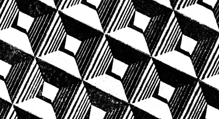
For the logo, with Love in London having such a big focus on the city of London and celebrating connections, I immediately thought of London underground. It’s such a quintessential part of the city and is one of the prime ways that people physically get around to see each other and connect. With that in mind, I started playing around with ways to incorporate that with the photography element of the campaign.
Design Process and Deliverables:
For the concept of the logo, once I’d starting working to combine aspects of the London underground with photography, in particular the camera lens, it became a matter of refining it. The logo actually started to move away from having the photography aspect and focusing more on the love aspect of Love in London. In terms of the look, the design took on more of a sticker style, almost like the stickers you’d see on the London Underground tube.
I used the London Underground colour scheme, with the red of the central line as a main colour because the central line is at the heart of London. For the font, I used LondonTwo, a font that is recognisable from the font used for London Underground. I felt this would convey trust by linking Love in London to an established system, as well as showing the link to London itself.
For the marketing of the Love in London campaign, they were lucky enough to partner with TimeOut so, aside from social media advertising, there was also print advertising. For the social media advertising, I used my initial idea of playing around with polaroids and putting imagery from the last Love in London campaign into polaroids and showing hands holding it in front of where the image was taken. For the TimeOut half page ad, I started by looking at previous TimeOut half page ads.
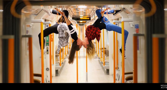
Initially, I was looking at focusing on imagery of photographers in action, but ultimately decided that using a captivating image from the previous competition would entice more potential entrants. The image (by Moving Cities) provided a symmetry that led itself to the half page layout, making it simple yet, pleasing to the eye.
Client’s Opinions:
While they ultimately went with a different logo as it was decided they wanted it to be adaptable for different cities, they did like the idea and they felt the rest of branding and marketing showcased the heart of the campaign and matched the scale it had grown to.
Tools/Programmes I Used:
- Adobe Illustrator
- Adobe Indesign
- Adobe Photoshop
Project Tags
Companies
CLiKD
- Technology
Love in London
- Charity