An exhibition without walls
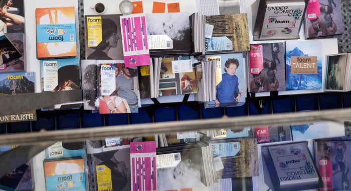
Foam presents an online exhibition celebrating the works of young artists shaping the future of photography.
Each page layout and image reveal animation are unique.
We’ve worked on the design and motion in close collaboration with the Foam team and the artists themselves to ensure the results were in line with their work and expectations.
Bring emotion to the browsing experience
We embraced randomness in order to foster discovery. Each time you open the website, a different artist work will be featured on the digital cover introductory page, allowing you to navigate from another starting point.
Content is the main eye-catcher
We minimised the interface to purely support the artworks and even disappear when necessary. We never cropped any visuals and made use of the whole width and height of the screen to do justice to the visuals.
Express different ambiences and feelings
With a limited amount of intervention (layout, colours, reveal animation, captions…) we had to accommode the atmosphere and tone of each artist’s project.
Dive into the exhibition: http://talent.foam.org/


