Engaging parents to personalise their child’s letter for Banjo Robinson — a UX Case Study
Client Project | 2-Week Sprint
Project Overview
Context & Brief
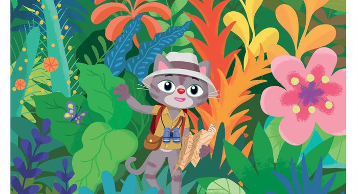
Banjo Robinson is a PenPal service for children between the ages of 5 to 8, where children write and receive letters from Banjo, a globetrotting cat that visits different locations around the world and writes his discoveries.
Since the company was founded in 2017, Banjo Robinson has updated their website constantly for a while but has hit many obstacles with their User Experience (UX). Me and my team have worked closely with Kate Boyle, the co-founder and CEO of the company and her team to design a 2.0 version of the website on mobile first, with a streamlined UX and updating their branding to a new look and feel. Our key requirements for this process is to increase website conversion rate (currently 1.5%).
My role
The team consisted of Sam Smith, Preyesh Chauhan, Massimo Giraldo and myself.
Having read through the brief, we decided to allocate roles on the basis of our strengths and what areas within the UX process we wanted to improve on. The roles and responsibilities I took on during this project were:
- Contextual Inquiry, Company & Brand Research
- Screener Surveys/User Interview
- Competitor Analysis
- Lo-Mid Fidelity
- Facilitator
Key deliverables
The required deliverables for this project were:
- Research insights & findings concerning competitors, user types and behaviour
- Personas and scenarios
- Experience map/User journeys
- Information Architecture
- Design & usability recommendations for improvement
- User flows and screen flows
- Product Sketches and wireframes
- High-fidelity mock-up
- Prototype of designs
- A final presentation to the client
Results
The new design of the mobile website now:
- engages users to fill out their child’s information via ‘Cat-Chat’ to personalise letter
- has made the service easier to understand via onboarding process in the beginning
- requires users to pay for the product first before personalising their child’s letter
- allows users to see sample letter once personalisation has been completed
- gives users feedback on how far they progress via ‘Paw-gress bar’ in checkout
Design Process
Client Kick-Off Meeting
Having the initial client kick-off meeting was crucial in understanding more about the company, brief, constraints, risks, scope and goals, having the client kick-off meeting was crucial. The client kick-off meeting was held at Banjo Robinson’s headquarters.
Meeting findings
The business objectives are:
- to retain their user base and increase conversion rate
Assumptions:
- Move user data collection process to the end of the checkout they will be able to increment the conversion rate
- Need to find a way to engage parents/guardians to fill in the postscript (PS) messages, as this would further increase children’s engagement and likely to have a positive impact on the business.
- What we established:
- No user research was conducted by the client
- User interviews would be needed to confirm client’s assumptions and to understand if there are any other areas that present pitfalls
- Target device is mobile, as the majority of traffic(new customers) go to the site via mobile
Process
My team and I decided to use the Double-Diamond UX process to help guide the workflow of the project. This was incredibly helpful as this sets out clearly what is our next steps. To keep track of what everyone is doing everyday, I was assigned as the team’s Facilitator. The role included organising daily stand-ups and write a diary which includes insights, lessons learnt, task completed and UX methods used.
Phase 1 — Discover
Competitor Analysis
In order to understand where Banjo Robinson sits within the market and what common trends there were, we compared to other companies that sell similar products.
After comparing various companies (including Banjo Robinson), we could not find any direct competitors, as Banjo Robinson is its own niche market. Instead, I decided to compare with subscription-based competitors and found the following:
- Most have fewer steps on the length of onboarding
- Most were educational
- Most end users are children
What I learned from this is that Banjo Robinson has a great unique selling proposition(USP) as they are the only company that has a character that both children and parents can engage with. In addition, as a team we wanted to aim towards making the mobile website to have fewer steps on the length of onboarding to engage with the users as much as possible.
User Research
Screener Surveys
We conducted a screener survey first to allow us to filter down our user base so we knew we were interviewing the appropriate people for the brief; parents with sons and/or daughters. When carrying out the screener survey, we knew the people we would then further interview would ultimately be our target market, and the people we would then aim the product at. Again, this would involve parents with sons and/or daughters who would be interested in setting up a subscription with Banjo Robinson.
The screener survey resulted in us identifying 31 to further interview over their interest in the brand. These were the findings:
User Interviews
9 user interviews were conducted through face-to-face and telephone. We were able to gather 6 unregistered users via our own contacts and the 3 registered users from Banjo Robinson. The reason for doing the user interviews was because this provided us with a full understanding of what the users are doing, feeling and thinking when using the service. Through the interview process, I picked out some key quotes that represented what most of the participants have said about the service.
- “I feel I put a lot of trust in them when I entered my information into the website”
- “Cost would be an issue because parents have lots of demands from different directions. But if it was part of the school programme then I would be more inclined to buy into that”
- “Interaction on a portable device would have to feel meaningful to me. I know this is going to improve things for my child”
Usability Tests
In order to see if the existing website had any problems with their onboarding process, we tested 5 non-registered users who have not seen the site before to get unbiased information. We were able to find out where the users struggled during the test and what they expected from the website. I have highlighted below what the users have said about the service:
- “I would have expected that ‘Buy Now’ and ‘Buy Gift’ would have been together in the process.”
- “What is bulk pricing? Price difference is minimal and really confusing.”
- “If the subscription isn’t renewed, does Banjo just cutoff or does he write a goodbye letter?.”
User Flow version 1.0
At this phase of the project, I made User Flows of the existing website, version 1.0, to show how long it takes for users to achieve their goal. What I’ve learnt by doing this was that there was a lot of stages that users need to progress through, which would lead to decision fatigue. Knowing this, we used this flow as a reminder for later phases.
User Research Synthesis
The team and I used the Affinity Map method to identify common trends to help us see a bigger picture of what groups/topics we need to focus on. We did this by gathering both user interview and testing data and writing this up on Post-It notes, afterwards, we grouped similar suggestions and pain points. The main trends that we were able to identify were:
- Onboarding Process — Users stated that they were confused about where to put their child’s written letter and “there should be a clearer explanation of how the product works.”
- Price — Cost can be an issue with parents as there are different demands to meet in their daily life
- School (Involvement) — Many users have stated that if Banjo Robinson was mentioned through a school programme, they would be more inclined to buy the product.
- Education (Numeracy) — Parents would like to have numeracy included in the product as this will help with their child’s education
Design Studio
A Design Studio is an activity to quickly generate ideas to solve problems which involves stakeholders in the process as well. We decided to do this activity because we wanted to learn more from our stakeholder’s perspective to uncover ideas that were not thought of before; afterwards narrow down our scope to focus on specific solutions to implement. I took the role of being the facilitator for this activity. From this, we were able to get several different solutions to the problem statement we took to the meeting.
Problems:
- Customers don’t feel at all assured if their information will be protected
- For most users they find it hard to understand the process of the service
Solutions:
- Include a virtual letter, so that users can see an overview
- A video of Banjo explaining the process and the importance of the individual stages,
- A progress bar to show what stage you’re at and how long is left,
- A ‘Catline’, suggestion where Banjo may pop up offering help is a customer is on a page for anything longer than 45 seconds, and an in-depth FAQ section.
Phase 2 — Definition
Experience Map
To portray parent’s behaviour throughout their journey from entering the website to receiving their child’s first letter, I made an experience map to show-case this. The existing website of Banjo Robinson had a significant of users bouncing off from the website when users got to the personalisation phase, and this was due to the amount of pages that users had to fill out resulting in decision fatigue. Based on our research, users did not find this engaging and therefore leave the site.
User Persona
In our user research, we were able to identify common trends and key elements that consistently appeared our affinity map, which then led us to making the user persona, Joanna. By producing this, it gave us a constant reminder as to who we should be designing for.
Problem Statement
Joanna needs a way to engage her daughter, Kelly, during Saturday morning learning time so that Kelly can learn to read and write in preparation for her next school year.
Solution — “A subscription to Banjo Robinson’s pen pal service”
After figuring out our problem statement, we decided to do a visual representation through a storyboard that everyone in the project can see clearly.
User Flow version 2.0
As a team we agreed to continue with our process and made this clearer via user flow. The below diagram shows our approach to the new website flow, which this informs our development phase. When we looked at this, we asked ourselves, “How do we engage users throughout this process?”
Phase 3 — Development
Low-Fidelity Prototype
To quickly test our ideas and flows, we made Low-Fidelity Prototypes using paper. Afterwards, we tested this with 9 users.
We then gathered all the user’s feedback and made an affinity map to find recurring themes and pain points. Using the affinity map method here proved effective since it shows different possibilities for improvement. The recurring pain points are as follows:
- Price — “6 month is too long. It’s not a matter of money, I want an option to try first. There are other platforms that give trial options.”
- PostScript — “Stuff like that (big empty box), I just probably won’t fill it in because I have no idea what to put in it.”
- PS Suggestion — “I feel like there should be an example inside the text box, like “Hi, what could I also write for ____.”
Mid-Fidelity Prototype
The insights collected from the user’s feedback helped with the development of the Mid-Fidelity Prototypes. By moving into mid-fidelity, we were able to find out if the font size, interfaces and interactions work. The tool we used to make the prototype was Figma.
One of the main problems that we tackled was how to engage parents to fill out their child’s information by incorporating a chat-line in the onboarding process. At first we called it a ‘Quiz’ but instead we called it ‘Cat-Chat’, since our project revolved around Banjo Robinson the cat. We originally had in mind that ‘Cat-Chat’ would be an interactive chat that parents can talk to, however, we questioned if this feature can be developed. Different sketches were made to see which solutions would be easily implemented in the future. In conclusion, the solution would be to disguise the form-field as a chat-line.
Phase 4 — Delivery
Branding
Banjo Robinson was at a stage where they needed to change their branding to a whole new look and so we decided to use the new assets that they have given us.
High-Fidelity Prototype
In our final design we incorporated Banjo Robinson’s new assets that were provided by the company itself. At this point, we felt that the design from Mid-Fidelity was both feasible and viable to move into High-Fidelity.
Conclusion
Outcomes:
- Uptake — we believe by using our methods the conversion rate will be increased to 1.5%.
- Personalisation — used a chat-like style solution with progressive disclosure.
- PS messaging — clear and concise information given at an early stage.
- Engagement — changed the tone to create a strong emotional bond with Banjo’s character.
- UX Deliverables — hand-over all the research notes, assets and prototypes.
What I learnt:
- Being a facilitator for the design studio was an eye-opening experience as there were 6 people from the client’s team to instruct. Human behaviour is impossible to control, therefore I learnt the importance of being flexible and thinking on the spot.
- It is easy to get lost with various problems to solve while doing the project, also, need to always question if what we are solving is the main problem.
To find more about what I do, please check out my portfolio.
Project Tags
Companies
Banjo Robinson
- Publishing