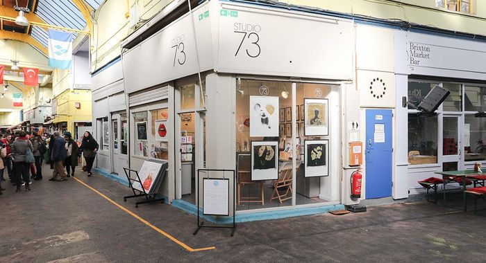
Studio 73 Presents: The Importance of Presenting Your Artwork
Is presentation key? What is the importance behind presentation? Let's look into it.
The visuals behind art can be one of the most powerful things a being can experience. We look at a piece and can instantly identify its story or take time to truly understand its meaning whilst breaking down each corner and other times we may not figure it out at all. Isn't that magnificent? As creatives, we motion through endless ideas of how to get our art appreciated whether it's a song we're about to release or an art piece that has taken us weeks to complete. One thing we know is we want that creation to stand out in its own way.
Art is shown in many formats such as installations, hung on a gallery or viewed on a website through professional means. As an online art gallery and platform, we want the art to be the centrepiece and to draw your attention to the detail, the colour and the story. Whether it's online or in a physical space in person, presentation is key. We think about things such as space, colour, quality and design.
The use of colour and space (for example used in the picture above) is important to consider as you don't want distractions around the piece so instead of using a bright background, having something more neutral such as grey can define the artwork more and draw attention to its detail and intricacies for viewers. If the artwork itself is more neutral, a more colourful and contrasting background may fit the piece better and make the art pop more.
Find out what colours work with the art and work against can be easier when you take pictures. Adrian Flower, Owner and Photographer of Studio 73 uses a neutral background in this picture to brighten the artwork. Using the grey also matches the website's design and colour palette or if you're in a physical space, paying attention to the environment and what space and colours would bring your artwork to the forefront is an important thing to pay attention to.
Quality is another keyword. In the modern world of social media, we come across many photos and videos where users show off art, their creative designs or hobbies. However, some may take pictures in an amateur way where it can look original and captivating and others don't quite get the layout of their design right but they get a lot of engagement and views. Why?
Some of the things may be that they have already defined their target audience and no matter the quality, their audience is there for it. Others may have been shared through an influential person and get the recognition that way or perhaps the artist owns their brand or 'raw' shots. The list can go on and on. So the importance of quality comes into the question of 'How do I want my art to be seen?'. Do you want your piece to stand out and have a more professional shot or something a bit more basic?
We take professional shots with lighting and placements that make the art stand out in its own individual way. Quality is one of the most important things when it comes to our online presence in both the art itself and how the picture is taken. Consider the background, space, equipment being used and the person taking it really showing an interest in the work and knowing the right angles and perspective for it to be shown off.
The design falls into place when considering presentation. What will my art look good against? Is your art very detailed and colourful or more minimal and understated? Figuring out what design looks good with your art whether it be a very busy background like painted walls or something less busy such as a white wall in a gallery.
The most important thing is making sure your art is the centre of the picture and is presented in the way you want it to be. If you are taking the picture, all of the elements such as quality, colour, design and space should be thought of and if someone else is taking it, their professional perspective should meet yours. Your creation is important and deserves attention.
So here is the summary: Pay attention to what you want your art to convey and how to stand out. Look into complementary colours, the background that suits your design or brightens it up. Find a professional who understands your vision and supports your work. Have quality pictures that can still show the organic side of your work if that's what you like to focus on. Define the space for your artwork and define your theme. Overall, we think presentation is important and a key part of getting your work noticed. What do you think?

