asdesign rebrand and bespoke typeface
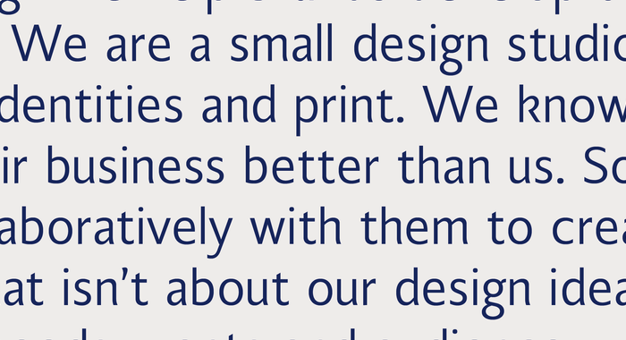
The new identity focuses on utilising a bespoke typeface to act as an anchor for adaptable systems that are to be applied over time. The typeface is based on a humanist sans serif representing my own history as to what inspired me to become a designer. Even though asdesign focuses on our client’s needs I still feel it’s important that the brand reflects its journey and connection to my own career, using that to showcase the knowledge and expertise that has been gained over the years. The choice of the earlier humanist sans typefaces also allowed the overall design to have slight non-uniformity. These little differences create a more living typeface instead of what can feel mechanical at times. This human touch is something I wanted to bring out within the design of the typeface, while also having a structure that brings it all together. You can read more about the design here – asdesignlondon.com/musings/rebranding-asdesign