Audible Book Cover | D&AD New Blood 2020/21
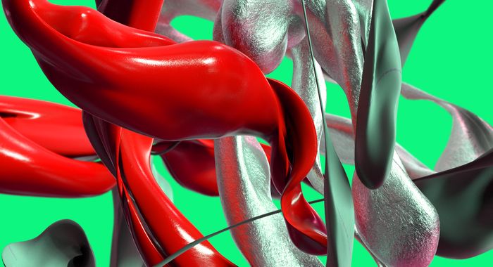
A D&AD New Blood Brief that I did as part of a university project: The purpose of this brief was to design a cover for Audible’s audiobook, The Faraway. This is a fantasy-adventure genre with a target audience between 18-34yr old, and looking to escape from everyday life. In summary, the audiobook is about a character named Daniel, who is “always daydreaming about faraway places”. - Whilst working at a local store, a mysterious figure comes to town, and soon Daniel’s dreams become a reality. Using the photocopier, my photography, and using a friend’s face to represent the main character named Daniel, the design started to come together. By combining Surrealism and Dadaism, I have created a collage-based design outcome.
Inspired by Salvador Dahli and Surrealism, and I wanted to achieve that dream-like look. I thought it makes sense to make the design layout look out of this world in order to respond to the brief's key points. (18-34yr olds looking to escape and the characters dreams becoming a reality)
About the collage:
To symbolise the character, I used a selfie from a class mate to achieve this. In addition to the character's dreams becoming a reality, I wanted to include the character within the cover. I placed the type over my classmate's face to leave something to imagination for the listener, and no-one knows what the charcater, as that's a mystery. But it's just enough to suggest that the character gets sucked into a strange place where reality and dreams intwine.
Although the elements are random, I've laid them out in an thoughtful and intricate manner; creating an organised chaos.
I experimented a lot with this project as the brief has the option to get really creative and use your imagination. I had a 2 other runners up for the final design, but I ended up having choosing this one because I felt it was the most experimental and felt it was more 'dream-like'.
I experimented a lot with this project, as the brief allowed getting creative and relish in imagination. I had two runners-up for the final design, but I decided on this design because I felt it was more experimental and felt more 'dream-like'. I felt this design would strongly stand out the most amongst the sea of squares on Audible's menu page; from the sharp colours from the ransom-style font, to the surreal visuals within the image.
The Runners Up | Concepts
Using Clouds to symbolise dreams and escaping to another world. I adored the photography and editing process, and I felt this idea was very strong. It was well-liked by my peers and tutors. - However, I wasn't keen on the font because I wasn't sure if it went with the imagery.
Although the same typography as the final, I enjoyed making this one, but I didn't feel this design wasn't as strong and maybe was a bit too chaotic. I felt like it was slightly moving away from the brief because this looks like I'm moving more towards astrology, rather than story-telling.
But the point of this design was to suggest that when dreaming, perhaps we are actually travelling to another realm within the universe; capturing travelling through space, leaving earth and harsh reality behind.
Project Tags
Companies
D&AD New Blood
- Events