Brief in Brief:
Castello’s commitment to creative cheesemaking with techniques and ingredients from around the world, had led to its ‘Creatively Crafted’ positioning and large portfolio of uniquely flavoured and textured cheeses. But this steady proliferation of products had also created a range with fragmented, disparate designs and varying levels of Castello branding.
For 2017, the ambition was to strengthen the masterbrand and bring greater consistency to the range, as well as making the ‘Creatively Crafted’ positioning more meaningful to a ‘foodie experience seeker’ audience by dialling up the sensorial taste experience of each cheese.
Thinking and doing:
While the Castello portfolio had grown over the years, the packaging itself had remained the same for some time, so we saw an opportunity to create something bold and unexpected - both for the brand and for the category itself.
We began by uniting the family with a dynamic sash device that creates a consistent, ownable pack architecture and conveys the quality and authority of the Castello brand.
Within the sash, the refreshed Castello crest creates a masterbrand presence that’s cleaner and more contemporary, while an updated flavour indicator makes it easier for consumers to navigate the range by strength and taste.
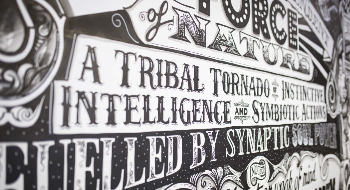
With taste experience our key benefit, we then created a range of evocative patterns and colourways, each one designed to evoke the sensorial taste experience of the cheese - whether smooth, sharp, creamy or crumbly – with product names styled to complement and further convey the taste profile.
The finishing touch is new product photography, shot to feel indulgent and flavourful but with a deliberate simplicity that allows the design to shine.
Companies

Bulletproof
- Design