Living Well Derbyshire: Brand Identity
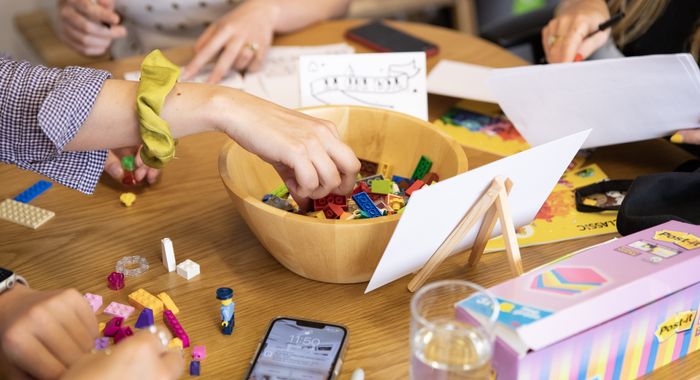
A recent branding project I've been working on with Innovation Unit for a new mental health service in Derbyshire. � We held a workshop with the Derbyshire team about what was important to them and their local area, and a big reoccurring theme was nature and its ability to restore and renew. This really made me think of David Hockney's iPad drawings from 2011 because his relationship with local countryside is really strong and this comes across in his vibrant and positive use of colour. His paintings have inspired the palette for this brand identity. There is also a big focus on green to reflect the importance of nature for this client. The imagery of dry stone walling and what it could represent was something that the client really resonated with, and so it visible in this visual language. The way a dry stone wall is built (without cement) shows the strength of how people can all support each other in a community and hold each other up. The different combinations of colours and arrangement of stones shows how the service can be used in different ways for different people and be supportive in many ways.


