Nationwide Degree Show: The JKR Curation
The Nationwide Degree Show is a collection of work from art & design students, who's final year shows have been cancelled due to COVID19. What started as an initiative by Fresh Meet to plaster billboards across the UK with student work, has now resulted in an online collection of over 1000 submissions from over 100 universities and 17 creative disciplines. The Curation Series is a programme of student work selected by industry leaders, creative pioneers and trendsetters. Below you will find a selection of student work curated by JKR, design-led creative company.
Jones Knowles Ritchie is a global design and creative company. They were the most awarded design agency two years running (2018, 2019) and boast some of the biggest clients in the world. From Budweiser to Burger King and Dunkin' (Donuts) to The Gut Stuff, their work has pushed creativity and brand behaviour all across the world.
JKR have curated a selection of work from the student submissions that they feel shows the most potential with help from Tom Baines, Designer, and Creative Director Della Laurence, has provided commentary,
#1 - Ethan Brown, Ben Chamberlain and Ella Flood.
The first piece for the JKR curation is a joint project by graduates Ethan Brown, Ben Chamberlain and Ella Flood.
Della Laurence writes "A playful design that maintains its simplicity - joyful!"
Ethan Brown, Ben Chamberlain and Ella Flood, Norwich University of the Arts.
Ethan and ben write, "Pure is a conceptual juiced water for kids which encourages them to be creative by spelling with cans and doodling on printed letters. Pure promotes recycling, healthy drinking and creativity – one can at a time."
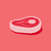
#2 - Erin Ruane
The second piece for this curation is by graduate Erin Ruane.
Della Laurence writes "Clever and simple idea, beautifully executed. Breaking the normal codes of condom packaging".
Erin Ruane, Graphic Design, Norwich University of the Arts.
Erin adds, "In the heat of the moment, it’s important to stay protected. HEAT aims to encourage greater protection for those unexpected intimate moments with its discreet design. Inspired by the invention of the safety match, the collection includes a series of unique custom match boxes containing condoms for when you find your ‘perfect match’".
#3 - James Sheard
The third selection for this curation is a typeface and demonstration designed by James Sheard.
Della Laurence writes "Beautiful typography. Great craft."
James Sheard, BA Graphic Design at Leeds Arts University.
About this project, James says "Display typeface Castle, and accompanying type specimen, was inspired by Welsh history. It references these visually through exaggerated serifs as well as Wales' rich Industrial Revolution which is shown through the block type style."
#4 - Henry Marcel White
The penultimate selection for this curation is a music label branding piece by Henry Marcel White.
Della Laurence writes "I love the way this logo is so flexible and comes to life in motion."
Henry Marcel White, Graphic Communication and Illustration, Loughborough University
Henry says "As one of my final year design projects I branded Spotlight Sounds, an East London based youth music label and artist development programme. Within this project I created a visual identity including album artwork, responsive logo, apparel design, AR Instagram filter and more."
#5 - Ella Flood and Erin Ruane
The last piece for this curation is a joint branding piece by graduates Ella Flood and Erin Ruane.
Della Laurence writes "This design just made me smile, you would want to hire a bike and get involved. Great copywriting too."
Ella Flood and Erin Ruane, Graphic Design, Norwich University of the Arts.
Ella explains "We created an identity for the invented Brighton-based 'Bright Hire'. Bike hire schemes are often dull and uninspiring. Bright Hire was created with the intention that it couldn't be overlooked. Brighton is a quirky, colourful and unapologetically different coastal treasure. To honour this individuality, our scheme draws on the distinct visual aesthetic of the iconic Brighton stick of rock. Throughout the identity, rocky textures and stripes fill the illustrations, Pride-inspired wavy rainbows flood the posters and playful copy related to 'rock', 'roll' and 'bright' create a happy and confident tone of voice. The identity spreads across uniquely Brighton touchpoints, such as a photo stand-in on the pier; Bright Hire also has it's own rock-inspired route system. In collaboration with Lucy & Yak, Bright Hire would produce limited edition rock-striped apparel. Our identity is a celebration of the quirky, colourful and anything-goes attitude of Brighton. Bright Hire is as vibrant as the city, because Brighton rocks!"
You can find more talent from all of our submissions at the Nationwide Degree Show or through the Fresh Meet profile.
You can also visit the artists of this curation in the project credits below.
Project Tags
Companies
Fresh Meet
- Design