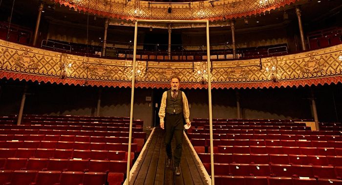
The Old Vic Season 2021-2022
Each year the artwork for Old Vic seasons is updated and refreshed within the framework of the brand identity, which is completely typographic in nature. The 2021–2022 season was the first time the theatre had presented a full season of plays since before the global pandemic. The approach I took for the artwork was to strip everything back to its most basic parts – using only one single colour per production, all black text, and a single, bright colour for the season announcement. After a year of closure, the reopening was a chance bring audiences back together and an uncomplicted, honest approach felt most fitting for this. It also felt like the natural end point of a process of refining the visual identity over the past few years.

