Didn’t go? Well, The Dots did for you...
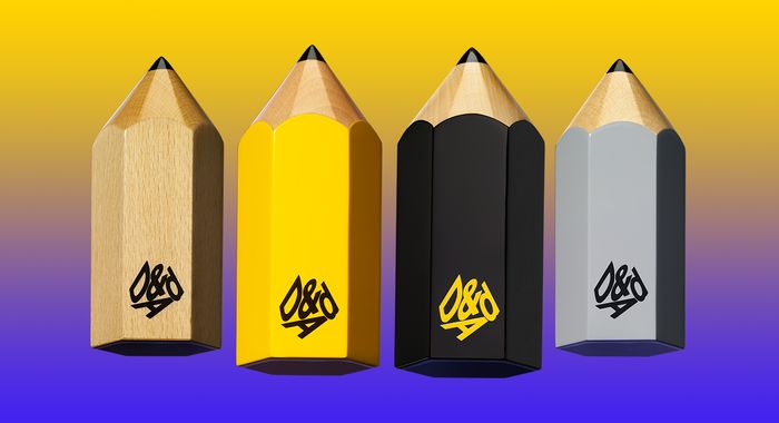
If you didn’t manage to get down to Brick Lane’s cobbles and at the Old Truman Brewery between 25-27th April, you missed 2017's D&AD Festival - a spectacular hub of creative energy with 150 talks, ideas abuzz and an array of portfolios exhibited from talents in design, advertising, art direction etc. Alas, shoo that fomo away because The Dots have got your back.
We’ve covered a list of our top 6 inspirational ideas that all now-creatives should be in the know about.
Read on to soak up the insights of legends old and new, including Stefan Sagmeister (Sagmeister & Walsh) and Marina Willer (Pentagram).
1. See into the future
Crystal balls aside, Marina Willer's talk titled ‘Design for Change’ placed significance on where the future is going culturally and how this links to design. Marina (Partner at Pentagram London) said that:
"Design is all about foreseeing the future and forthcoming change"
The canonical Graphic Designer and Filmaking icon quoted Marshal Brown, with: "Everything that is solid melts into the air". She used this to comment on fluidity in identity, genders and culture and how this is reflected in the creative industries- ideology that is imperative to take on board in 2017.
Keep up with Marina Willer's work here.
2. Embrace Change, Always
Dick Powell of Seymourpowell was also a commentator on change, noting that it's important to embrace it.
“[Clients that are resistent to change] are like a giant jelly, where they bounce around and get excited for a bit, but then they end up back where they were”
Powell commented that clients often hate change in design and innovation because of the cost of it. Not the way to go, rather:
“It's exciting to create new paradigms and new categories of a product”
This was summarised perfectly with the image of a little kid commenting on a typewriter: “Cool… a laptop that prints as you write and you don’t have to plug it in!”. Learn more about Seymourpowell.
3. Take over the virtual world
In line with the positives of change, the talk on ‘Pervasive 3D Storytelling’ by Microsoft Lift’s CTO Mark Stanley, stressed the amazing opportunities that brands will have if they learn how to channel content into the realm of VR and 3D. Believing that no brand is currently the leader in VR and 3D, Stanley noted:
“There’s lots of potential to take over this space.”
The power of new storytelling is something that all facets of the creative industry need to consider, as there’s a wave of escapism on the horizon.
Alongside Mark Stanley, keep an eye on Resh Sedhu, Creative Director of Virtual Reality at Framestore, whose work in this field includes the virtual reality experience ‘A Field Trip to Mars’ and following a brief for particularly magical clients, find out more here.
4. Beauty in design matters
On the Thursday afternoon, design legend Stefan Sagmeister compelled us all in a conversation on the importance of beauty in design. Although we can’t recreate the charming finale to his talk- an impromptu communal karaoke session- we can let you know Sagmeister's number one point:
“Functionality hinders beauty, but beauty should always be a consideration in functionality and an end goal"
Exploring how beautiful design changes human behaviour, the Co-Founder of Sagmeister & Walsh noted:
"Aesthetic areas have a substantial impact on people’s reactions to their environment, exemplifying the functional and aesthetic architecture of the renovated highway in Manhattan- whilst 60 million people have used the area, the major crime number is zero"
That’s the kind of world that we want to live in, although like anything, honing in on beauty takes time.
Sarah Cox, Creative Director at Aardman, hit on how beauty & patience is interdisciplinary in the industry. Cox's talk ‘Slow & Steady’ explained the amount of graft behind beautiful animation, disclosing:
“It's normal for an animator to finish about 5 seconds worth of animation in a day, this equates to about 60 drawings!”
5. Don’t just do it for the likes
Anna Higgs, Creative Director and Filmmaker at Nowness presented ‘(Dis)Content: Creative Direction in the Audience Age’ which centred upon the seemingly unstoppable addiction our digital generation has with views and likes. Higgs suggested:
“The really interesting thing is to stop obsessing about reaching that 10 million views, rather, let's think about the what, the data and the why.”
The creative director credited making a difference to just one viewer’s life as far better than reaching thousands of views, subsequently tearing down the idea that it's all about fast-paced content and warning the crowd to “ignore the next agency that tells you to 'make 30 second films because people won’t watch longer videos', as it’s not true.”
Rather, like in Director Marie Schuller's powerful 'Define Beauty: Am I Ugly?' short, Anna prides work born from:
“Experimentation and immersion within the audience’s world and in your world. It's that space that provokes debate”.
Following neatly onto our next source of inspiration, Mr Bingo would back this up, the illustrative artist echoed: “I’d rather make something that 100 people absolutely love than reach 10,000 that just click by.”
6. Ideas turn up in funny places
Presenting to a morning crowd, Mr Bingo woke everybody up with his barrel of laughs talk called ‘37 Things I’ve Learnt’. Out of a puddle of humorous predicaments and perspectives, Bingo’s thoughts on making ideas really stuck.
Stop trying too hard at your desk was amongst the advice, as creative block is not going to be relieved sat in the same old place. Instead, Bingo recommended the crowd to escape big city life and walk:
“Life goes slower when you’re walking, one day walking feels like 3 days in London” and to be open to finding the best ideas in funny places, sharing: “I often get ideas from places like the shower and cycling” (cue a quick flash illustration of a the speaker struggling on a bike in a storm, having a lightbulb moment).
Bingo suggested that creatives need to think outside of the box when it comes to business: “I like art and humour but I don’t like businesses and I don’t like money - sadly I need it”, admitted the rap dabbling illustrator, continued (a little controversially): “I hate advertising so I did the opposite, I put my prices up on Black Friday and actually got more people buying my stuff!.”
On a final note, the one match for Mr Bingo’s alternative approach to the industry has got to be David Shrigley, who entertained the crowd with his ‘Good Ideas and Bad Ideas’ on gaging audience reaction.
Known for statements such as: “I’m not pretending to be somebody who’s got really limited craft skills. I just am a person who’s got really limited craft skills” and being pretty open about his obscure style, Shrigley talked the crowd through his 2013 Turner prize submission, a urinating life model sculpture, based on his poor life drawings from uni.
Another example of work Shrigley gave was a neon sign reading ‘Exibition’, noting the attention the incorrect spelling received proved his point completely - art should prompt a reaction. Final highlights included his taste for hiding things in shows, such as large model teeth, giant pink foam snakes and multicoloured balls inside gallery walls.
Perhaps, Shrigley proves that there's never a dull moment in creativity if you don’t want there to be. With such an assortment of ideas and speakers, there certaintly wasn't a dull moment at this year's D&AD Festival.
See below for the offical event video.
Want more insights from senior creatives and to meet them for yourselves? It could be worth hopping on this link and applying to an upcoming Portfolio Masterclasses at either AKQA or VICE.
Words: Robyn Sian Cusworth
Image Credits:
Image 1: Marina Willer on Behance
Image 2: Seymourpowell
Image 3: Resh Sidhu for Framestore
Image 4: Sagmeisterwalsh (Jessica Walsh)
Image 5: Anna Higgs 'Am I Ugly?'
Image 6: Mr Bingo Postcards
Image 7: David Shrigley, Article
Image 8: D&AD GIF, Miami Ad School: Madrid

