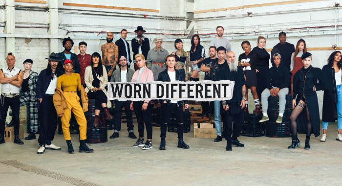
EASTPAK - SS16 Campaign
Eastpak had lost ground to the more trend focused brands of Fjallraven and Herschel, and needed to put some visual distance between themselves and the lifestyle led imagery of their competitors. Eastpak’s product principles focus on reductive design. A pared back and bold art direction was developed that reflected this simplicity, along with the creative and colour rich heritage of the brand. For the 2016 campaign we ‘owned the back’. Universally simple and flexible for all markets. Brand consistency was key and subsequent campaigns and social comms adopted the same clean, elevated art direction.


