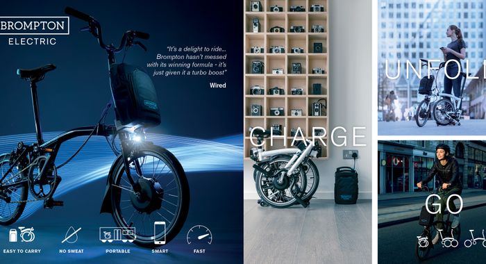
Brompton: Swift ecommerce evolution
When the pandemic forced high street shops to close, Brompton approached us for help developing their digital retail store. We designed a unique eCommerce experience closely aligned to cyclists’ real-life interactions with this iconic British brand.
Unfold your story
There is so much love for the Brompton brand, owners form their own social clubs. And Brompton bike riders love to see their personality reflected through their bikes with their choice of colour, design and saddle. People don’t pick a Brompton, they design one, by taking a frame and choosing elements that appeal to furnish it.
So we set about replicating that creative, customisable feel through Brompton’s eCommerce experience.
Our central design theme, Unfold your Story, allowed the unfolding bike experience to live online and invited users to reflect their personalities on two wheels.
Design with personality
Brompton lovers used to visit the stores and browse a staggering 116 possible variations of folding bike before settling on their chosen design. But when the pandemic closed shops, people started buying bikes online. And with cycling one of the few activities that was unrestricted, sales rose steeply. Brompton recognised it was time to update their website, which was six years old and designed when people preferred to buy their bikes in person. As a result, the ecommerce experience had not been a priority.
We wanted to create a site with buyers at the centre. Shoppers’ desire for a bike that reflected their personality meant the online experience had to show the same attention to detail as buyers experienced in store. The ecommerce experience didn’t yet match up to other interactions with the brand.
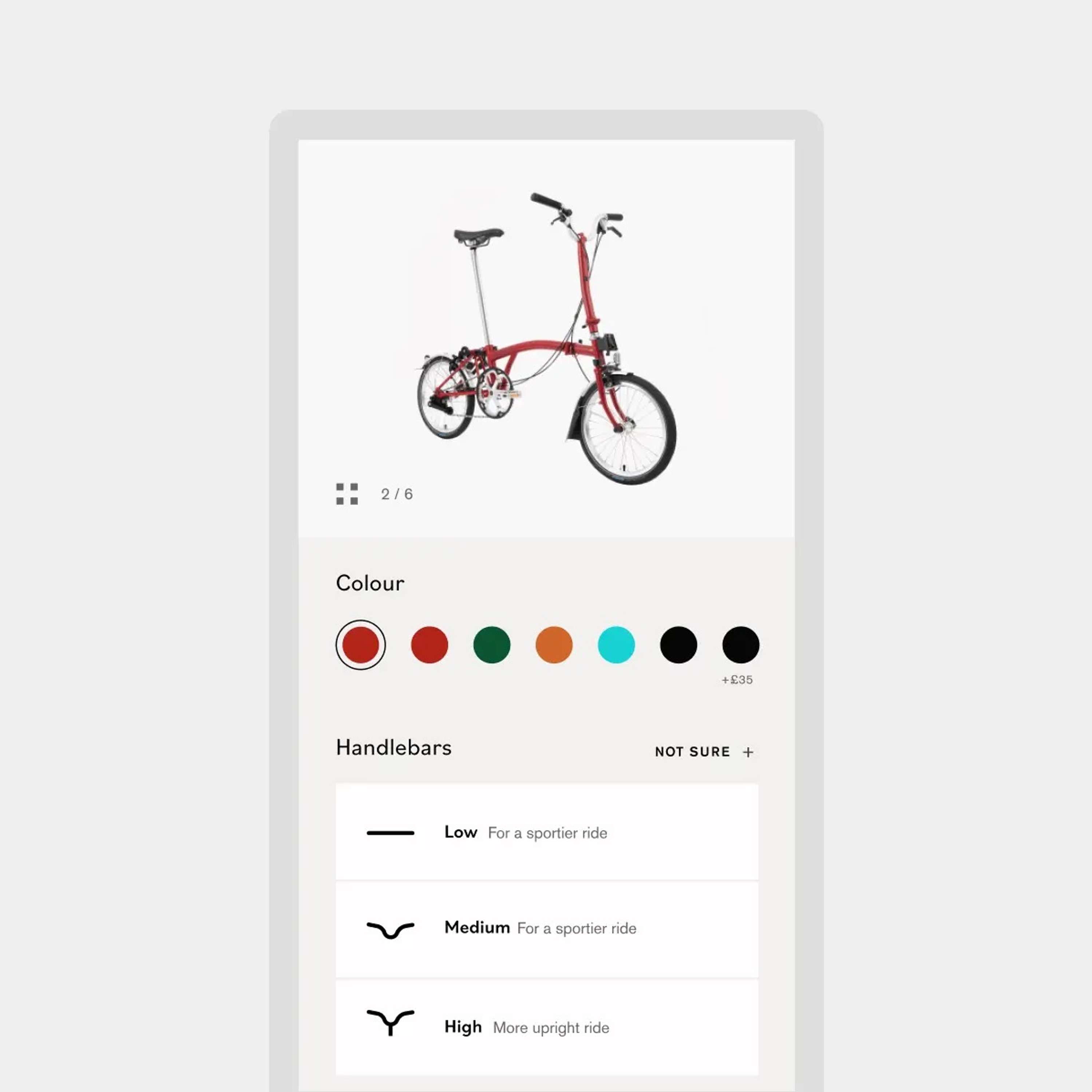
So we designed a site that would allow users to create their own Brompton, taking the frame and choosing elements to personalise their bike. Our central design theme of Unfold your Story embodied the bike, while being people-centred and intuitive.
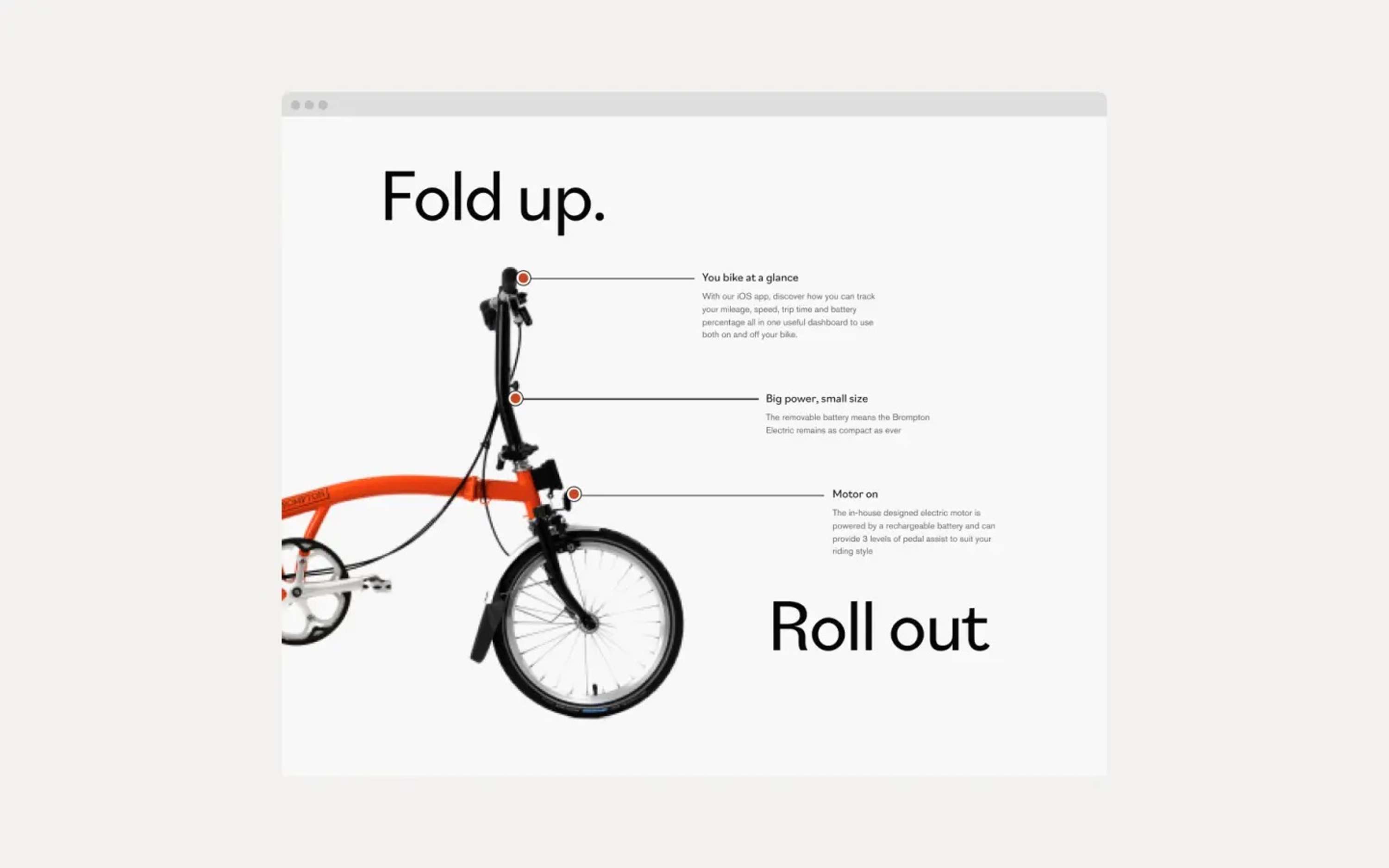
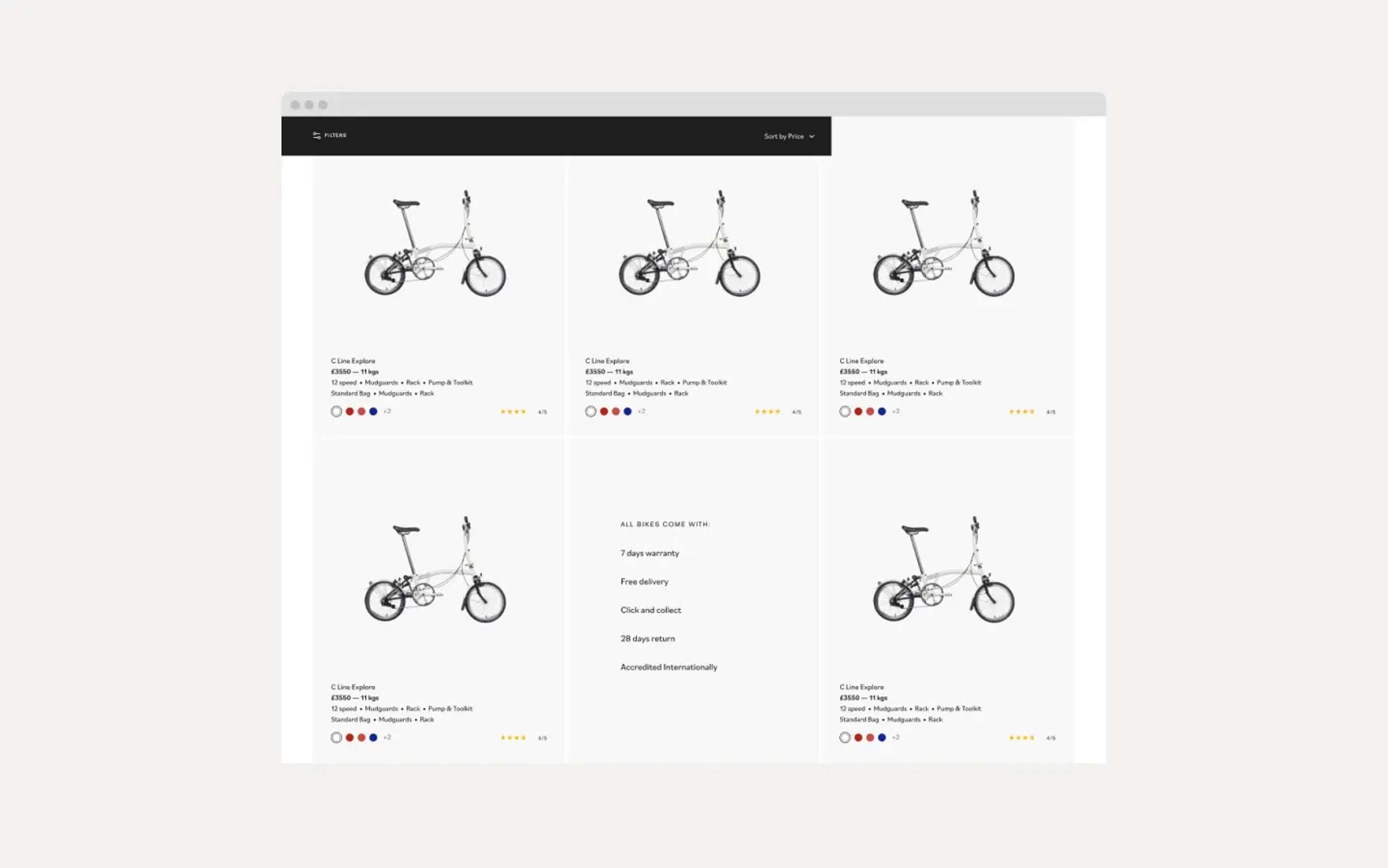
Designed for people
We fully integrated the exploration of the bikes with the shop, rather than keeping them separate things. ‘Bike’ and ‘Shop’ came together. By thinking of marketing and ecommerce as one and the same, we were able to improve the experience for all Brompton fans.
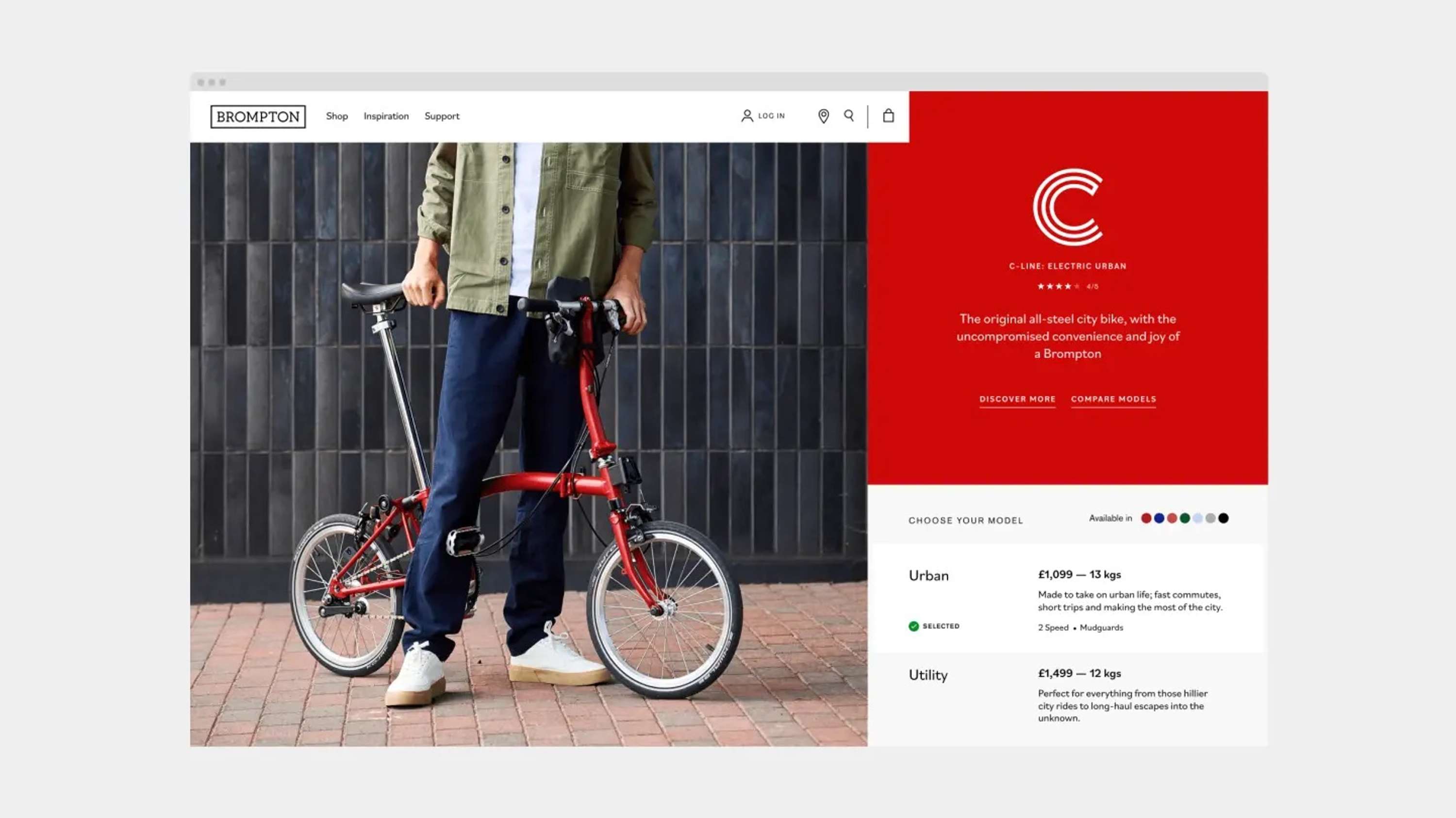
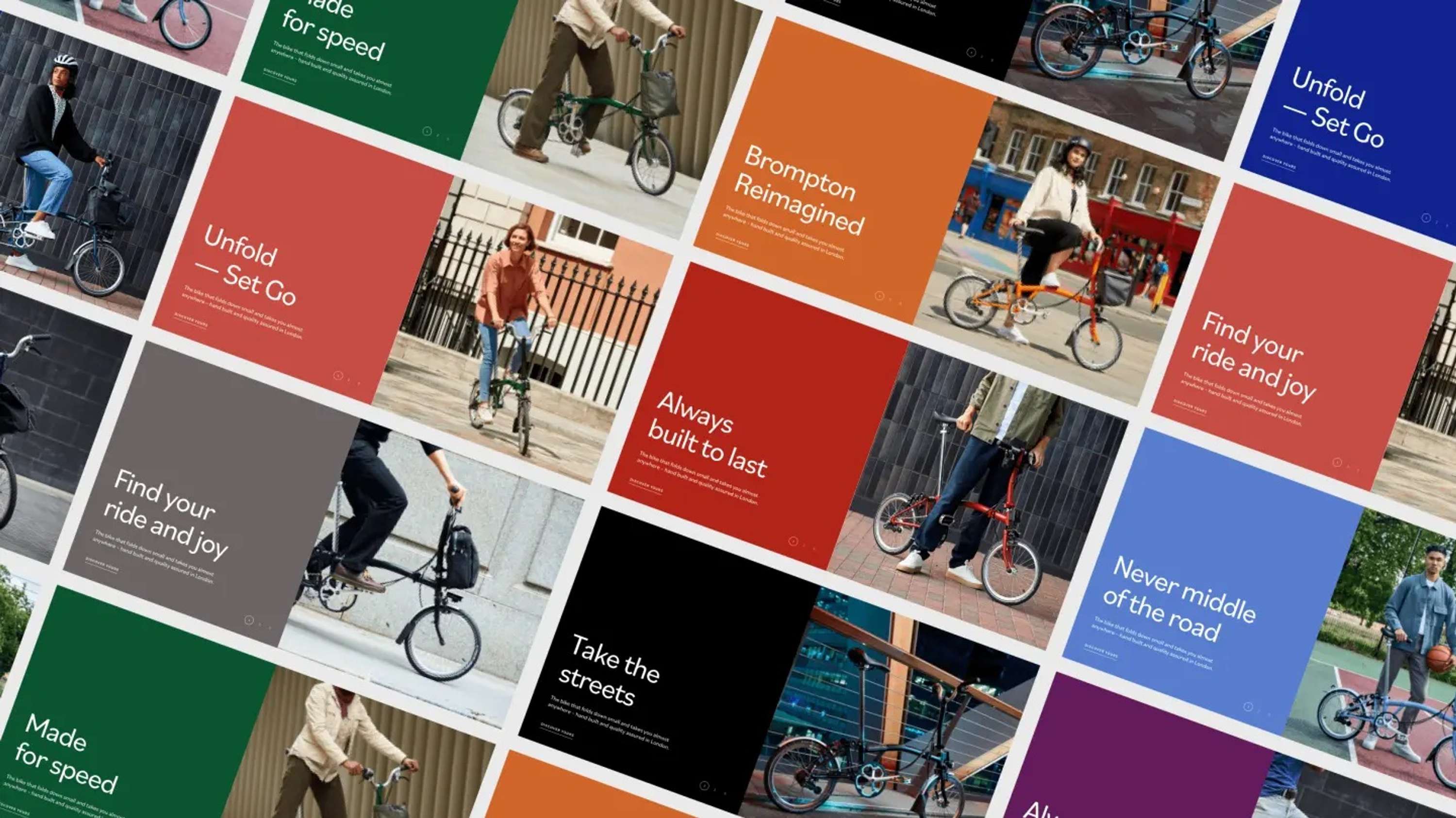
We designed all digital assets to create a feeling of unfolding throughout the website and layouts. We wanted the structure and hierarchy of the site to feel familiar, and so made it seamless to learn about product lines alongside the option of buying, much like you’d be able to consult a store expert while browsing various models in real life.
Instead of giving each bike model its own landing page, which would create too many choices for the shopper, we streamlined the experience. Once a cyclist has picked the line of bicycle, all further decisions about model, seat type and colour are customisable.
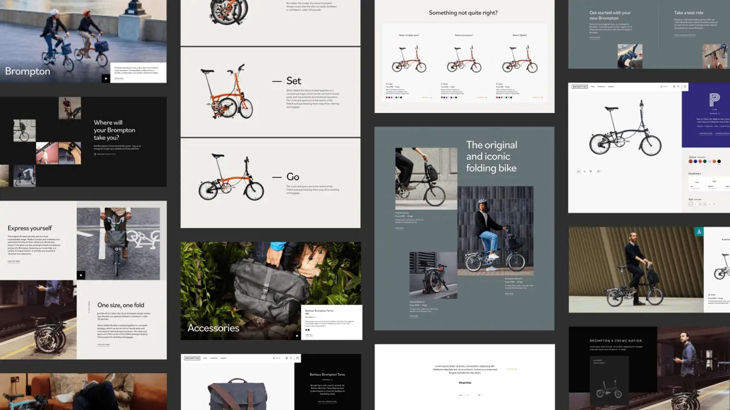
“Beyond transformed the buying experience from functional to emotional by enabling fans to express their personality when choosing their bike, just as they would in a showroom. The rapid evolution was a joy. And the Beyond team pulled together to deliver a first-rate experience at speed.”
Chris Matthews
Head of eCommerce, Brompton
