Compare Equity Release
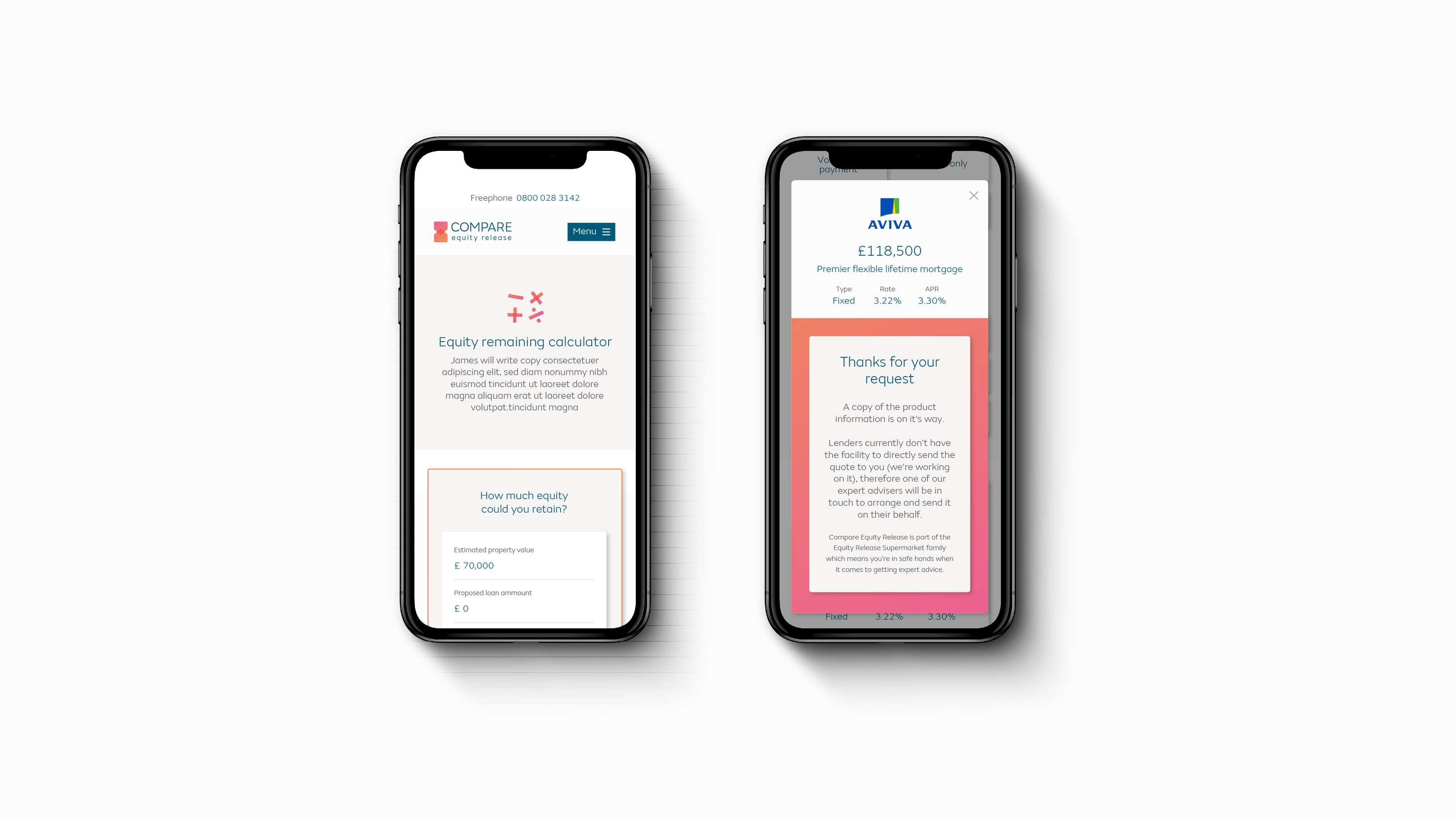
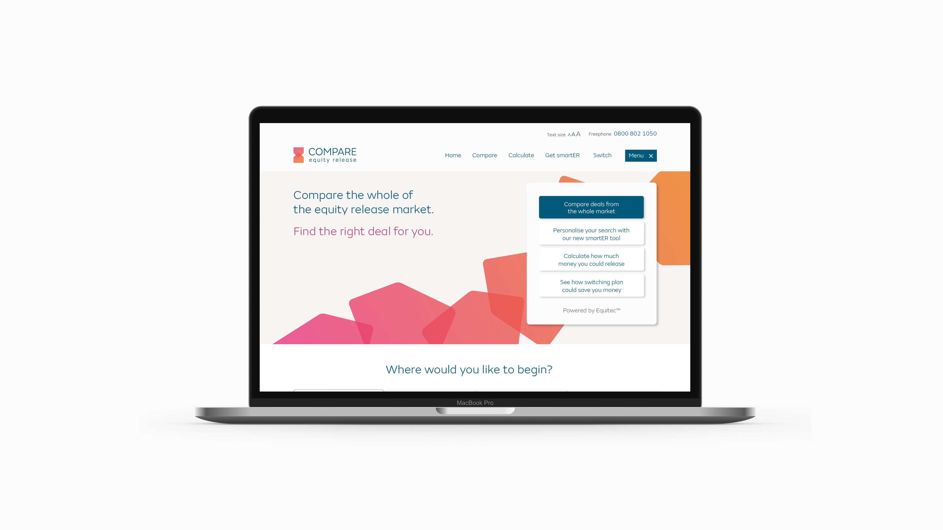
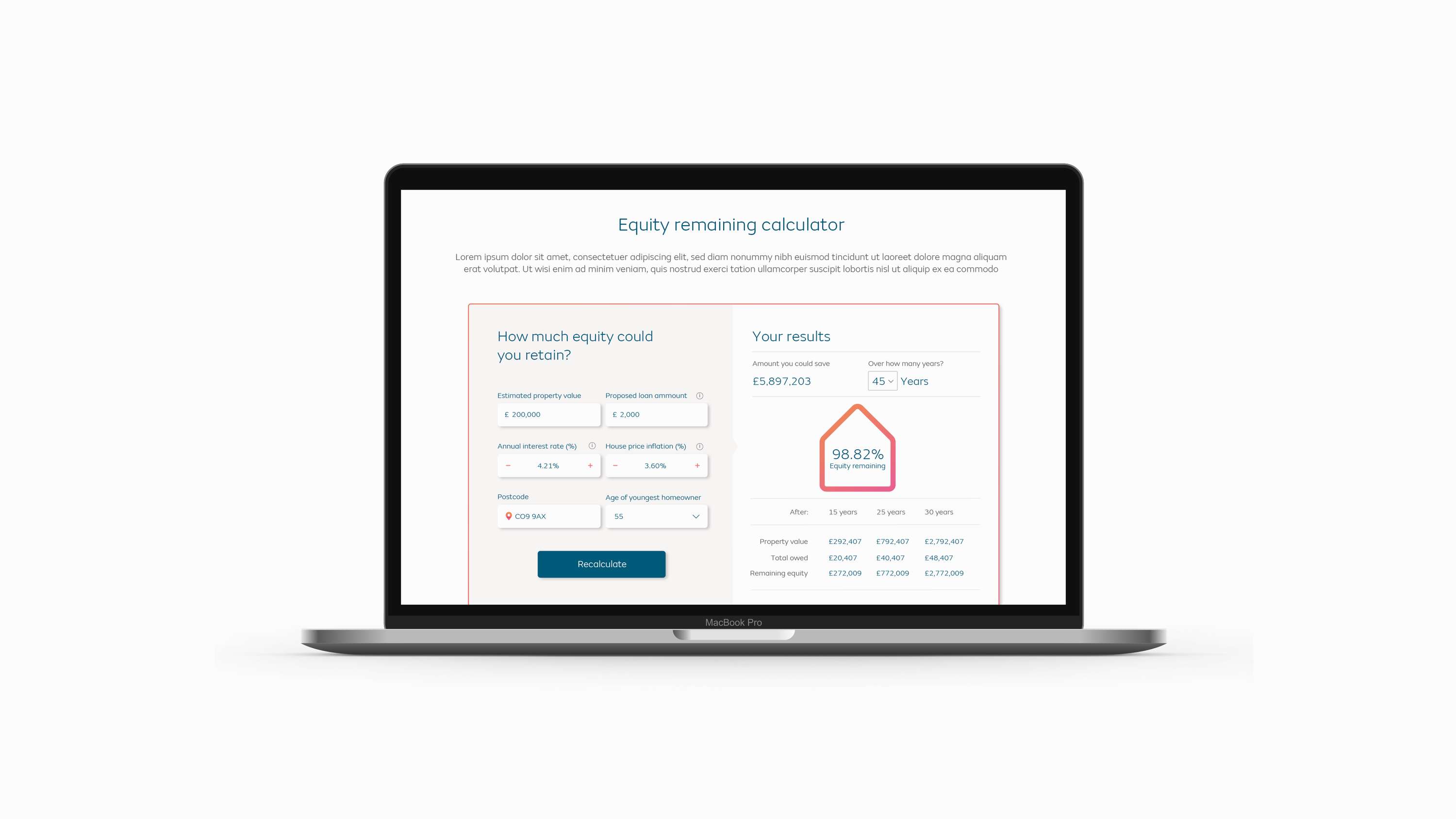
Unlike most equity release sites Compare ER brings comparison to the forefront in order for the customer to find the right deal for them. We used the overlapping of imagery and shapes as nod towards comparing products while the use of a gradient and typefaces chosen created a subtle link to the the over arching group identity of Equity Release Supermarket.


