CTRL
Brand refresh
–
CTRL is a weekly club night located at York's Fibbers venue. They approached Superfried requesting a complete refresh of their identity and marketing collateral.
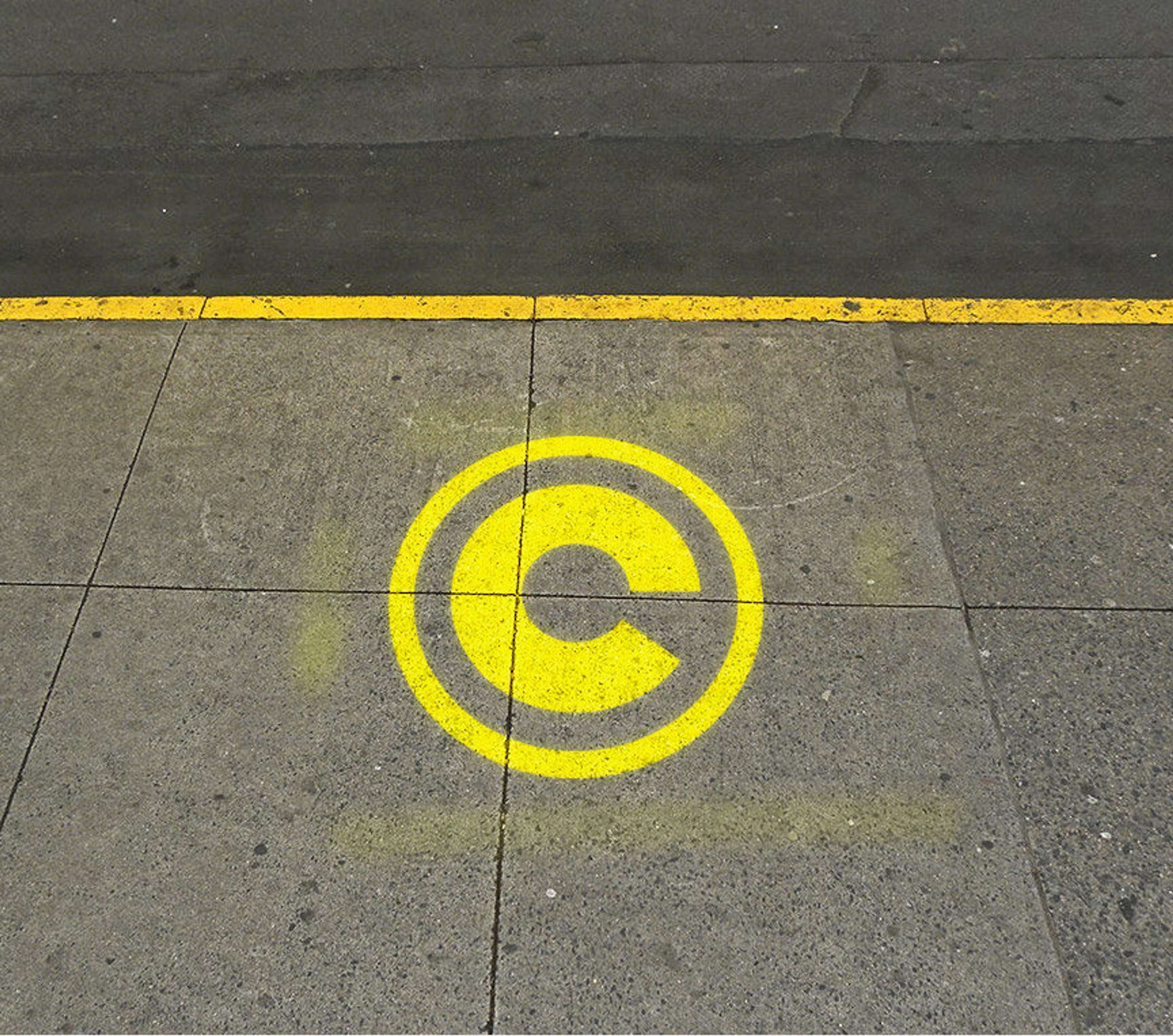
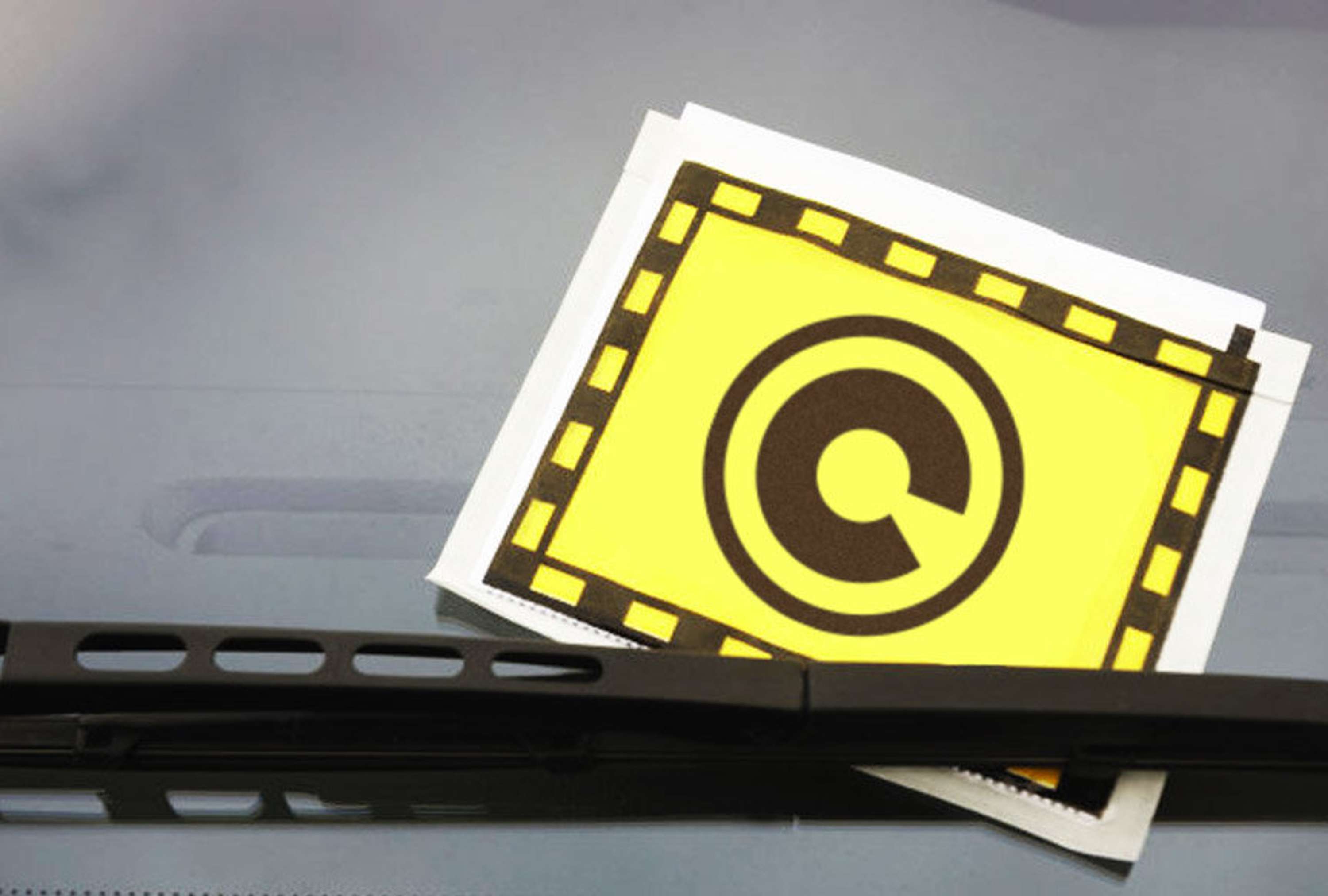
The name Control immediately led to strong, bold images of control systems and signage. This was also supported by the inherited logotype, where the stylised letter 'C' resembled a directional road sign.
With such a distinct initial letter it made sense to utilise this in some way as a logo marque. The simple addition of a circle conveyed the signage style. Slight typographic tweaks were also made to the logotype lettering. Yellow and black provided the perfect palette and use of double lines, an apt graphic device. Two robust, authoritarian typefaces were selected for all copy.
Moving onto use of imagery, this is so often a cliché pitfall for club nights. Wishing to avoid this and continuing the theme the name was once again the source of inspiration. A controlling 'big brother' watching your every move led to the idea of CCTV. They take an extensive selection of shots at each event, so it was logical to make use of this resource and style accordingly.
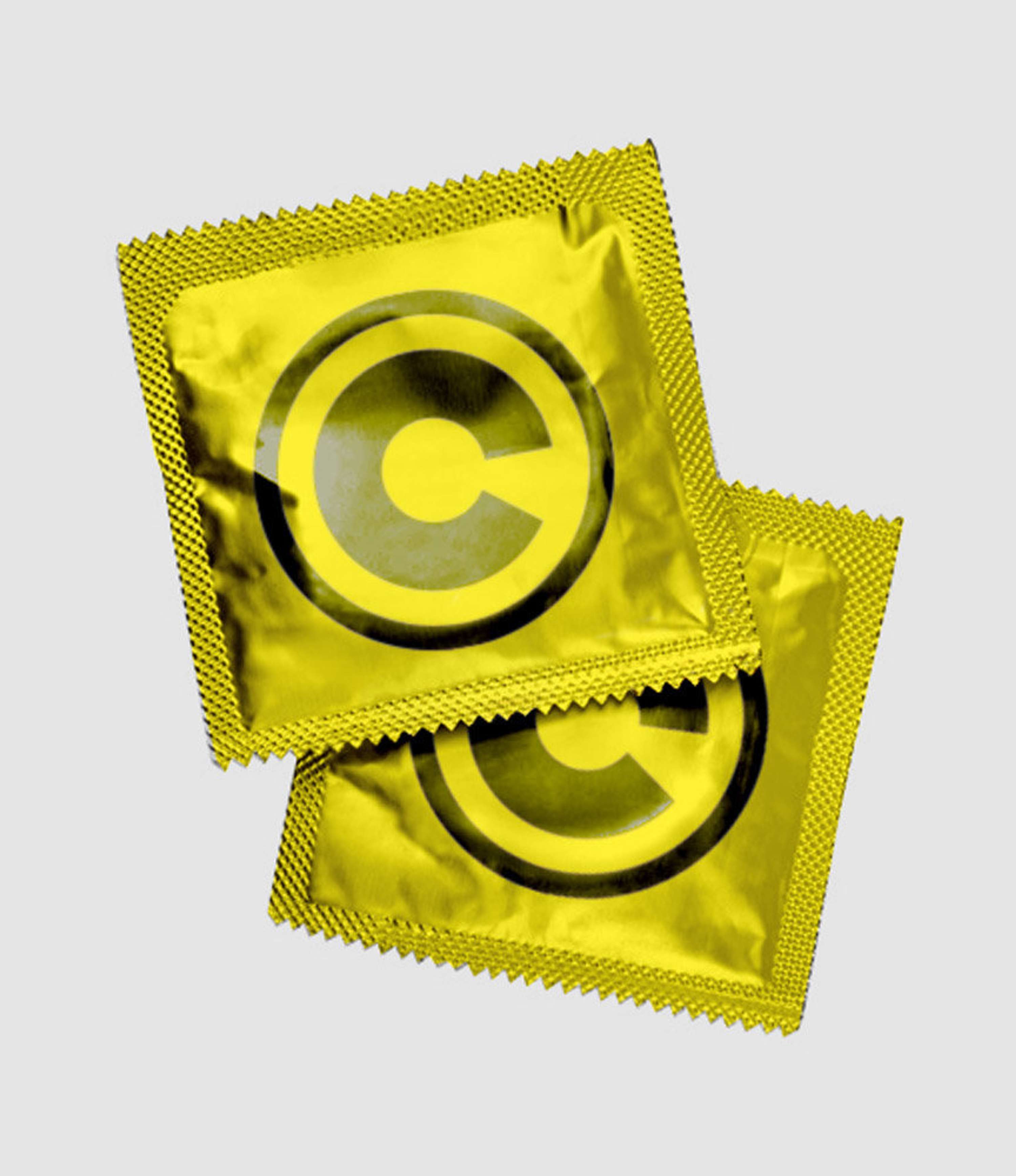
In addition to the collateral and online marketing, proposals were made for potential guerrilla marketing campaigns. This included the idea for the apt use of condoms with a humourous, positive message – Birth CTRL.