FTSE Russell


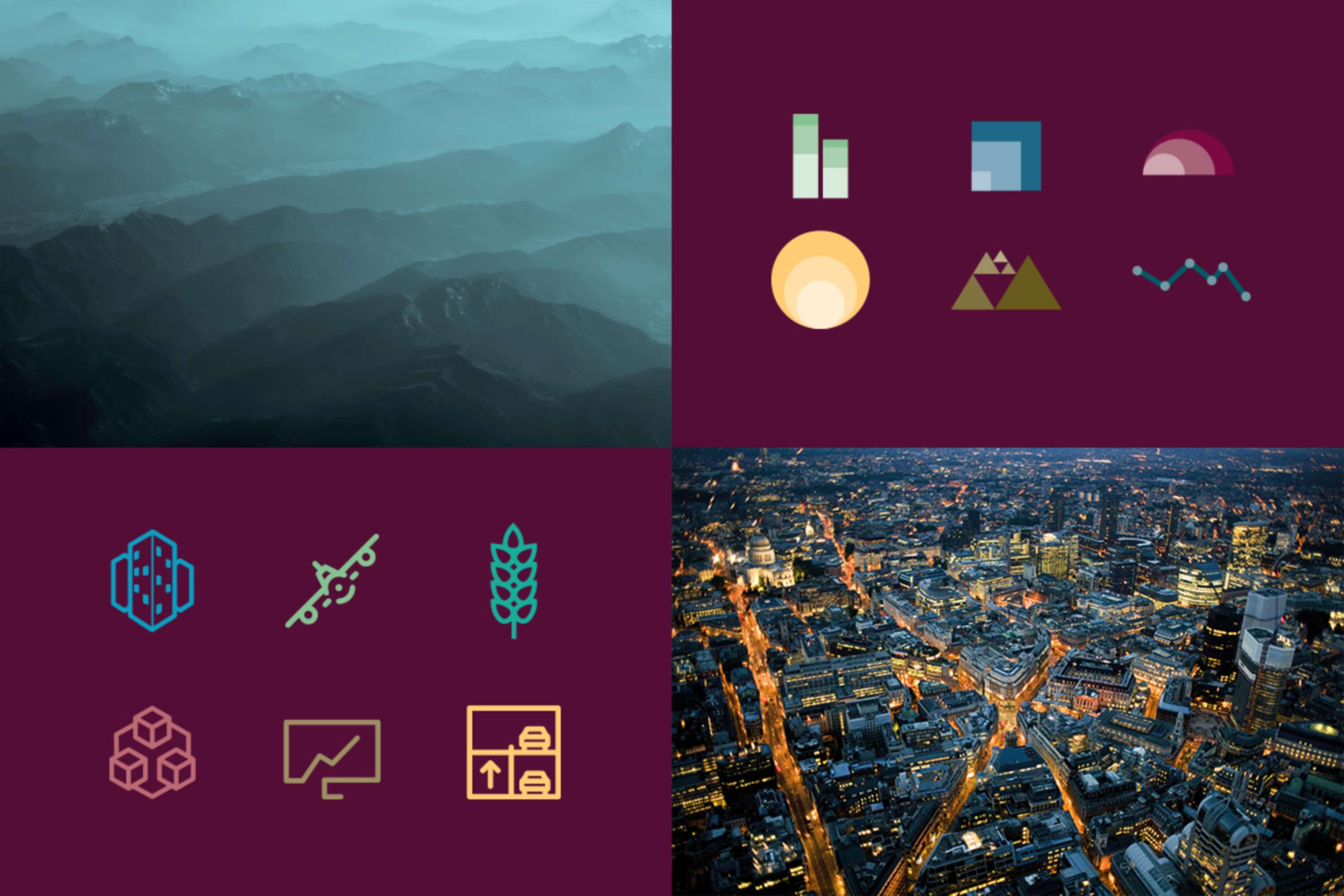
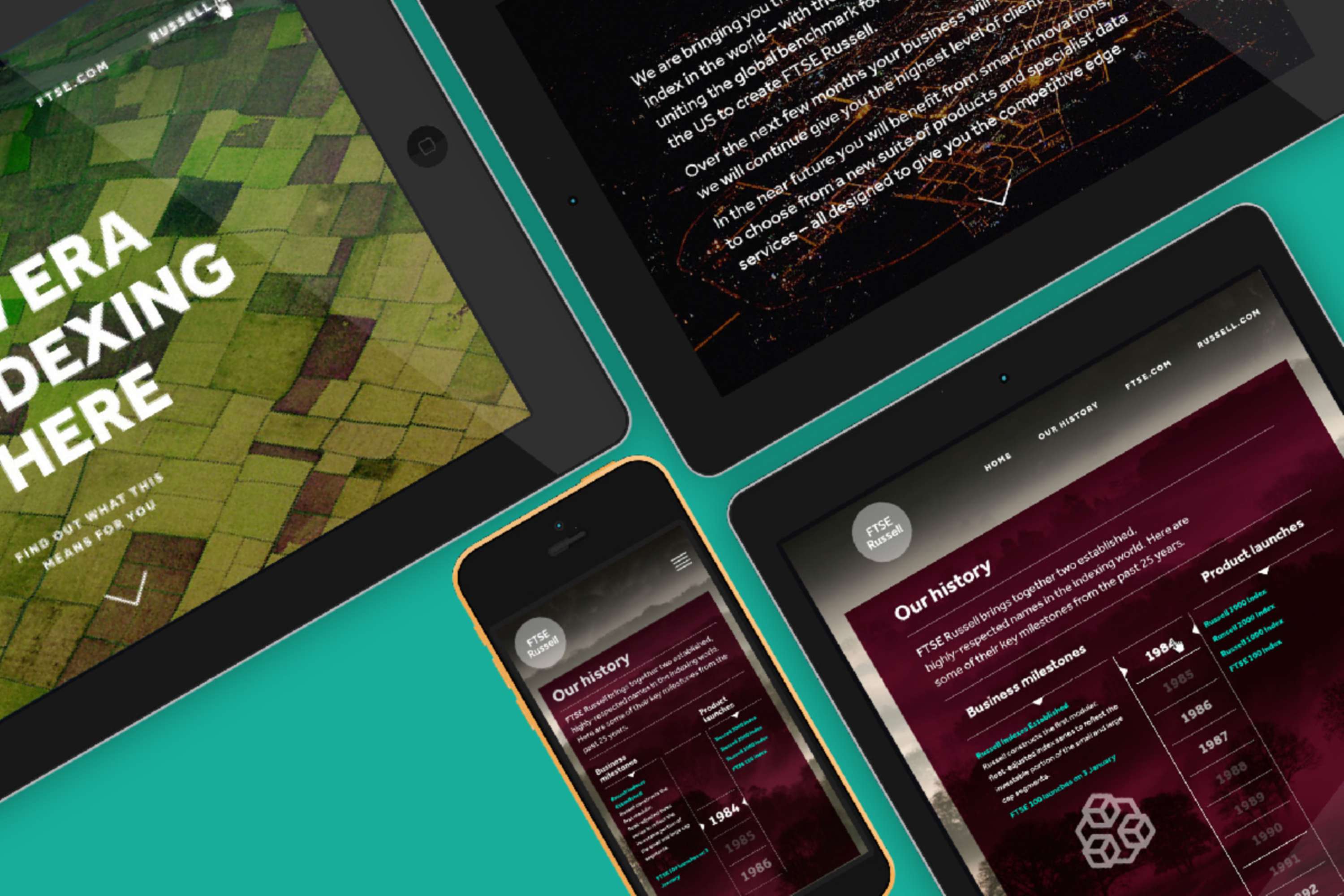
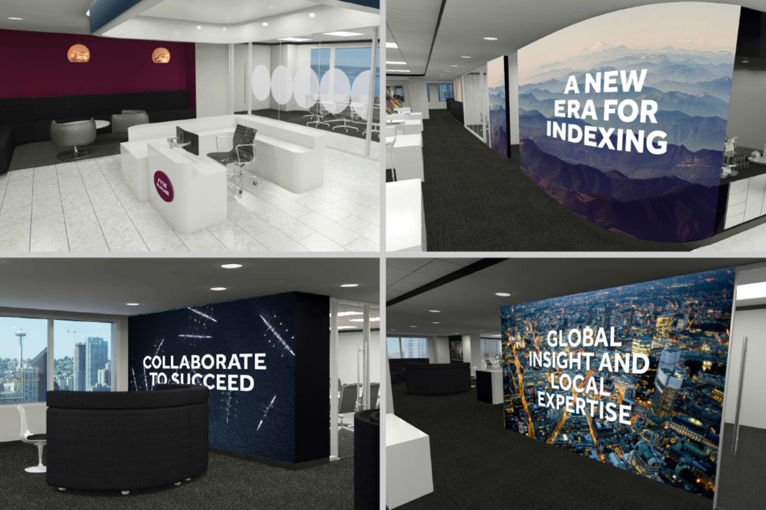
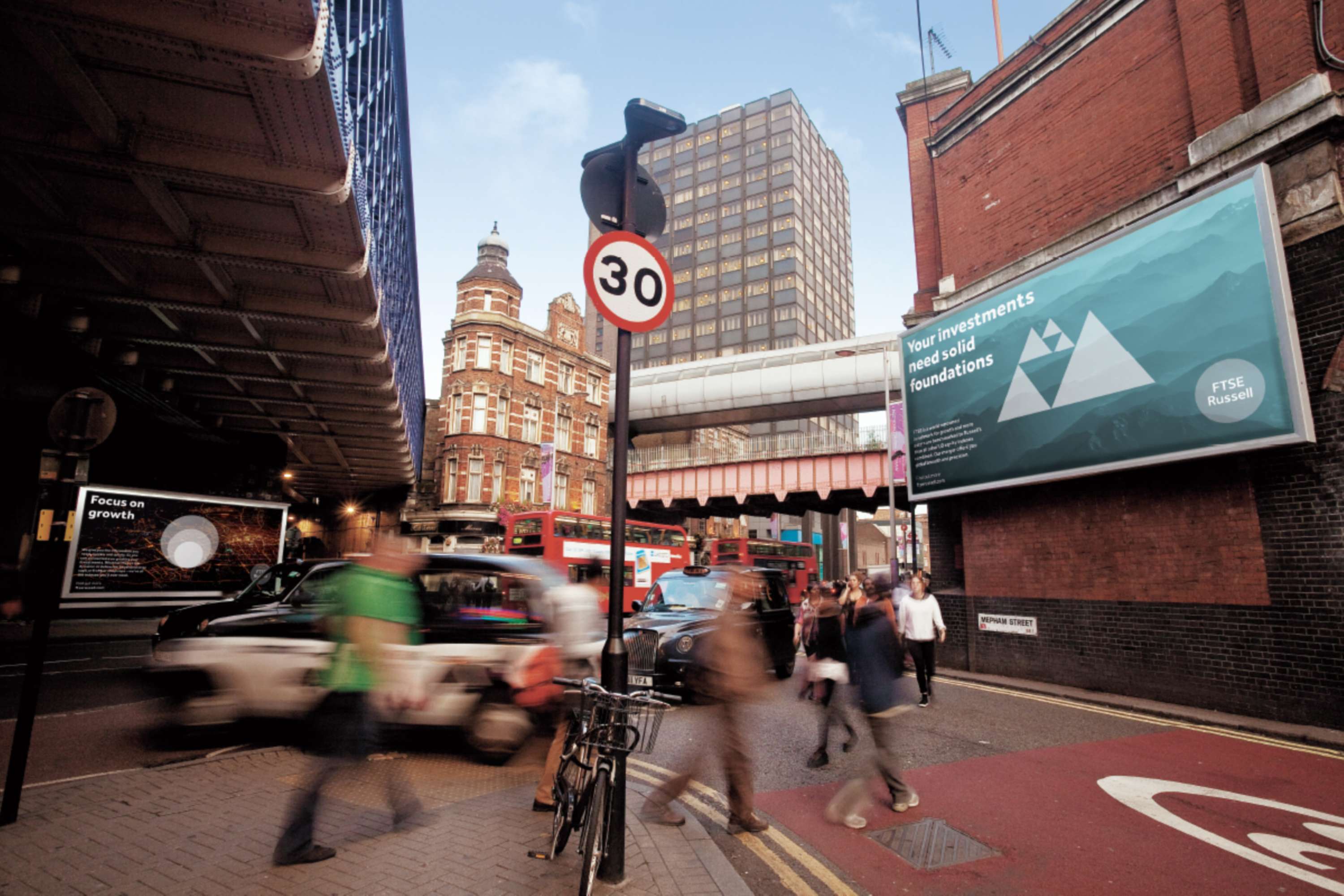
After London Stock Exchange Group has acquired FTSE (Financial Times Stock Exchange) and Russell, they brought them together to start a new chapter of delivering indexes, insights and tools across the globe. The logo is central to the brand. It is simple and bold. The circular design is the full stop. The impactful mark FTSE Russell makes on global indexing market. The confidence of their viewpoint. And the complete, 360° approach they take to data and indexing for their customers. The primary colour palette is made up of FTSE Russell Burgundy and white. Burgundy represents quality and is the colour that sets them apart from their competitors. The secondary and tertiary palette is used for other communication pieces, like graphs and charts or covers. The imagery represents FTSE Russell's perspective which is expansive, insightful and interesting. We also discover patterns in data. Our imagery reflects this with stunning vistas, unique angles and natural patterns. Icons help expressing their messaging in a bold and graphic way. They are unique and give them standout in the sector. To support the messaging on covers or adverts, simple icon infographics have been introduced.

Project Tags
Companies


Rufus Leonard
- Design