
Project type: UI / UX
Role: Data analyst, Researcher, Designer.
Tools: Sketch, Illustrator, Photoshop, Milanote.
Project aims: A UI and UX review and proposal for the waggle saas product. The dashboard is aimed at professional golfers and provides them with real-time data on a round by round basis, from the European tour.
New UI proposal
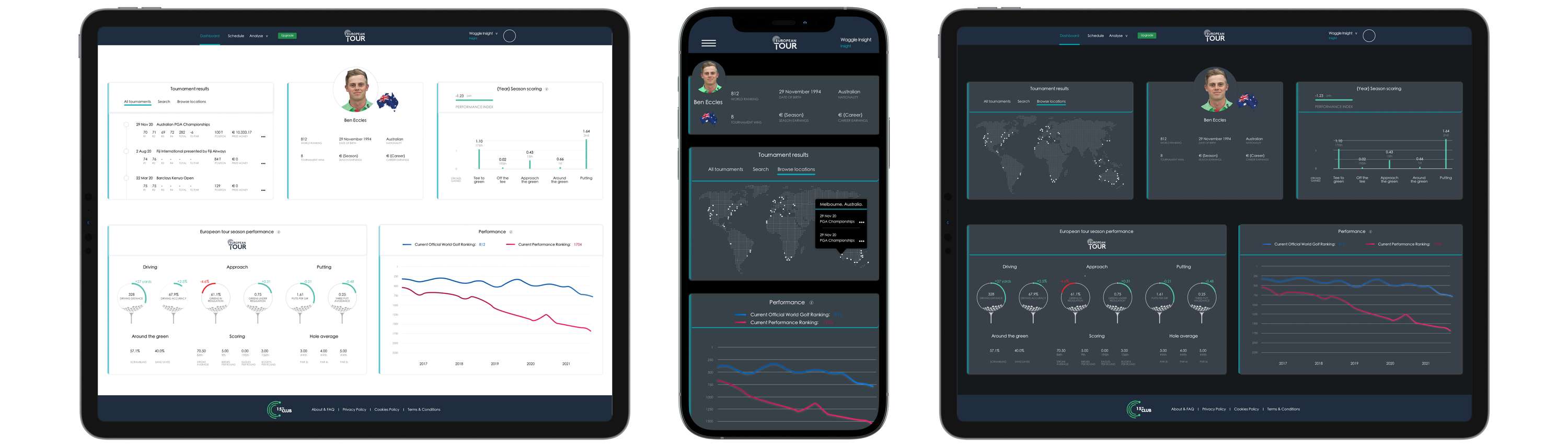
UI design rationale
Clean, uncluttered, with a focus on the data.
A new ‘browse locations’ product within tournament results including an interactive map to allow the user to search for past courses.
Cities with results are highlighted.
Selecting a city displays all tournaments played there with extra information via an on brand link.
White space added around each element to allow the information to breath and to increase the comprehension of information.
More prominence given to tournament results with added information, map, and search function.
Updated tour European Tour logo.
Header and footer kept on company wide branding. Colour indicator updated for clearer navigation for the user.
Current year label added to season information.
All information aligned for ease of comprehension and tracking.
Season performance presented as golf ball imagery to highlight important player stats.
Consistency of design elements
Consolidation of fonts.
- Headers. Heiti SC Medium. 14. 000000/ffffff.
- Sub headers. Heiti SC Light. 13. 000000/ffffff.
- Data. Heiti SC Medium. 12. 000000/ffffff.
- Data labels. Heiti SC Light. 12. 7F7F7F.
30px spacing between data.
Consistent information icons across the dashboard.
Data containers equal size with 70px headers.
UX design rationale
New dashboard proposal focuses on the user by intelligently grouping information based on type and update frequency.
Page split into season and career sections with added information, including nationality, career earnings, and tournament wins.
Tournament details use native scrolling. A text search and map function is added to allow for quick tournament access without scrolling.
Season scoring now displayed in a chart to easily see where shots are gained and which areas need work.
Rankings data increased from 8 month to 5 years. Current ranking displayed clearly.
Extra tournament information added to avoid an unnecessary click. This includes ‘score to par’ and ‘prize money’.
