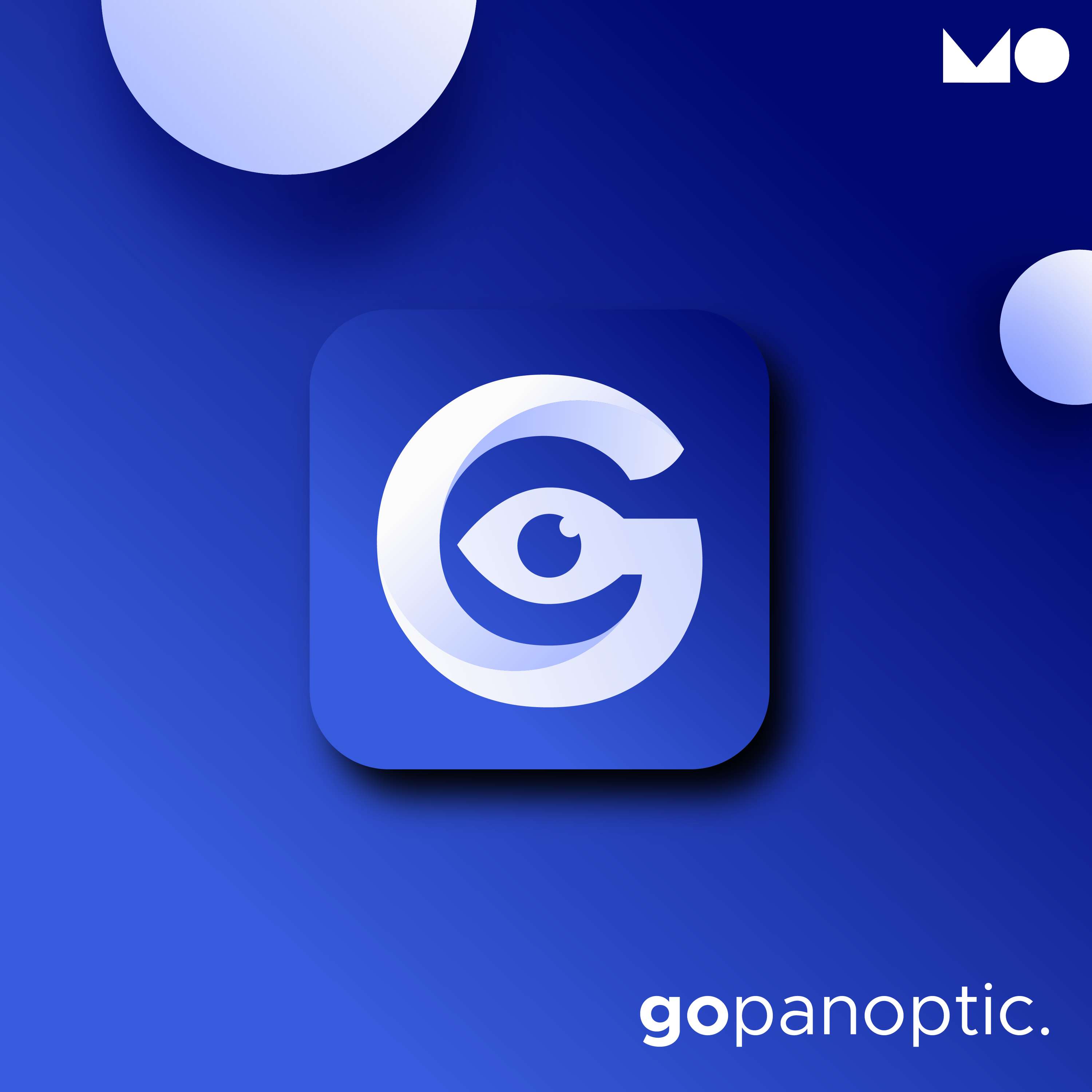
GoPanoptic.

A software company in the medical space. The name was inspired by the panopticon in the form of a central observation, their main focus was to have a logo that gave the impression that they are the all-seeing eye. To translate that to a brand identity, I presented a range of different logo concepts but there was one particular design that had the letter G with the eye. This instantly was the favourite.