Jubel beer rebranding

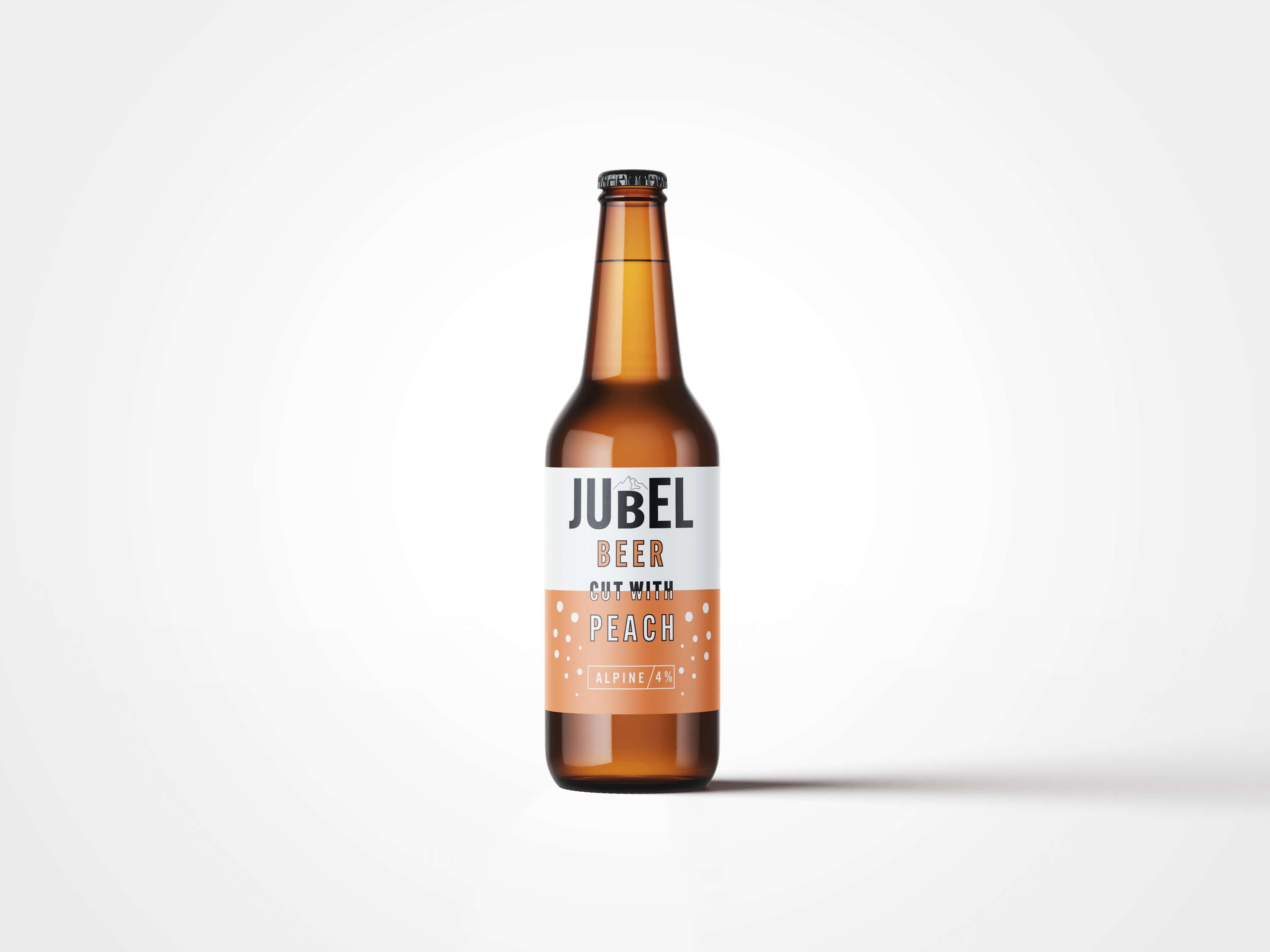
Problem: When Jubel first launched their products, their branding looked completely different. The label seemed more vintage and was connecting the beer directly to the alps where the idea comes from. When they got a contract with a big retailer, their struggled to get the beer out there- it was not clearly communicated why this beer is different. As it is neither a cider or a plain beer, rather the mix, just a few months after the launch they had to changed their branding completely. Solution: I wanted to create a label that combines some elements from the old and the new label. I thought it was important to somehow get across the origin where the drink comes from, the Alps, but in more modern style. For this reason I have decided to add it to the logo. I have kept the original peachy colour as I think it resonates well with the brand, and I have added some bubbles for a fresher look. As the brand wanted to make the idea of mixing beer with peach obvious, I have created typography that is literally cut with peach, similar to the original label. Note: This is a personal project, not commercial. Everything presented is made by me just for fun.