Love in London 2018 | Marketing Design
Love in London is a campaign started by the dating app CLiKD (who had been heralded as the “Instagram of the dating world”, thanks to the app’s use of photography) in collaboration with UK charity PhotoVoice. The campaign launched a UK wide photography competition to celebrate the different types of love in London through categories such as Love Your Partner, Love London, Love Your Community and Love What You Do. The aim was to raise money for PhotoVoice and improve CLiKD’s brand awareness.
My Role:
- Concept
- Image Sourcing and Retouching
- Large Scale Design
- Digital Design
Problem I Was Solving:
My role was to come up with a concept and design for the OOH advertising the campaign had been offered (digital billboards.) As 2018 was the campaign’s first year of running, it was an unknown name and CLiKD were still a growing app. The billboards would be one of the general public’s first introductions to the campaign, so they had to be clear, eye catching and memorable. There were two stages: campaign introduction and winner announcements.
My Research and Initial Ideas:
As this campaign was a collaboration between two brands (CLiKD and PhotoVoice) it was essential for me to go into the project with a clear understanding of both the brand identities. One of the reasons the collaboration came about was because PhotoVoice were trying to reach a younger audience. Working for CLiKD, I was already familiar with theirs, but PhotoVoice required some further research. In doing so, I was able to find strong crossover between the two brands: their focus on strong photography as a communication tool and their focus on the person they’re communicating with. With this in mind, I started looking into how other charities have marketed their campaigns.
With this knowledge, I was able to come up with some initial ideas. As this campaign’s heart was the photography competition, there was no question that photography would be at the centre. The best way I felt to convey that was to put anyone who sees the billboards into the role of the photographer immediately.
Design Process and Deliverables:
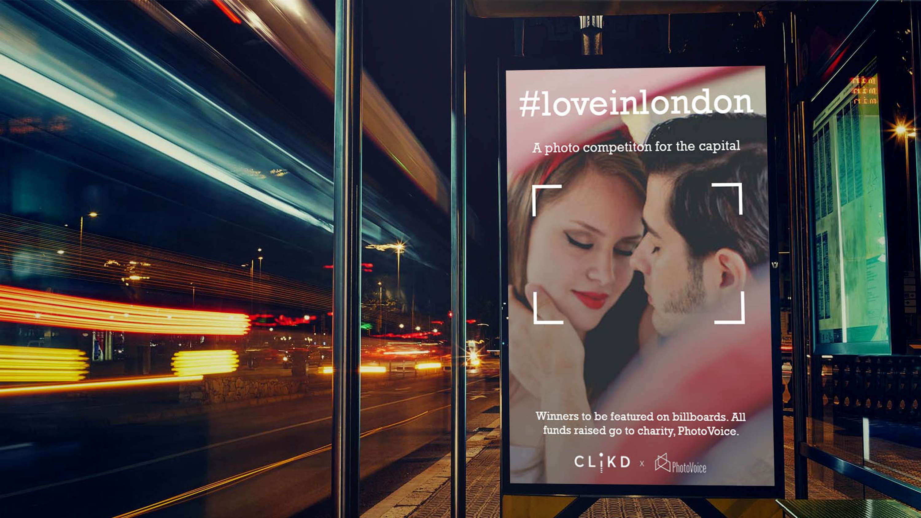
For the concept, I decided the best way to put people viewing the billboards into the role of the photographer was to make it seem like they were looking through a camera lens and taking the pictures that were displayed on the billboards.
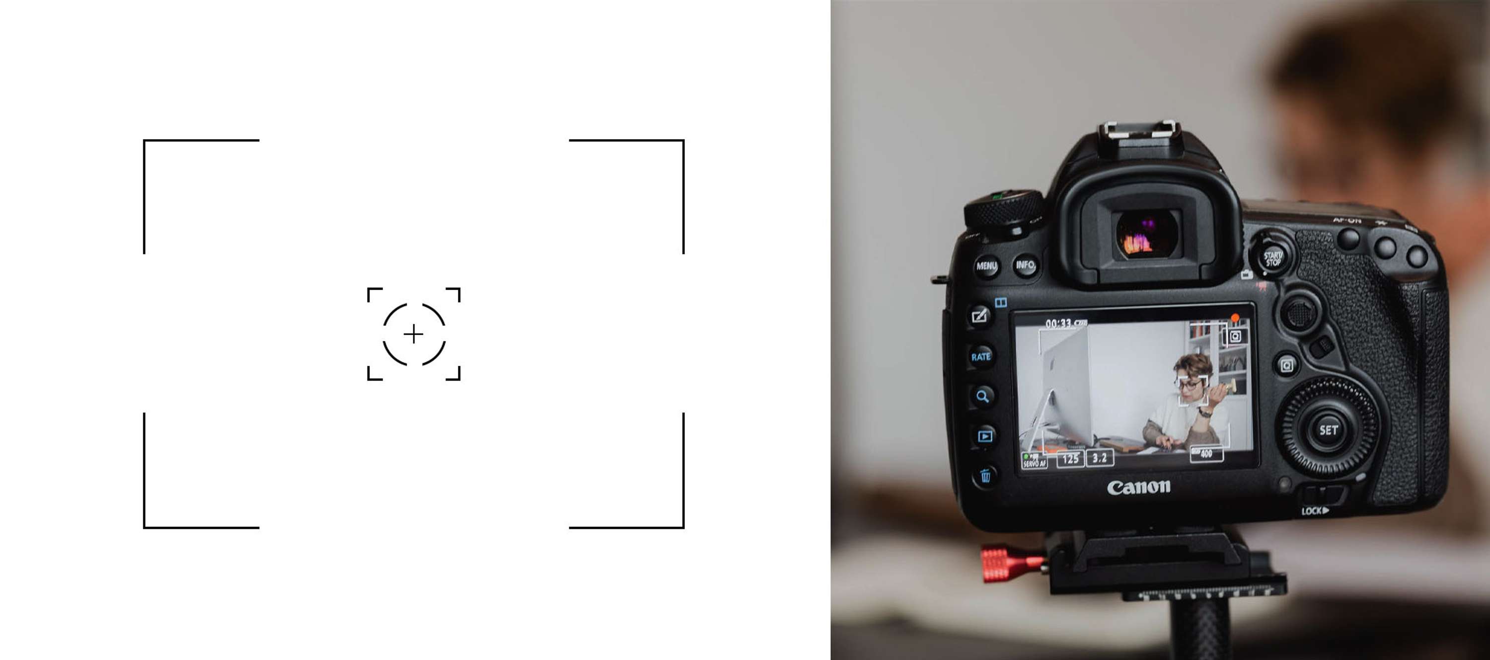
As someone who has a passion for photography, I took the idea of a camera’s viewfinder and how it creates a white frame on the screen when you’re adjusting the focus. That white frame became the backbone of the concept. A simple, yet effective way to communicate that photography was at the centre of the campaign.
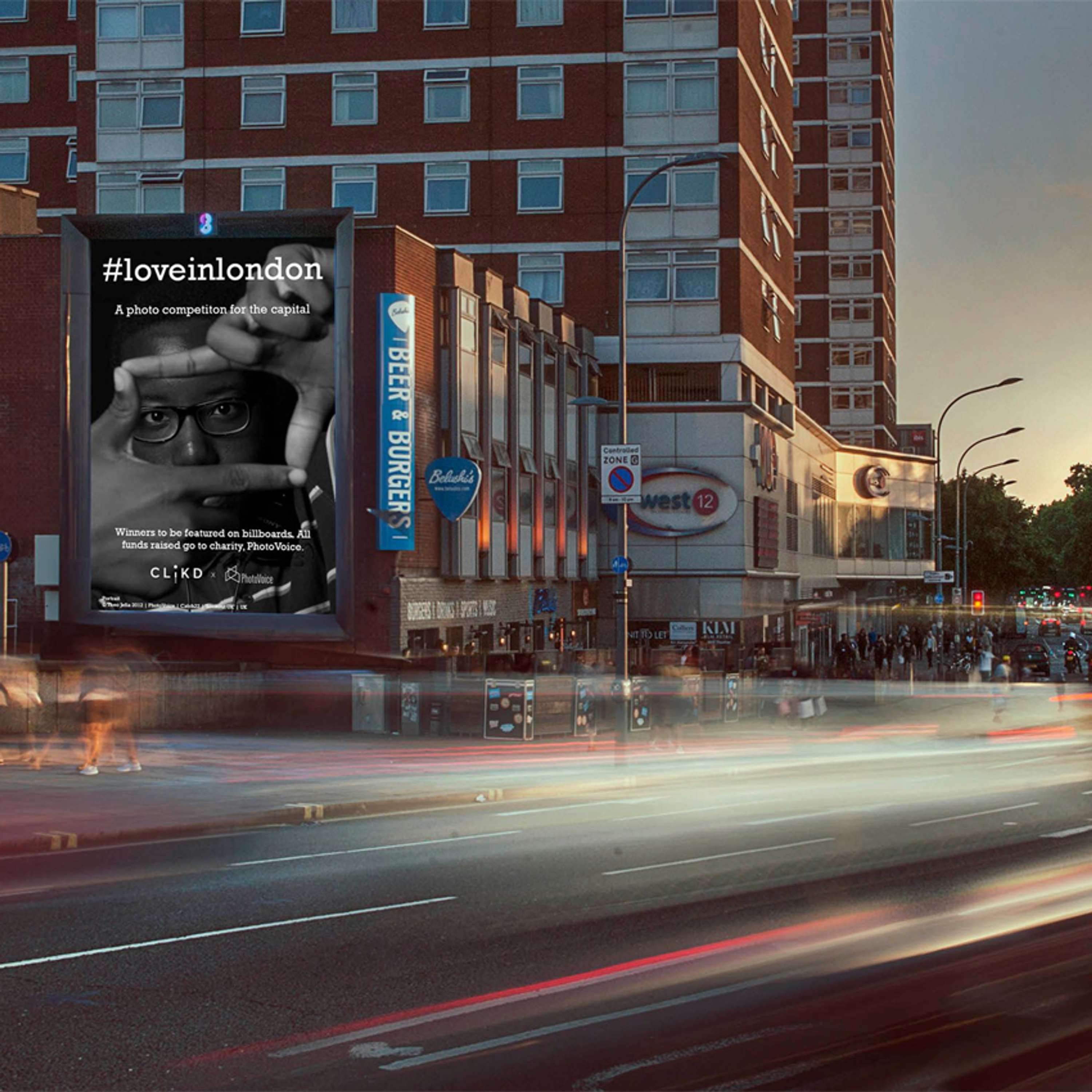
One thing that I had to keep in mind when designing was context. The billboards were going to be on some busy intersections, such as the Brent Cross roundabout, Shepherd's Bush, Streatham High Street and various bus stops. They would be seen by people driving. This meant that the billboards had to be simple, yet memorable. In terms of images used we were limited by budget, but I sourced images that had one main colour as their running theme e.g. if it was predominantly red or blue. The text was always going to be white for readability. Working with CLiKD’s creative director for the font, we decided to go with Rockwell because we wanted a font that was clear, but made a statement. We felt the bold, serif nature of the font did both.
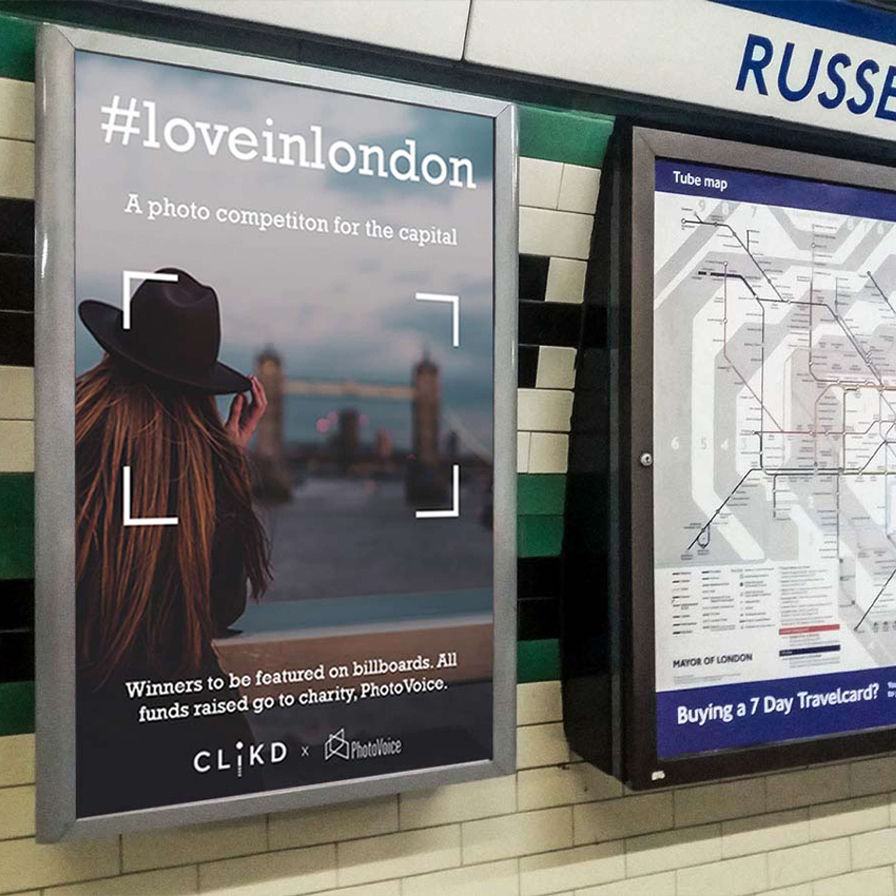
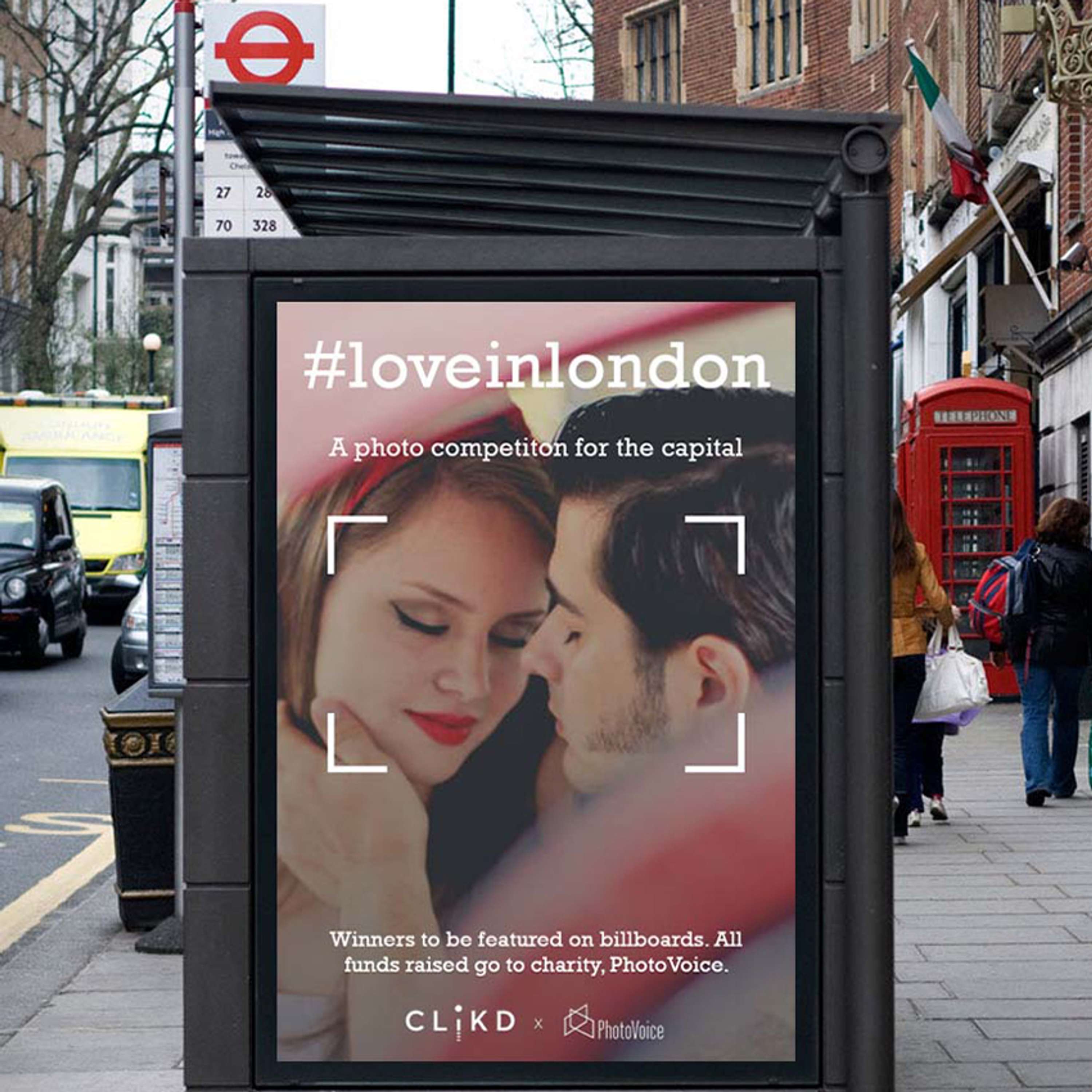
The main information that needed to showcased was the name of the campaign (we used the hashtag version #loveinlondon, so it was memorable and easy to search for) what the campaign was, what people would gain from participating and the organisers. At this first stage, the campaign announcement stage, the billboards were all static imagery.
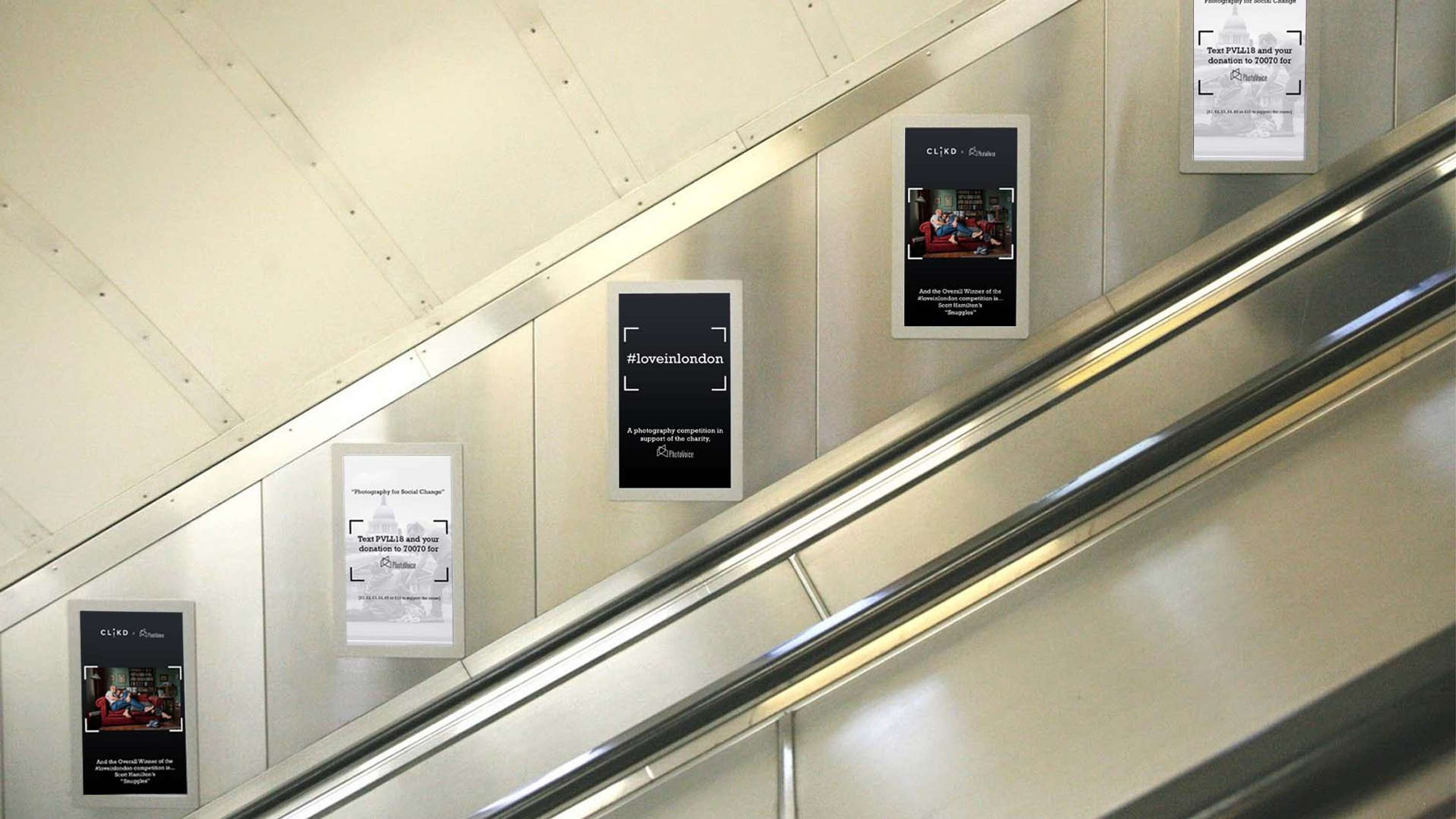
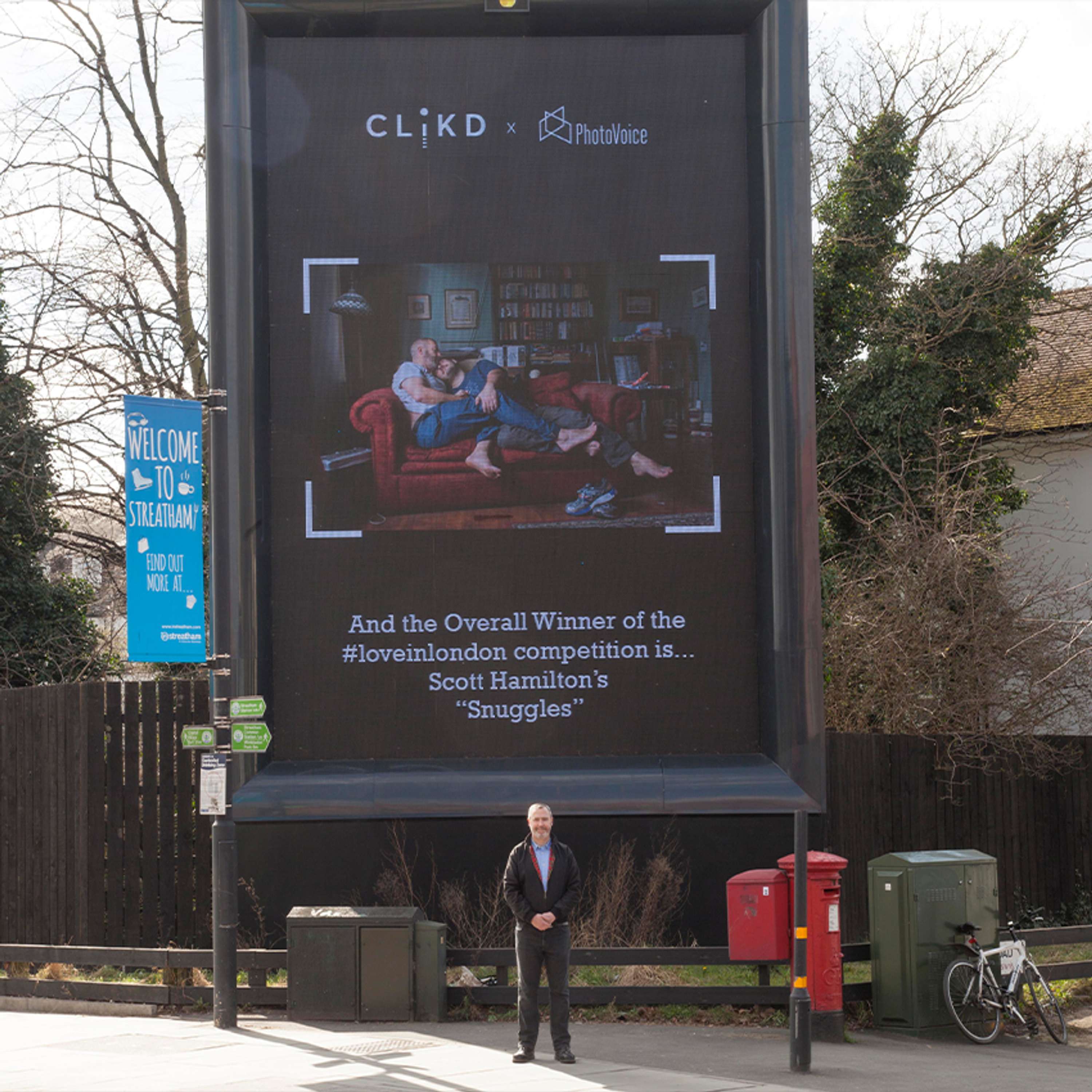
For the second stage, winner announcements (these were shown on billboards and tube escalator screens) the billboards could be moving, so I went for 3 slides. The first introducing the campaign again, then announcing the category winner and finally giving people an easy way to donate to the cause. I felt this was a nice way to round out the billboards, with the reminder of what the campaign was for.
Client’s Opinions:
CLiKD and PhotoVoice were very happy with how the billboards came out and felt that they were able to convey both brand’s messaging and goals.
Tools/Programmes I Used:
- Adobe Photoshop
- Adobe Premiere Pro