Mission Zero
The approach to explaining a process as advanced and technical as space travel (or moving money abroad) is to simplify it to the extent it becomes almost trivial. Space travel? Safe, fun and reliable. Customers don’t need to know the ins and outs of every process behind the scenes. Instead key touch points are presented in such a way that the inherent benefits are instantly obvious and impossible to ignore. This overpowers any feelings of doubt and instills a sense of comfort. The result of this work is a mailer marketing campaign, designed to create awe, wonder and excitement about the prospect of space travel.
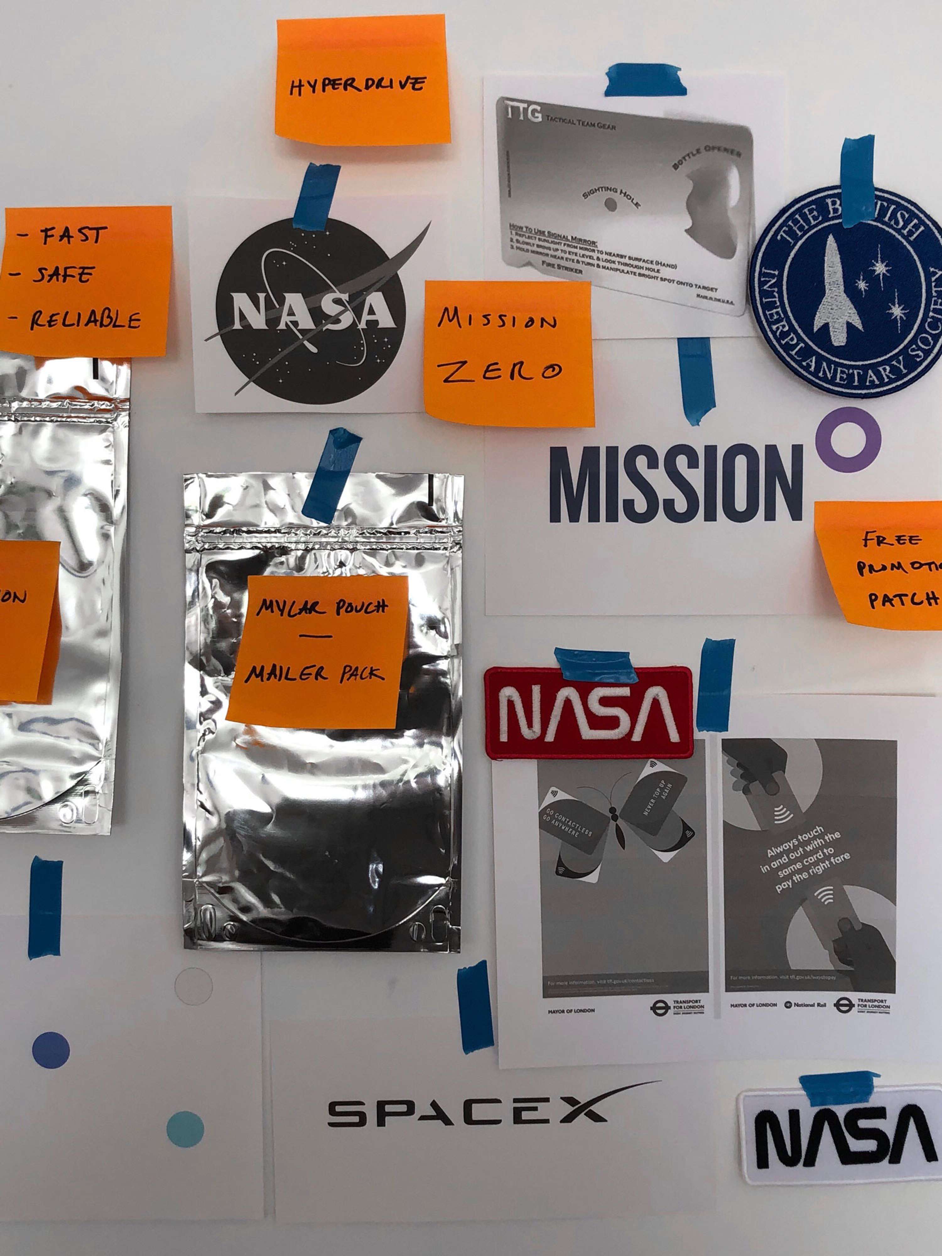
Process
Initial inspiration was taken from the visual style and branding used by NASA and SpaceX. The idea of adventure, exploration and excitement was key early on - leading to the development of a series of collectables included as part of a mail campaign.
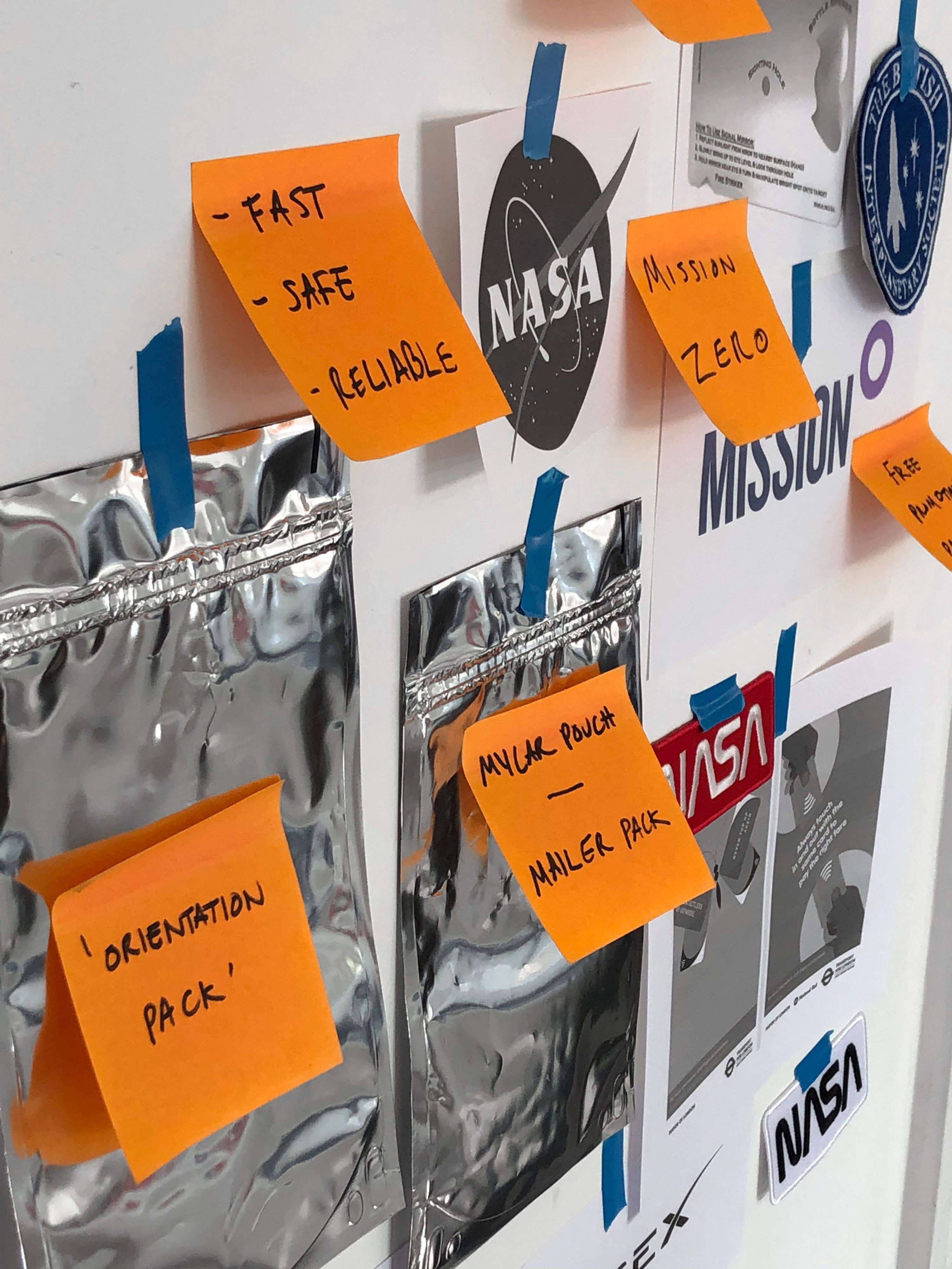
'Lumpy Mail'
Posting objects in the mail to future customers (pun intended) is praised as one of the most effective marketing techniques. The initial surprise of having something unexpected to open is a powerful way to help bolster the effect of the supporting marketing materials.
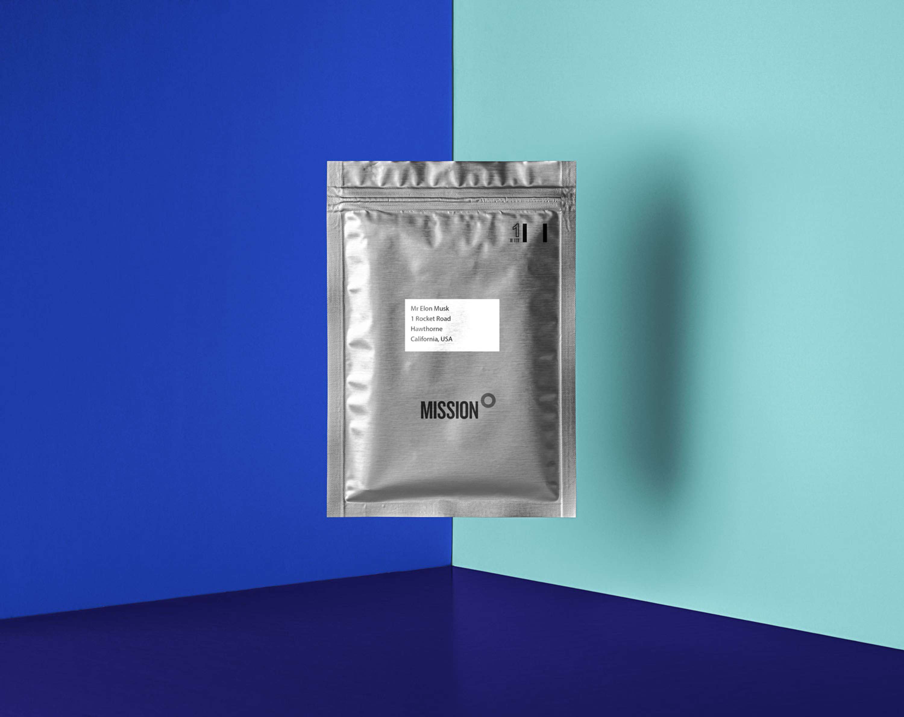
Packaged in an iconic silver Mylar pouch, synonymous with the space industry, the mailable pack delivers the excitement of intergalactic space travel to the homes of future customers.
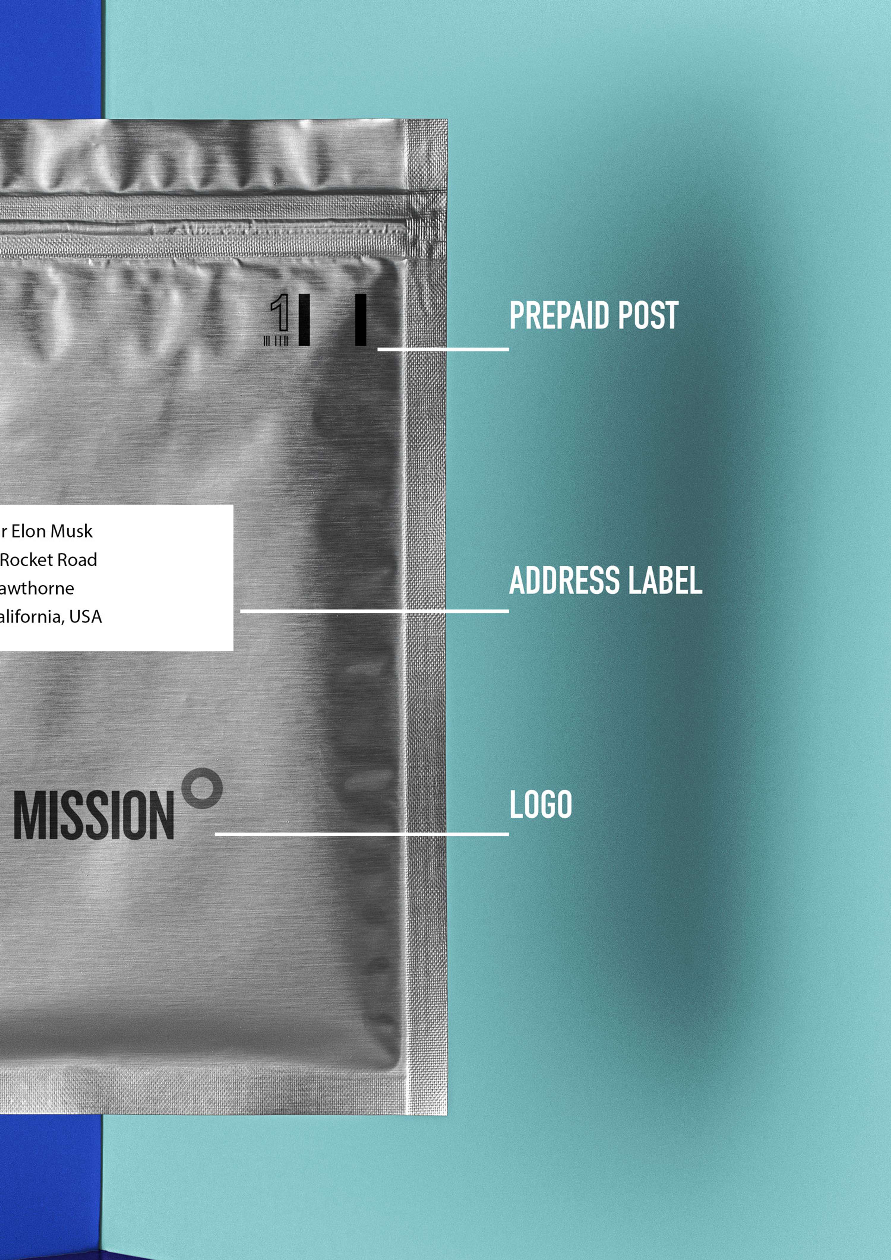
The highly reflective mylar material aims to serve as an instant signal to prospective customers the nature of Mission Zero's work in the space industry.
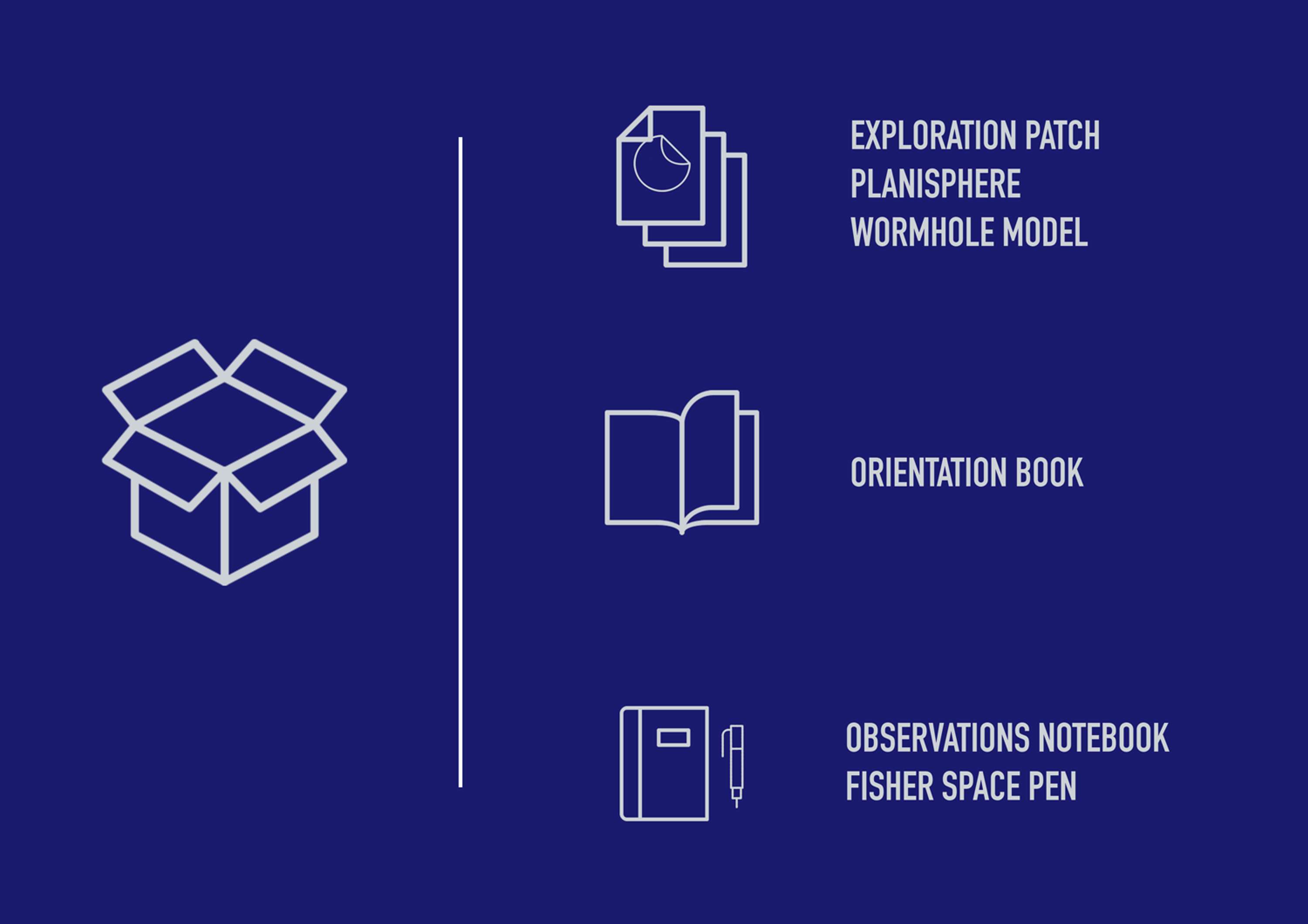
The pack includes a series of 3 novelty souvenirs, an Orientation Book and an Observations Notebook, complete with a Fisher Space Pen.
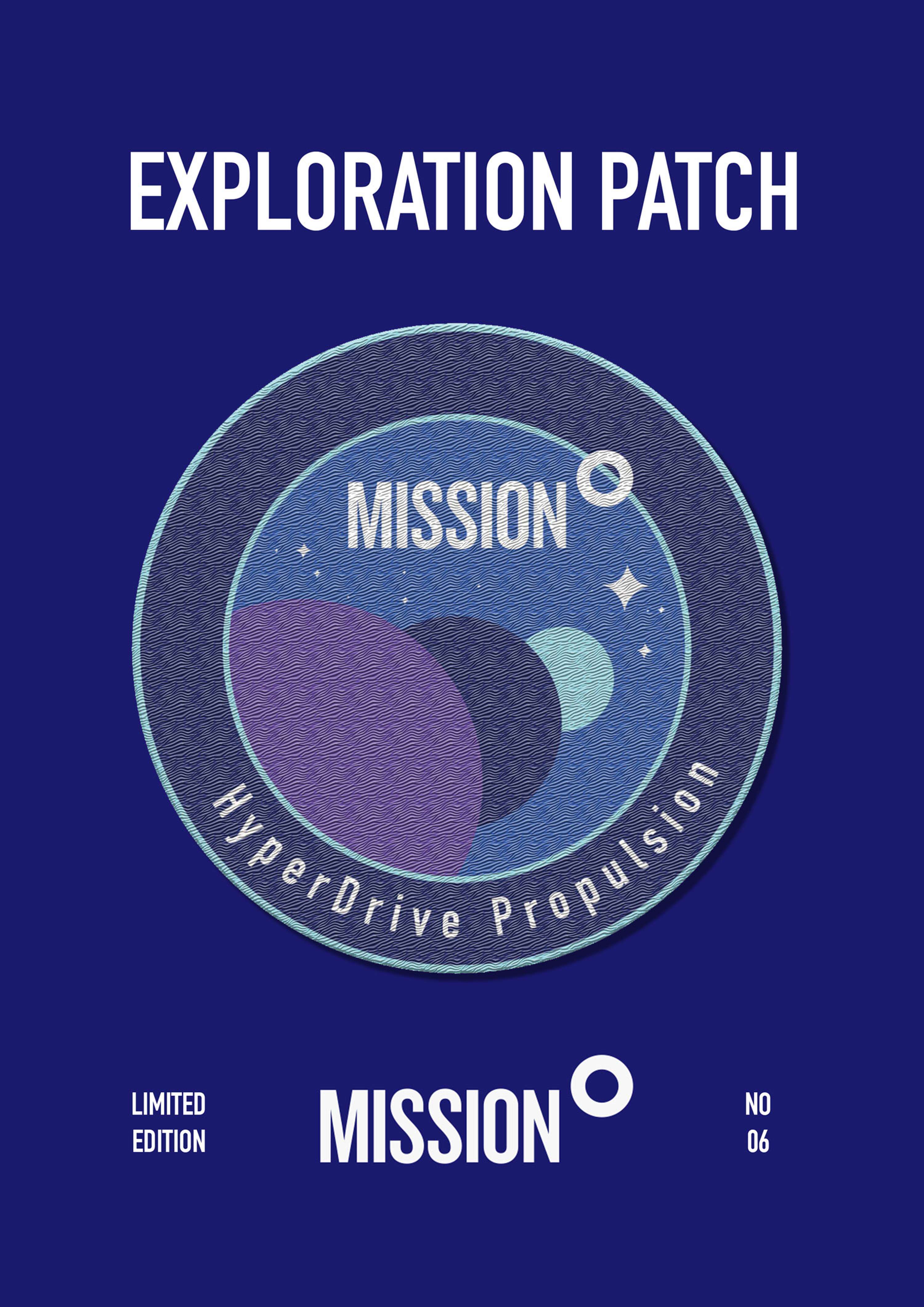
Exploration Patch
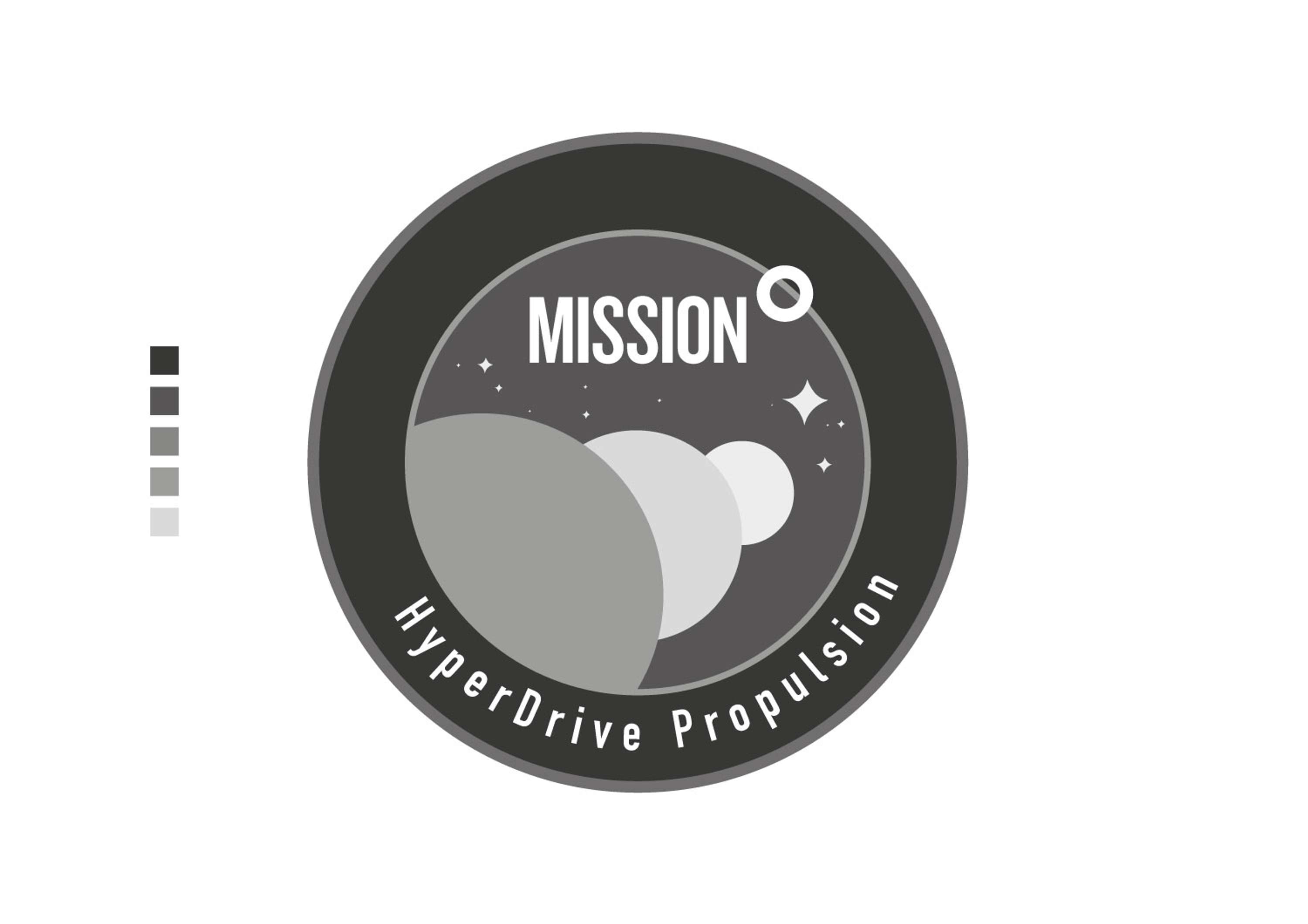
Inspired by the collectable patches earned and worn by cub scouts and explorers alike, this novelty patch uses all 5 of the given colour palette and is designed to invoke a sense of excitement and adventure.
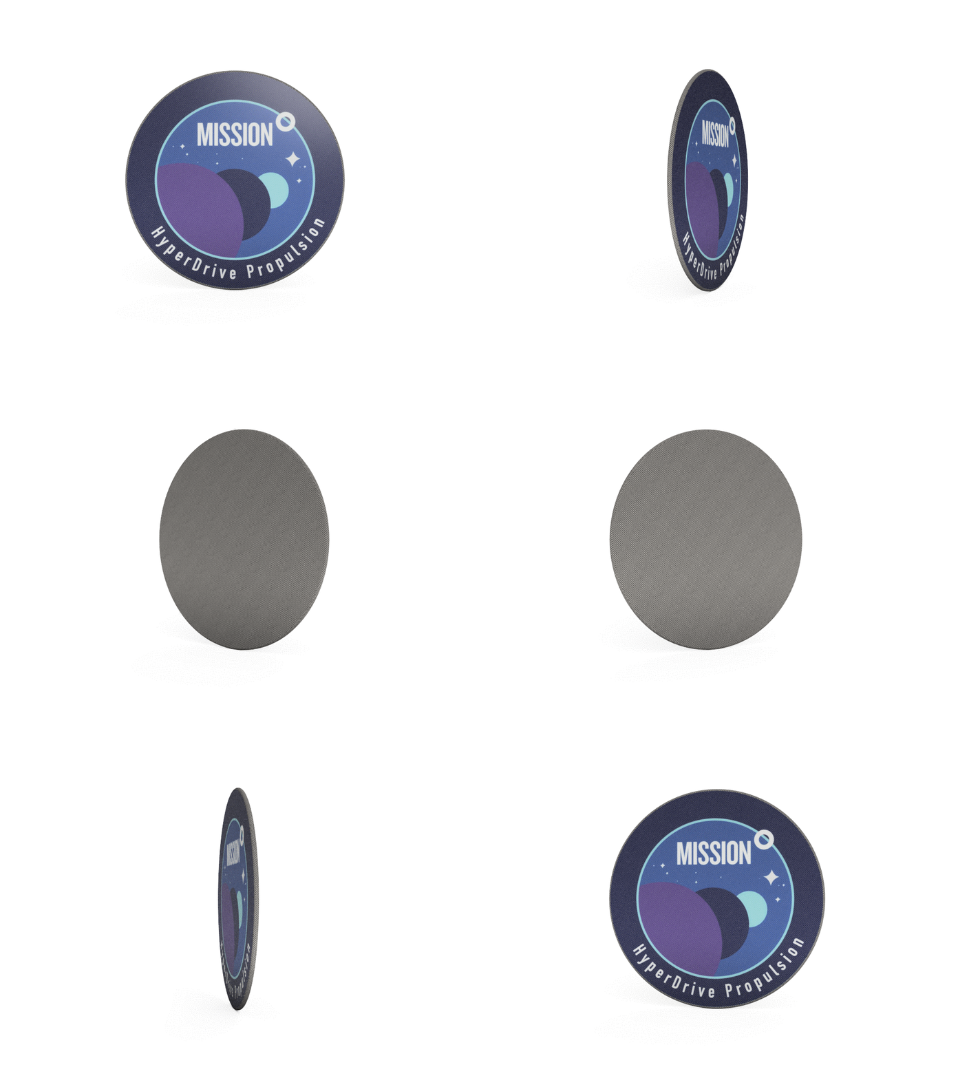
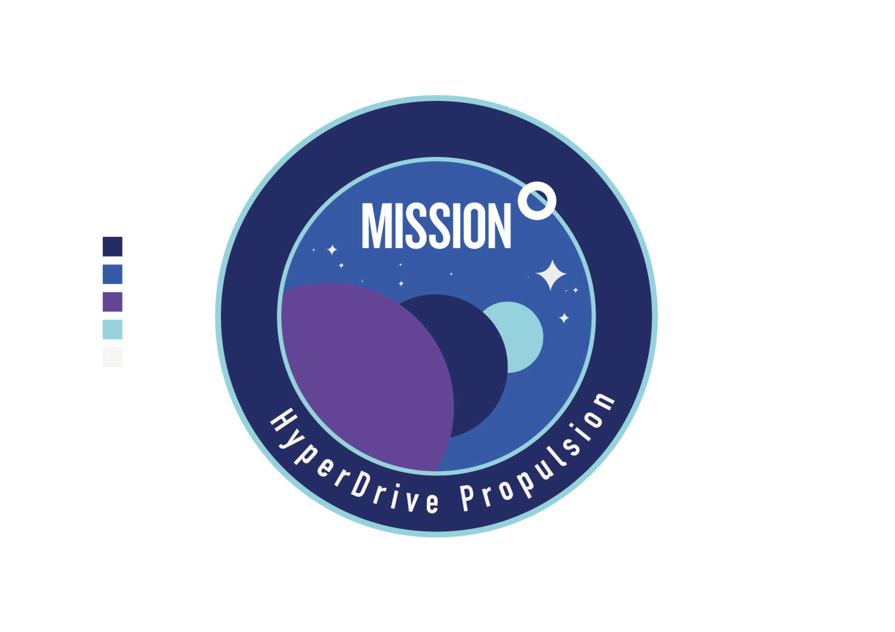

Felt backed and embroidered, it's the perfect keepsake to iron onto a favourite jacket or cap.
The bulk of printed collateral makes heavy use of just 2 colours from the given 5 colour palette - the darkest blue and lightest. These two colours, with the highest contrast, were chosen specifically to resemble the white stars of night against a dark sky.

Planisphere
Features a cut-out centre to track the ever changing position of the stars.
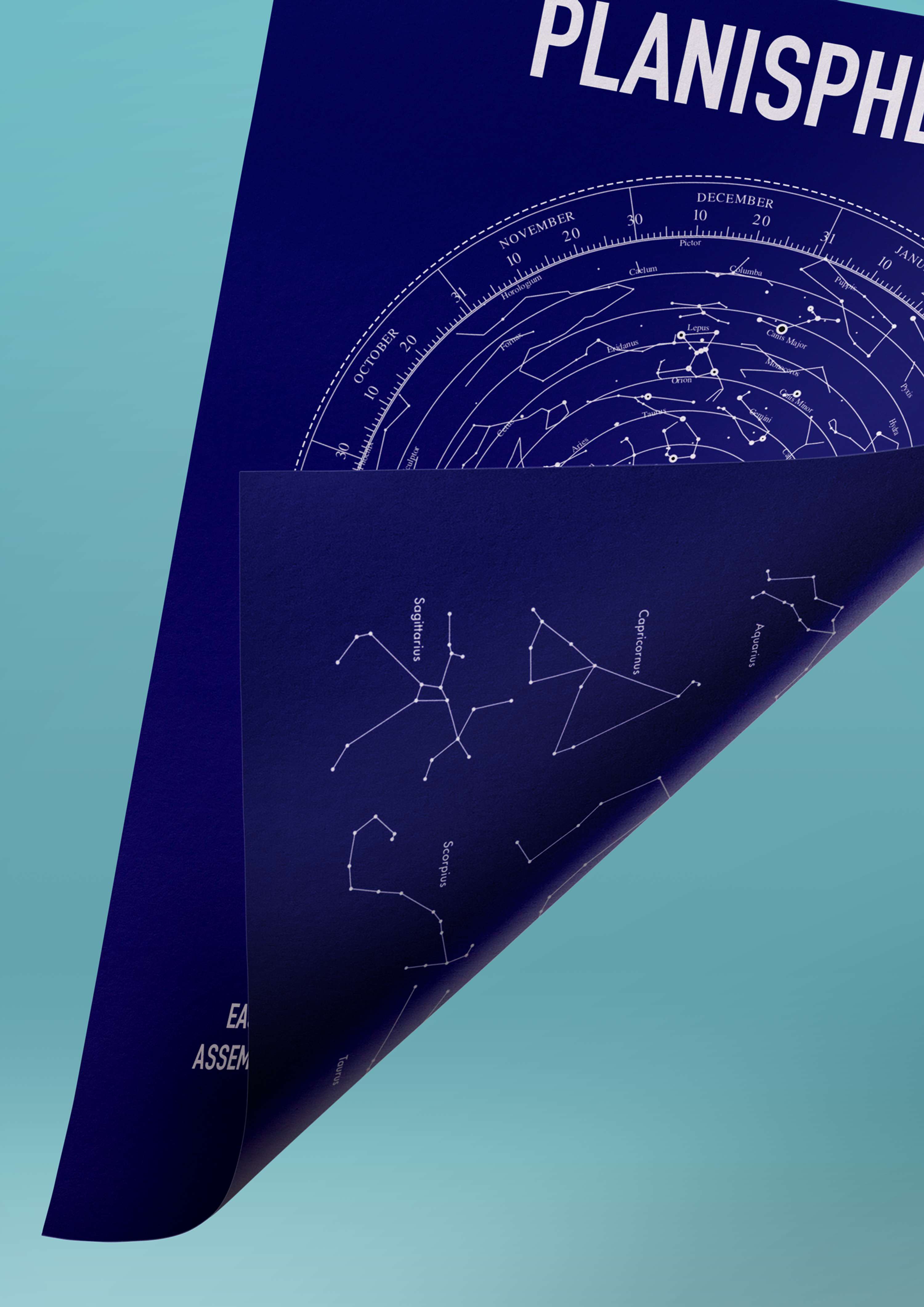
The back of the Planisphere features a constellation guide - the ideal companion to a night of star gazing.
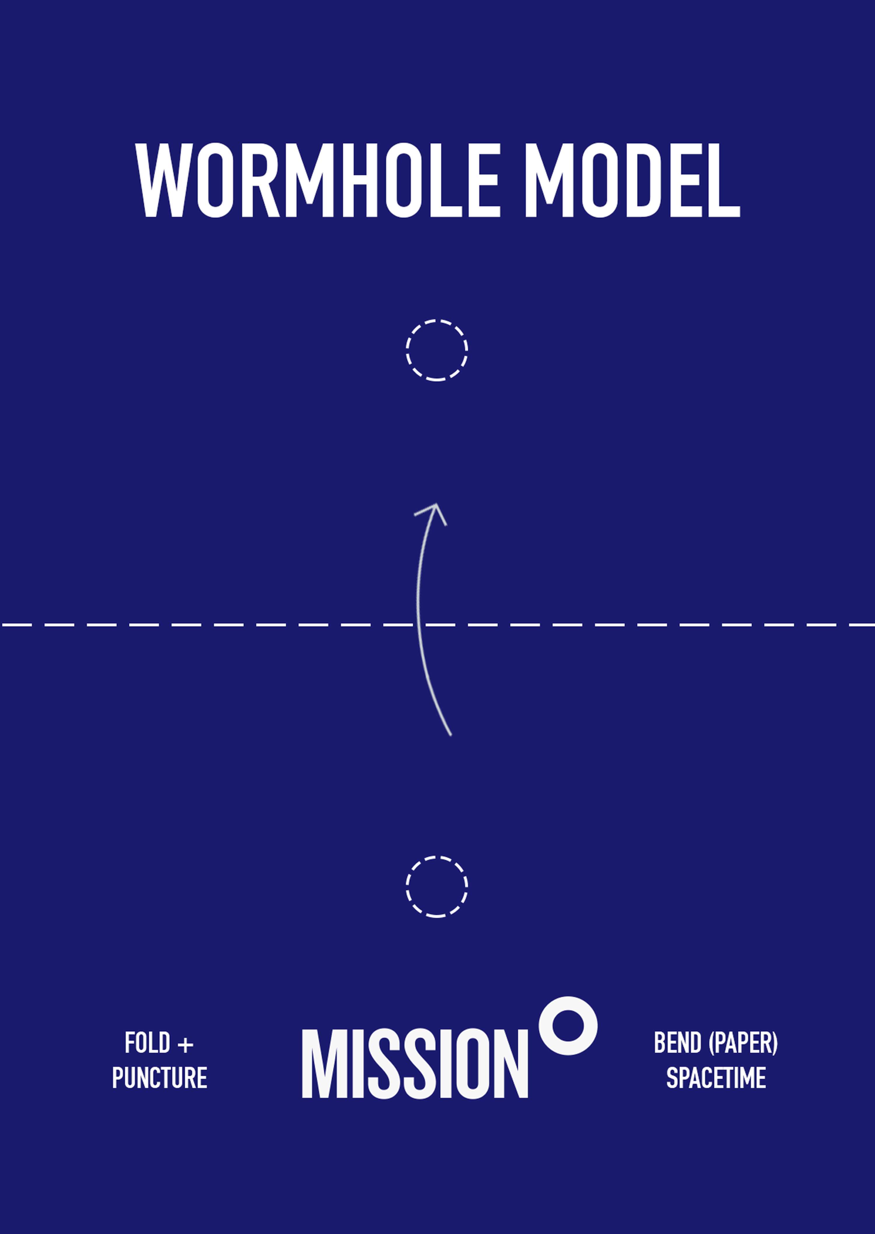
Wormhole Model
A tongue-in-cheek reference to a concept explained in numerous sci-fi films such as Interstellar (2014), where a piece of paper is stabbed with a pen to demonstrate the workings of a wormhole.
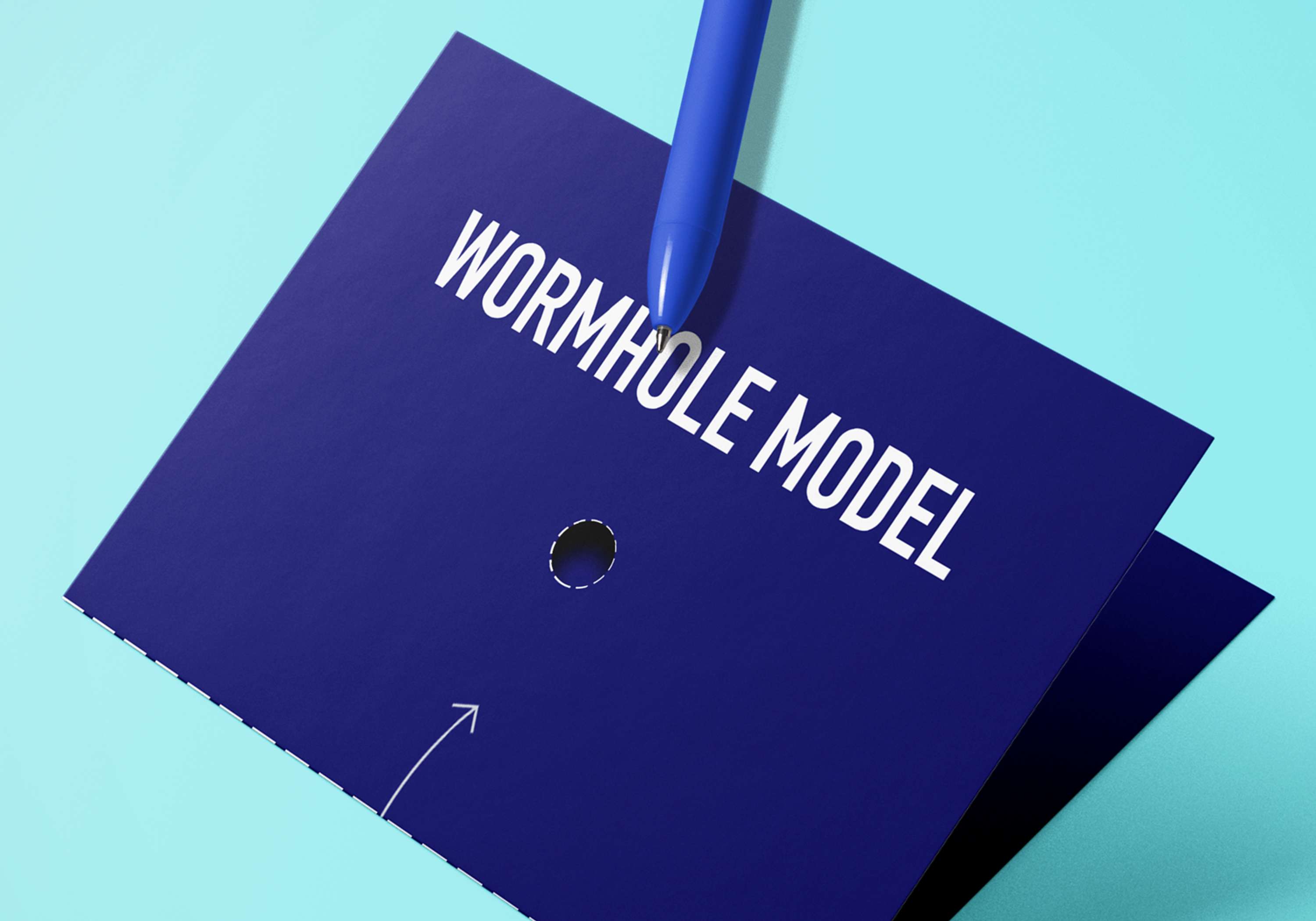
Puncturing the marked holes with the included Fisher Space Pen demonstrates the possible shortcut offered by one of the greatest natural phenomena of outer space.

Orientation Pack
Simple, bold and striking. The cover for the Orientation Pack does away with unnecessary artwork or other adornments and pays homage to the stripped back style branding utilised by the likes of NASA and SpaceX.
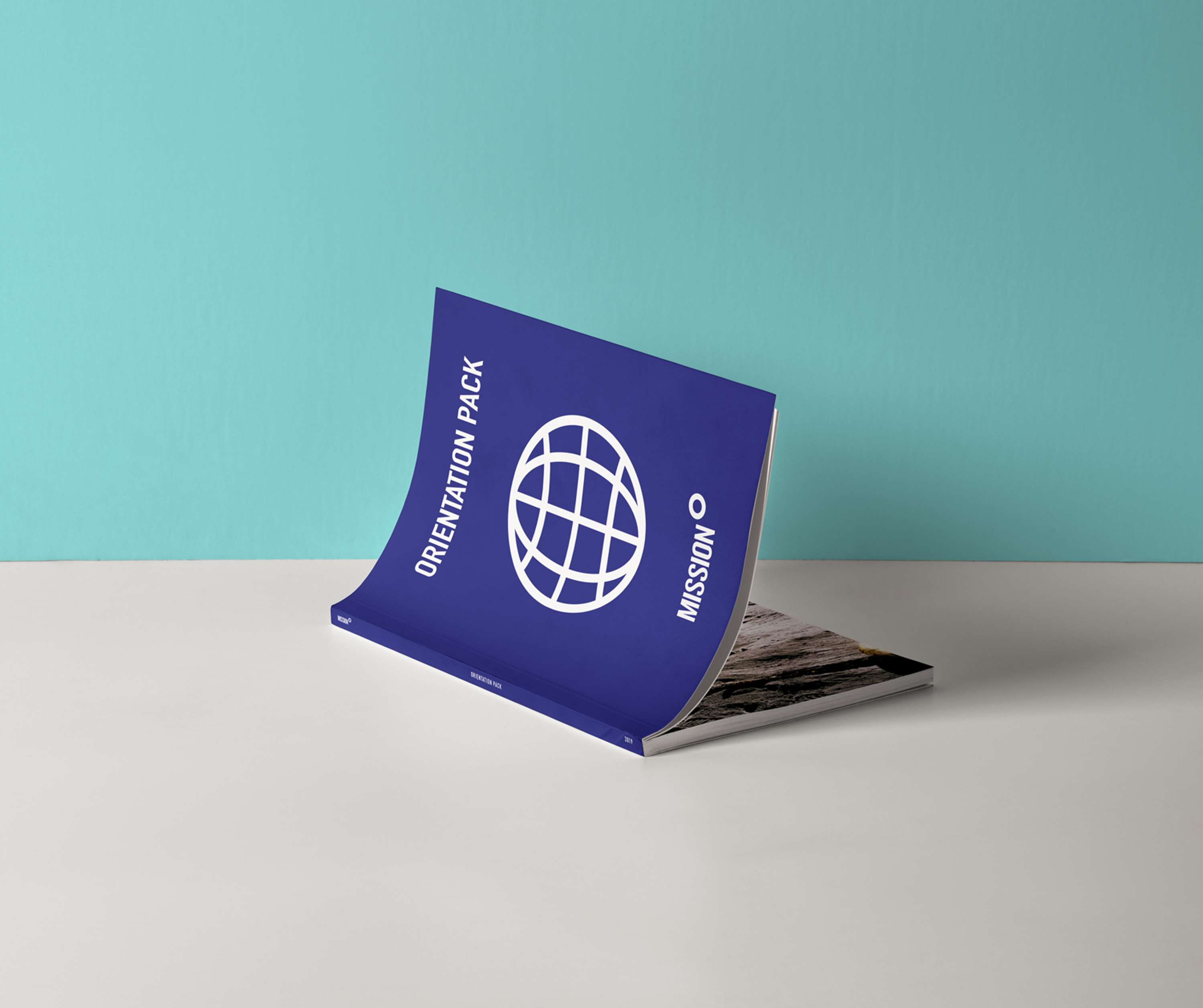
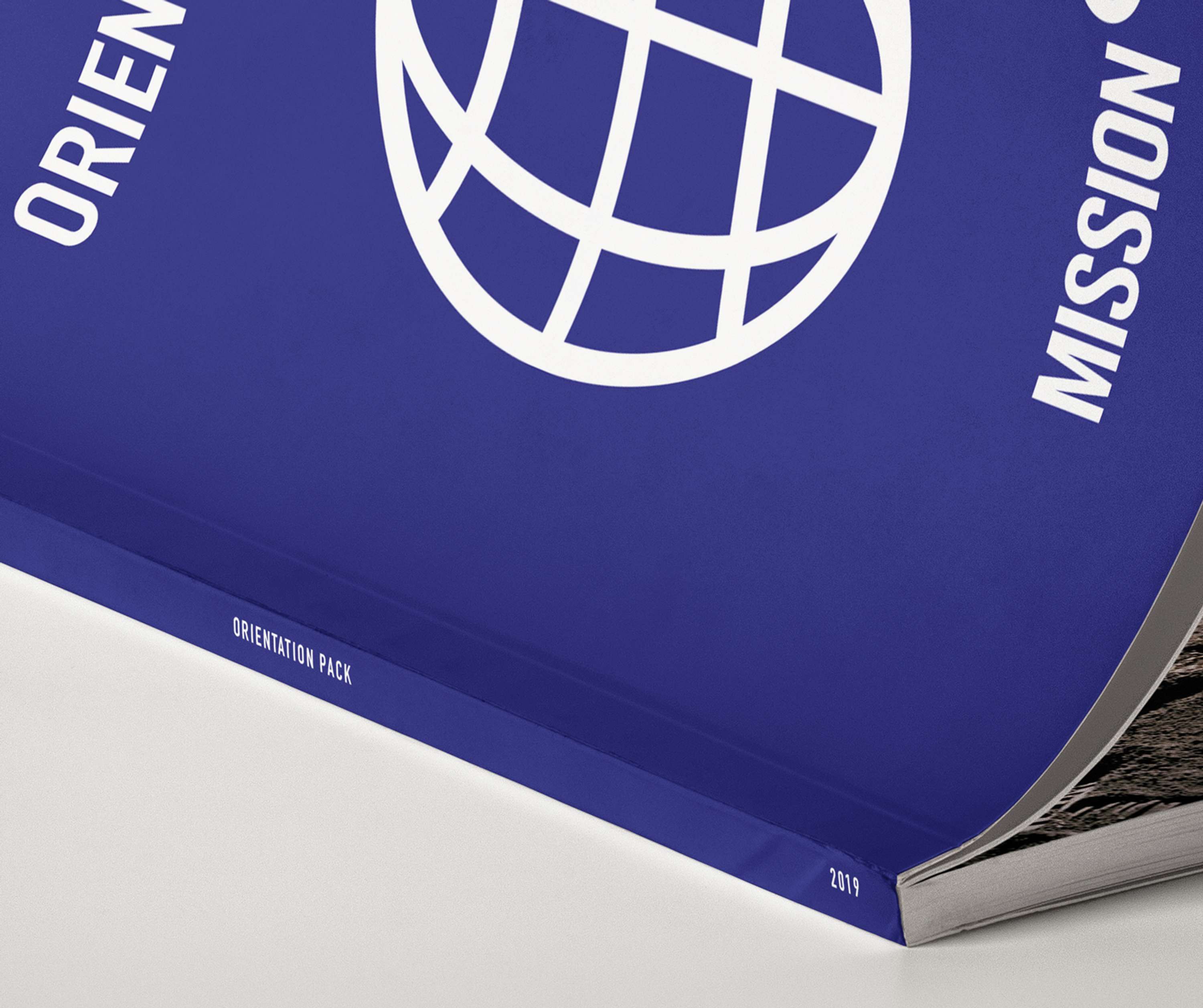
The globe icon is deliberately used to subtly remind customers of passports and in turn, safe and reliable travel.
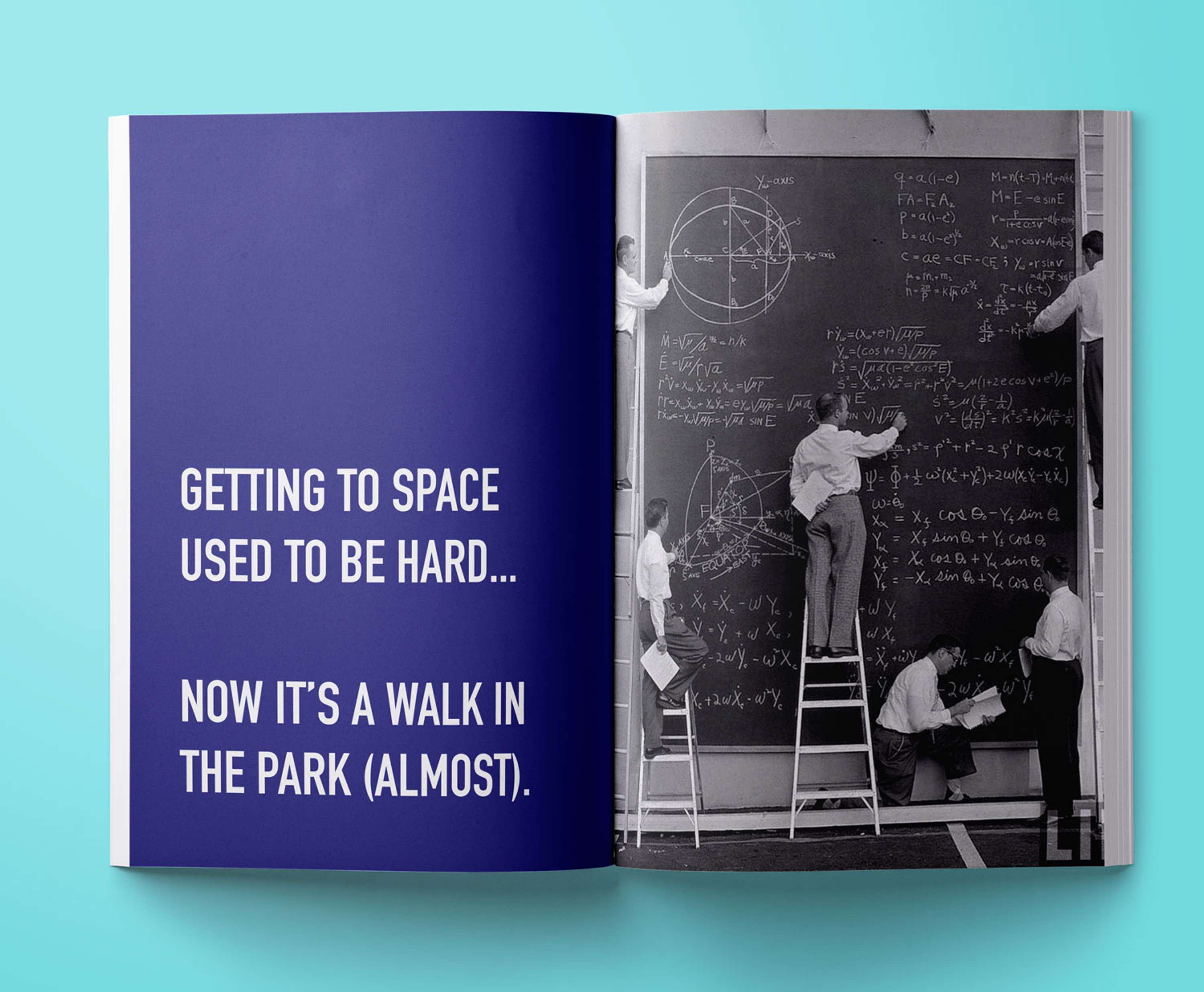
Light hearted humour and language is used to keep the idea of space travel positive and fun.
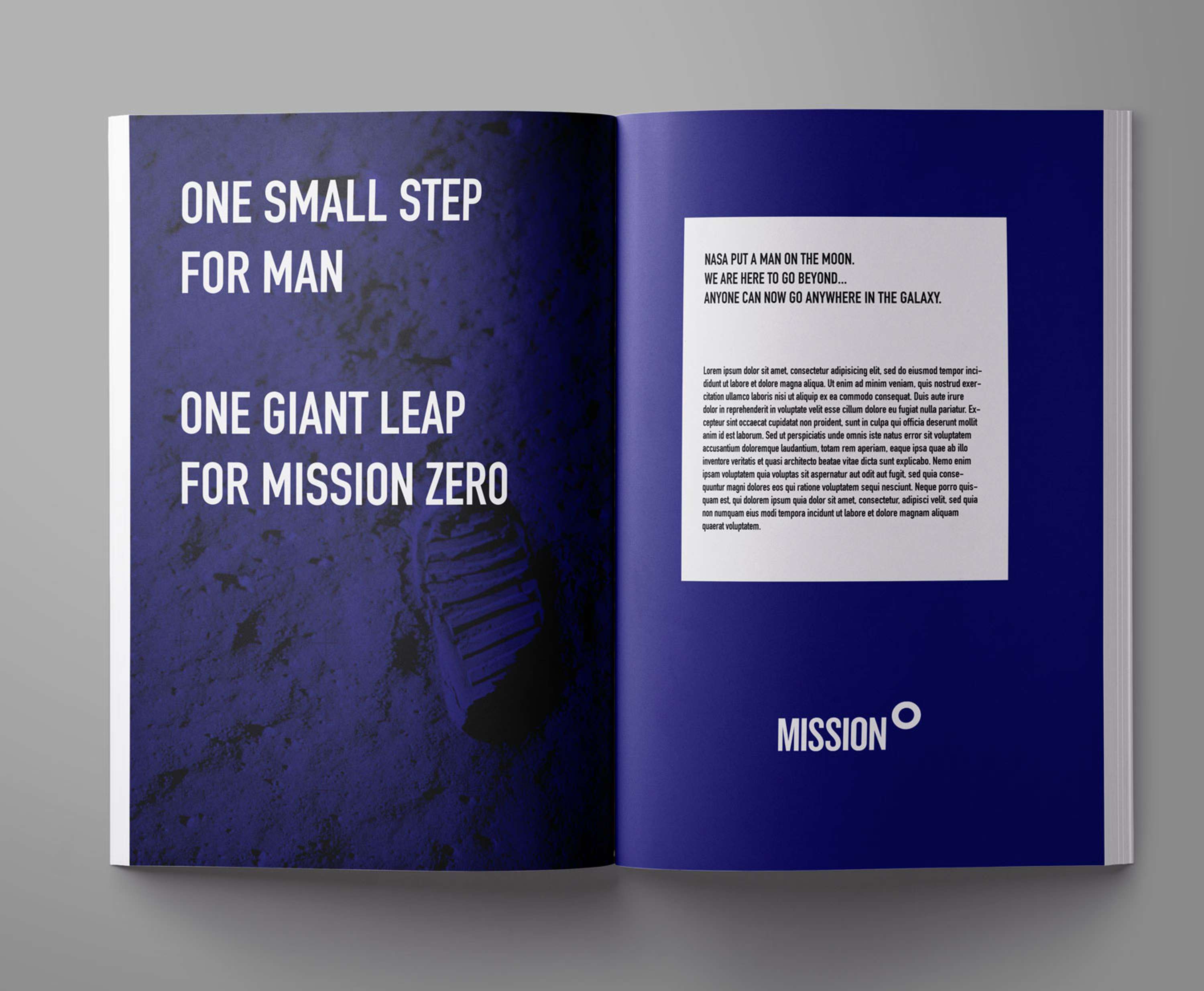
Historical images provide a useful contrast to emphasise just how groundbreaking Mission Zero really is.

Icons
Simple icons instantly build on feelings of trust and familiarity - people looking at icons feel better equipped to comprehend the presented information and are more likely to remember it later.
Taking social psychology into account, rounded icons have been used as they convey a greater sense of friendliness (which, after all, is the main task with presenting something as complex as space flight).
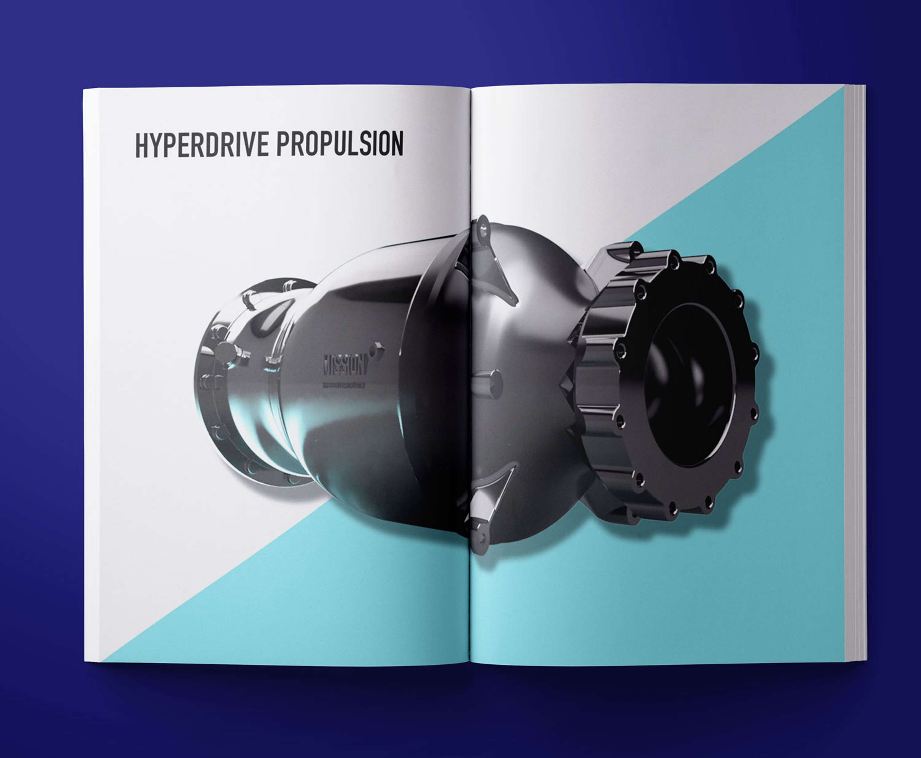
The Hyperdrive Propulsion technology is presented confidently. Large, glossy renders help pitch the tech in an appealing way - similar to how Apple does with its factories.
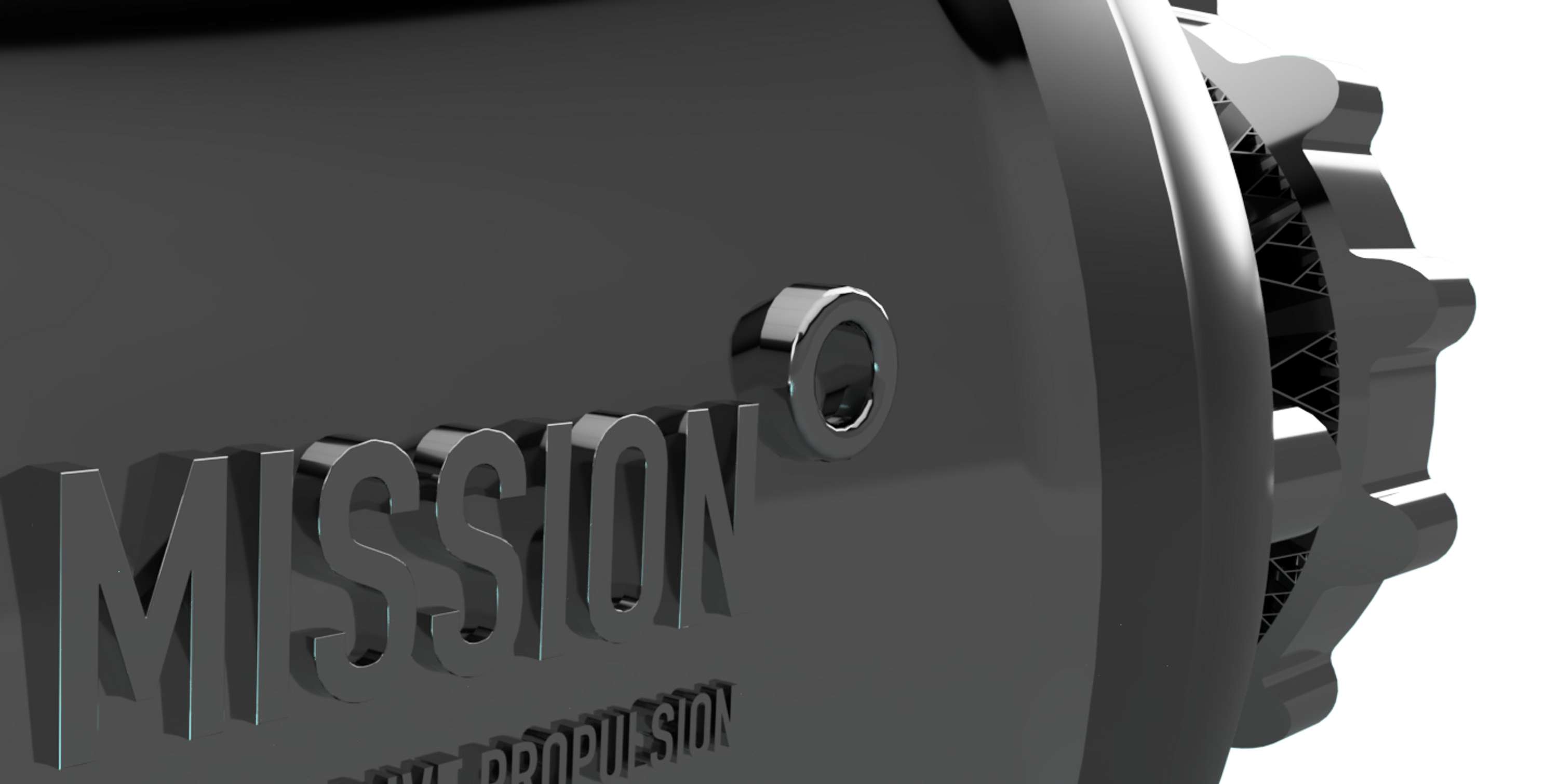
(Custom engine modelled and rendered in Fusion360)
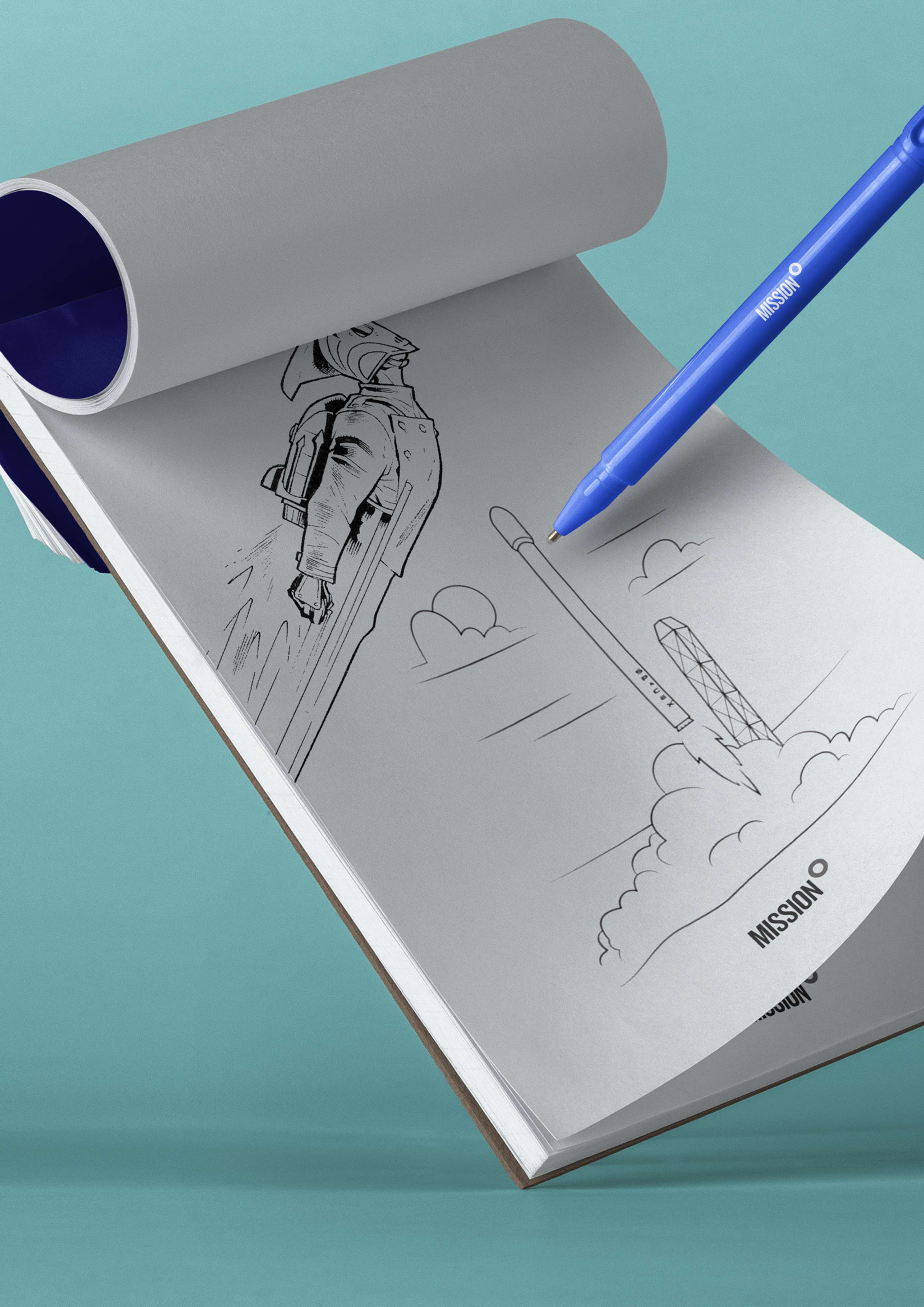
Pocket Observations Notebook + Fisher Space Pen
Perfect for in-flight scribbles and games.
Footnotes
There is infinite opportunity for how this could be developed further.
Looking at amenities kits for business class flights, there's a range of products that could work well as low cost promotional products added to this project, including branded eye masks and flight compression socks.
The eye catching packaging and playful style of the printed material was designed to encourage sharing - specifically through social media.
While conceptual in nature, there is nothing in this project that couldn't be instantly developed for use by another company right now. A quick estimate at sourcing the mylar pouches and patches showed a lead time of less than 4 weeks, both with relatively low MOQs.
