Not.Corn: Superfood Snack

Take the existing brand Not.Corn and create new packaging and social media posts for the superfood snack, popped sorghum.
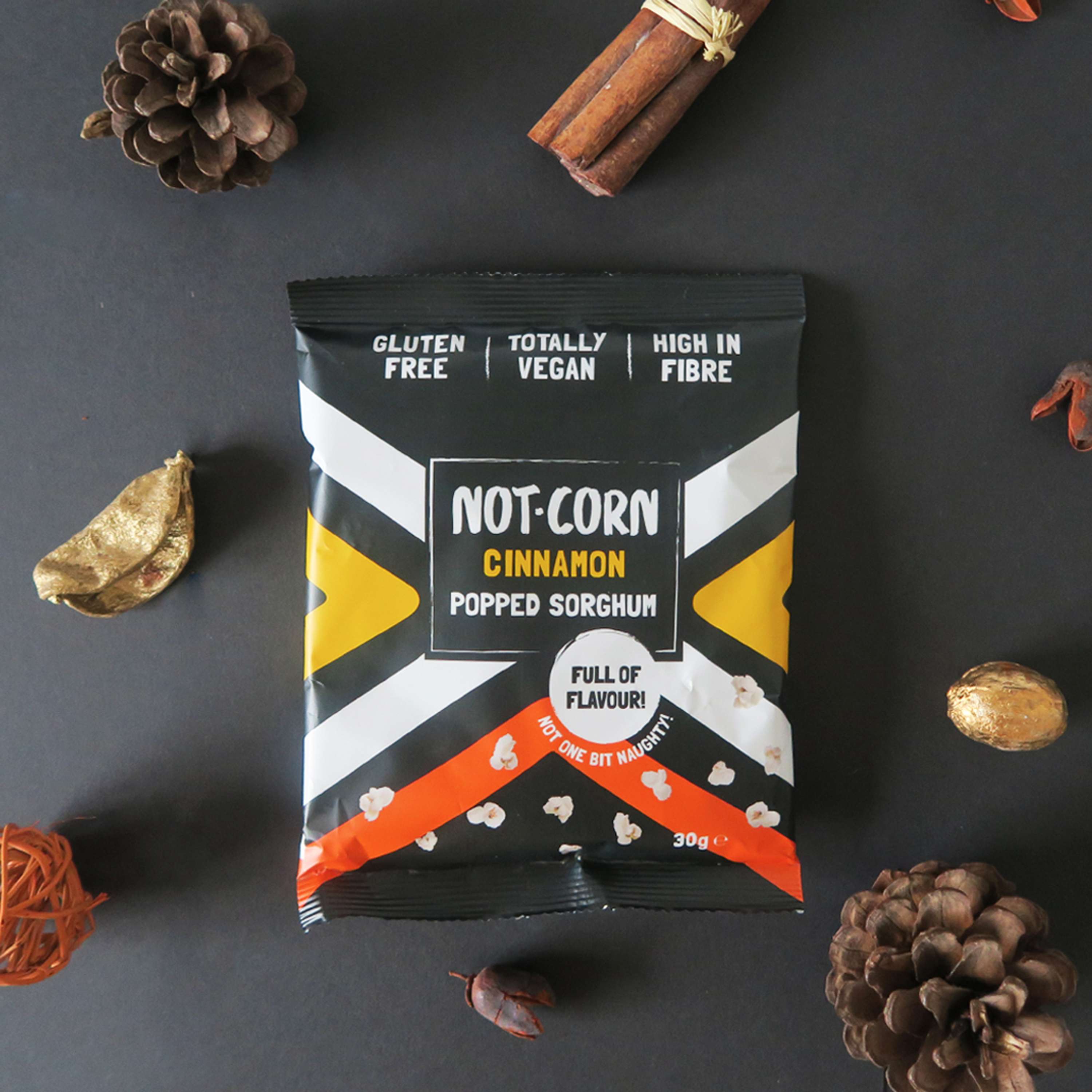
Cinnamon Packaging
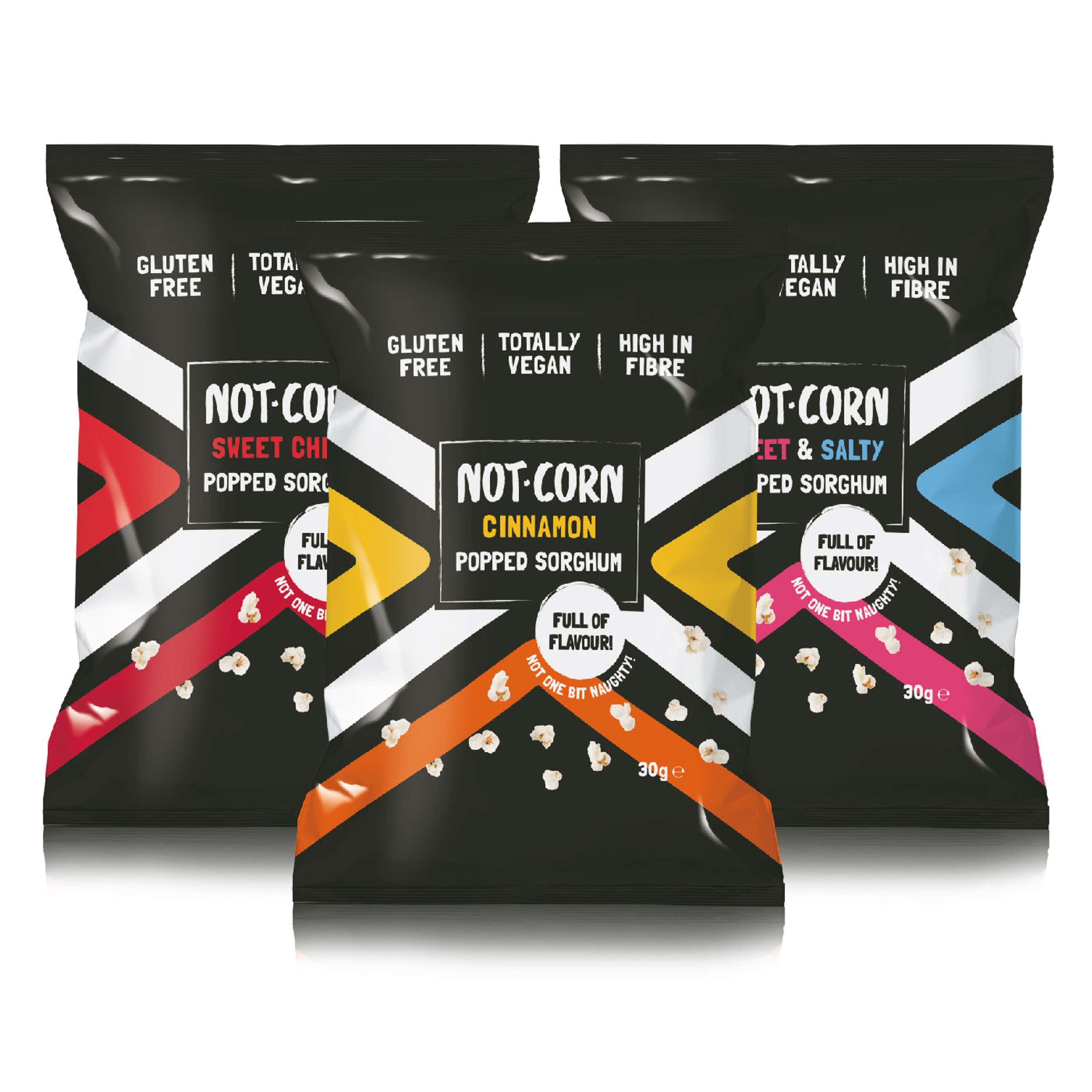
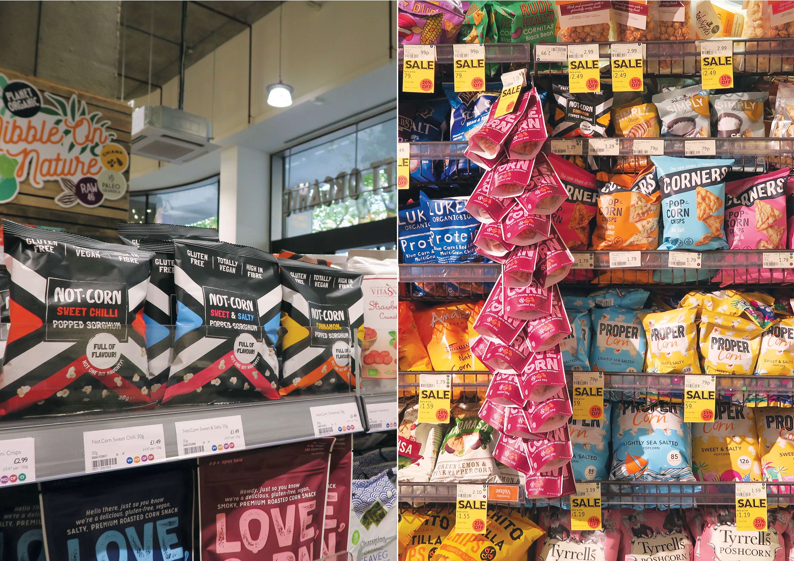
Sorghum is an ancient grain (like popcorn) that has been eaten in Africa and India for centuries. Not.Corn is disrupting the snack food category by being the first ever popped sorghum product in Europe. Rushina, the founder of Not.Corn wanted a whole new look and feel in order to position herself up against brands such as: Rebel Kitchen, Ugly drinks, Innocent and Propercorn. The brand values that Rushina wanted to come across in the packaging were: fun, cheeky, vibrant and rebellious.
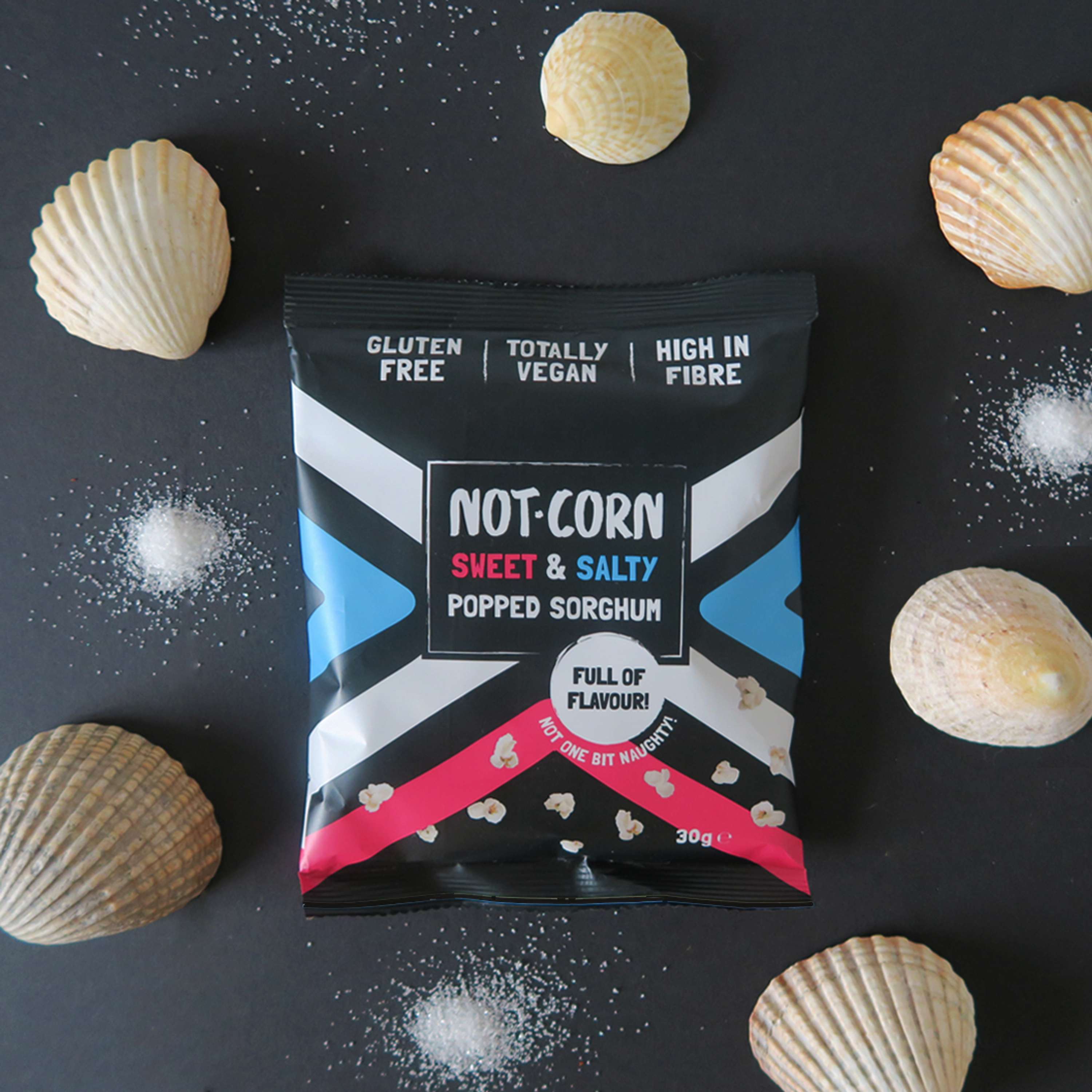
Sweet & Salty Packaging
The inspiration behind the packaging was to show the history of Not.Corn. The African inspired pattern design takes the consumer on a journey of discovery with flavours and shows the geographical origin of Sorghum.
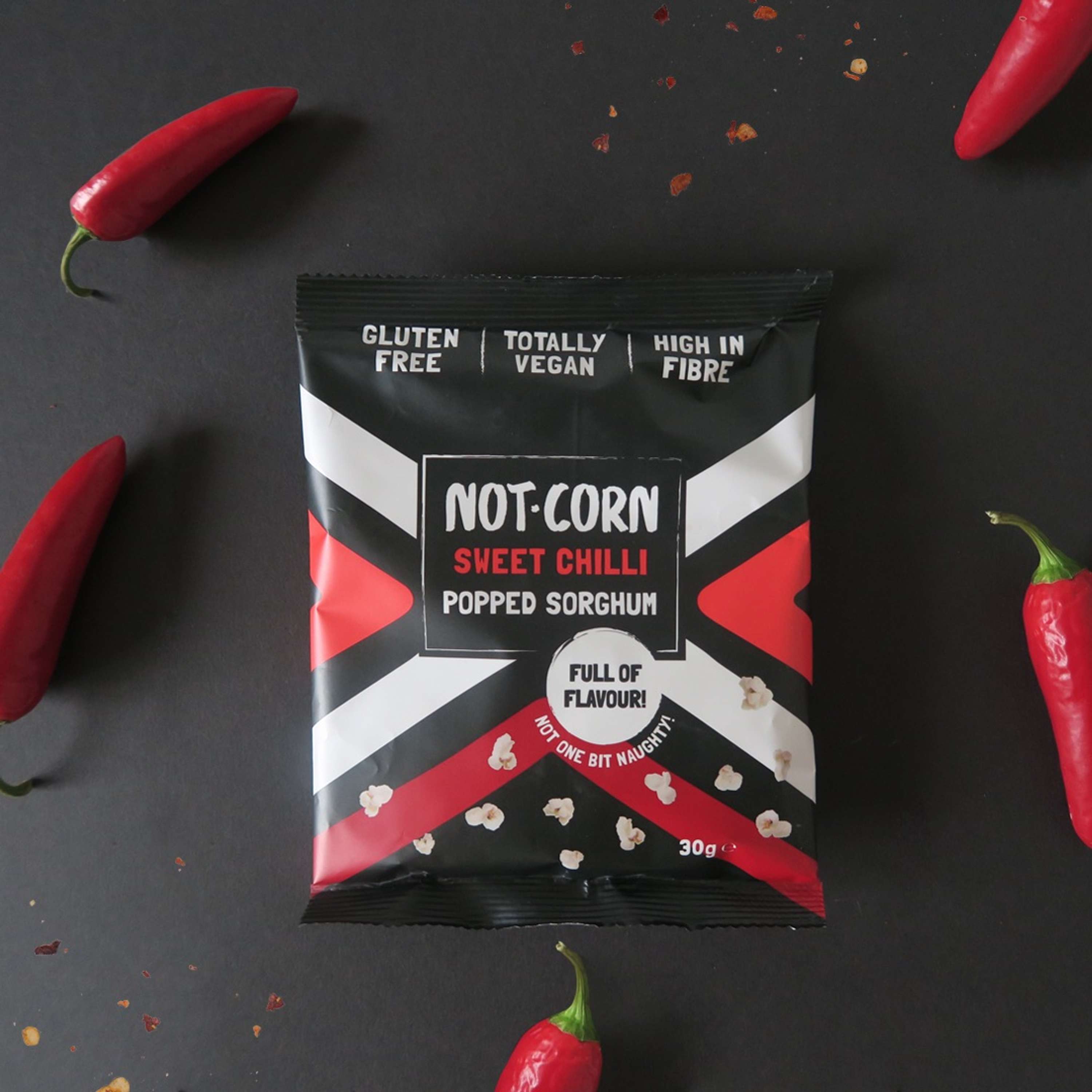
Sweet Chilli Packaging
The colours used in the design are complimentary to the flavours. The vibrancy of them also create a hit of colour against the black background making it striking.
Stockists
Not.Corn is now stocked in places such as Planet Organic, Whole Foods, Amazon, Hotcakes and Yumbles. Not.Corn has shelf stand out next to its competitors because of its different darker colouring and striking African pattern design.
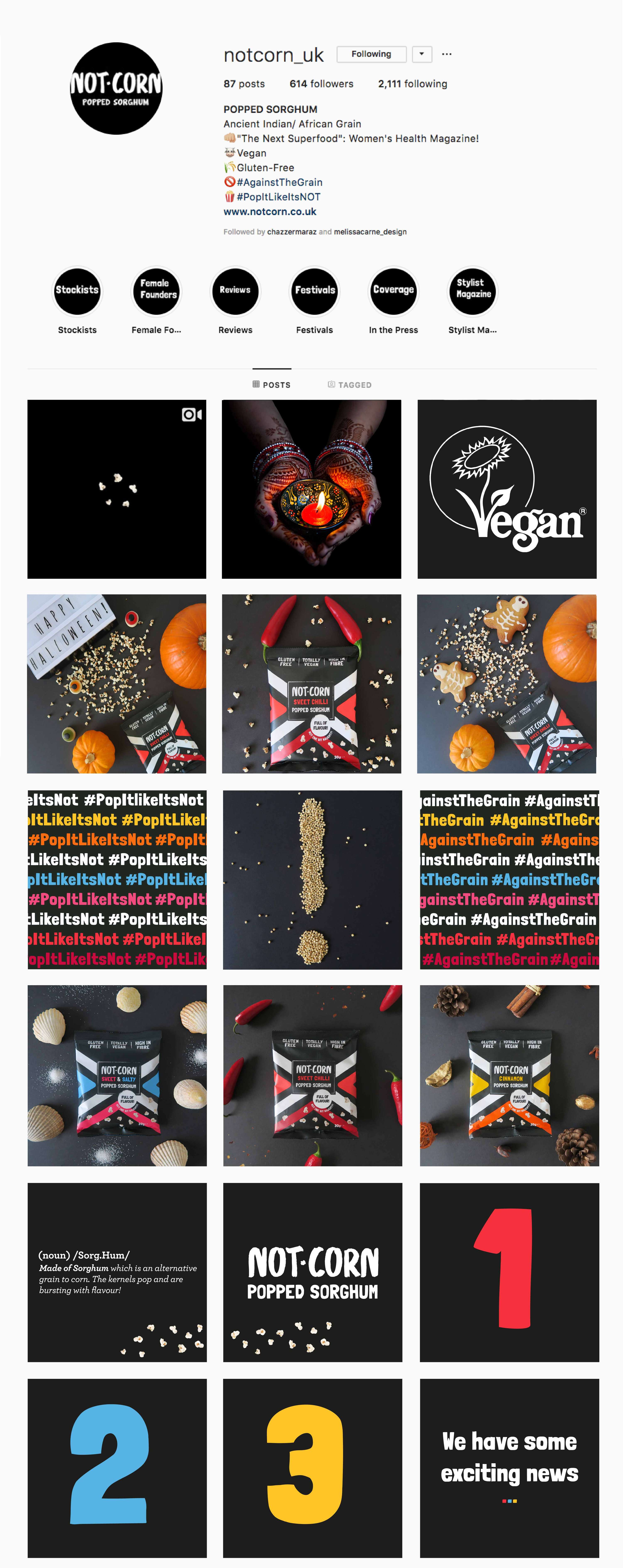
Social Media Posts
As a part of Not.Corn’s re-brand Rushina asked me to create social media collateral to elevate the brands image. I have continued to use the same colours and tone of voice to keep a consistent brand identity. Art directing and photographing the product has been a fun project that I continue to do in my spare time.