Penguin Random House Learning Journal
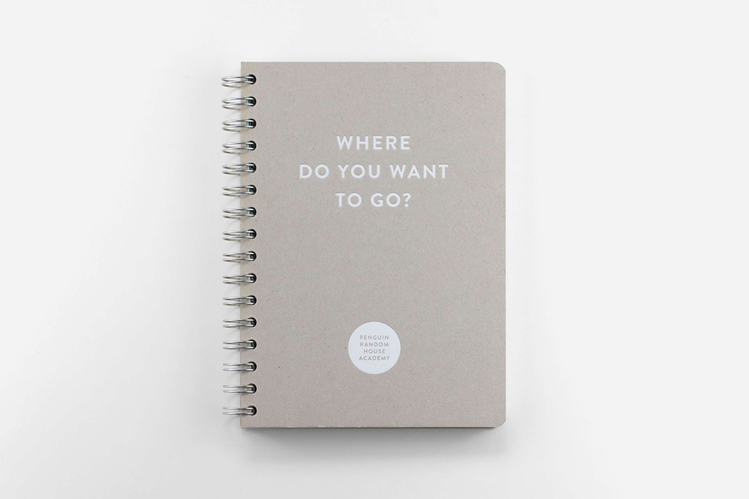
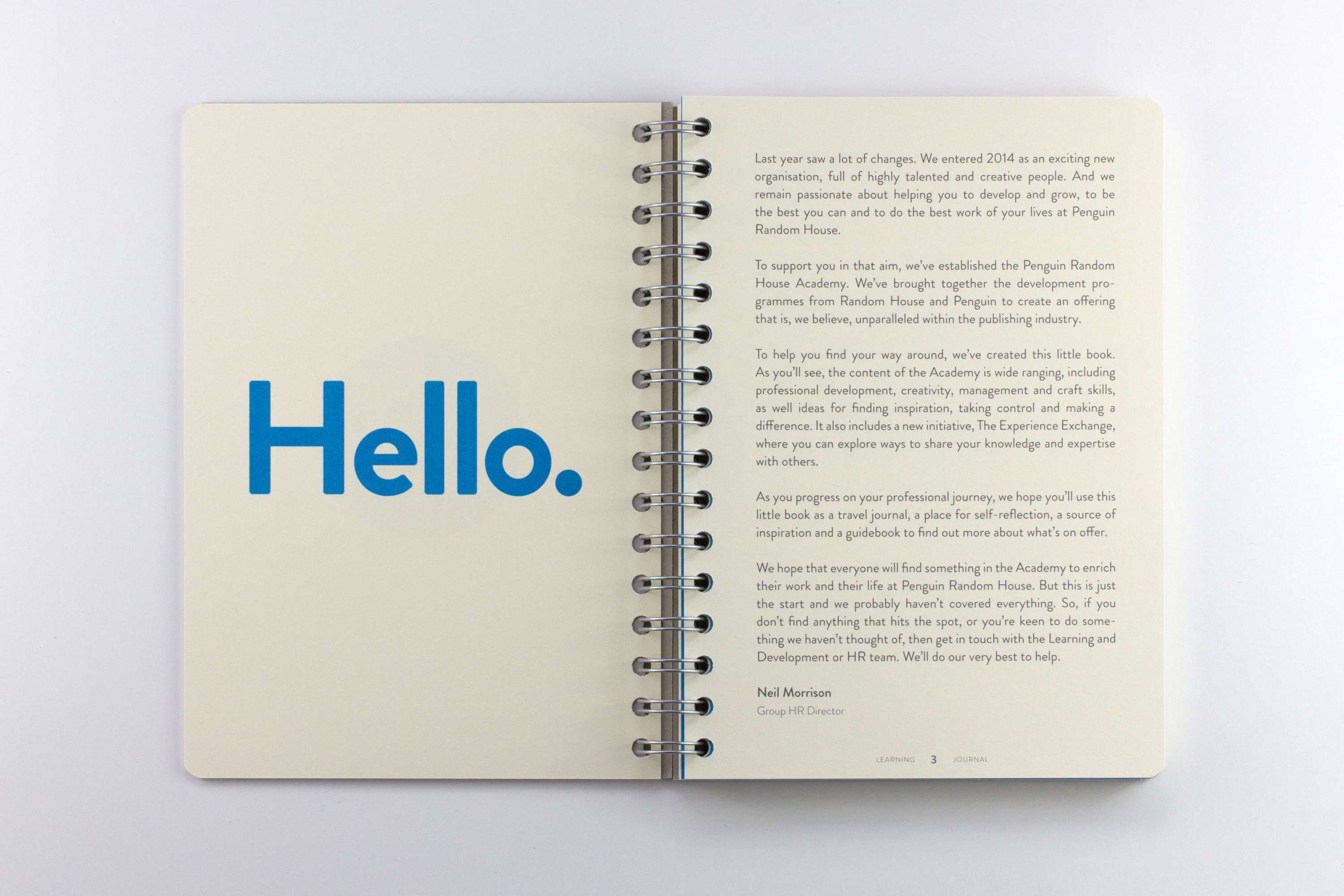
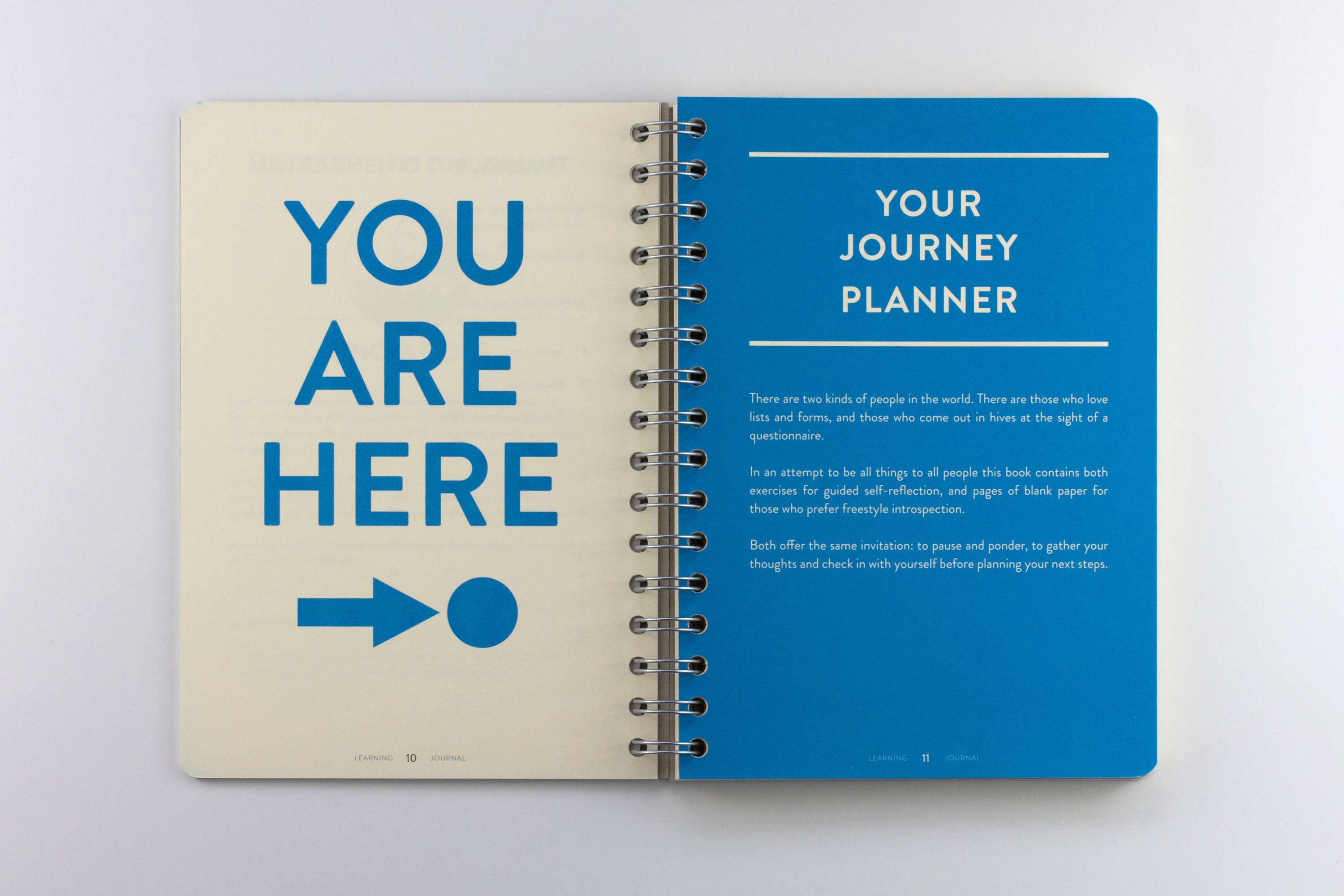
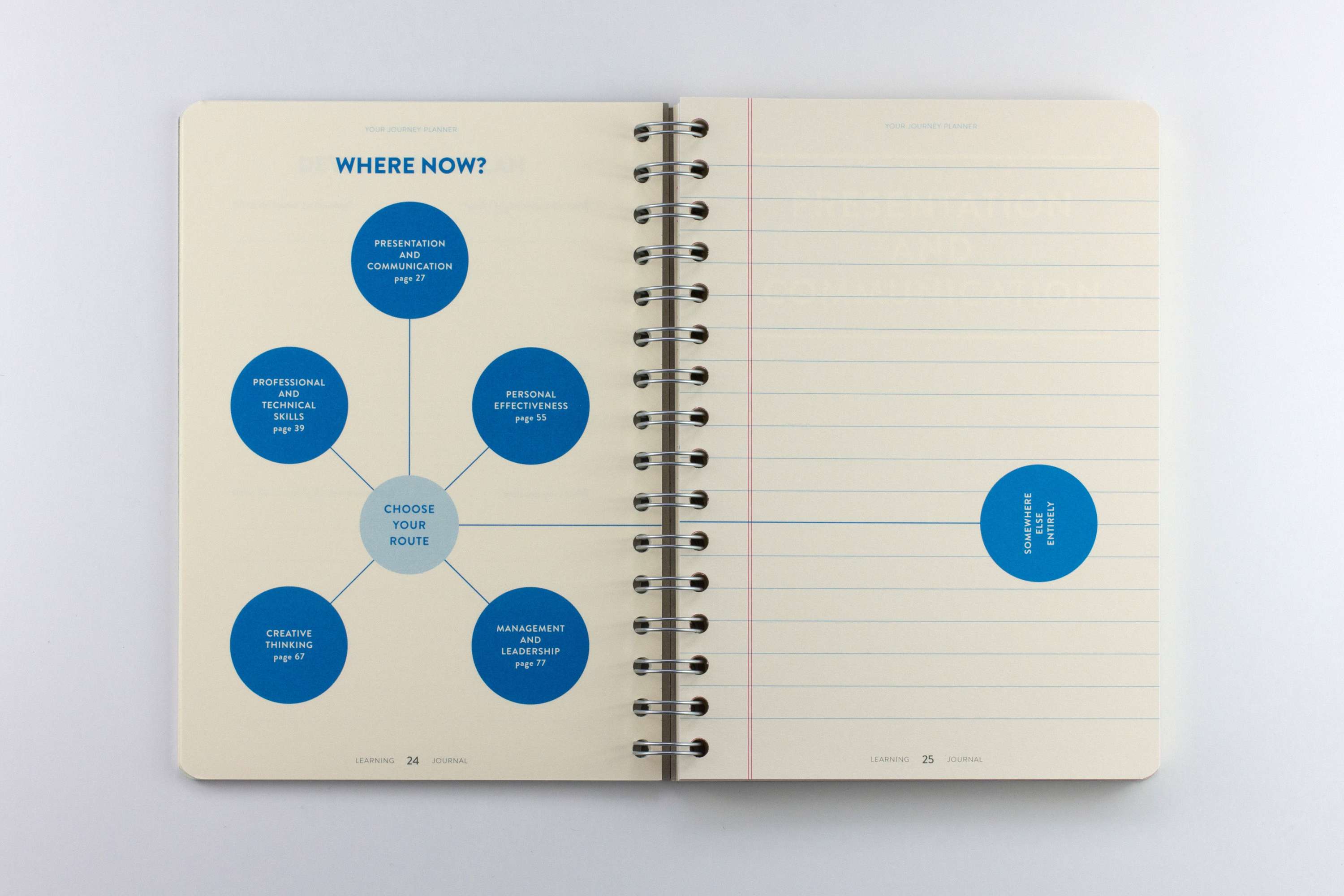
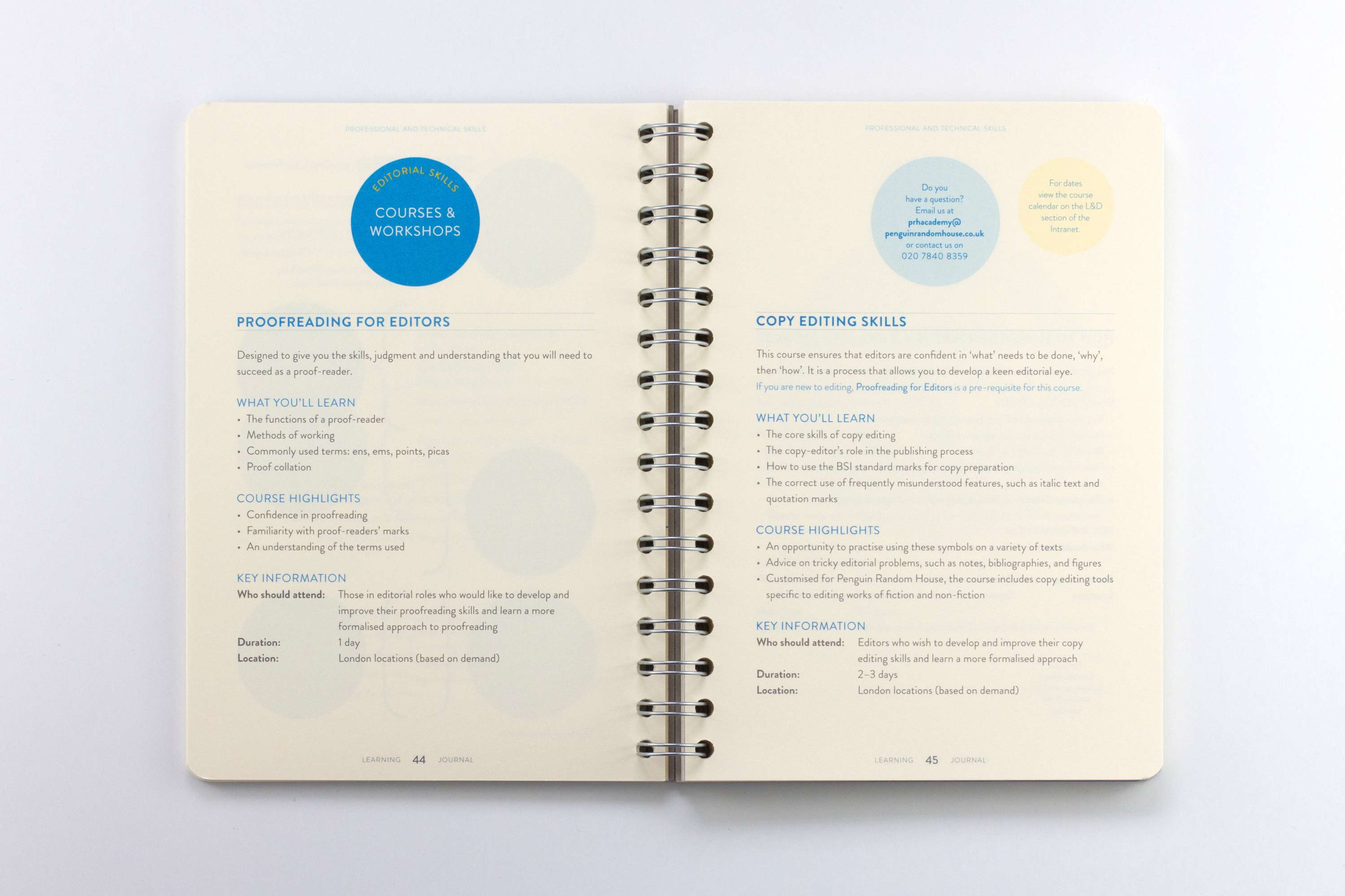
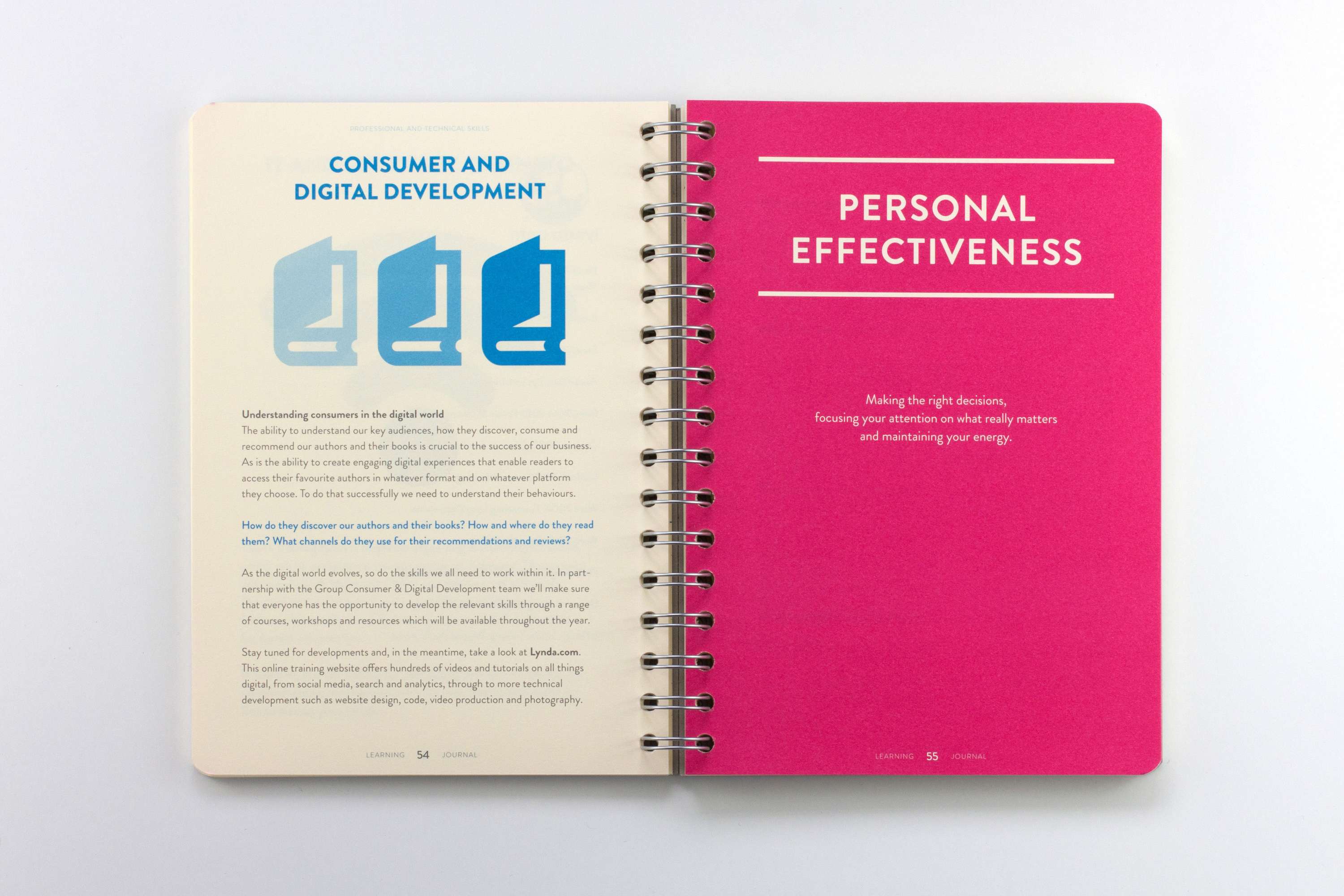
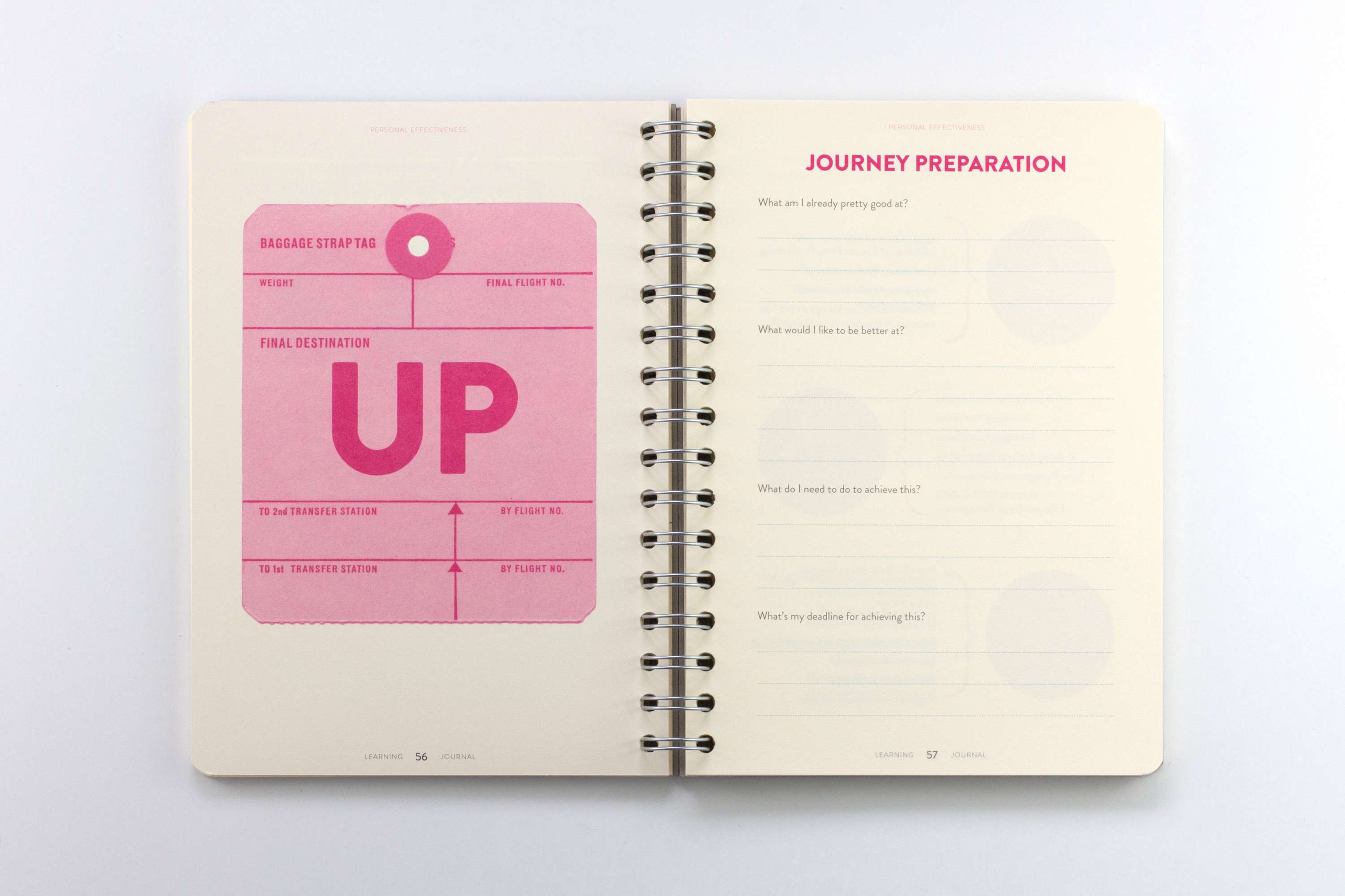
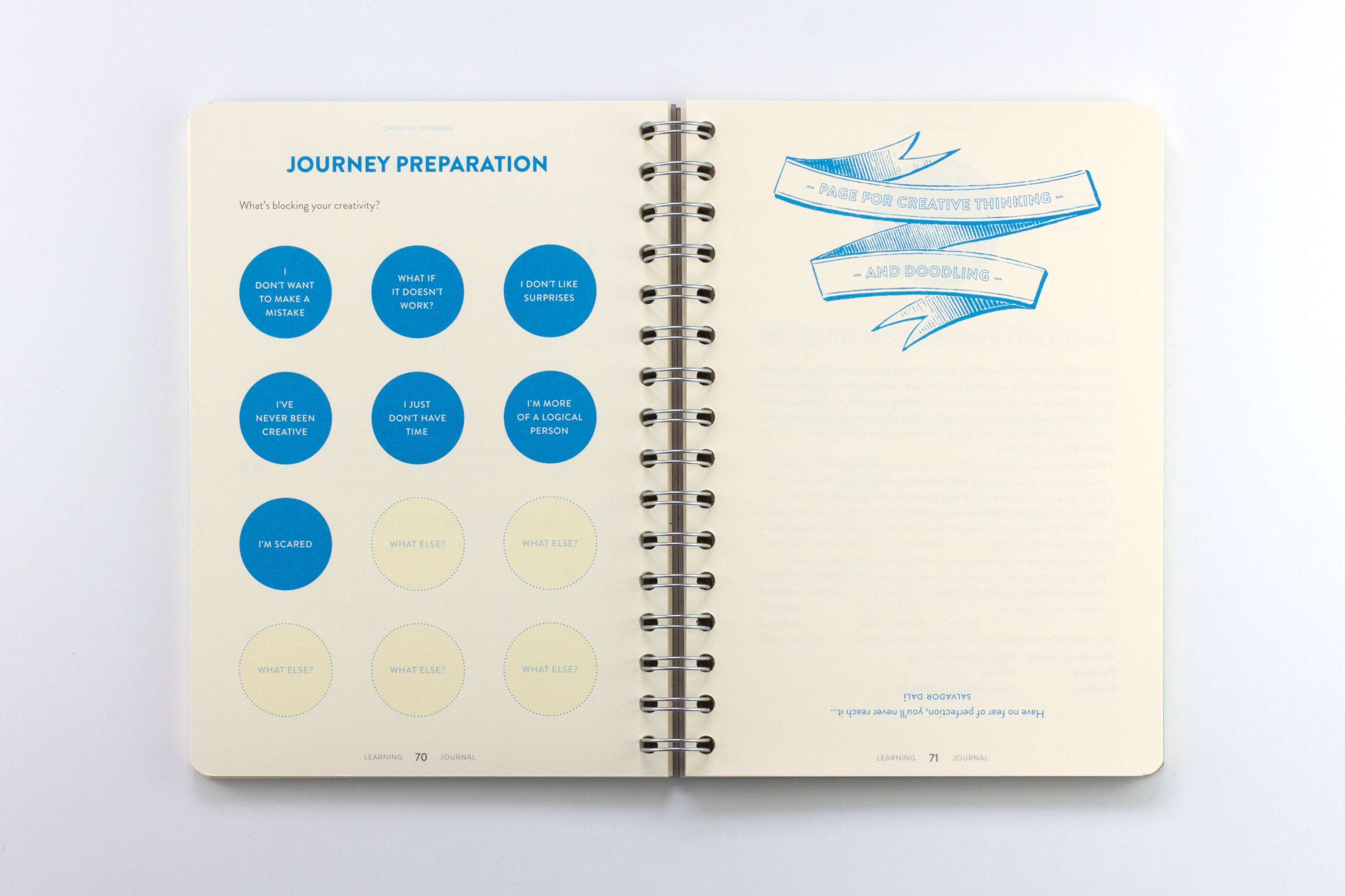
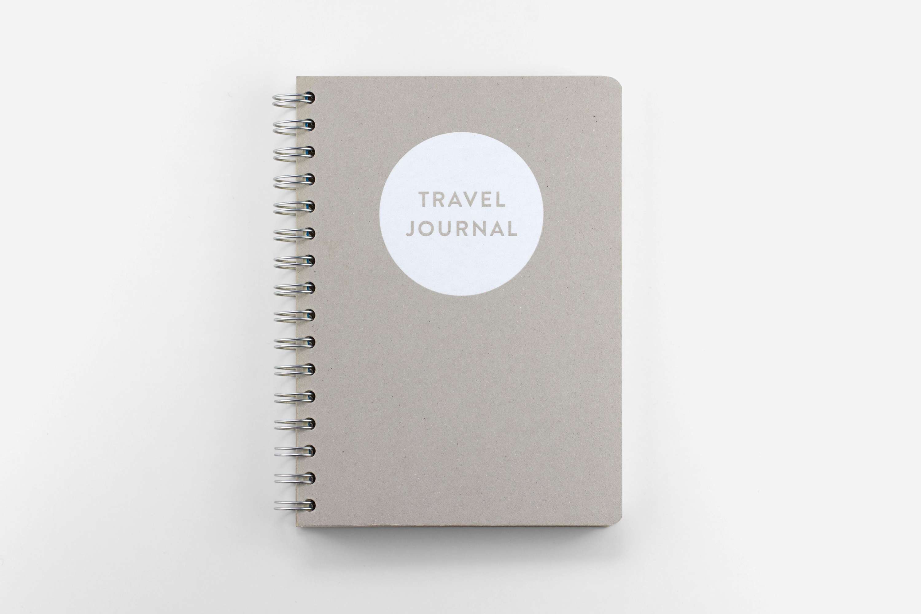
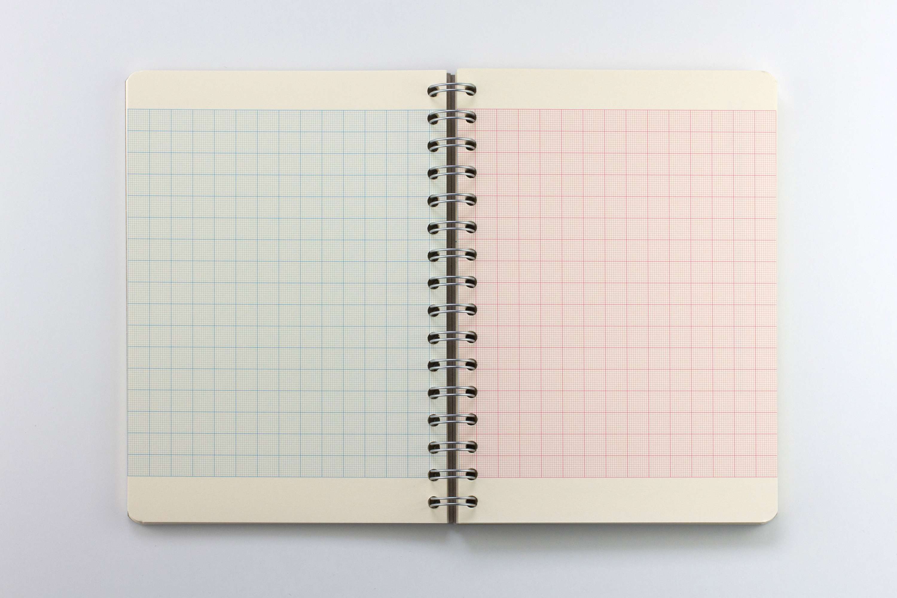
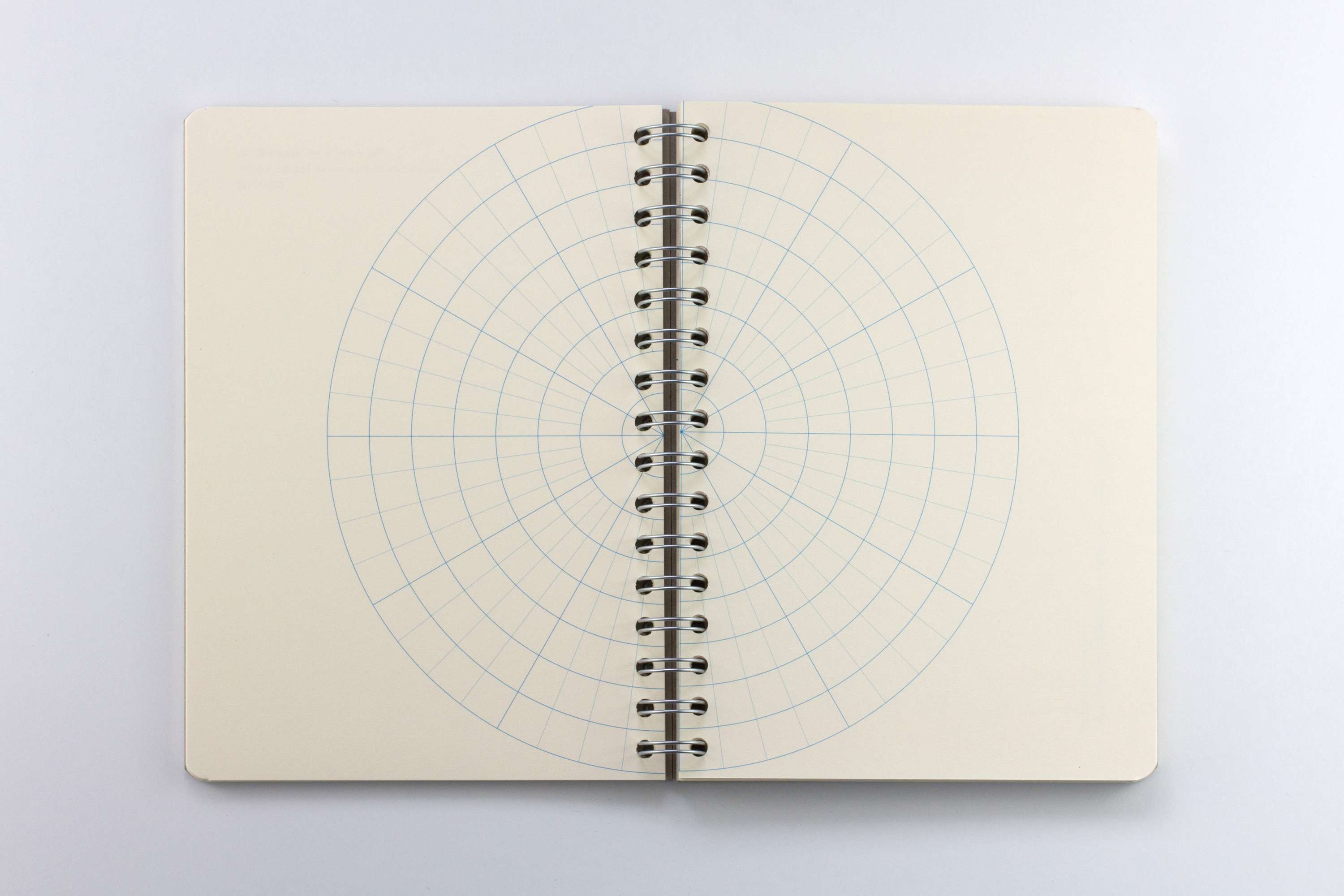
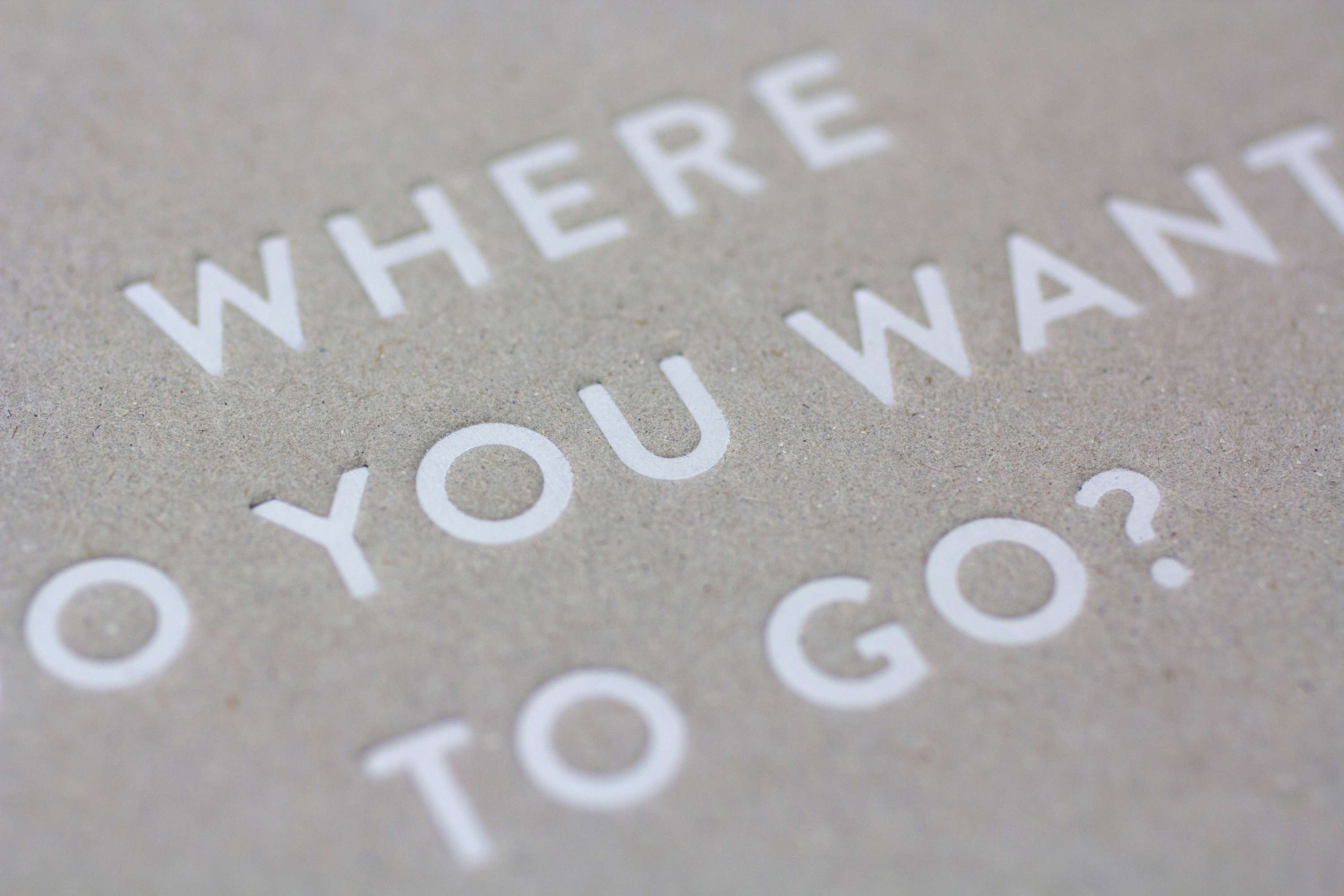
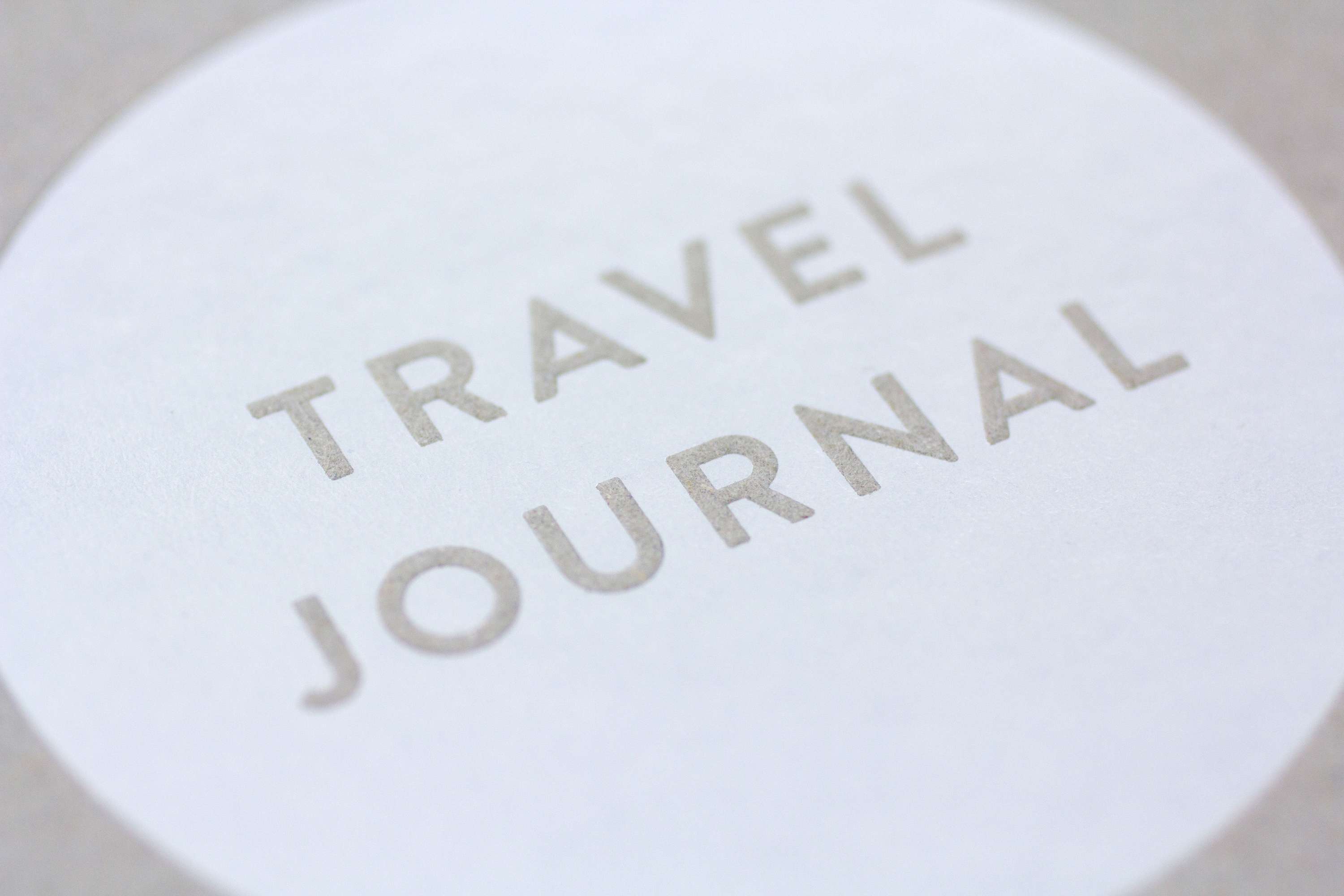
Penguin Random House asked me to put together a handbook for all their UK staff. It needed to combine two separate but connected halves: a learning journal full of information about their courses and training, which collectively formed the Penguin Random House Academy; and a travel journal, in which the employees could ‘reflect, collect notes, write down ideas and plan their next steps’. It needed to be exciting and motivational, inspiring and functional. I was also asked to create an identity for the Academy itself. For the Academy identity, I used a simple roundel design. I then used this as a stylistic trope throughout the book, together with bold typography, and a punchy colour palette of cyan, magenta and grey (with yellow used as a highlight in a couple of special instances). I then combined this with a mix of bespoke travel iconography and a selection of different notebook page designs. I worked through various different formats with the commissioning team, and we decided upon a book which could be read in both directions. From one end it’s a learning journal; flip it over, and it’s a travel journal. The two books meet in the middle with a spread that reads in both directions.
