A Monster Calls playscript

A production of Patrick Ness’s A Monster Calls was devised at the Bristol Old Vic in summer 2018. I couldn’t wait to typeset and design the play script as it is different from any other typesetting I had done before. The script changed several times as it was a collaborative piece between dramaturge, director and cast members. The deadlines for print and publication before first shows were tight.
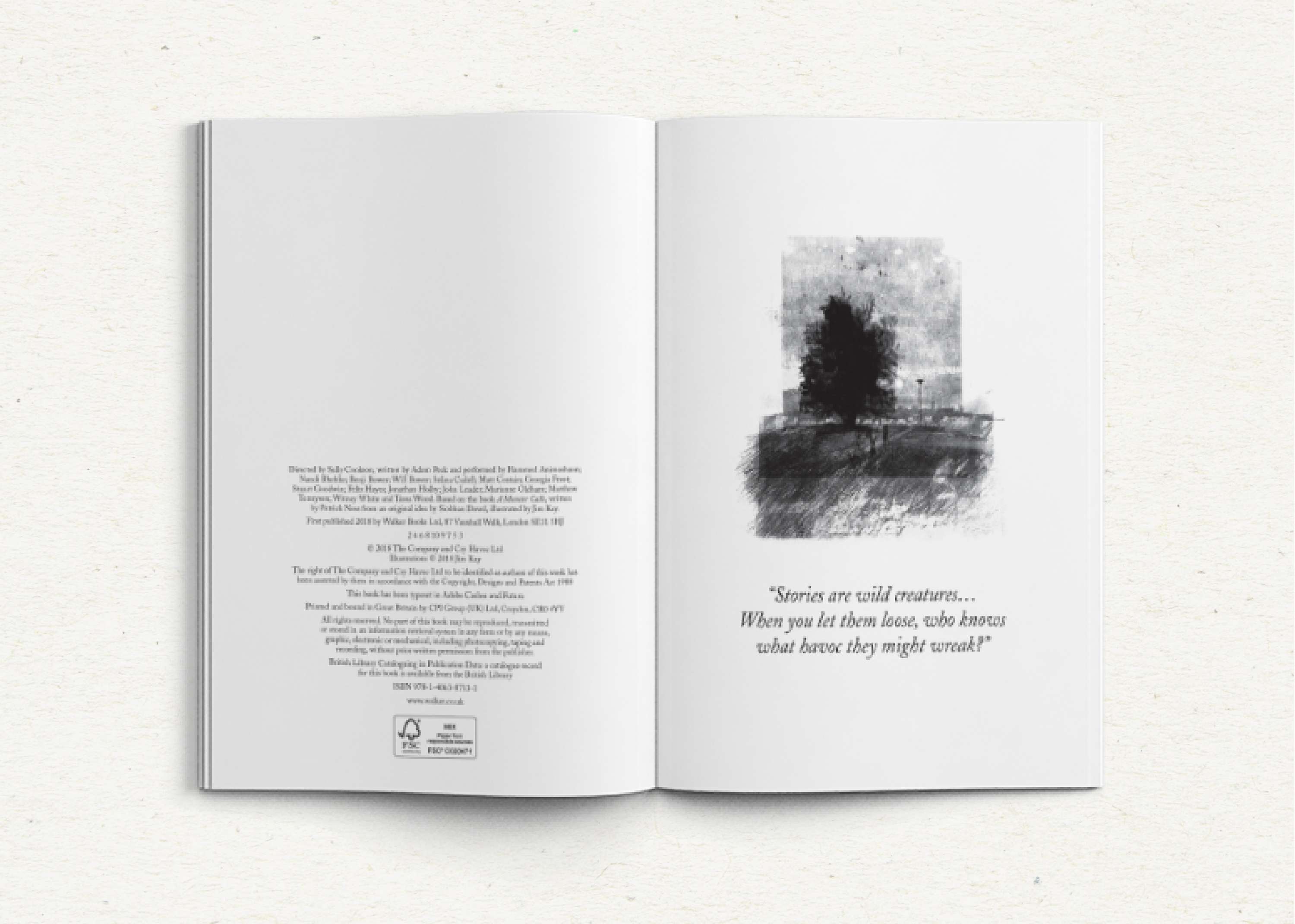
Playscripts that I looked at for inspiration were functional and simply set out – and I wanted to add more design and flair. I added an illustration of the yew tree by Jim Kay, illustrator of the original book, and a quotation from the tree.
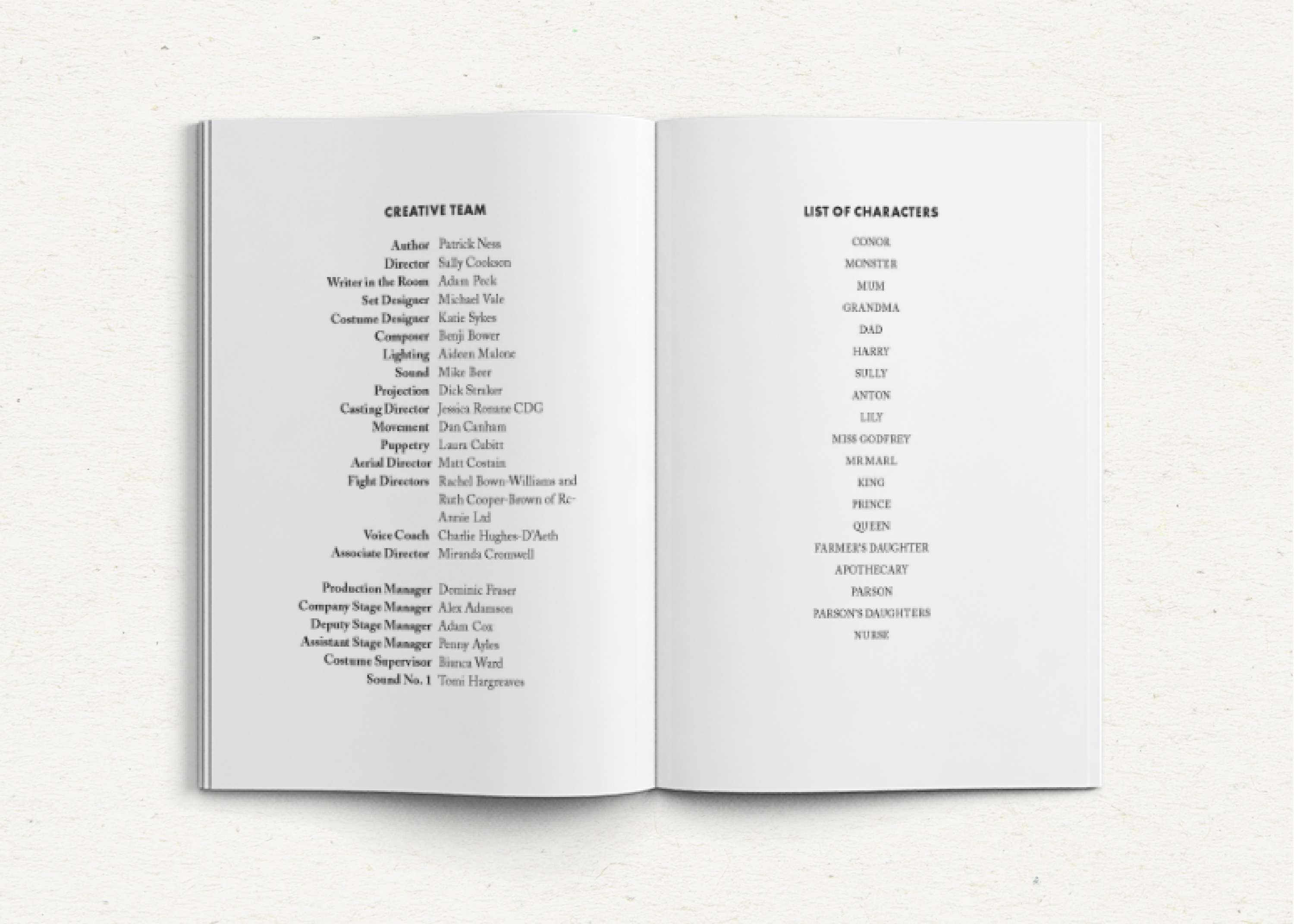
To differentiate between this page and the character list (following page) I created a small gutter down the centre of the page with the roles in a bold weight ranged right against the gutter and the names of the people in those roles in a regular weight ranged left.
A playscript traditionally included a list of characters at the front and I typeset this one simply, with the characters’ names centred and in small caps to match how they are presented in the main body of the play.
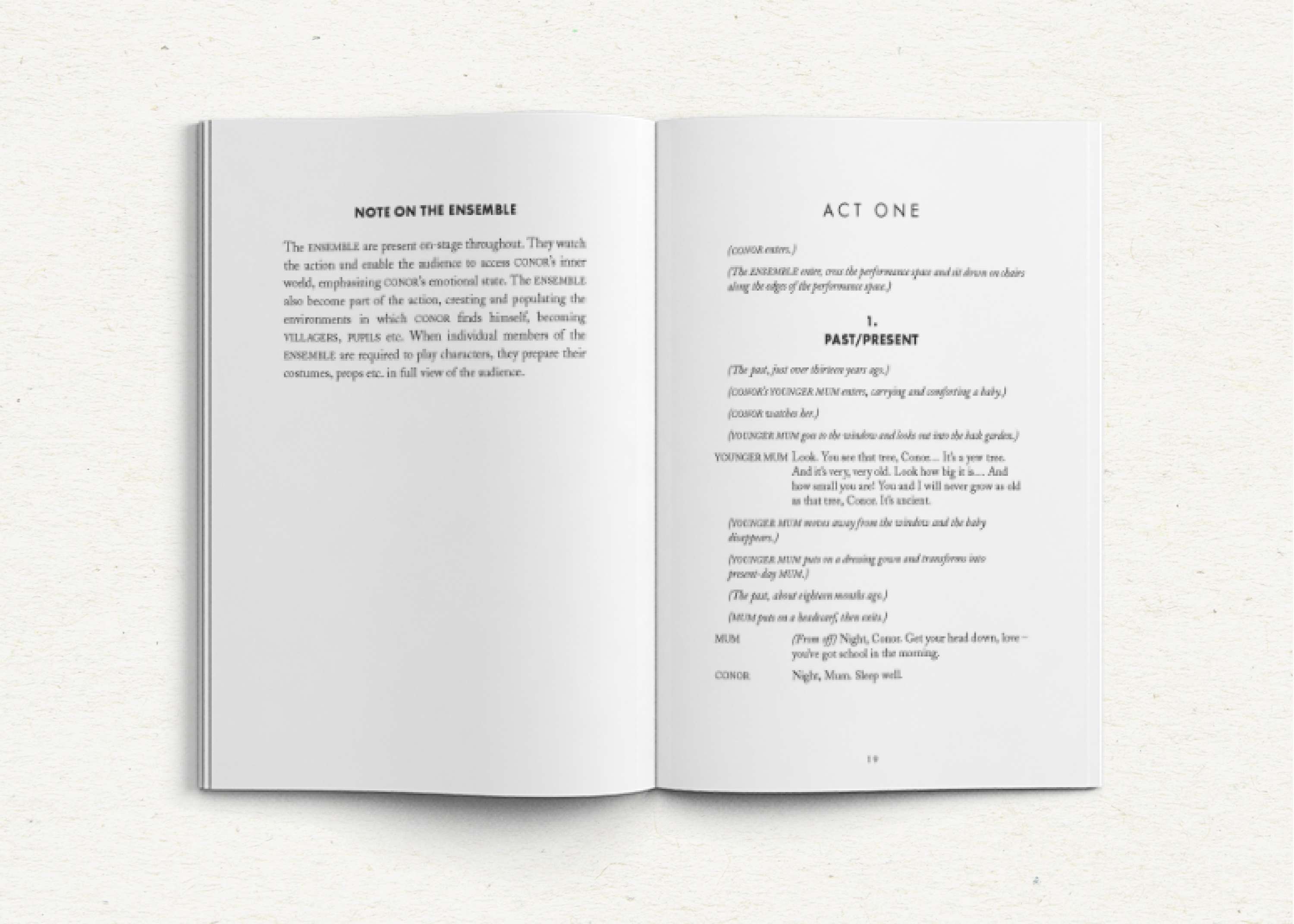
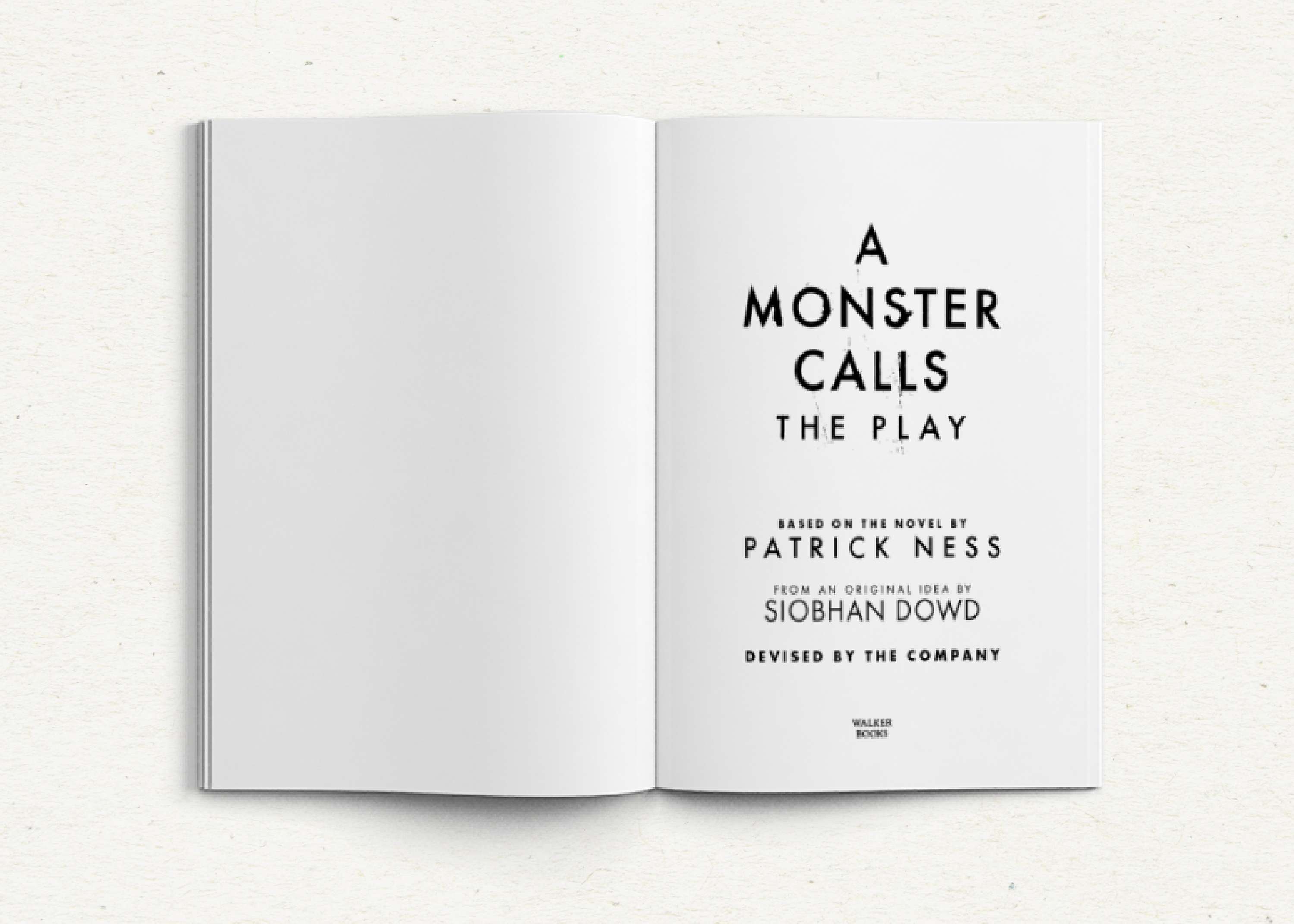
The play opens on a recto page with clear indications of the act and scene. The author’s other books have a distinctive style with Adobe Caslon as the body text and using Futura for headings. I used this as a starting point with which to format the playscript.
There are many scenes in the play and I had to clearly signal the start of a new scene by using a heading centred with space above and below, in a heavy weight of Futura.
The playscript included a lot of original front-matter, such as notes from the author, director, and designers of the show. I used the typeface style from the characters’ dialogue and used full-out paragraphs with small space in between to differ from my usual book typesetting style.
Usually I don’t keep lines together in paragraph styles in typesetting, but I felt hat it was essential to keep the first two and last two lines of speech together to help avoid widows and orphans and to clearly show whose line they were.
Using these examples of GREP (and many others) I could quickly format most of the playscript. Some styles had to be manually selected, but using GREP I had more time to make sure each style was applied correctly.
The pages have running heads at the top of the page (except on act openings) and folios at the bottom (except on act closings) in a light Futura font with wide kerning.
The stage directions are ranged left, set in italics, and characters’ names are in small caps so that actors can pull out the instructions aimed at them easily.
To clearly distinguish between different characters’ dialogue, the space between the lines is wider than the leading. To achieve this, I set the document baseline grid at 3pt so that I could keep consistency in the layout and flexibility. The leading for the dialogue and stage directions are set up at 12pt, with spacing afterwards set at 3pt.