A native font-stack


Hot on the heels of our friends at Booking.com, we’d also like to share our experience of implementing a native font-stack.
The importance of good type
As most designers will attest, typography is an inherent part of any brand and product. Choosing the right typeface can play a huge part in whether something is readable, usable and understandable. As designers we have a responsibility that the products we create are designed with all of these in mind.
So why in 2017 do we still see large web-based products with sloppy, out-dated typography?
Technically possible
Before webfonts were a thing, we used to have to resort to what, at best, could be referred to as silly replacement techniques — think Cufon, SIFr or even images. And what’s worse, I’ve been guilty of using all of them.
In recent years, we’ve seen the likes of Google and Adobe enabling us all to click a few buttons and within seconds have a custom font served to our pages. So what’s the big problem?
Whilst this is great for small sites, serving a ~200kb file to millions of visitors just doesn’t fly from a performance point of view. This matters, and we as designers have a responsibility on our products performance as much as anyone else. We need to be aware the affects of a poorly performant site will have on user experience.
This is further amplified as we see more and more users access our products from mobile devices where users are not always on a high speed connection.
So how can we get good type and balance the cost of performance?
The native way
With each operating system investing millions of dollars in design, we’ve seen a large portion of that directed to type design; fonts like San Francisco, Roboto, and Segoe are created with mobile and legibility at the core. By leaning on those font families, we can form a fontstack which offloads these decisions to the OS.
-apple-system, BlinkMacSystemFont, Roboto, Oxygen, Ubuntu, Cantarell, “Fira Sans”, “Droid Sans”, “Helvetica Neue”, Arial, sans-serif
We’re not the first and and probably won’t be the last to experiment with this technique. A lot of high traffic web products have opted for this method with Medium and Github being early adopters and we’ve recently seen our friends at Booking.com do something very similar.
Authentically mobile
By using this approach, we can take advantage of seamless transitions between native apps and web — potentially loading a web view within an app without the user even noticing. This could prove to be incredibly powerful as we see platforms converge.
Segoe > Se-gone
You might have noticed that there is no native typeface listed for Windows. Segoe UI is what you’d opt for here again given its readability and legibility on mobile. However, we discovered that Segoe’s baseline was dramatically misaligned compared to the rest which gave us trouble when trying to centre text vertically.
Having spoken with Mircosoft, there doesn’t seem to be a natural fix for this apart from serving their open source version of Segoe called Selawik as a webfont. We’ve therefore removed Segoe from our fontstack for the time being.
Weighing in
One of the other big benefits of relying on native fonts is that you get a much larger set of weights to play with. No longer are you constrained to just ‘normal’ and ‘bold’, but you can also tap into the rest of the font-family and start using Light, Heavy etc should you wish.
The practicalities
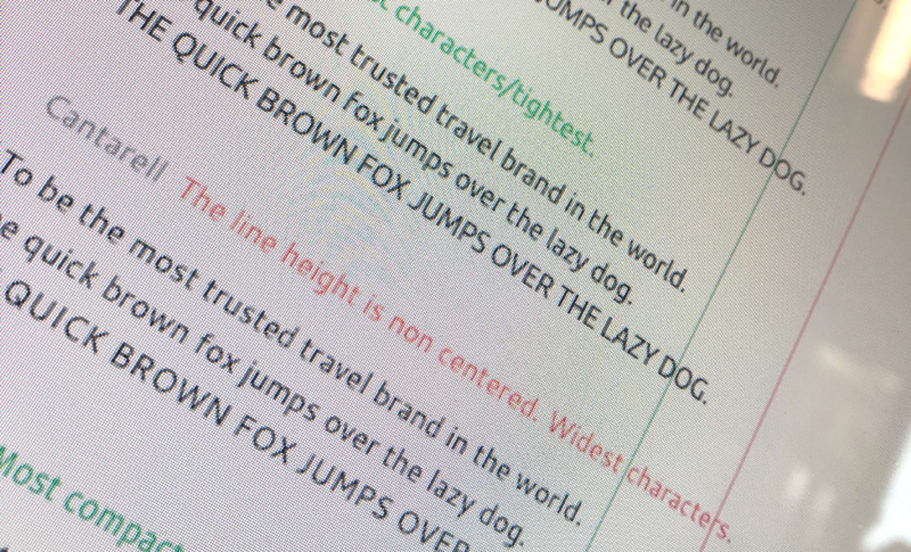
So we’re now supporting 9+ typefaces, which one do you pick when designing? We carried out an exhaustive exploration into character widths and their impact on line-lengths. Interestingly you’ll notice Canterell came in having the widest characters and therefore line-length, but given its small usage we’ve chosen San Francisco (SF UI Text) as our default.
The small print
Remember, whatever typeface you choose, be sure you have the relevant license should you choose to ship or distribute any of these files. We never make use of this font stack in marketing materials or anywhere that would require us to embed the glyphs as Apple and Google have strict licensing rules in place.
So what do the numbers say?
Of course we wouldn’t be doing any of this without checking some basic metrics to ensure it didn’t cause our users harm e.g. did it slow people down, did it cause bounce rate to increase? It’s at this point I’d love to say this change increased x by y, but that just wasn’t the case. We saw no visible impact on our key metrics and we’re cool with that — the primary goal was to improve the quality of typography, anything else was a bonus.
Future considerations
There‘s already a draft specification which would essentially see this rather long font declaration be consolidated to simply system allowing the browser to do the hard work. Read more here.
Further reading
Implementing system fonts on Booking.com — A lesson learned.
Inspired by the recent work that Github and Medium have done to improve their fonts and thus the reading experience on…booking.design
System Font Stack | CSS-Tricks
Defaulting to the system font of a particular operating system can boost performance because the browser doesn't have…css-tricks.com
The New System Font Stack?
A few months ago, I wrote about how you can use system fonts in the browser using the built-in keywords that work with…bitsofco.de
CSS Fonts Module Level 4
Unlike other CSS properties, component values are a comma-separated list indicating alternatives. A user agent iterates…drafts.csswg.org
Written by James Ferguson
Skills
- ✈️
- Senior Designer
- ✈️
- Product Designer
- SVP Design