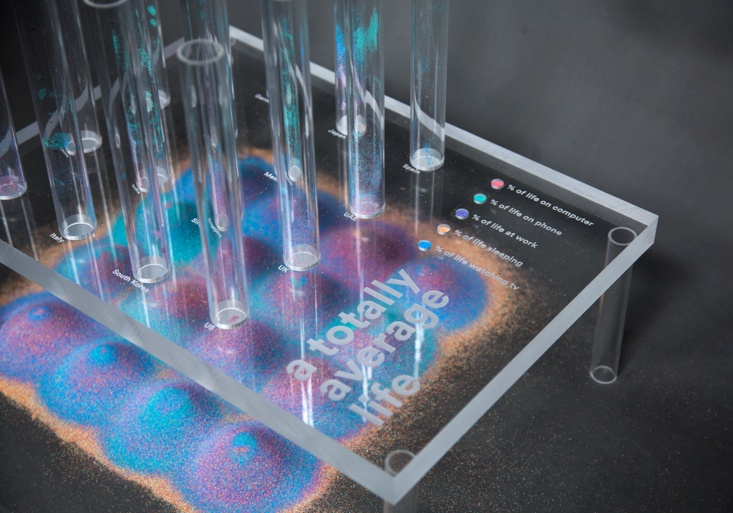
mapping time
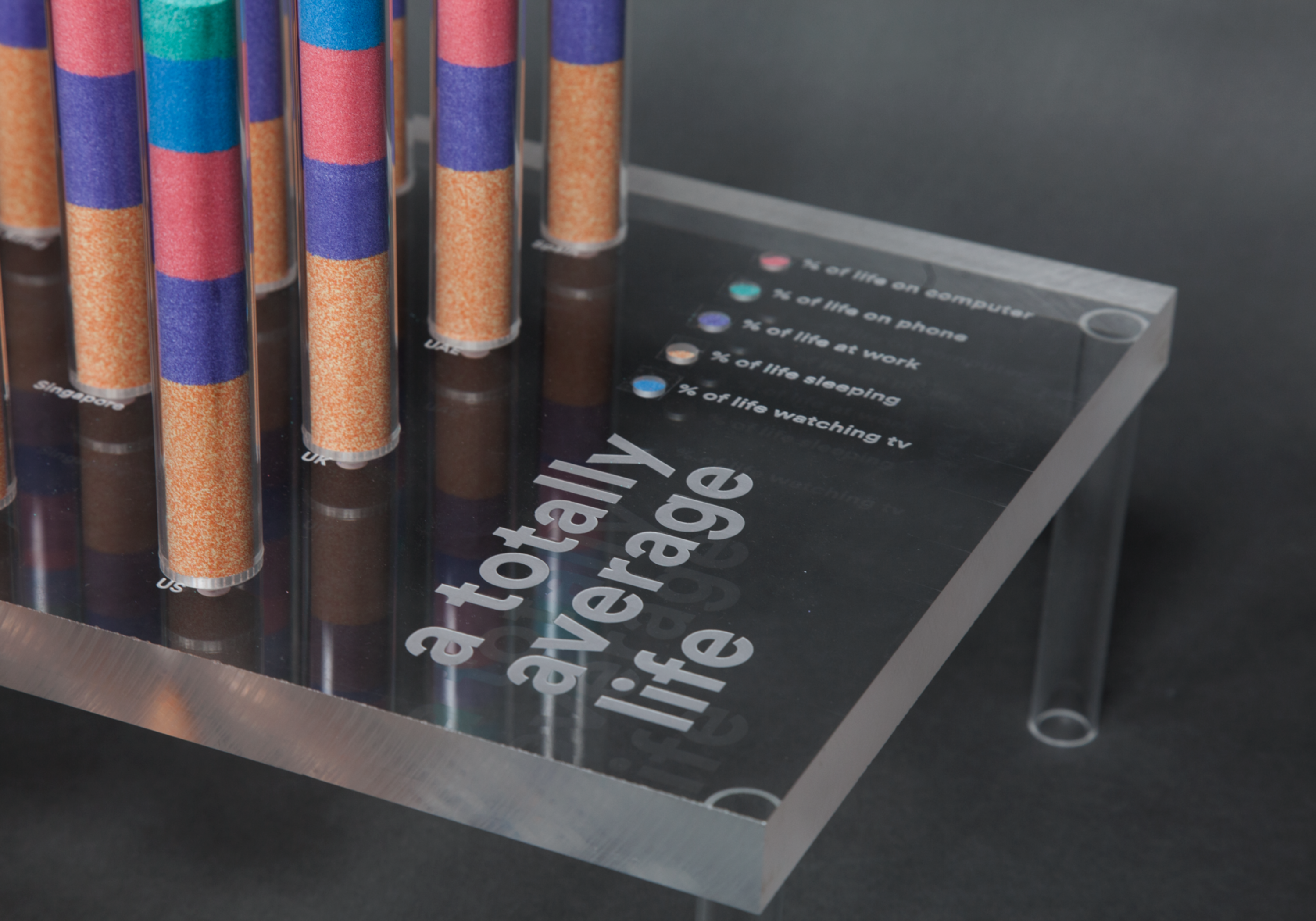
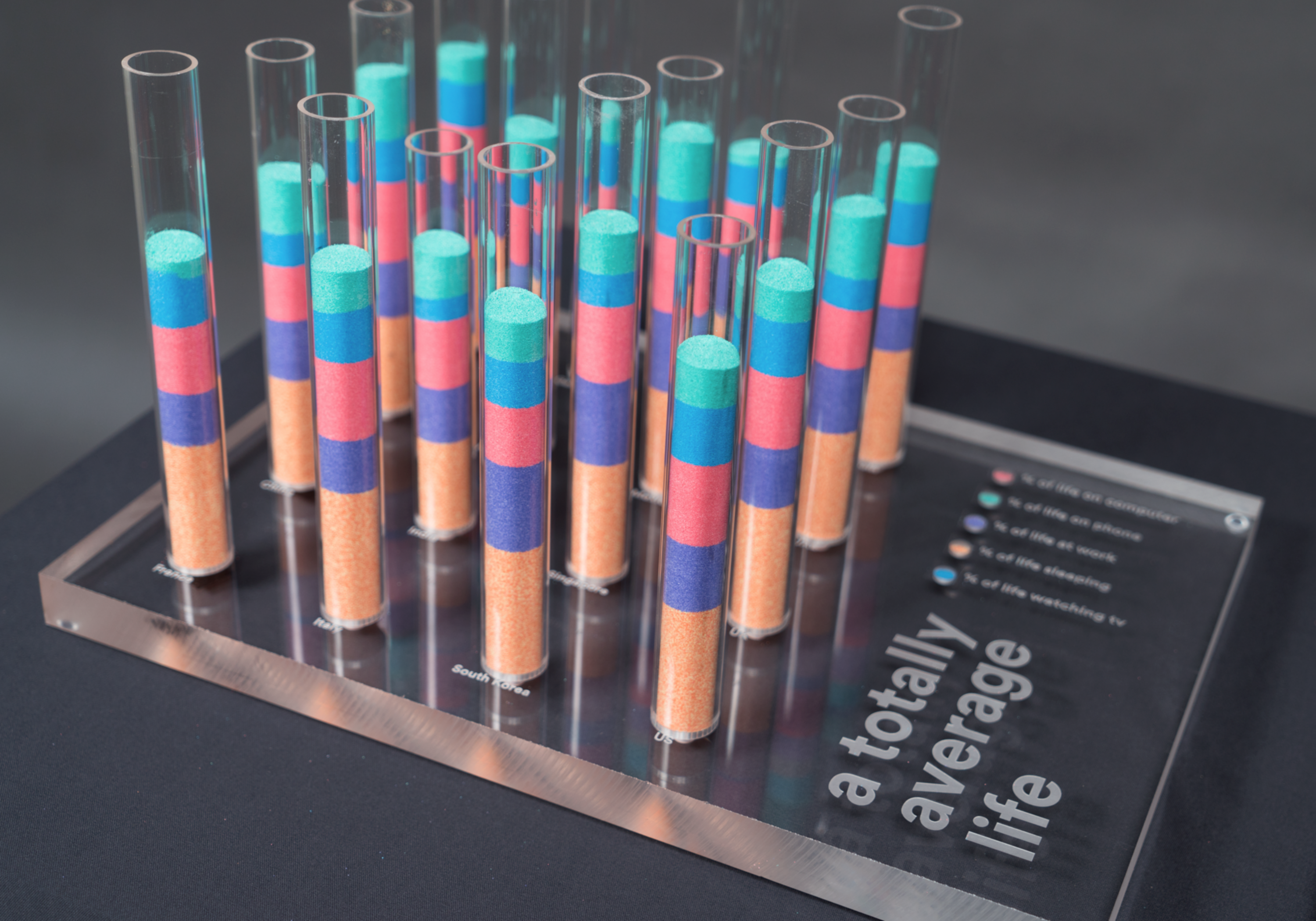
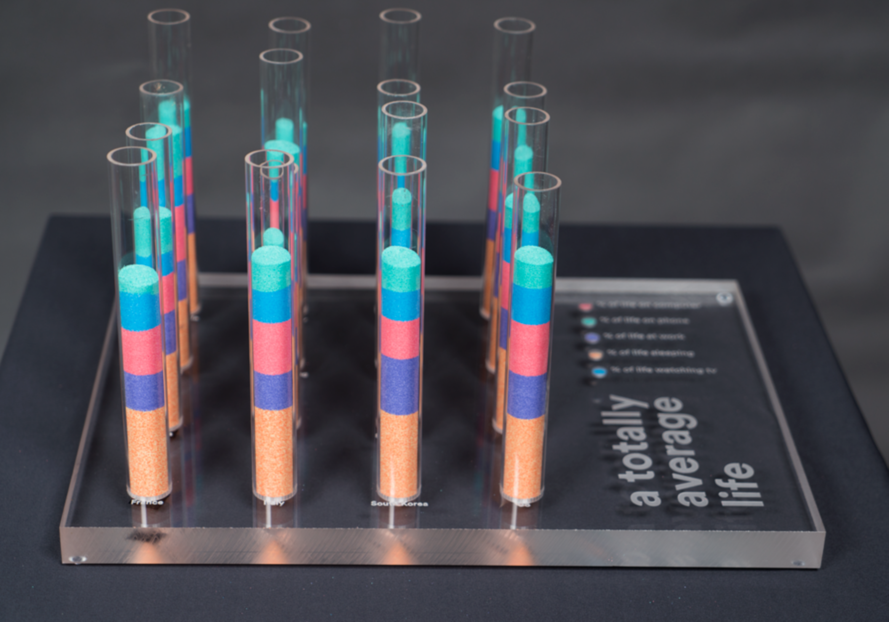
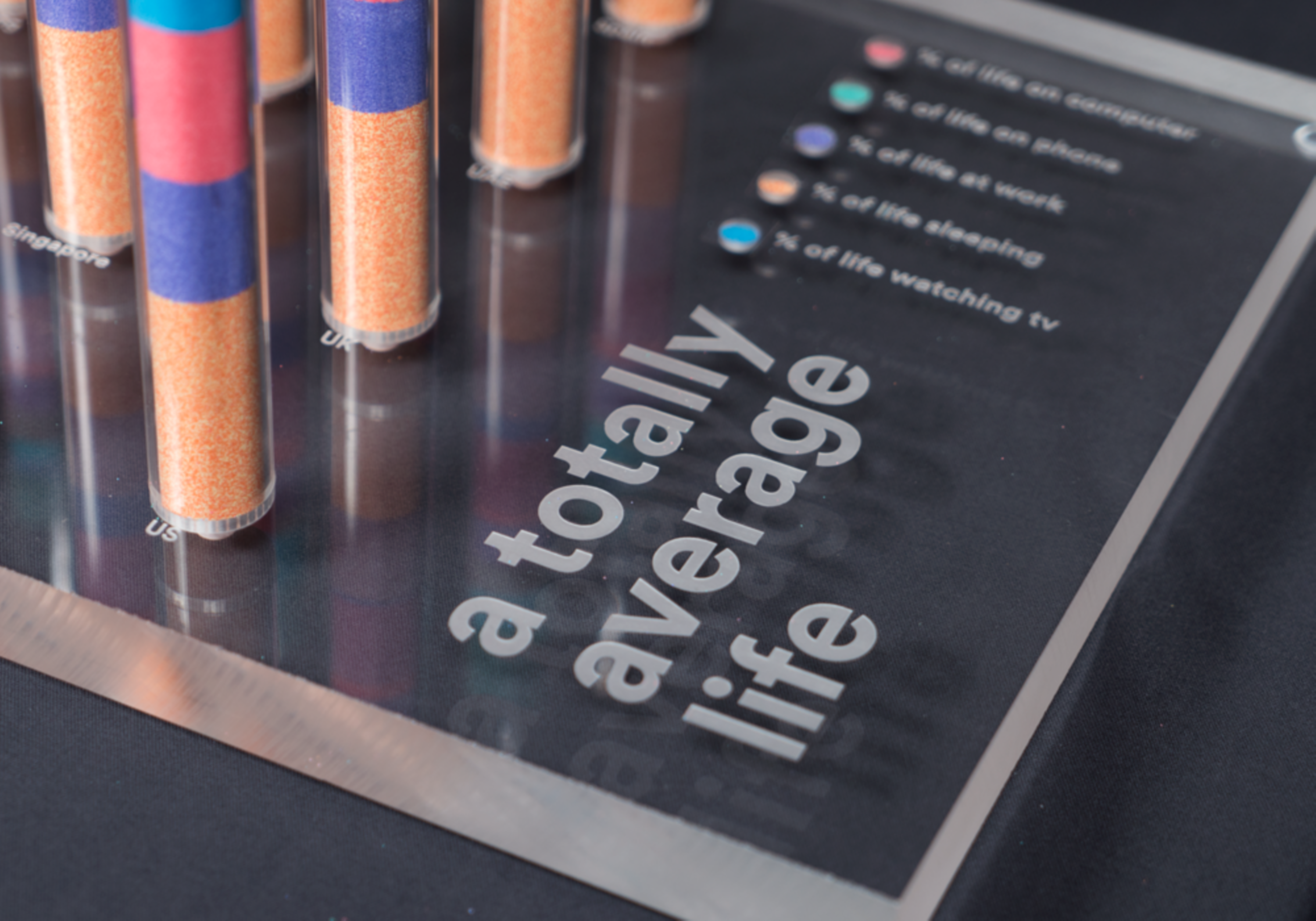
A physical infographic using the idea of sand timers to map the average amount of time 16 countries spend; sleeping, at work, on a computer, on a phone and watching tv, during their lifetime. The height of the tubes represents the average life expectancy in that country. The A3 acrylic block was CNC machined with funnels to create the sand timers and the typography laser engraved on.
part 2
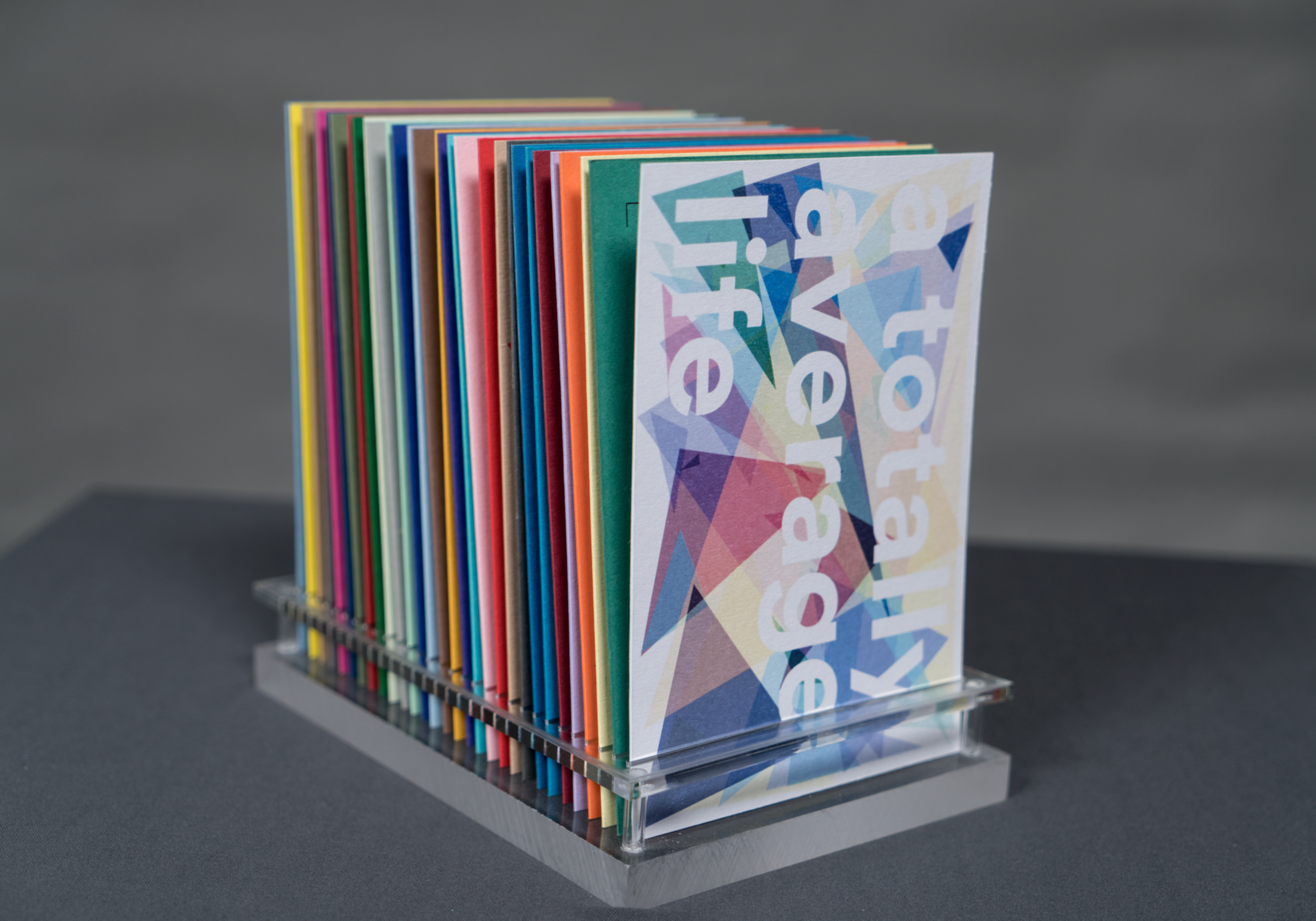
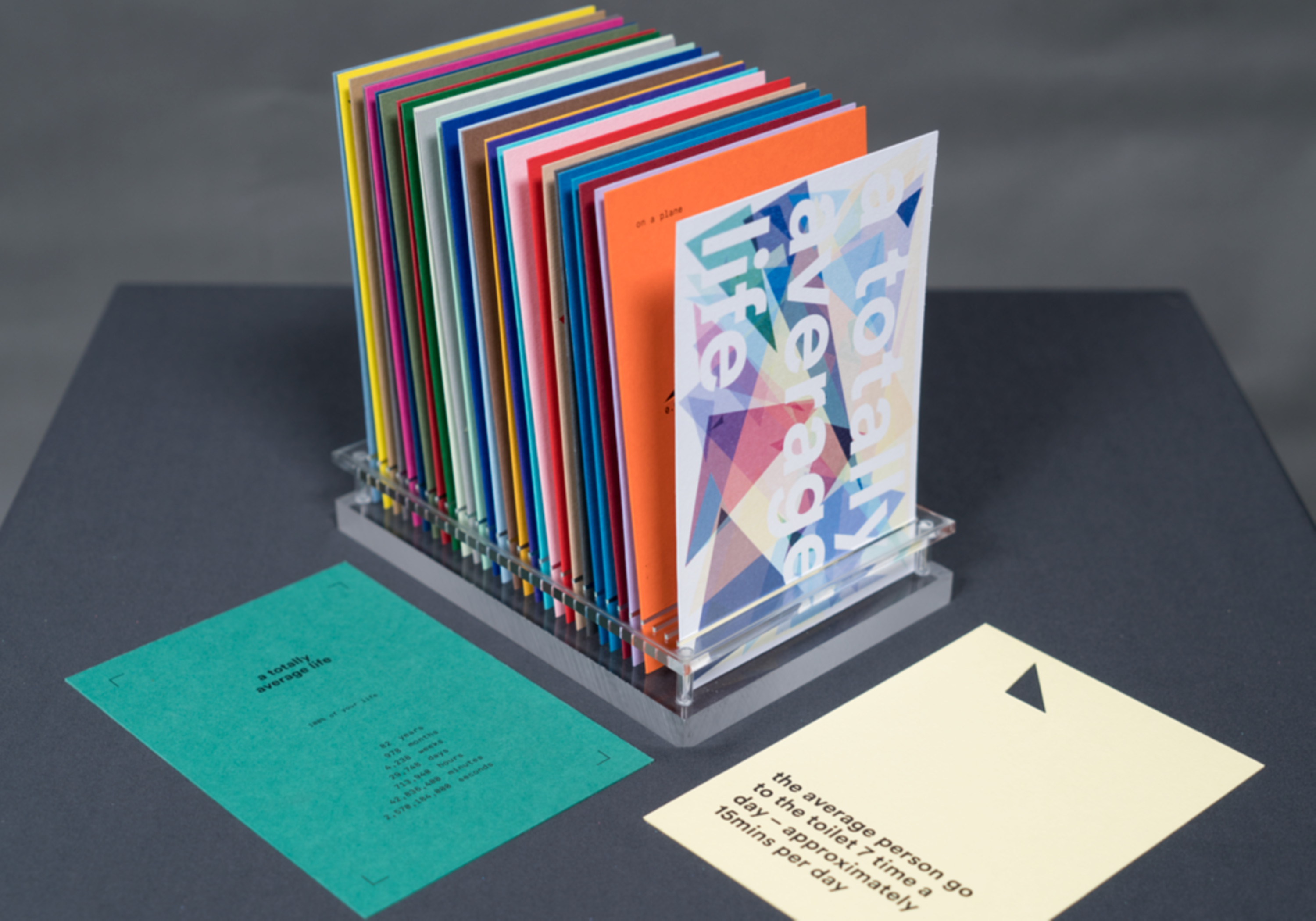
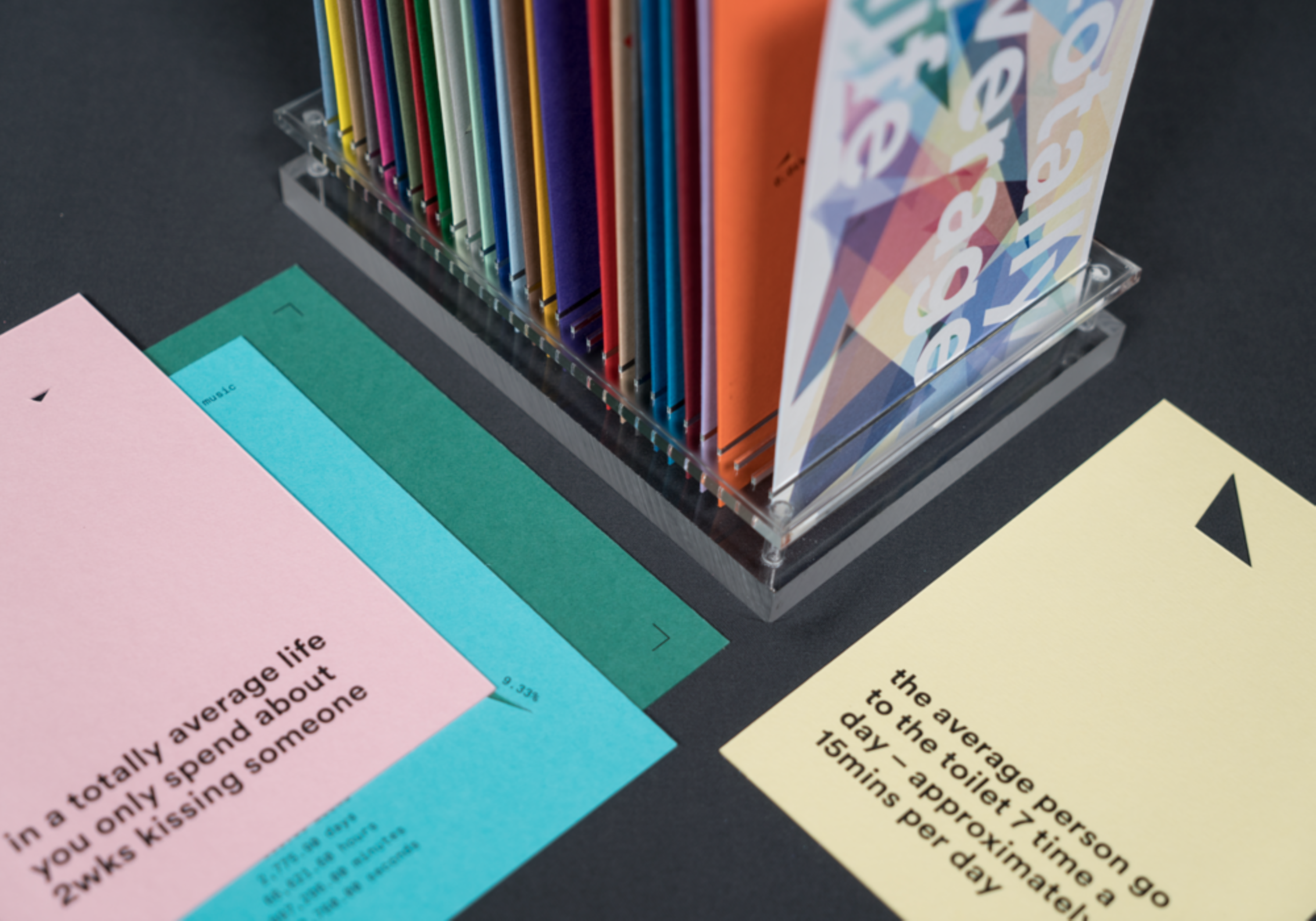
For the same project I also created series of double sided cards that slot neartly into an acrylic plinth. Each card has a common activity an average person spends time doing most days. A triangle is cut out representing the % of our lives spent doing that activity, where the cards size represents 100% of the average persons life. One the back of each card is a relatable fact about that activity.