Crumbs branding concepts
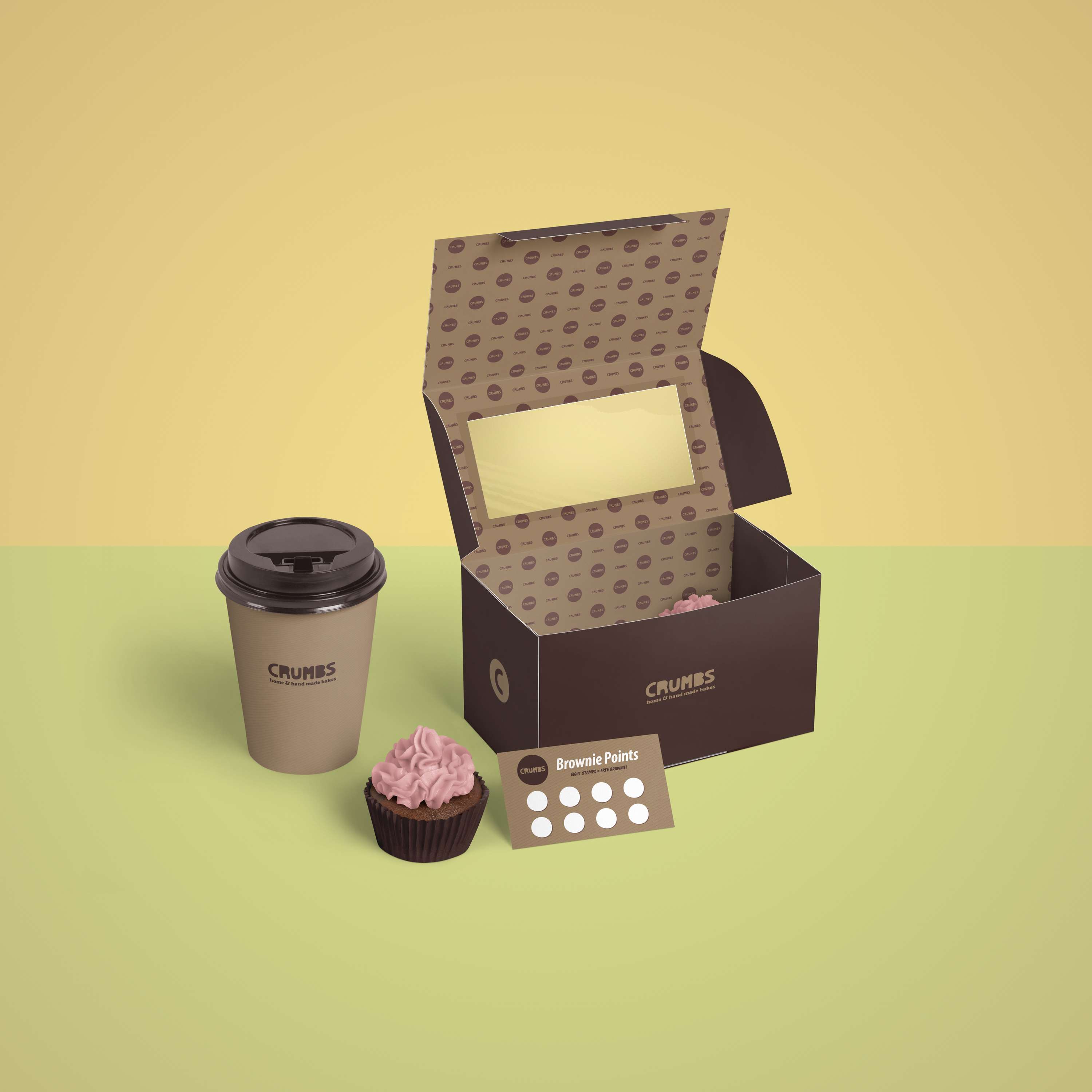
Concepts and initial direction for a new home bakery. Their mission, to provide the people of Scarborough with home baked treats that would satisfy even the most hardened chocoholic and the most dedicated treat hunter. The main logo is hand-drawn, based on cookie cutter letters, including the omission of the counters (always tricky when cutting out dough). The intention was to use recycled kraft paper board to complement the brand colours.


