
Brief
As part of an ongoing relationship with Ori, a distributed cloud platform, the brief called for the creation of a brand identity for their digital annual conference, focusing on the latest thoughts and technologies on Edge Computing.
The new identity had to complement Ori’s existing brand and to make use of Ori’s hedgehog mascot, bringing an approachable and appealing feel to a highly technical subject.
Solution
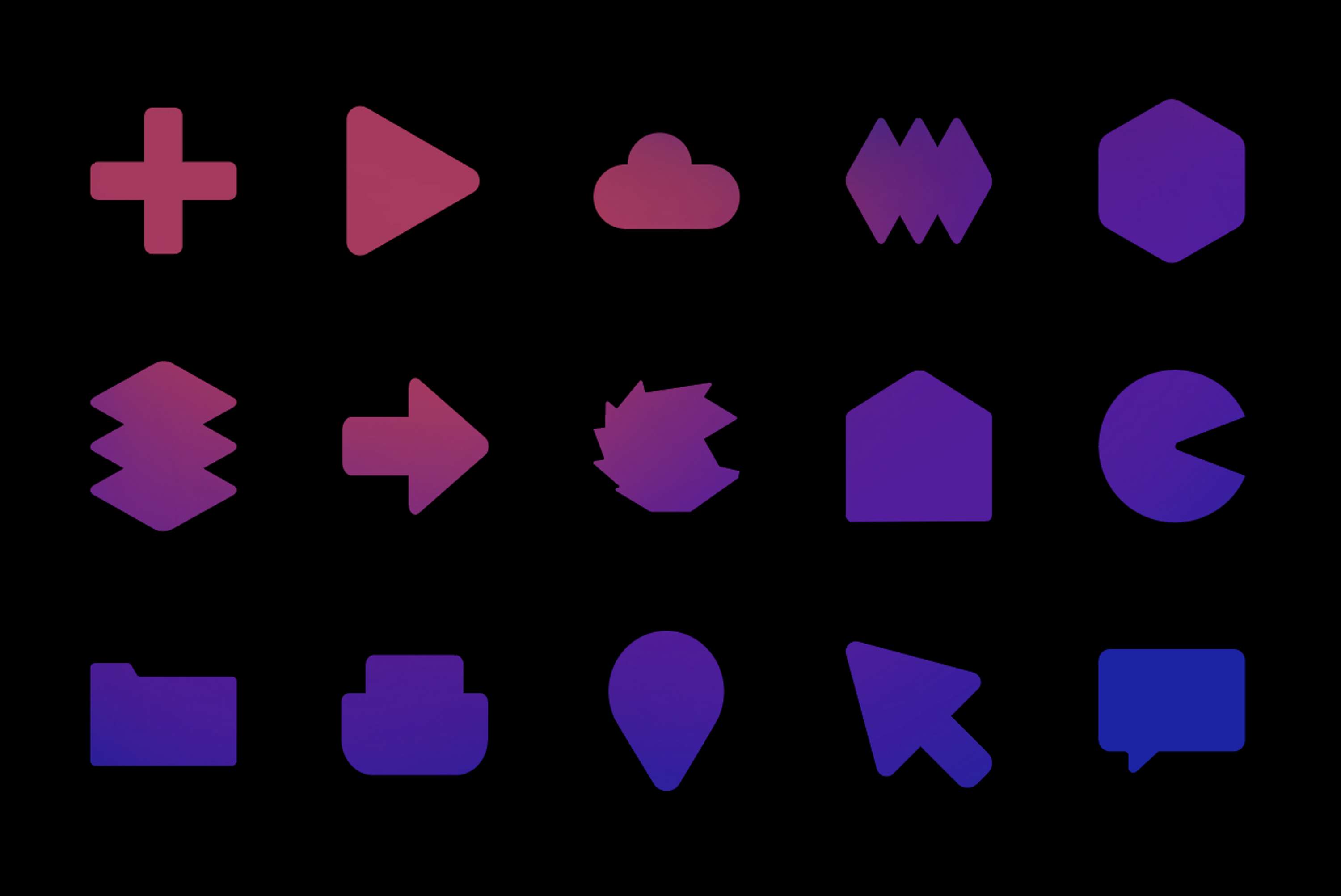
Using Ori’s existing mascot as the starting point, the logo overlays typography on a colourful sticker. With flexibility in mind, the logo is interchangeable and welcomes variation, being able to adopt a series of tech related stickers whilst maintaining consistency and being recognisable.
Using Ori’s main brand colour Cut Purple, the new brand explores the use of block colour with variations in opacity and the use of gradients to allow the introduction of any sponsors brand colours.
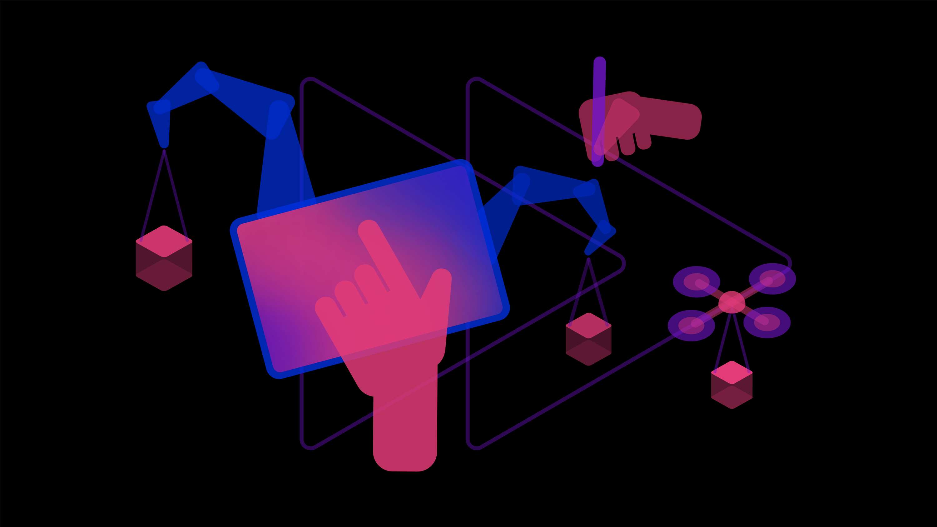
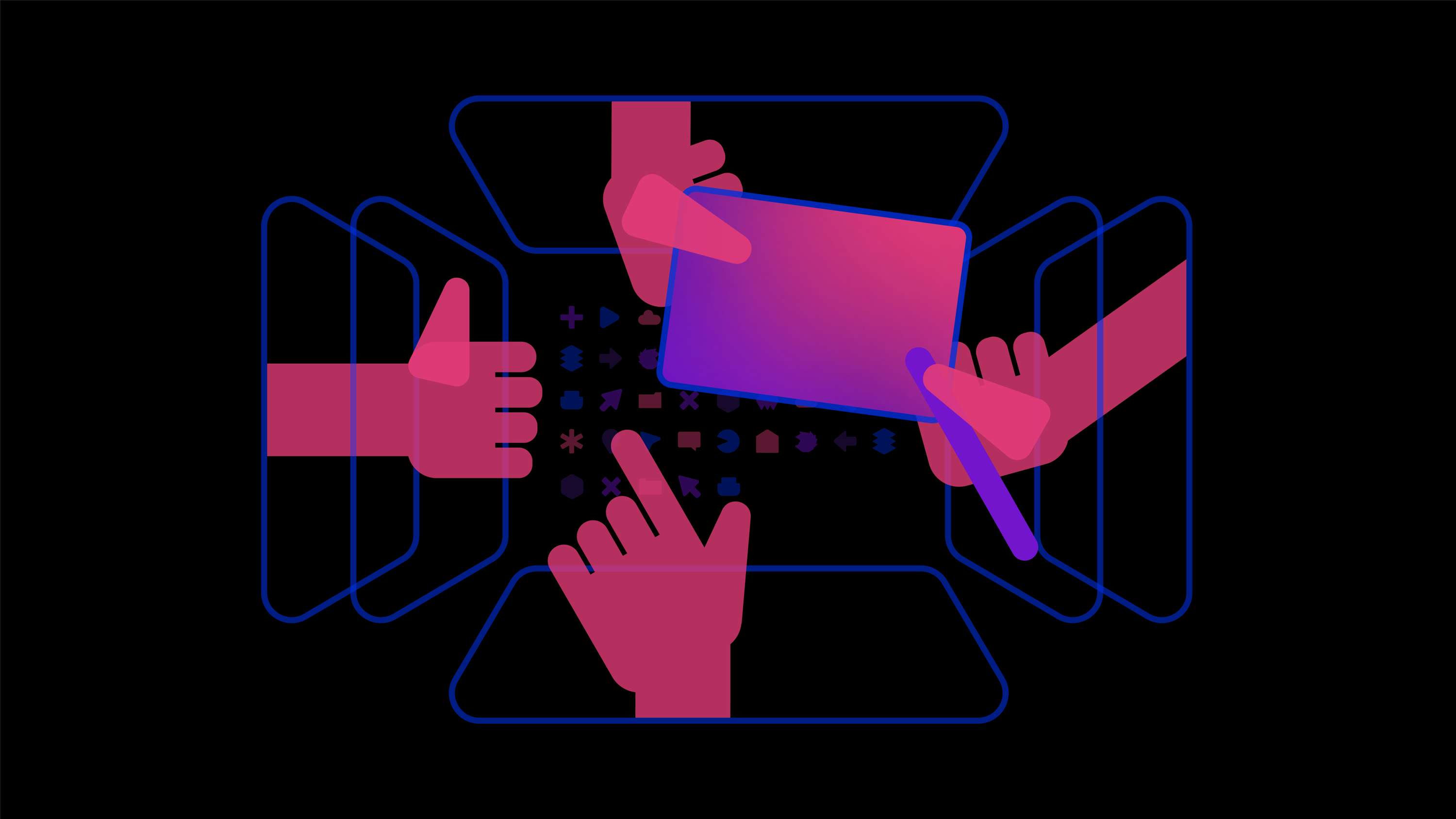
A series of illustrations and animations was developed to promote the event showcasing this year’s conference key themes: industrial IOT, gaming and community.
As a purely digital brand, it is set exclusively on a black background, considering the benefits of ‘dark mode’ to the end-user.

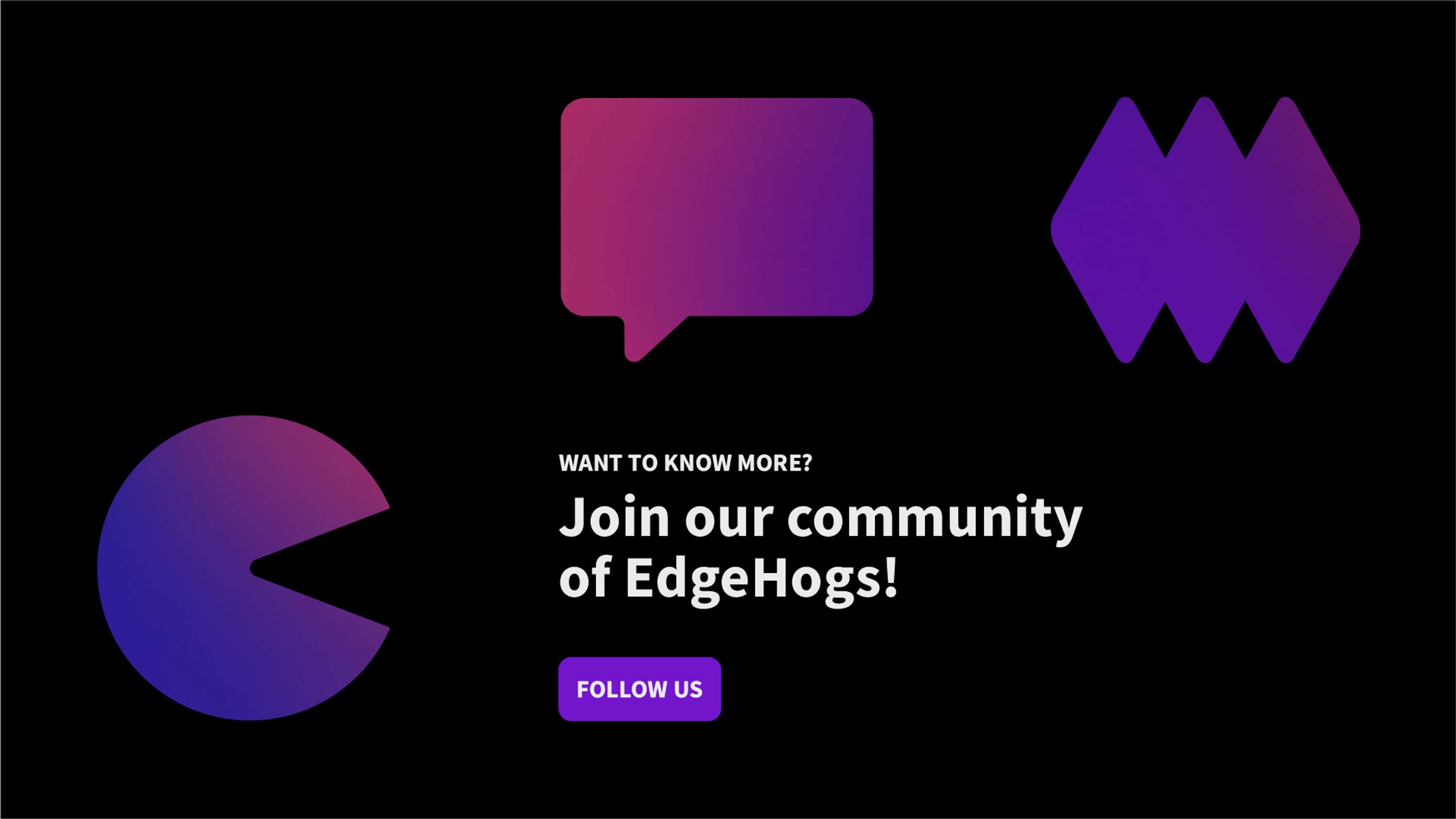
Follow me → Instagram
Get in touch → studioanabea@gmail.com
Check my website → www.anabea.studio
Thank you!
Project Tags
Companies

Ori
- Technology
Skills
- Brand Design
- Indesign
- Illustrator
- Design
- Branding
- Branding Design
- Identity Design
- Branding Identity
- Visual Communication
- Visual Branding
- Visual Identity
- Graphic Art
- Festival Identity
- Logo Design
- Brand Guidelines
- Content
- Content Creation
- Concept
- Animation
- After Effects
- Motion Design
- Illustration
- Icon Design
- Creative Direction