ISTD - Migration
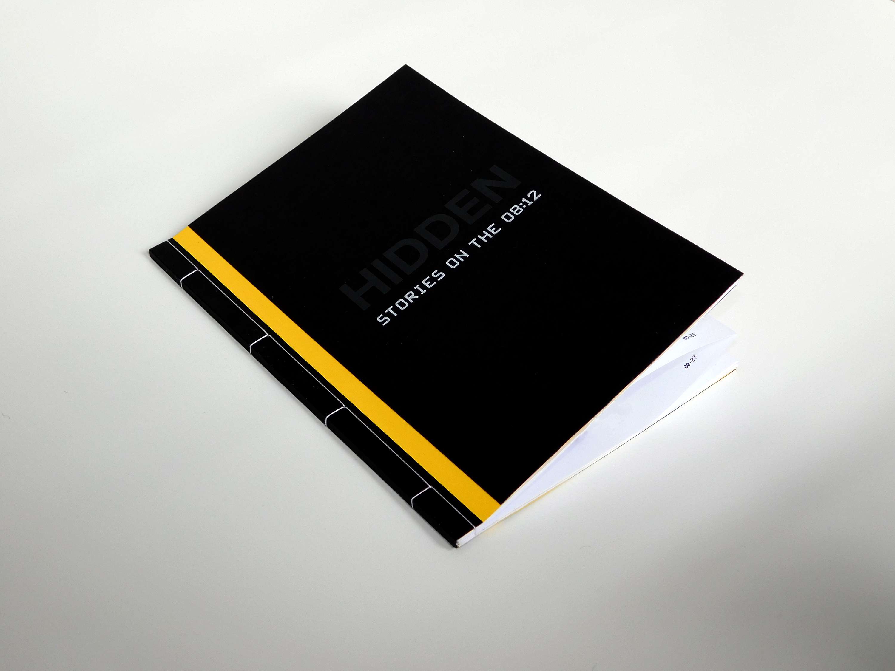
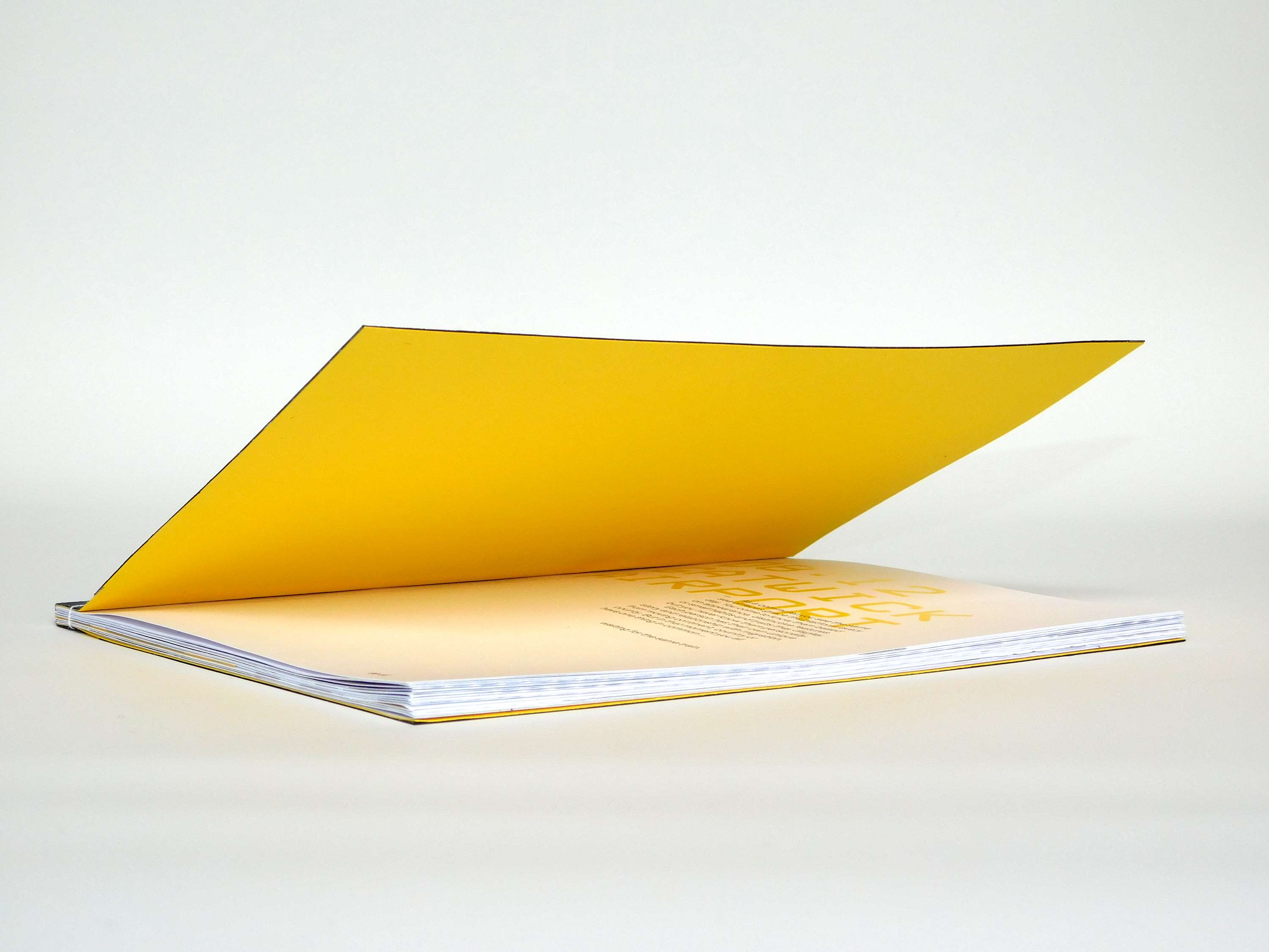
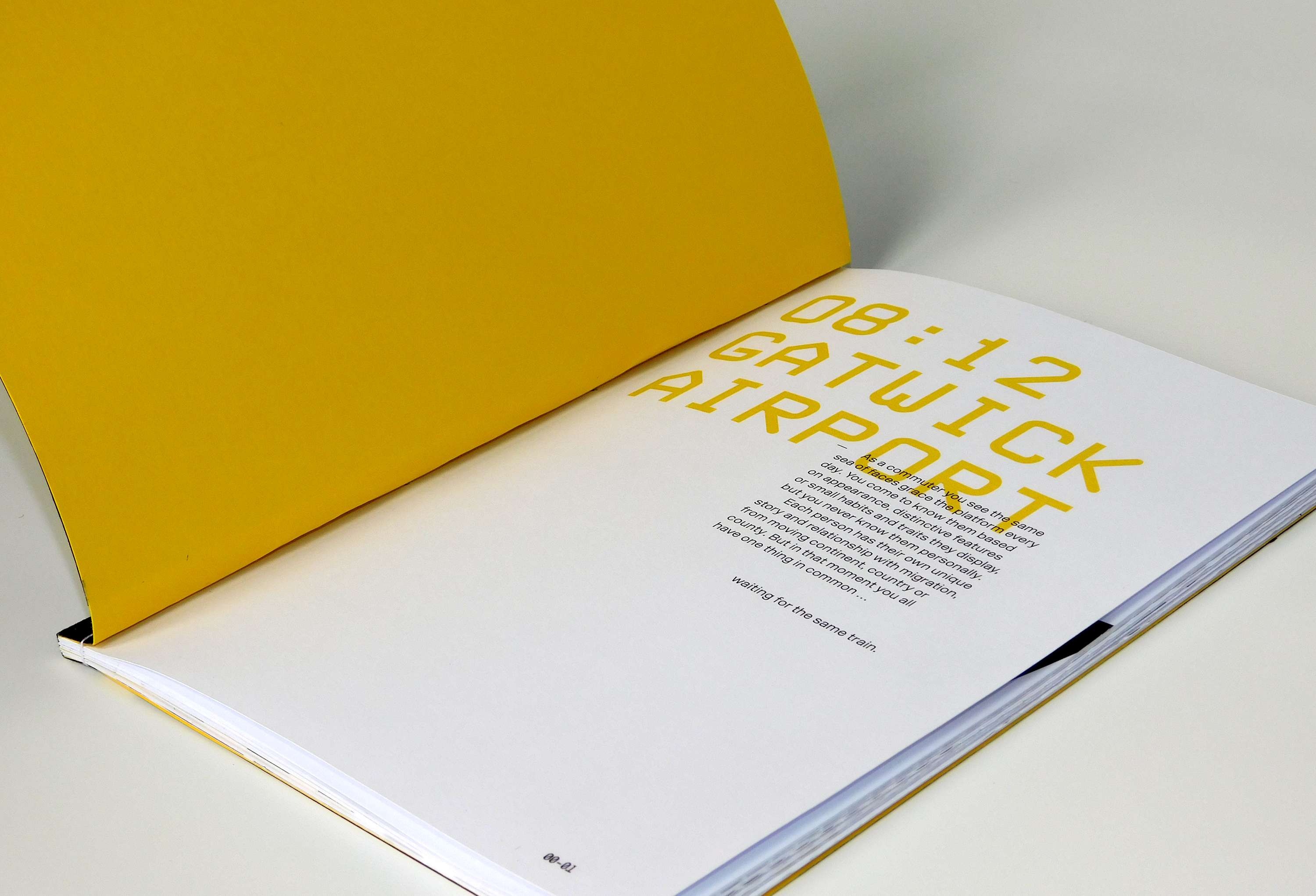
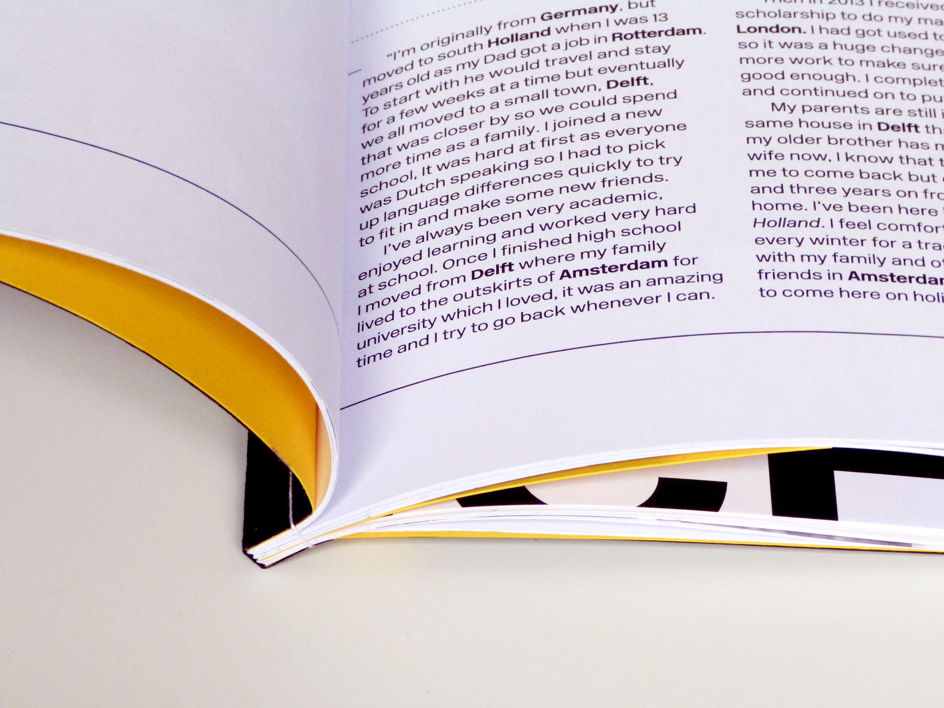
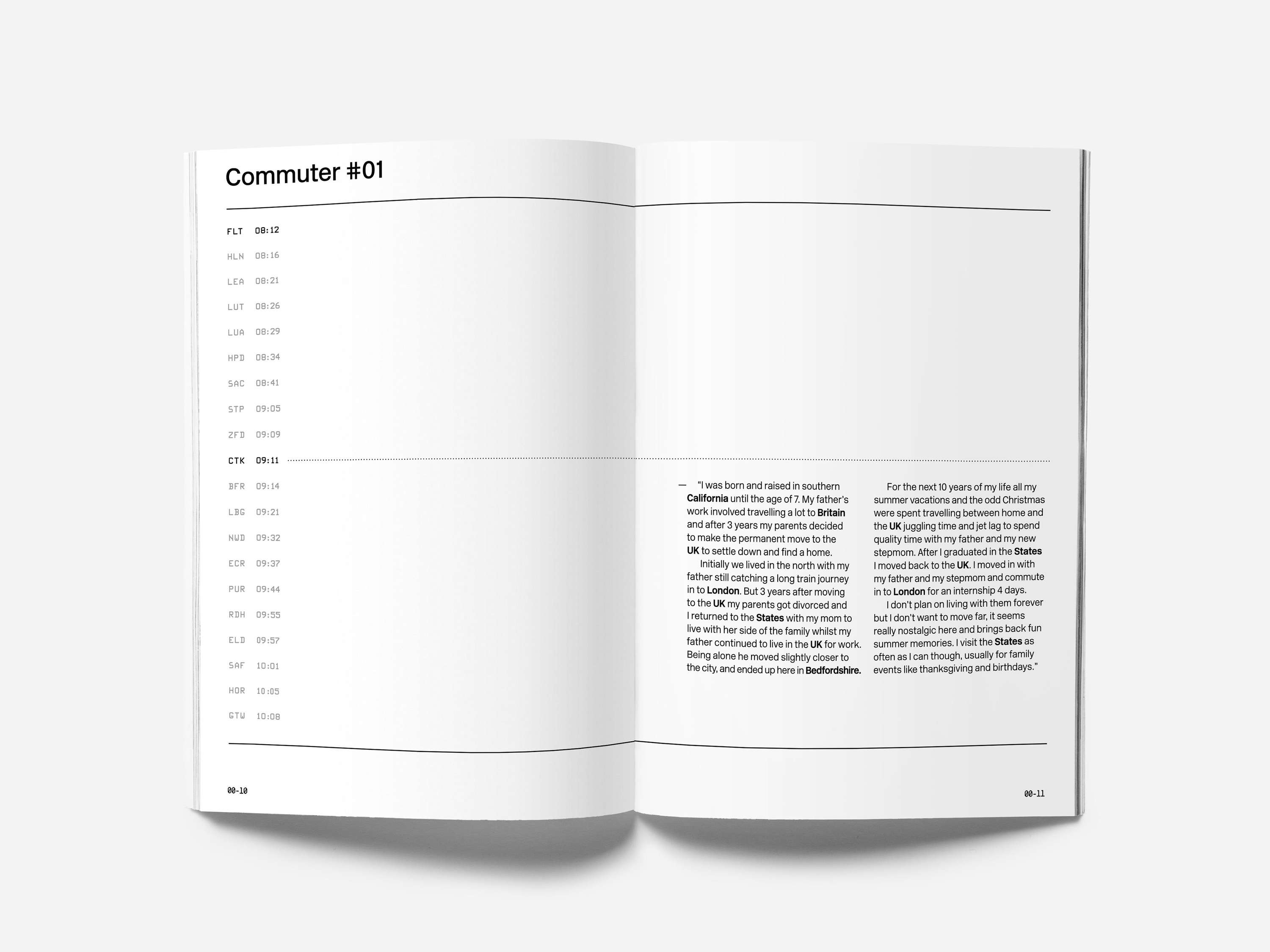
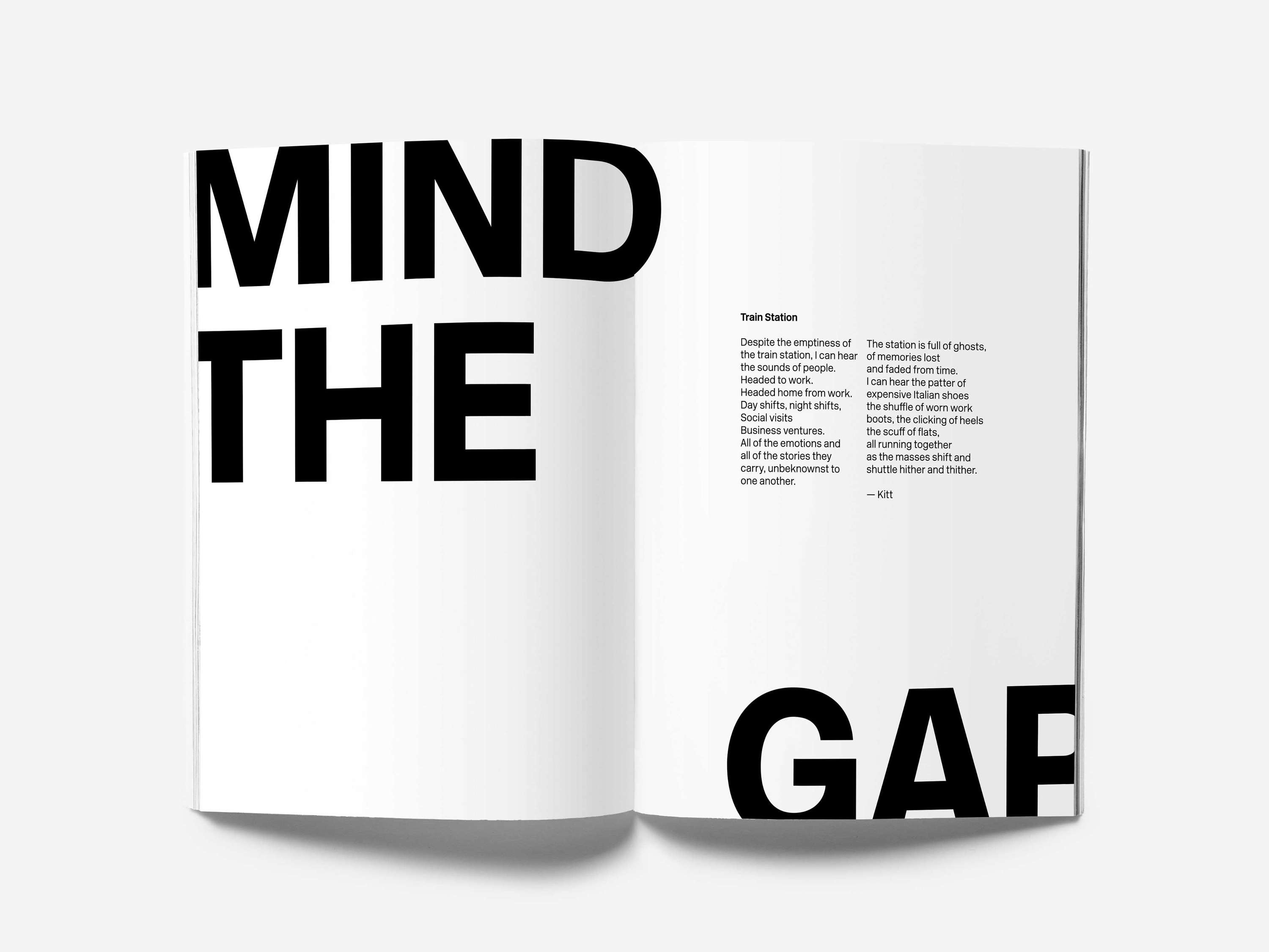
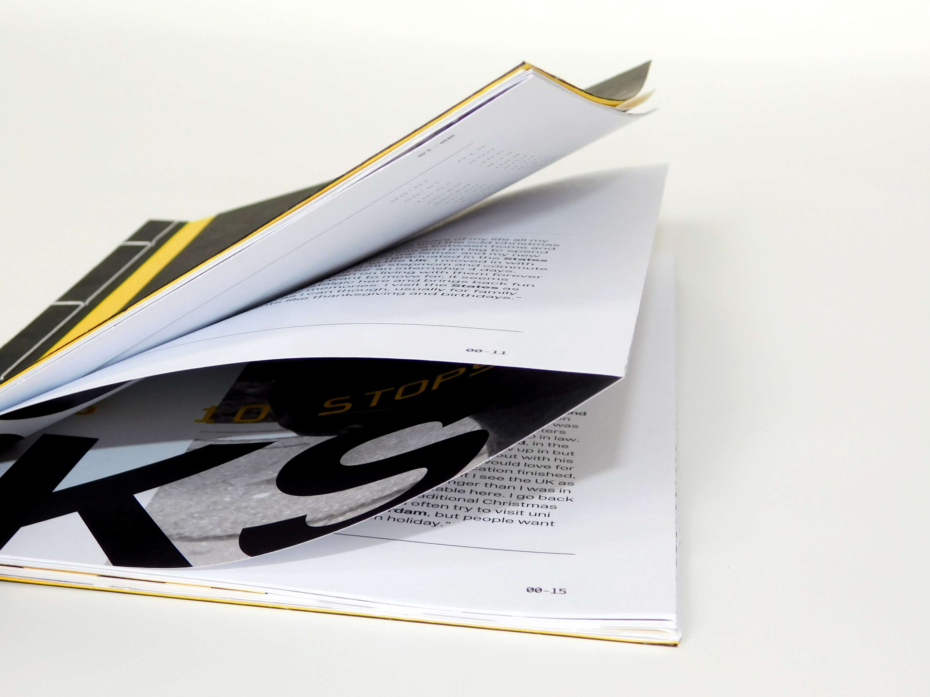
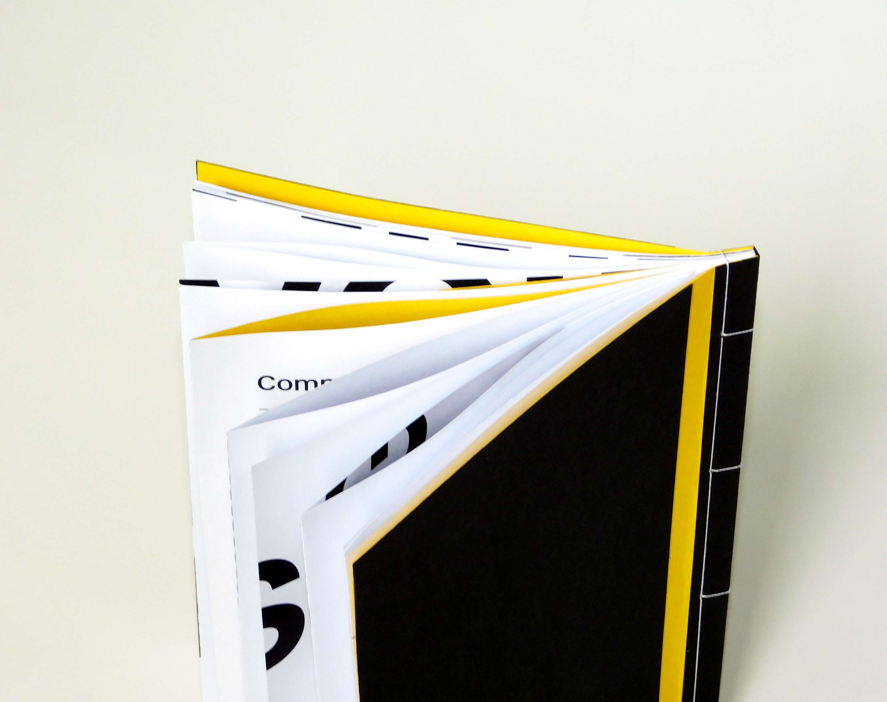
Brief: Design typographic work to celebrate the theme of migration in any form. Concept: I have taken the 08:12 train from Flitwick station for 4 years, I see the same people on the platform every day and I’ve come to know them based on little quirks and personality traits but never really spoken to them, so I decided to create a book that celebrated the migration of these people and how they all ended up getting the same train. The book as a whole, takes on the visual language of trains: A spread is equal to a 1/4 of the width of the tracks and the yellow page insert is the same width of the yellow line that runs the length of the platform. New Rail alphabet, the revived version of the original Britannica typeface used across the British Rail service, has been used throughout, with supporting type in VMS (variable message sign) to imitate the digital signs seen on the platform.
