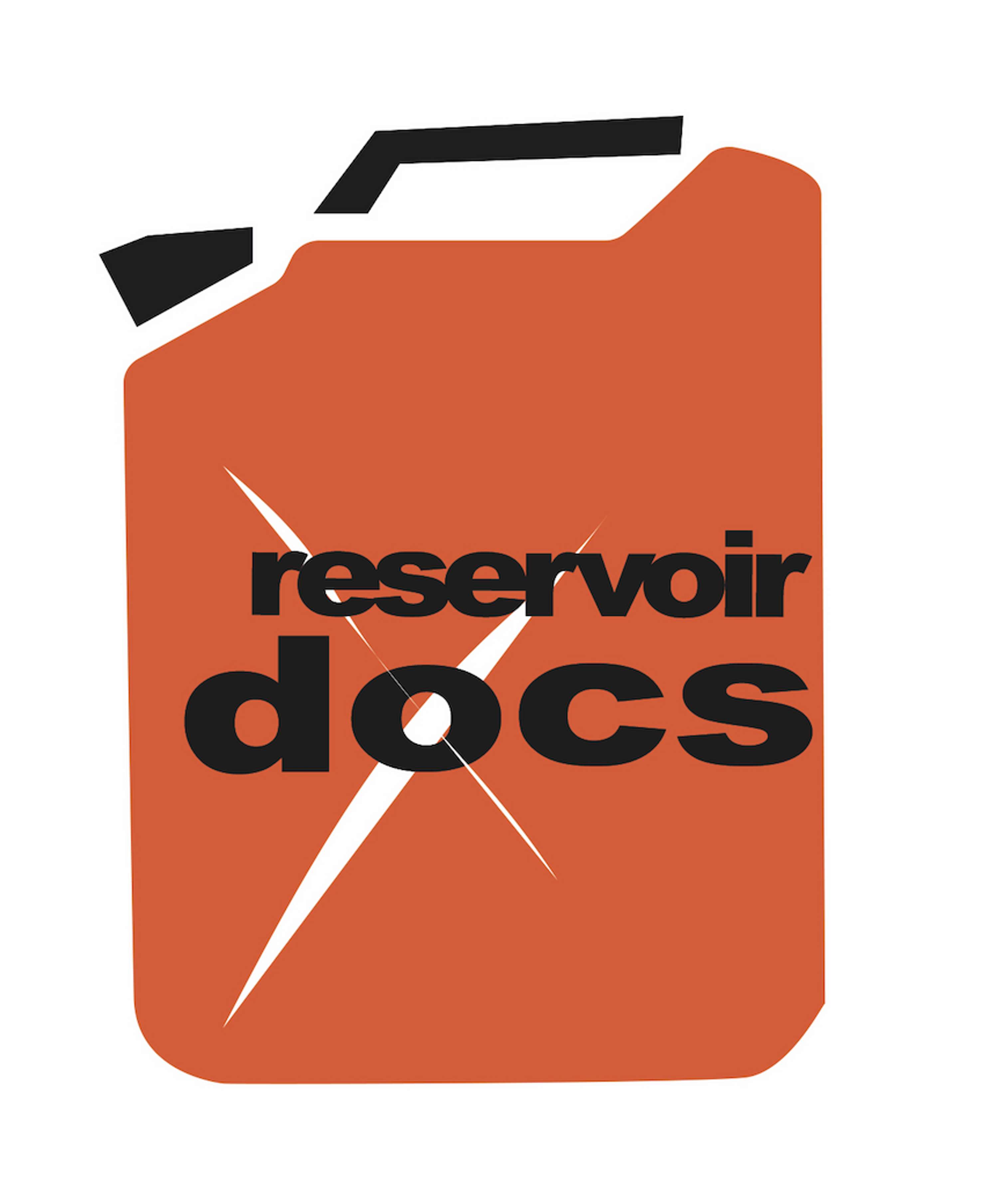
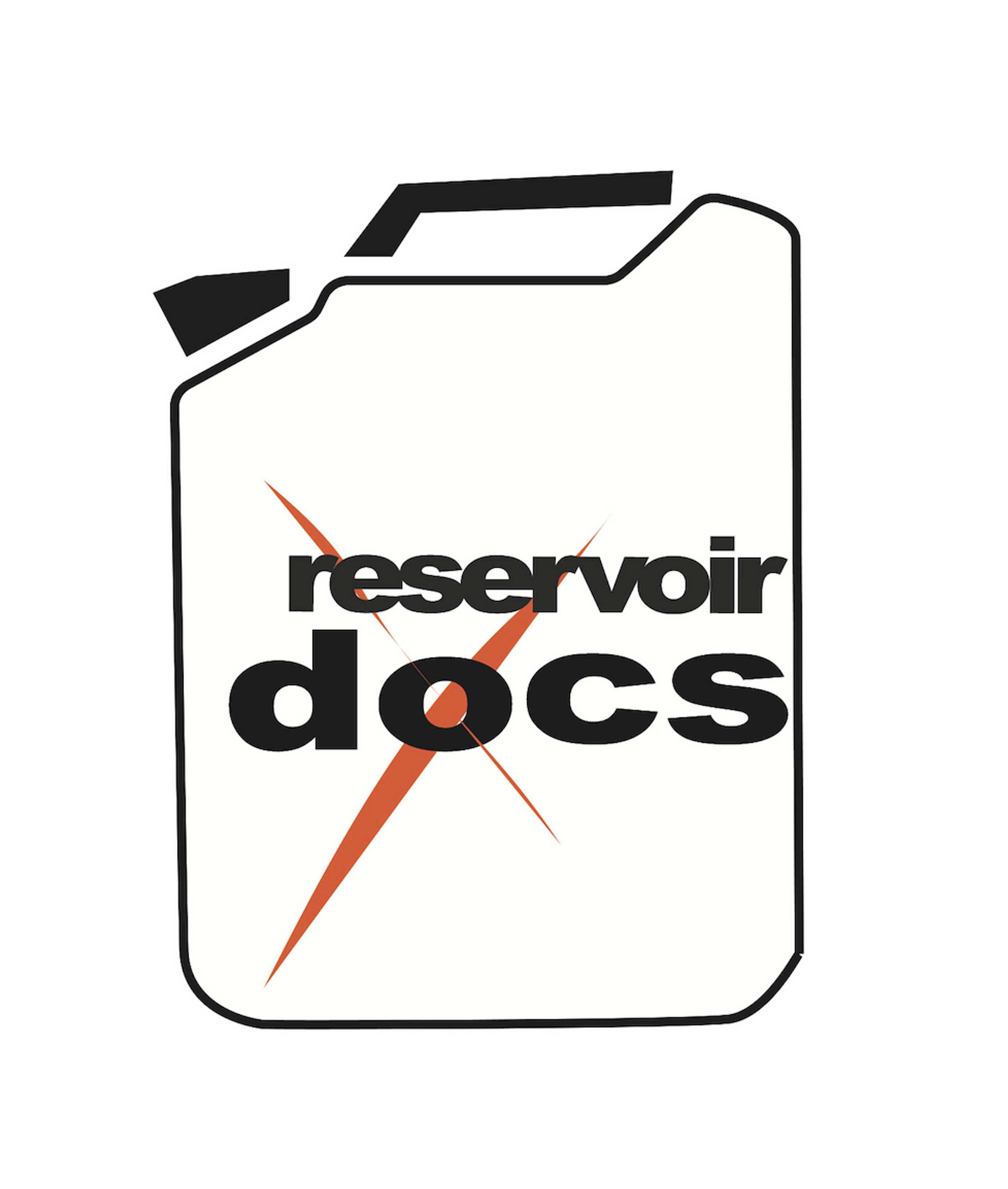
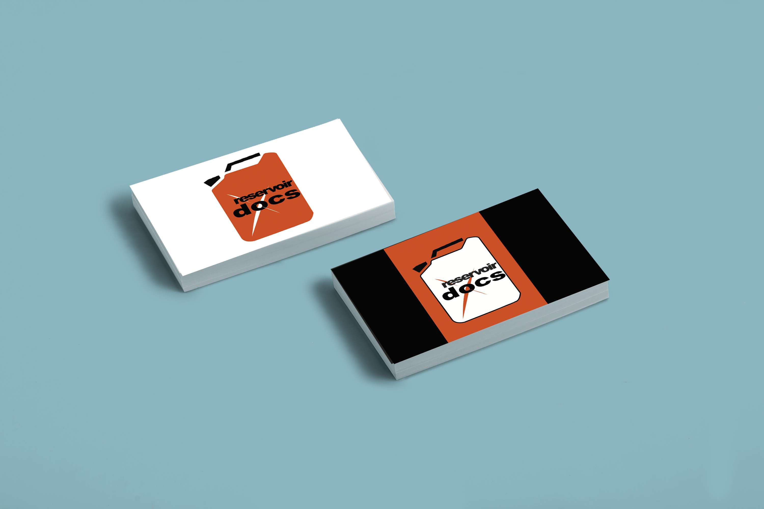
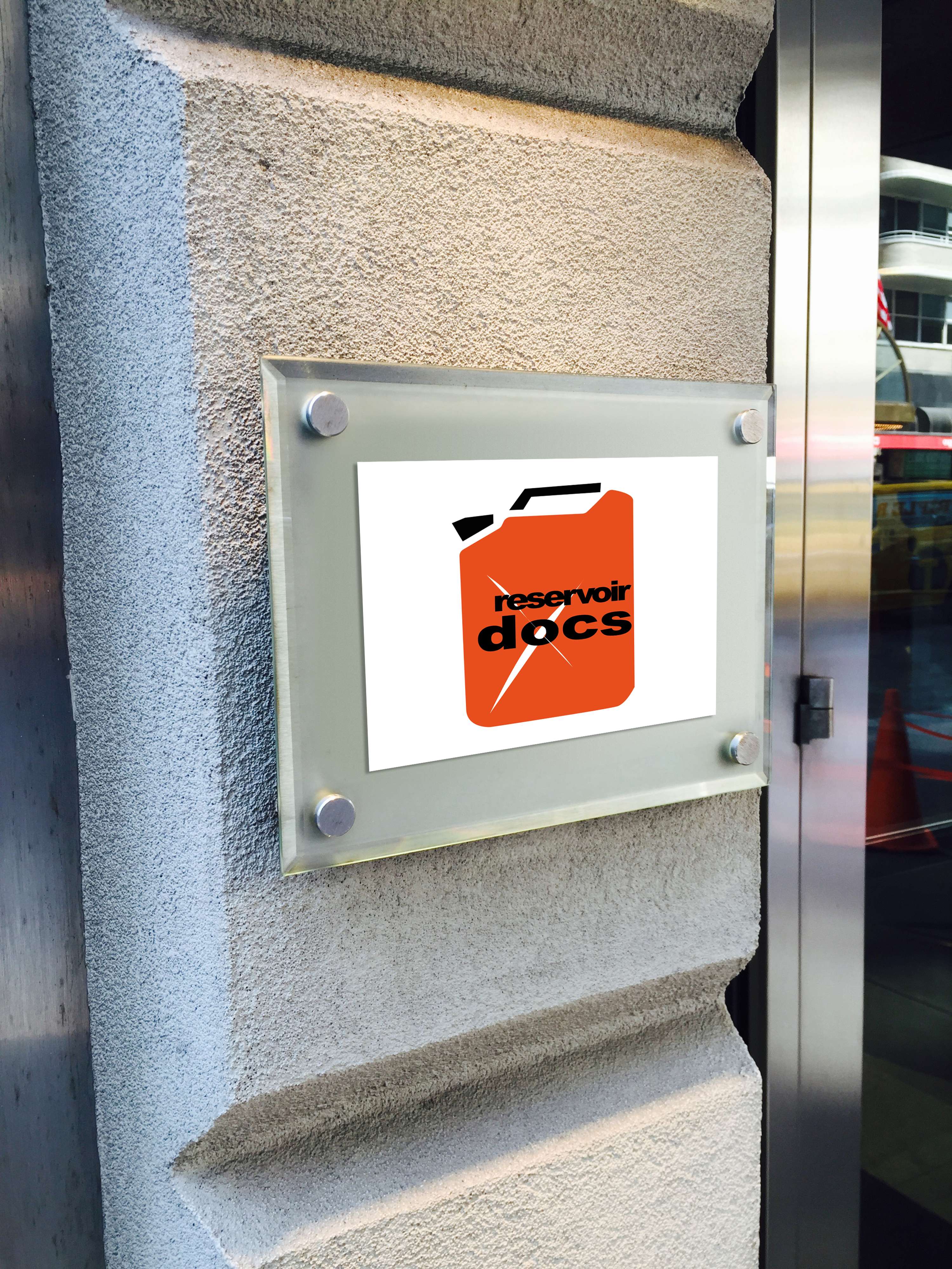
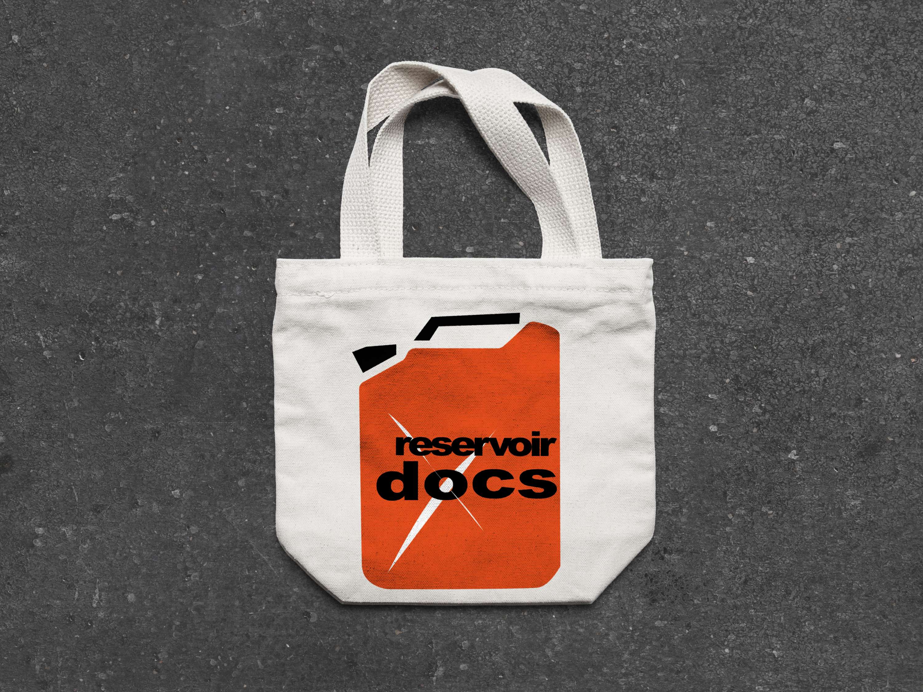
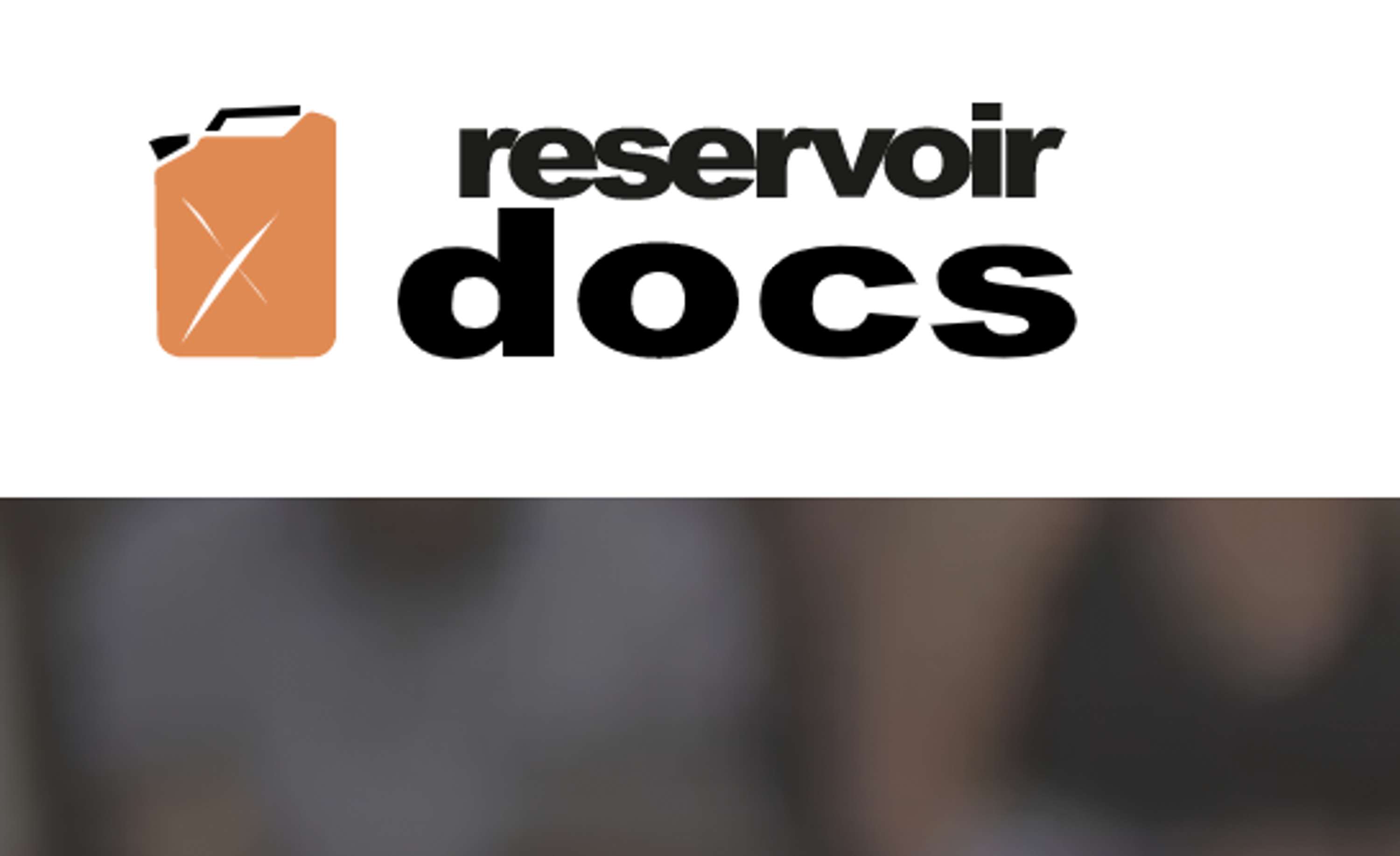
LOGO DESIGN FOR RESERVOIR DOCS

Reservoir Docs is an independent, international sales company specialised in creative documentaries, always with an art, culture and society angle. The Jerrycan has been used in the logo design concept as it is a synonym of reservoir. It also represents the company very well as it contains many innovative features. It is bold, robust and used internationally. I built an analogy between the company's identity and the jerrycan, both innovative and smart, bold and robust and to the point. Also, it implies that Reservoir Docs always has a reserve of documentaries to offer the world even if everyone else is dry.