POPNAX a corn baked based snack is a new brand which symbolizes light-hearted fun. With it’s Pop-Art inspired packaging design that is fun, fresh, and fierce, POPNAX’s entire product portfolio was depicted with the key philosophy of anytime snacking.

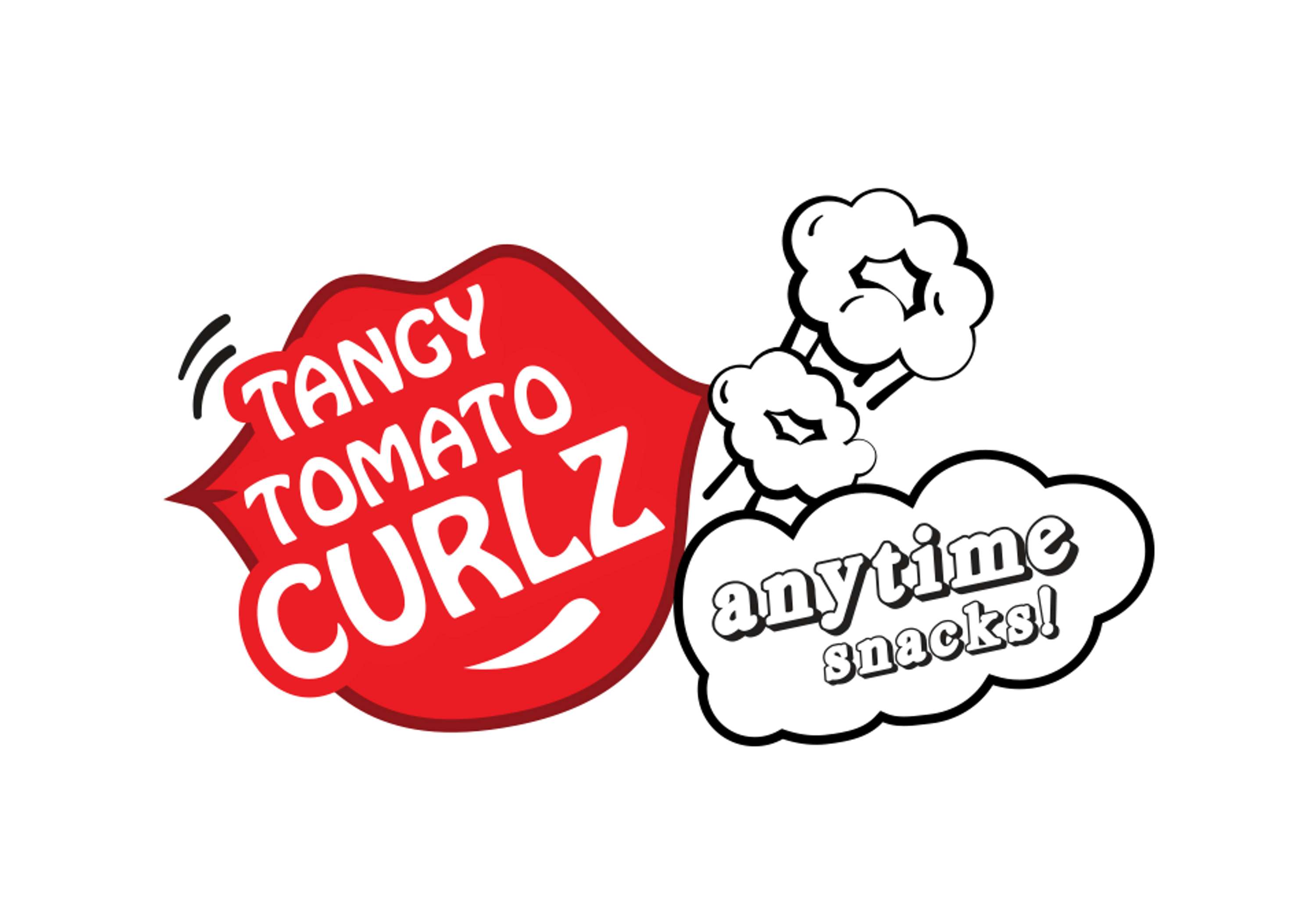
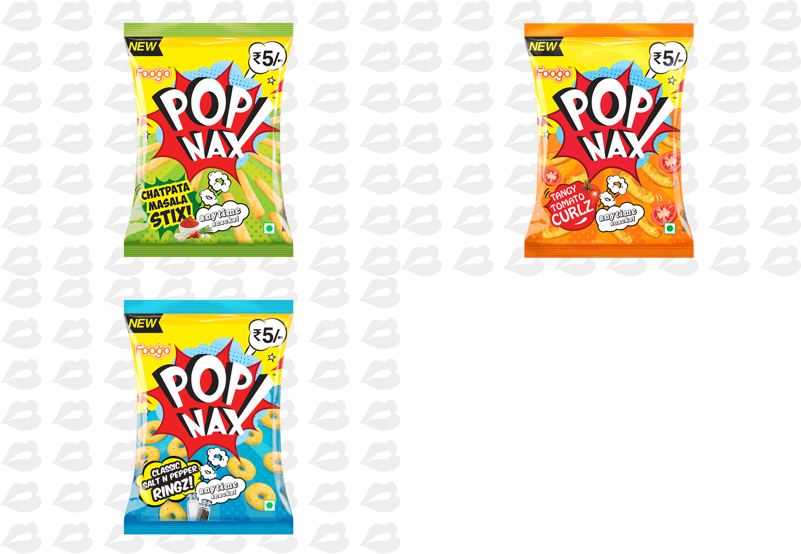
The design process started by first determining a mood for the product and a style that could be perpetuated across media. Thus inspired by the 60’s Pop-Art movement which we thought was a good approach to position the brand that was young yet dynamic!
Contrasting color combinations and illustrative style of the product inspired by the POP art Movement isolated from the competition on the shelf.
The POPNAX Identity is inspired from the strong iconography of the POP art movement particularly seen in comic strips which increased memorability. This unit also had a burst in halftone paying homage to the comic book era.
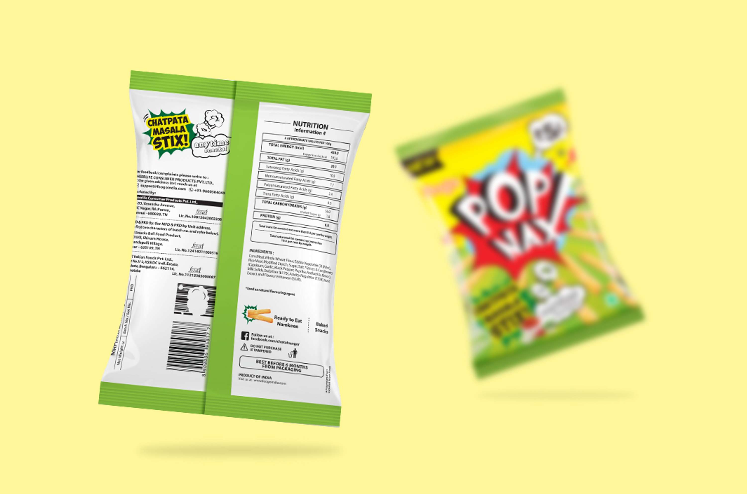
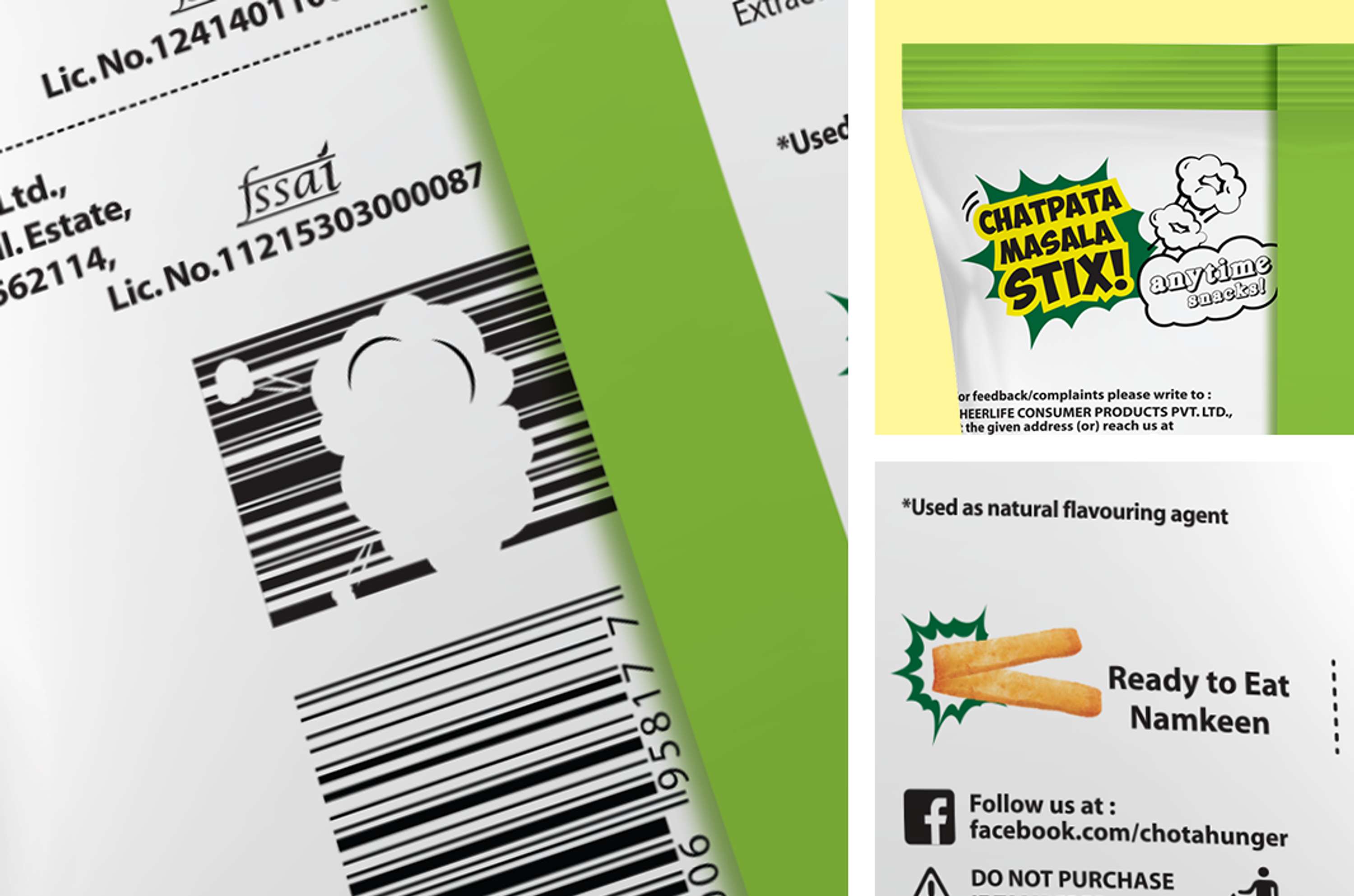
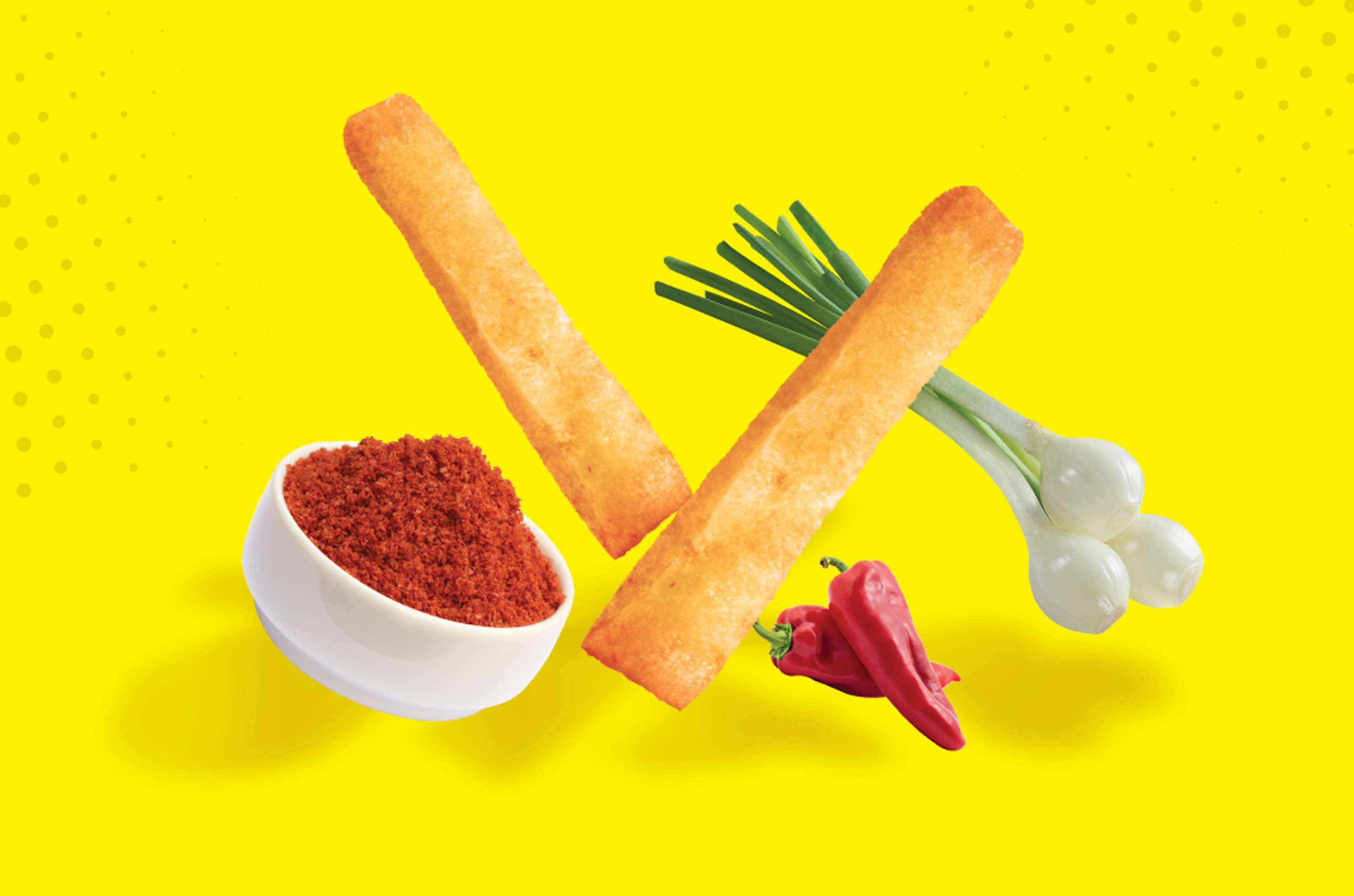
The geometric shapes and the bold colors are references from the artistic movement like the superimposition of forms refer to the printing failures that occurred frequently in that time. Specific visual cues were designed as per the flavours which acted as containers to hold the flavor names. The tone of voice was very carefully decided as it was to cater to the youth and so the current “internet slangs” were taken as a base to design an effective tone of voice that would run across a wide product range.
The new packaging design stands out from the competition, increase sales and brand memorability. It strikes a wonderful balance between fun, eye-catching graphics allowing the product itself to shine.
