QPT logo design

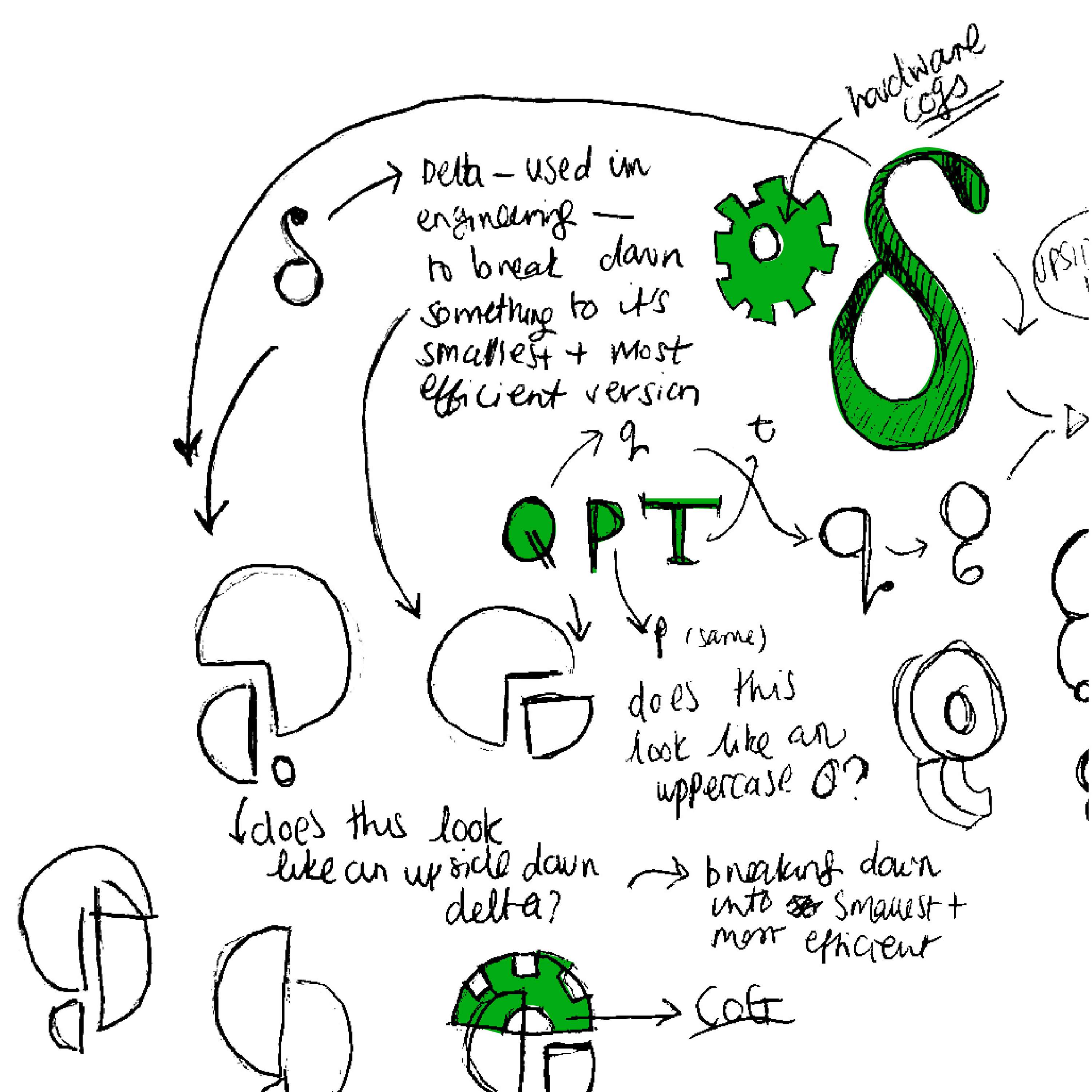
This logo was really fun to design, and it was interesting to study a subject that was quite far away from my normal. At QPT their hardware will minimise the CO2 produced when companies are product testing; they will use QPT's hardware to notice any issues during development and cut down a lot of unnecessary steps, time, and material waste. The concept behind this logo was to demonstrate the idea of reducing something down to its smallest and most efficient state. After speaking with the engineers I found out that the Greek letter Delta is used in mathematics and engineering to demonstrate exactly this. It also looks like an upside down 'q' which works nicely with their company name. After some development the lower-case Delta became too complex, the final idea incorporates the larger shapes being broken down to smaller ones from my initial idea. The Q also represents an 'on' switch.