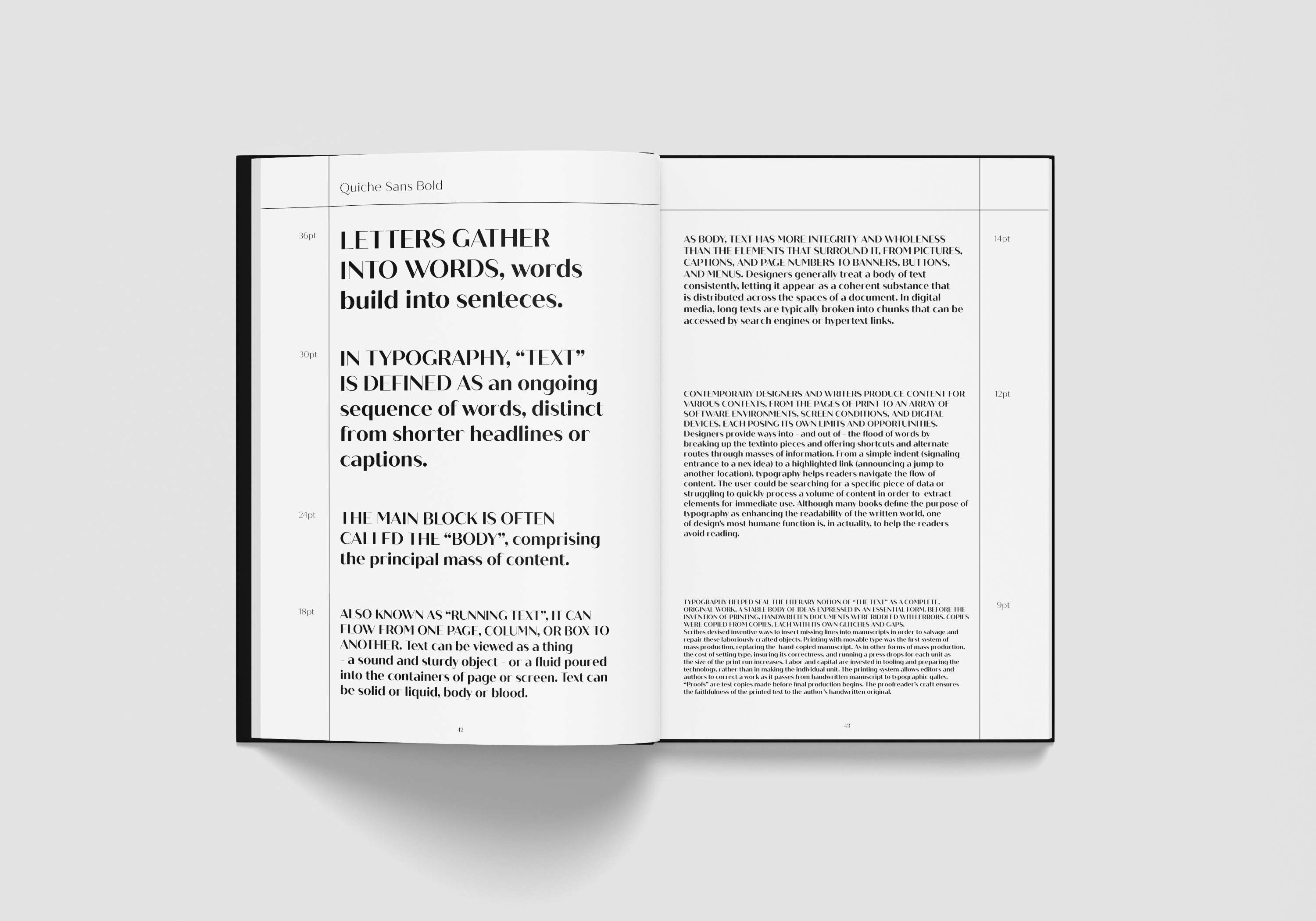
Quiche Sans Specimen
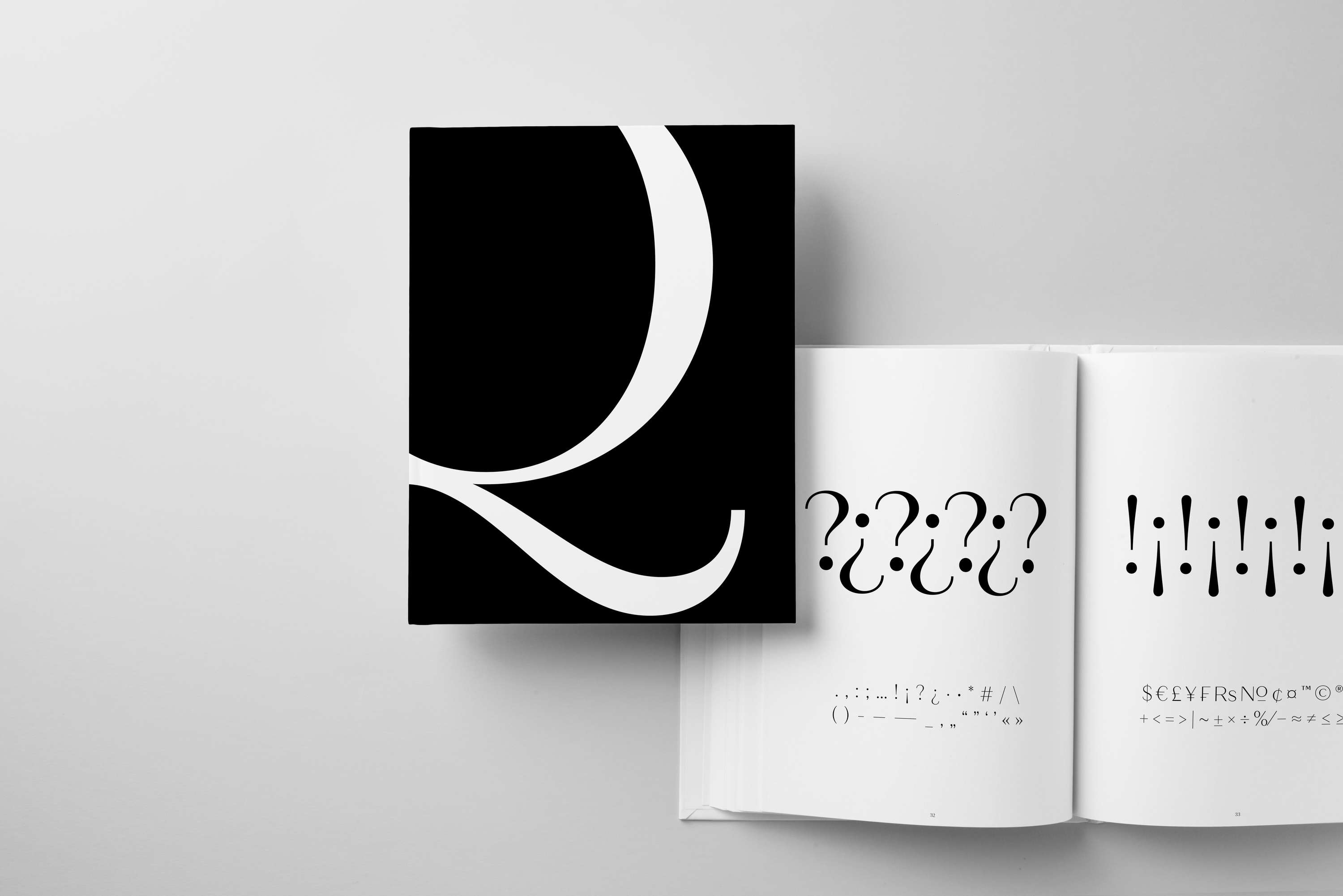
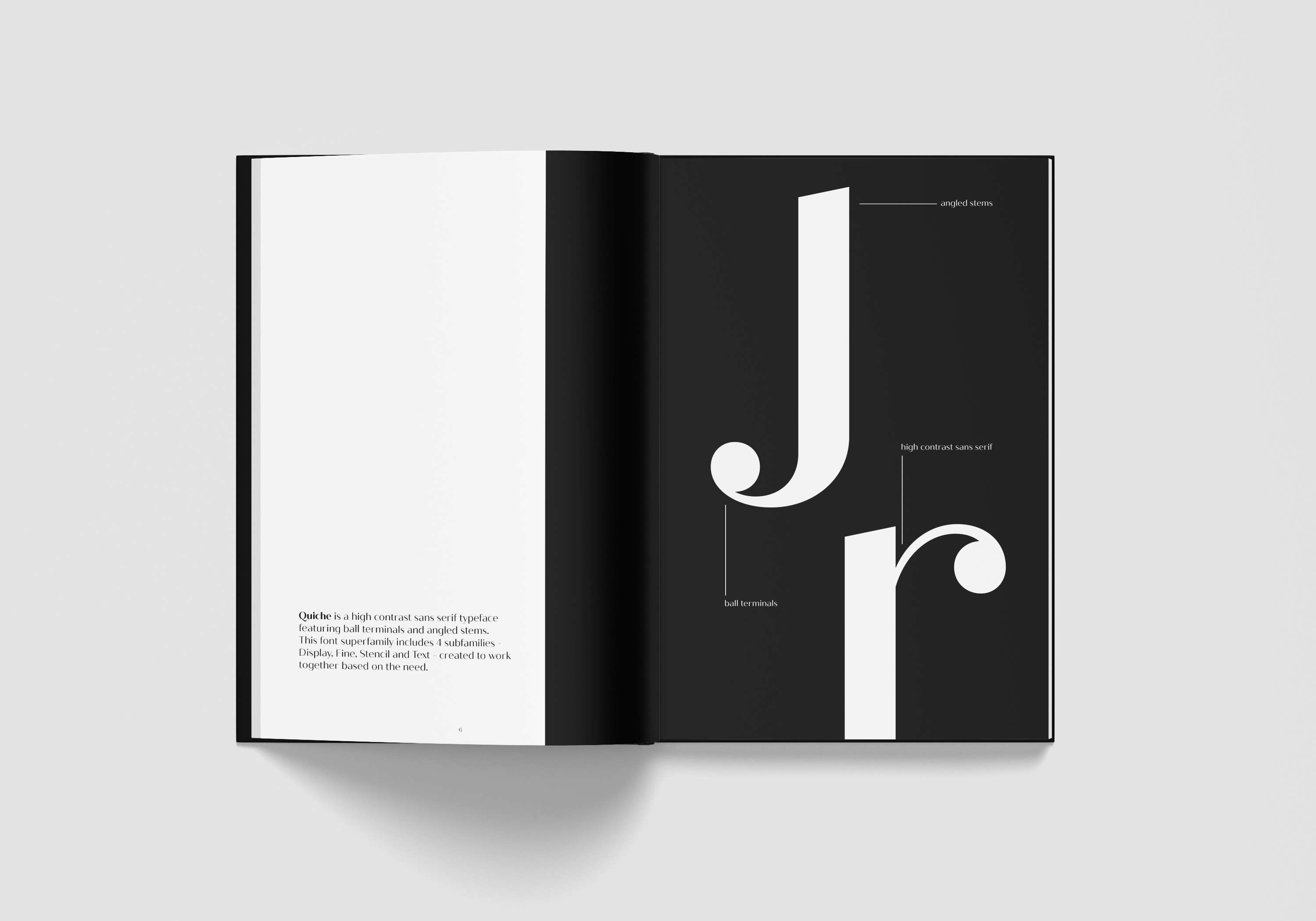
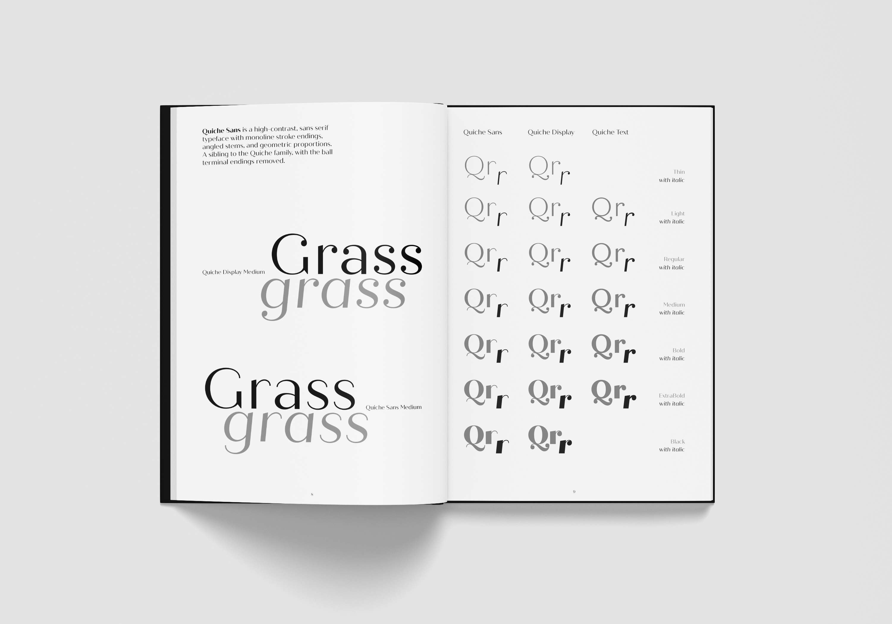
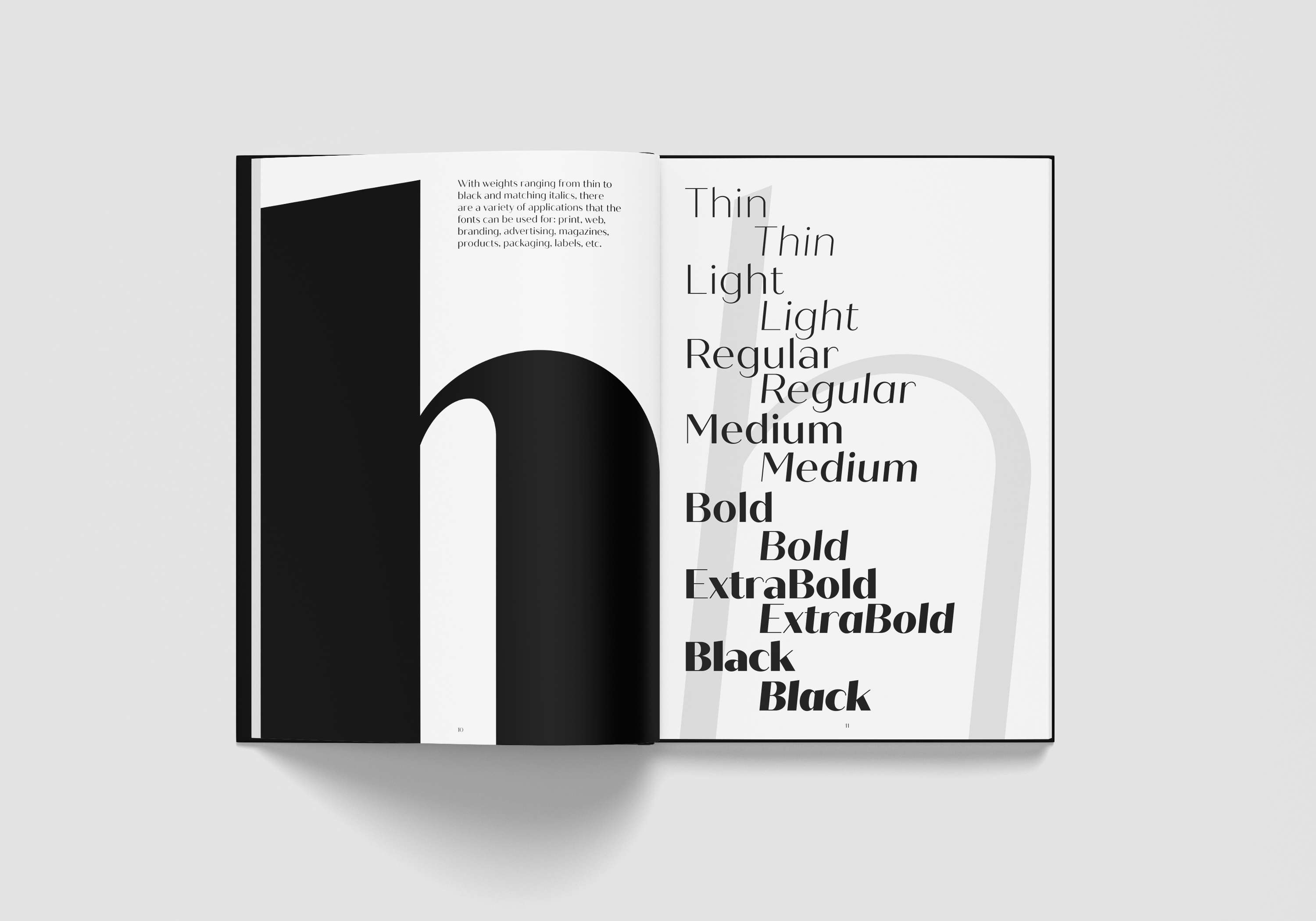
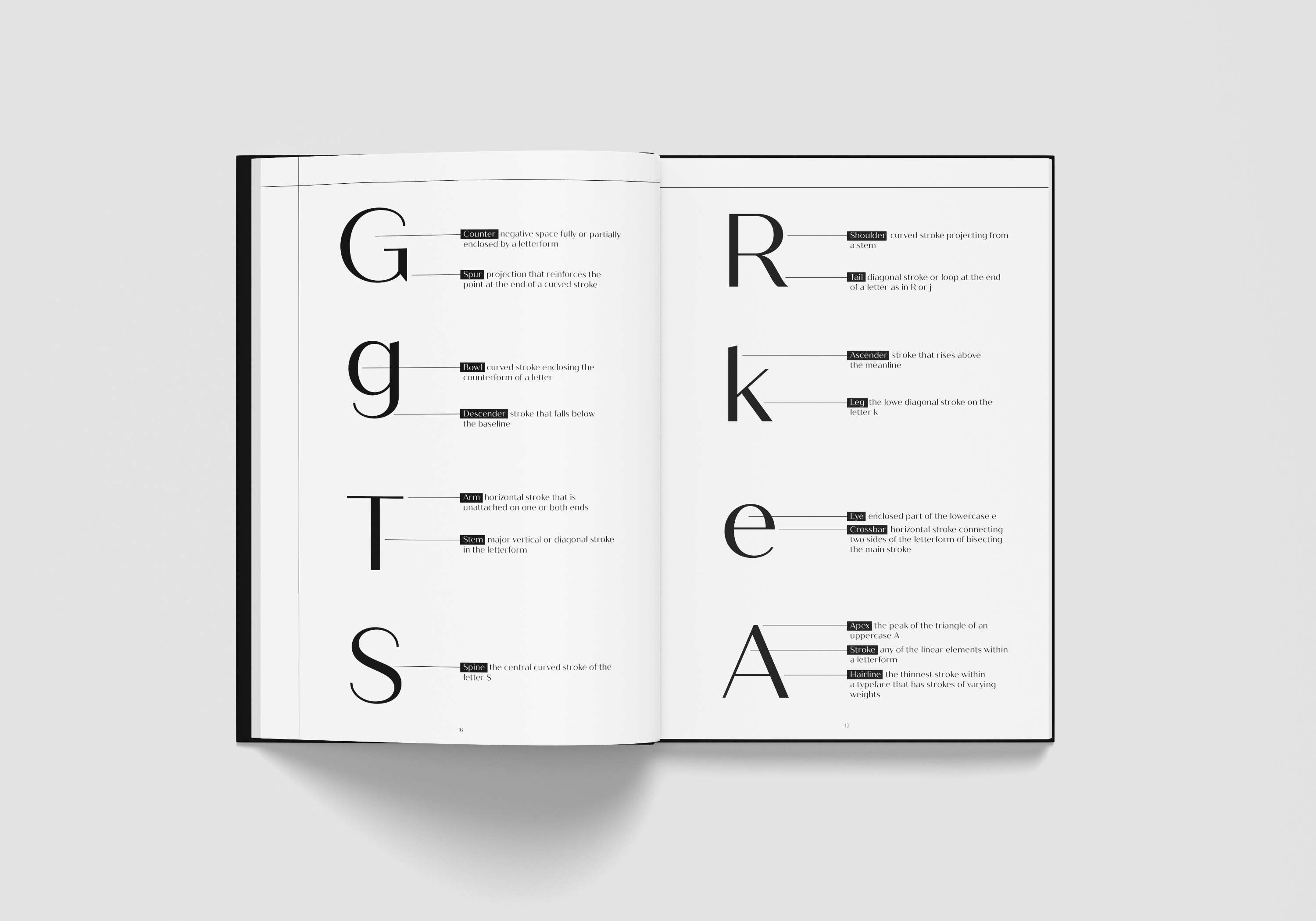
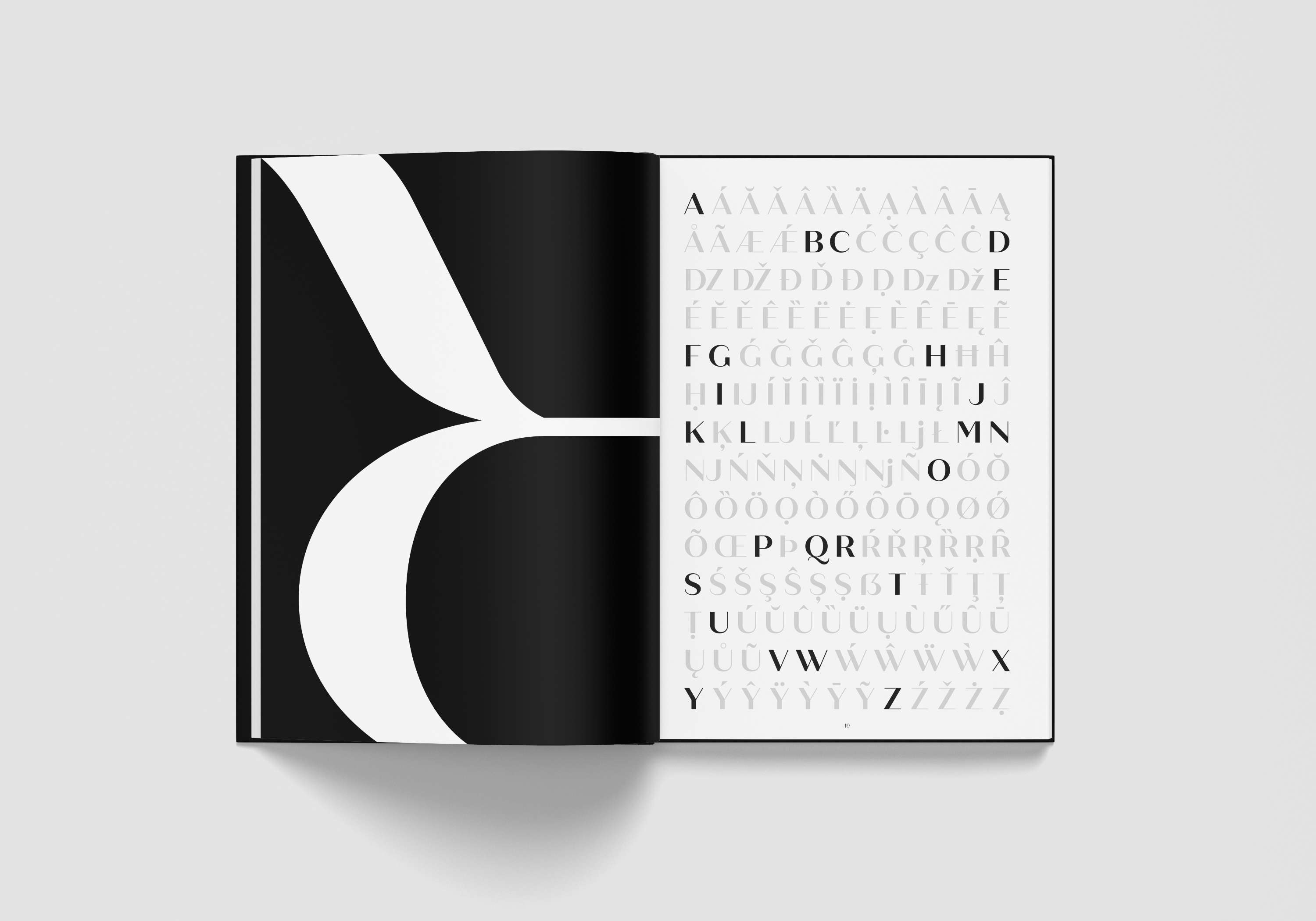
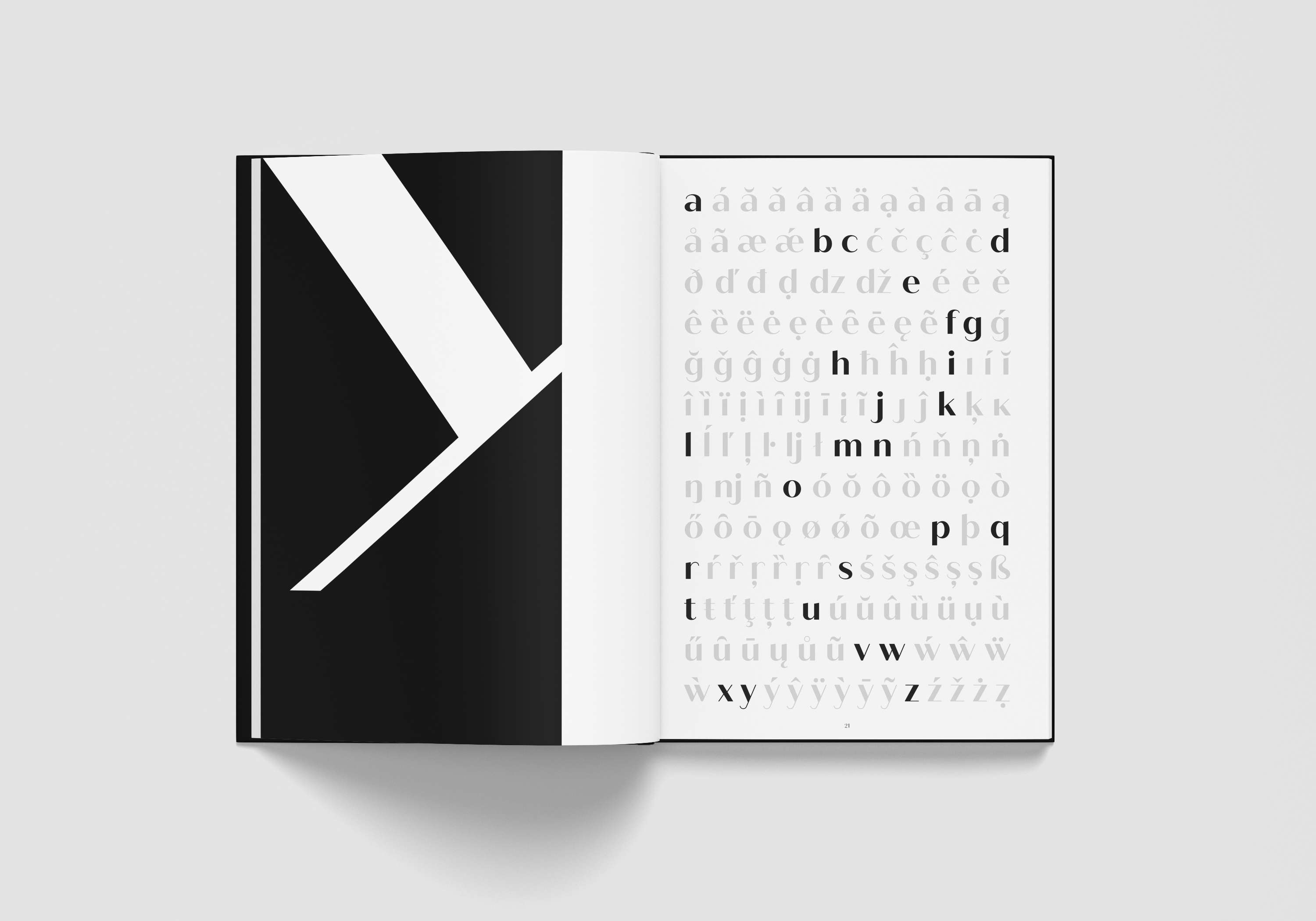
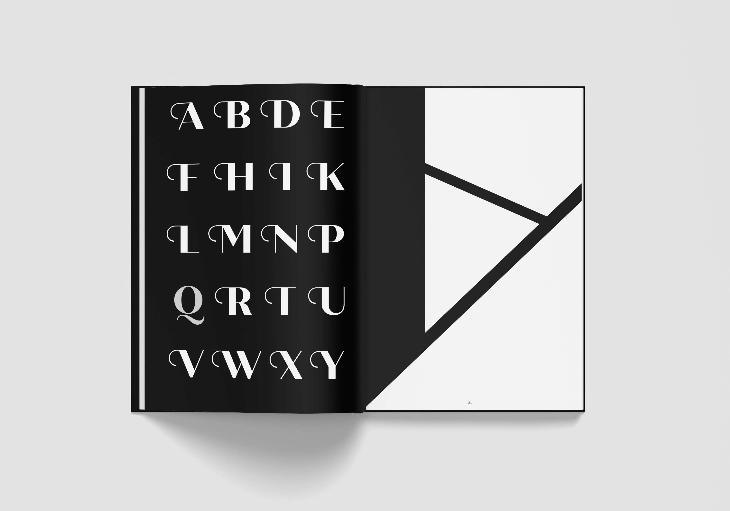
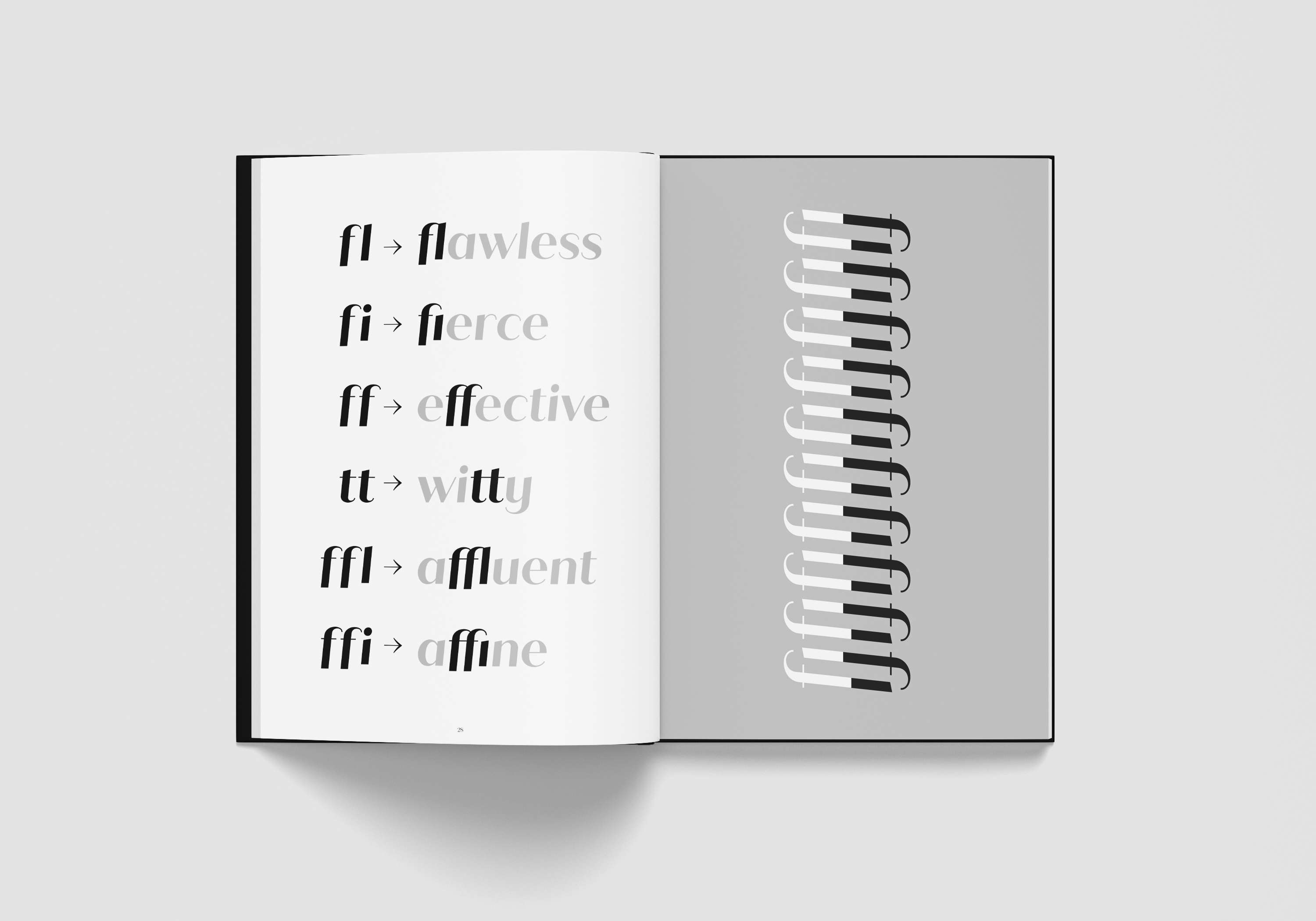
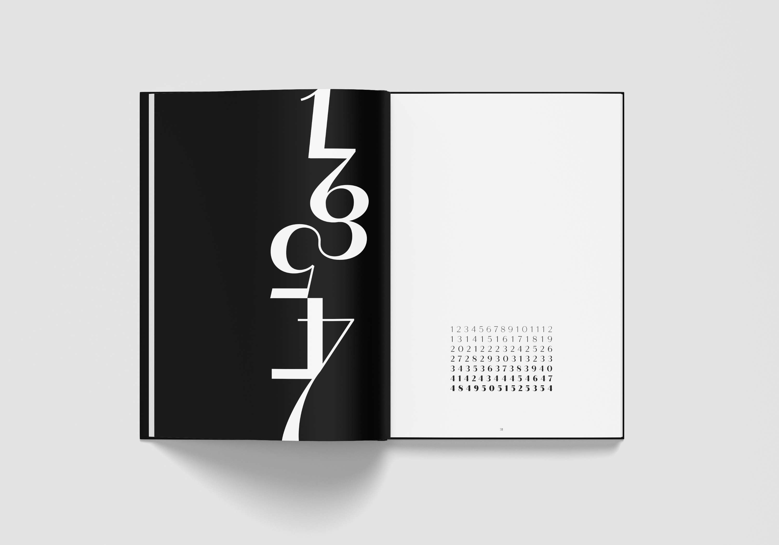
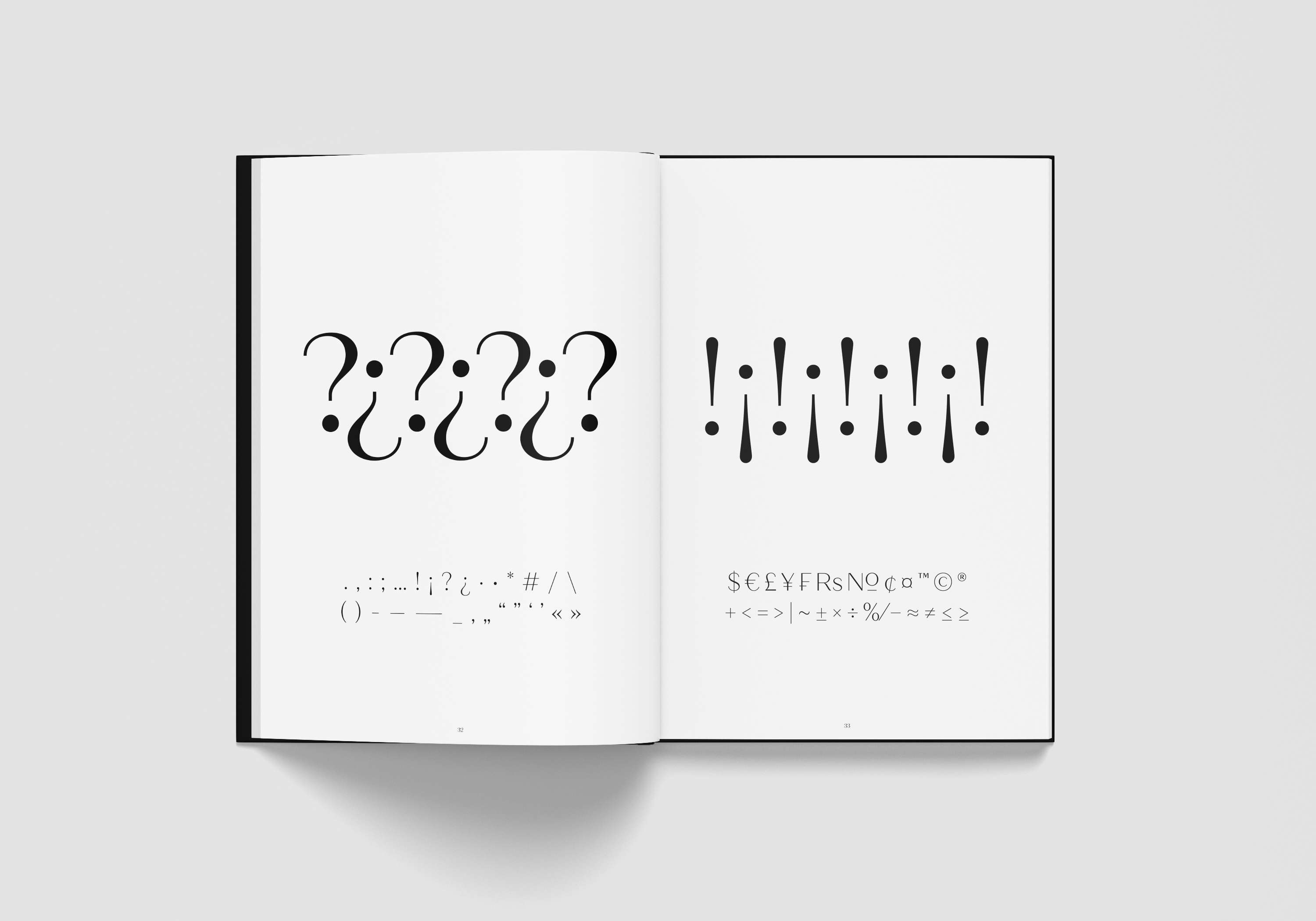
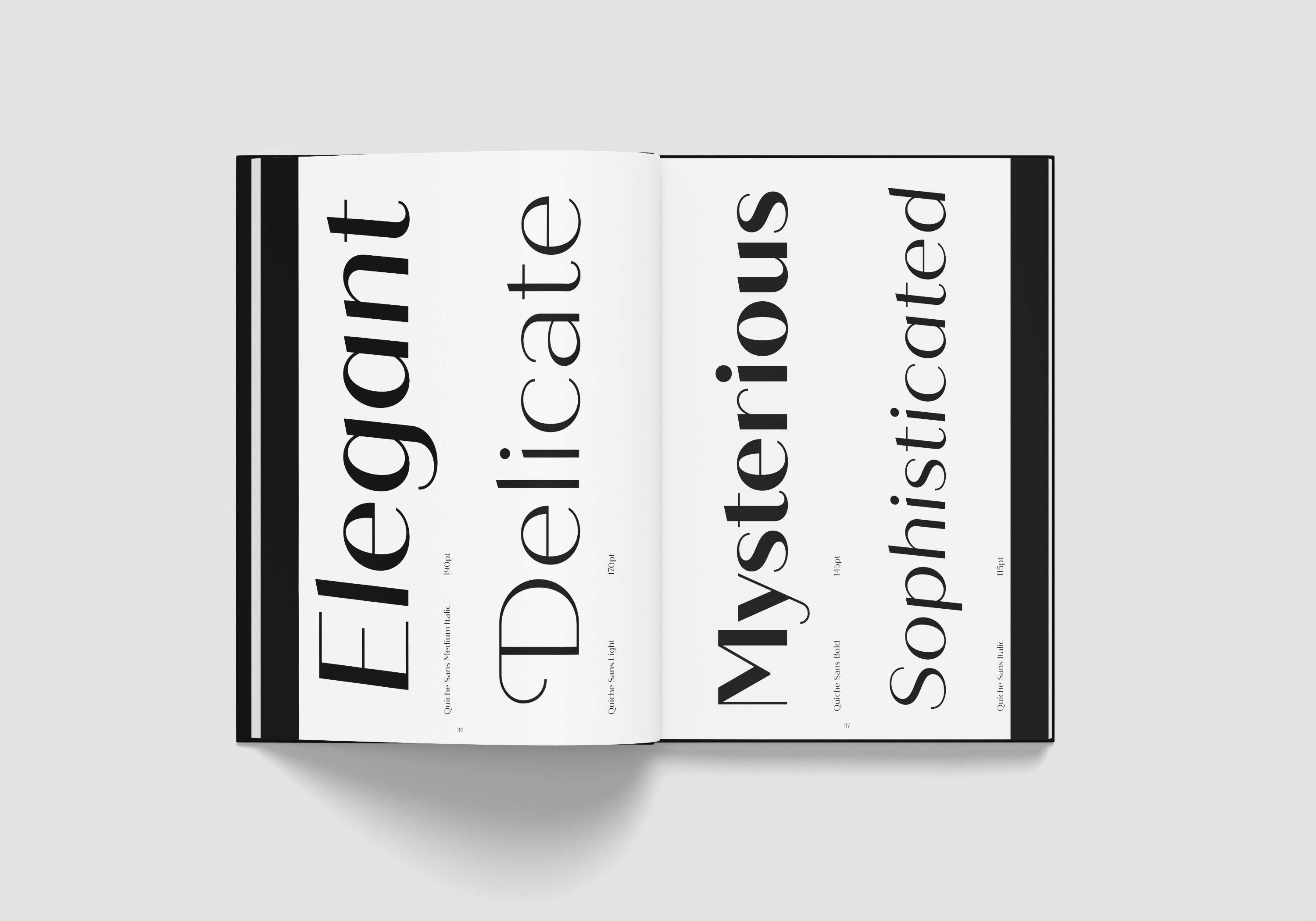
This project represents the typeface Quiche Sans on technical, aesthetic, applied, experimental and expressive levels. The specimen looks at the typeface in detail, identifying its specific qualities, its structure, exploring the weights that constitute the typeface family and the available elements, such as numerals, ligatures and symbols. Moreover, the specimen graphically explores identifiable characters such as the Uppercase A, K, Q, R, W. The aim of the specimen is to represent the range of communicative possibilities that the typeface affords, how the typeface can be used in differing contexts, from display purposes to reading contexts. To highlight the elegant, sophisticated and classy look of the typeface I used black and white only combined with a minimalist style.
