
In 2017, Rimac, the biggest insurance company in Peru, recognized that it was already far behind in the new digital world and desperately needed to reinvent itself.
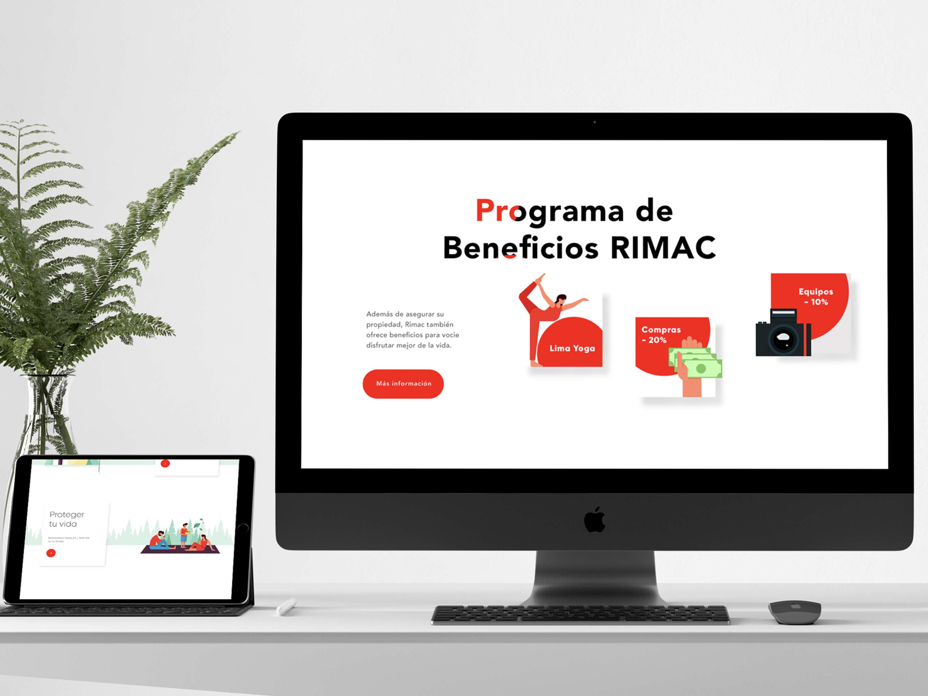
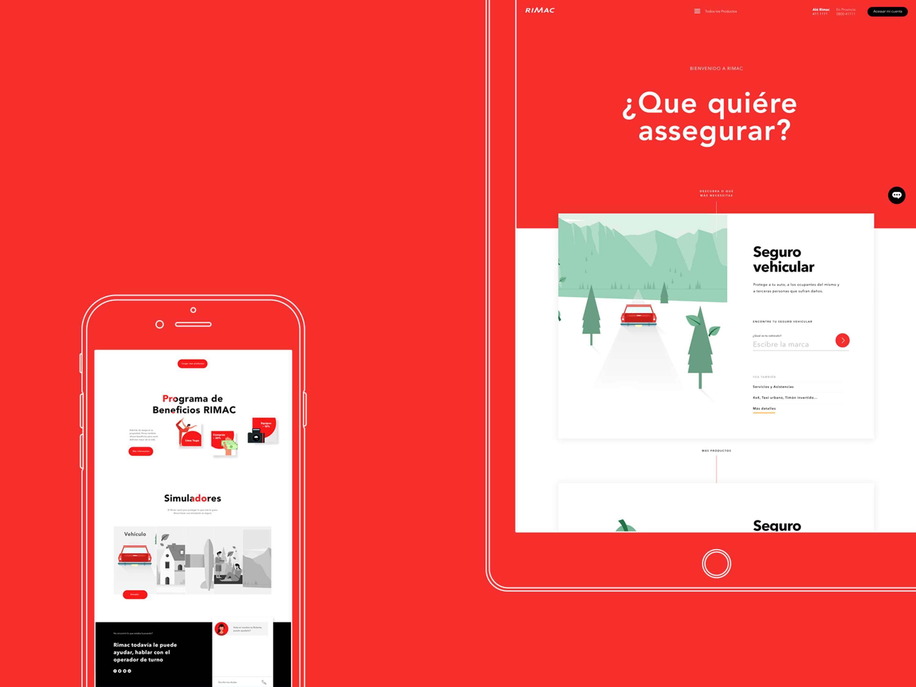
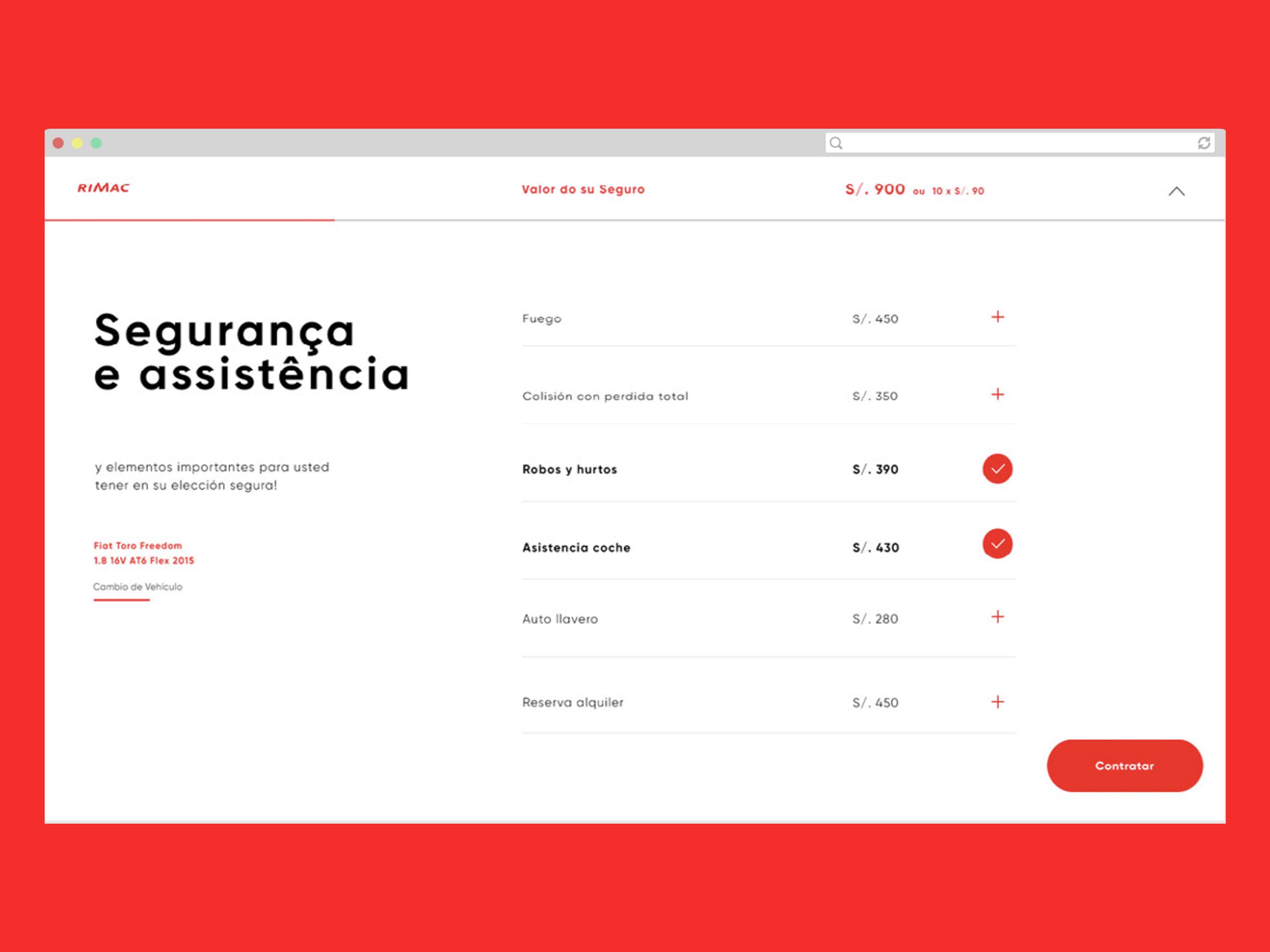
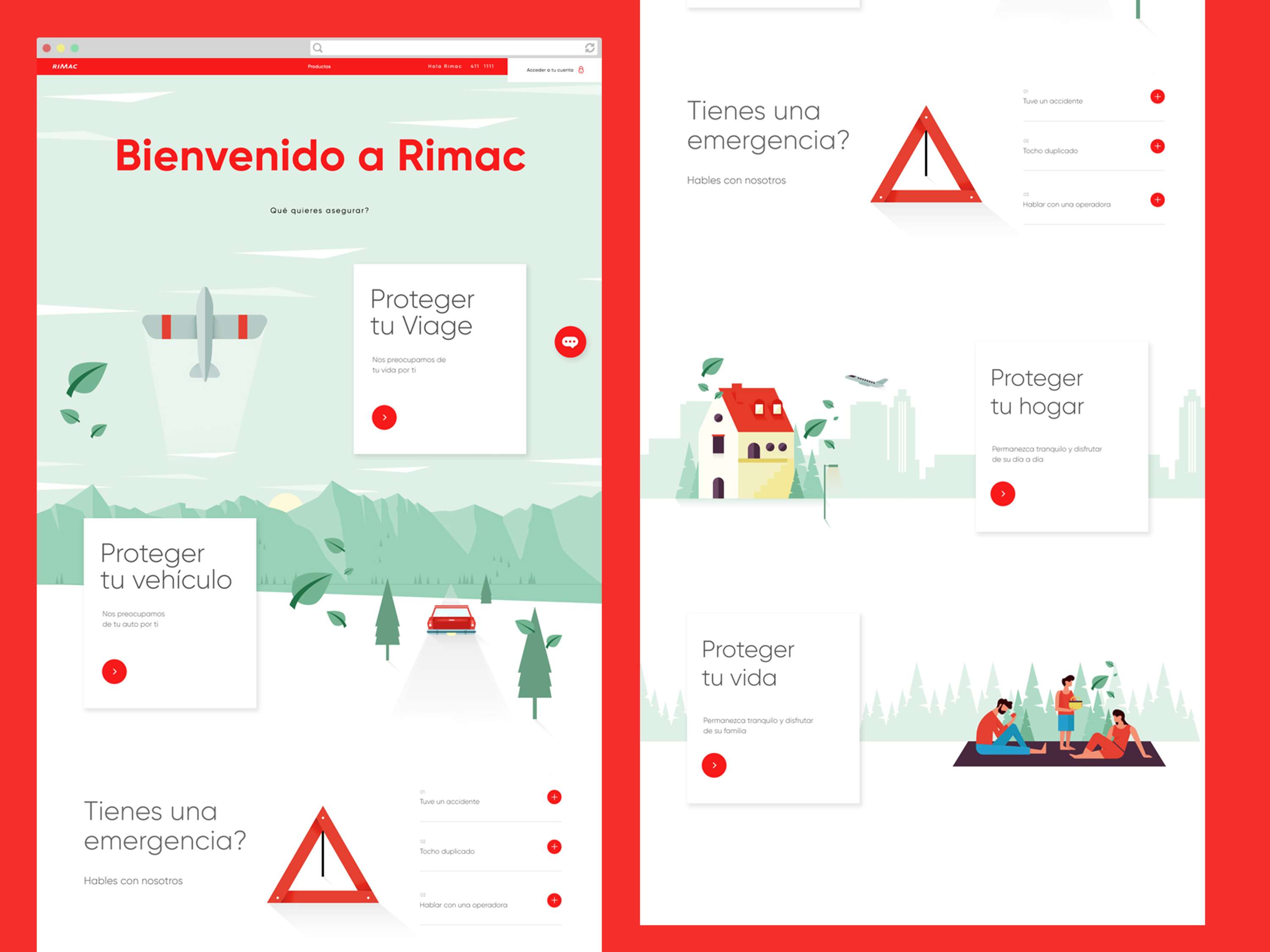
As the company was already using illustrations in their design language, we stayed with that. Their main design color was red and we drew inspiration from that and translated their roots into a new, fresh, and clean digital language. We used illustrations to tell a story and explain their products in an easy, simple, but also fun way. We incorporated that specific red for call to actions, types, and details which gave further significance to the color and brought cohesiveness to the entire site.
Role: Lead Designer
Work Done:
Made all the decisions related to visual design, design flow, user journey, illustration direction, and approval.
It was nice to work with a company that was open to innovation and welcomed new ideas.


Companies

HUGE
- Marketing & PR