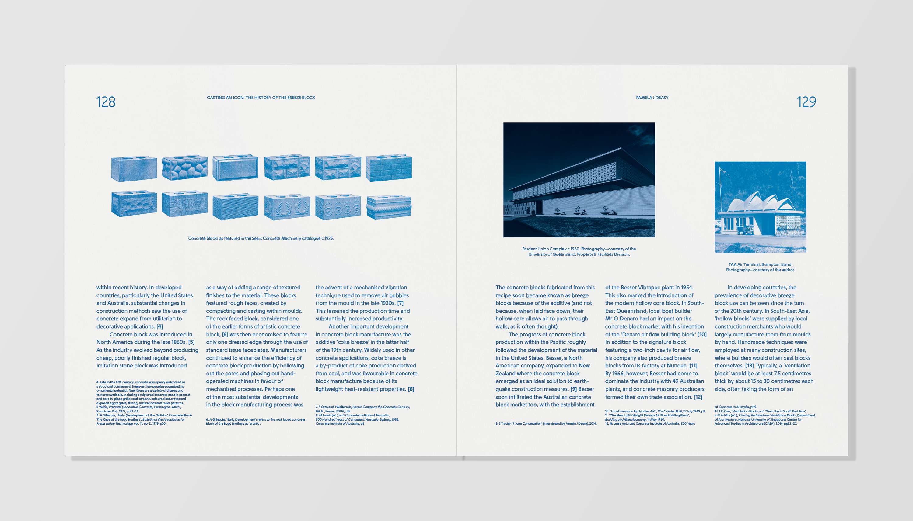
The Breeze Block Book
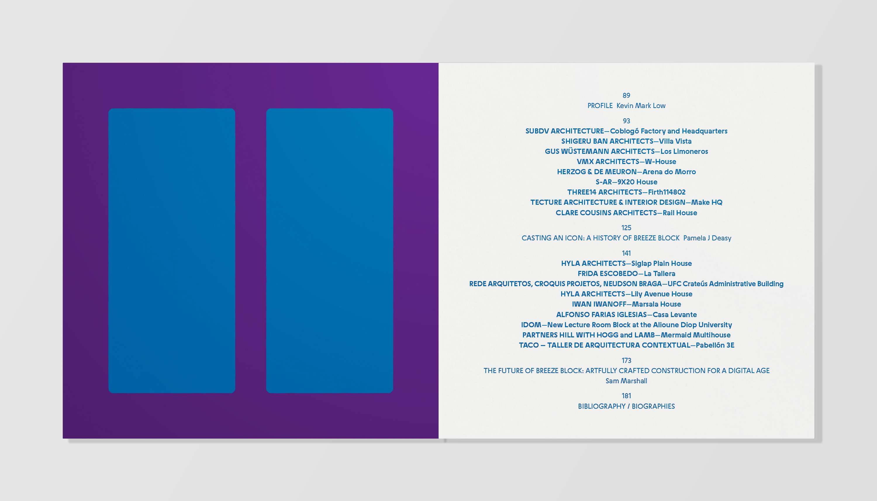
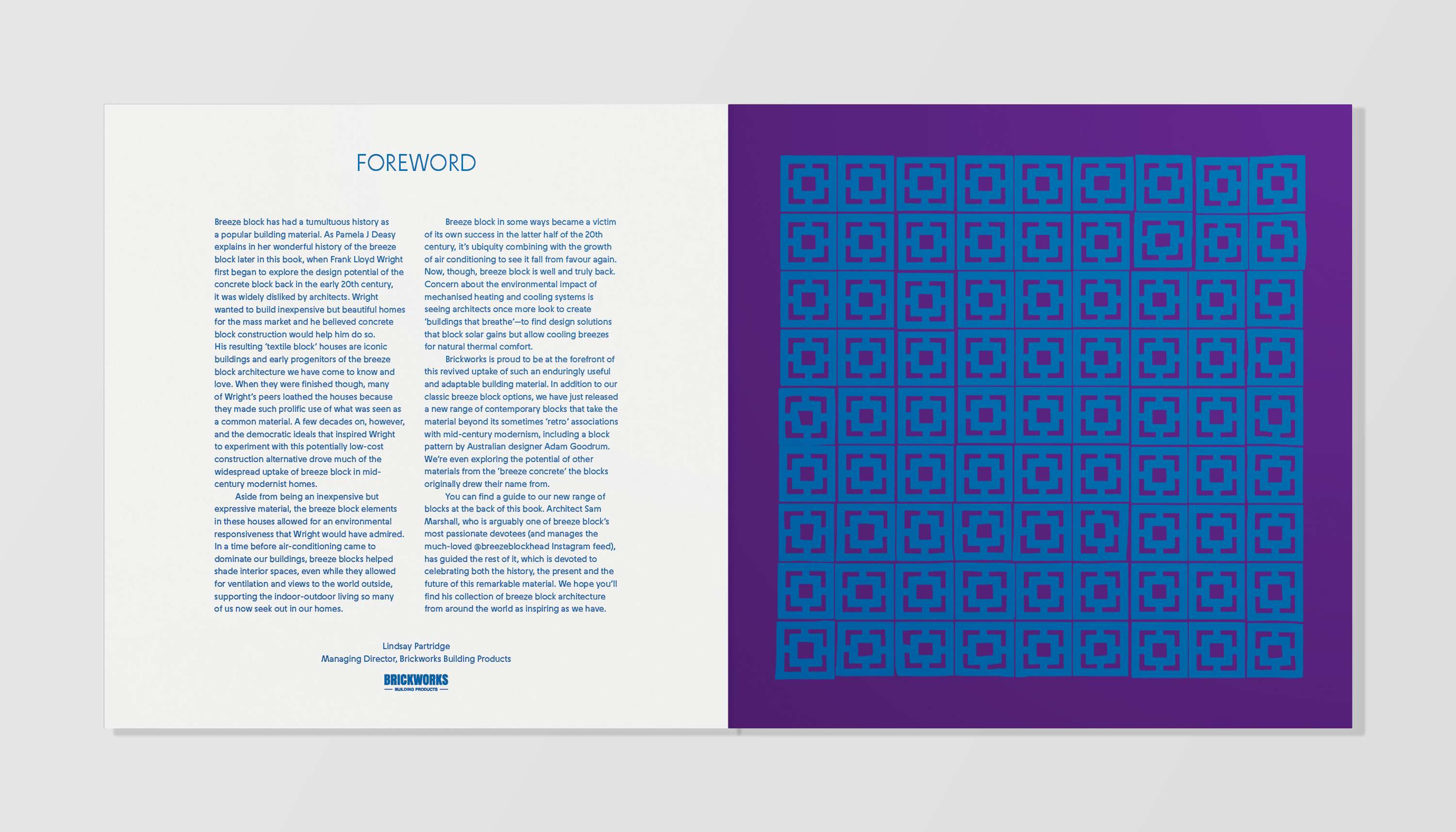
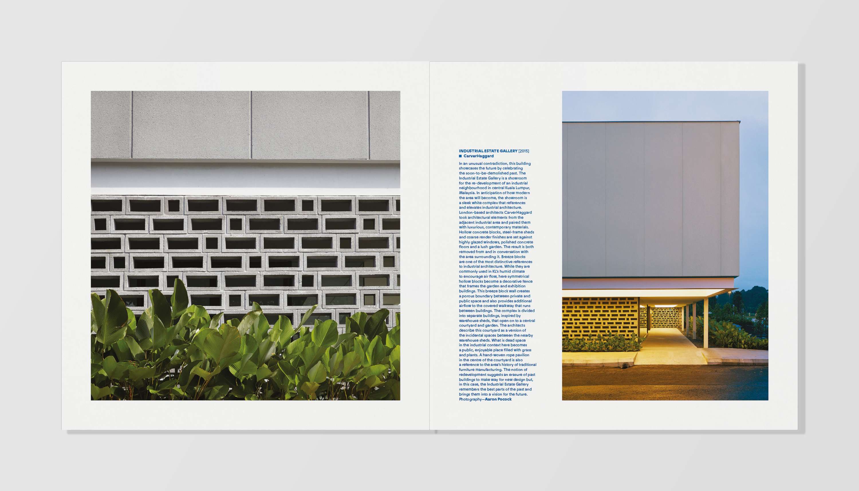
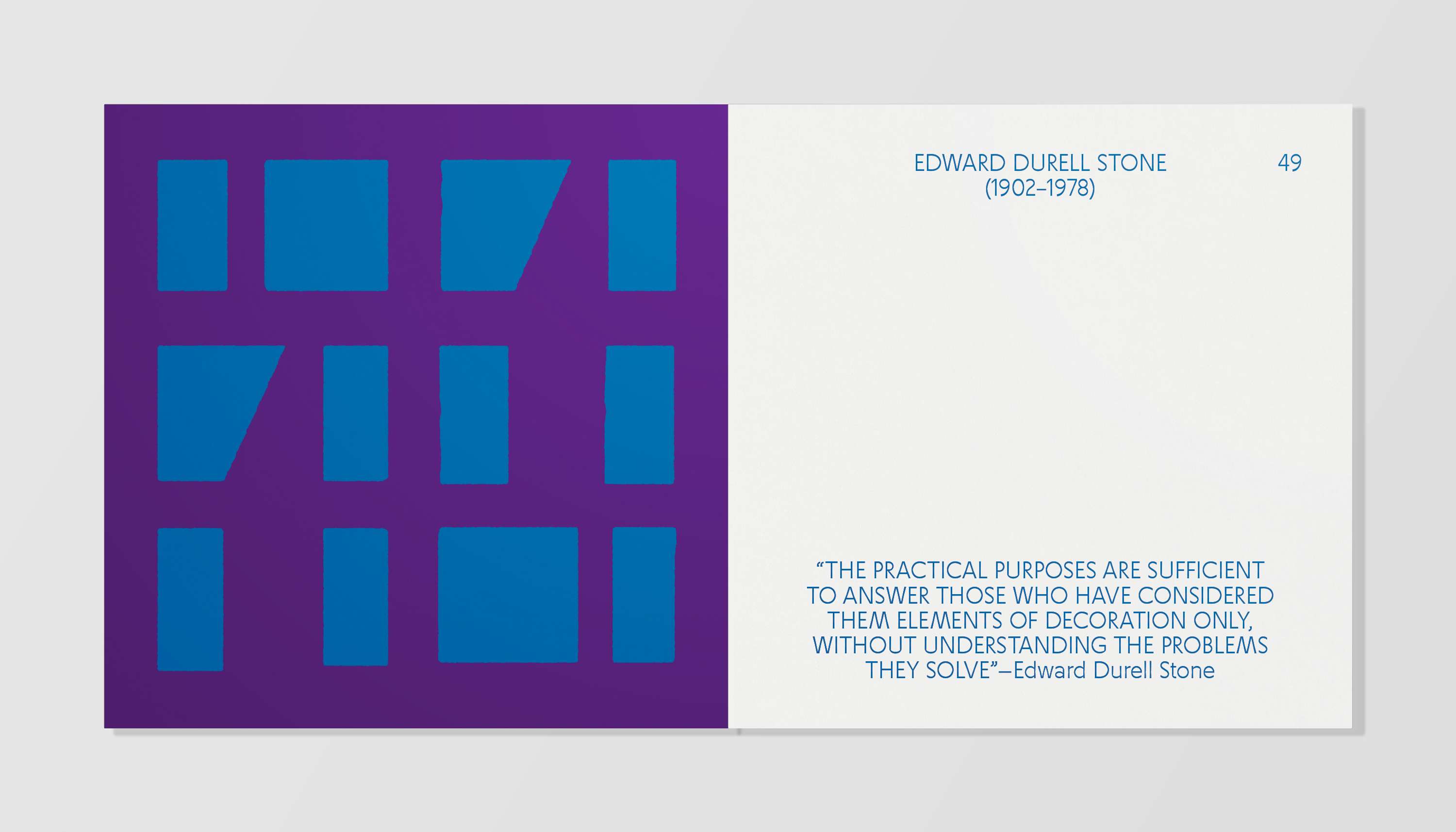
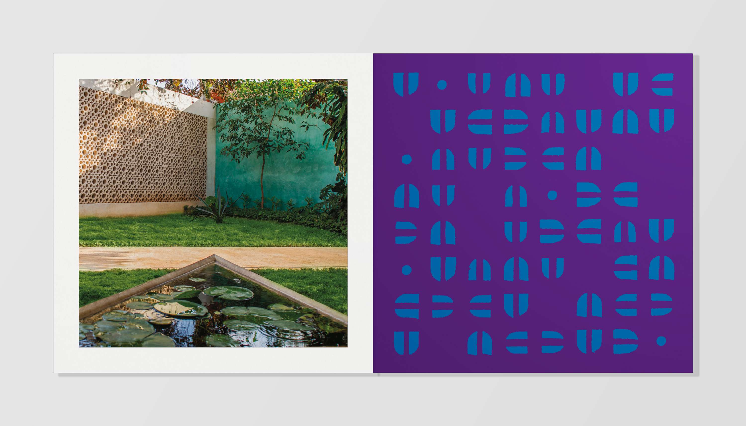
The underlying layout for The Breeze Block Book is an attempt to forego the usual design constraints and directly reference the large, square, block-y forms contained within. To this effect, a loose super scale grid was employed within a rigidly square format. Squared up blocks of text and images were then ‘cemented’ together with the page mimicking the walls and screens featured inside. Added to this mesh was a series of illustrations selected from a wide variety of found and supplied historical references (particularly those of editor Sam Marshall and his inspirational @breezeblockhead Instagram account). Large-scale, starkly geometric forms had their rough textural edges emphasised and enlarged to near actual size, or reduced down in order to form patterns on section dividers. These dividers were then treated as a series in their own right and given a screen-printed, poster-al feel through the use of a saturated colour palette and thick course paper stock.

