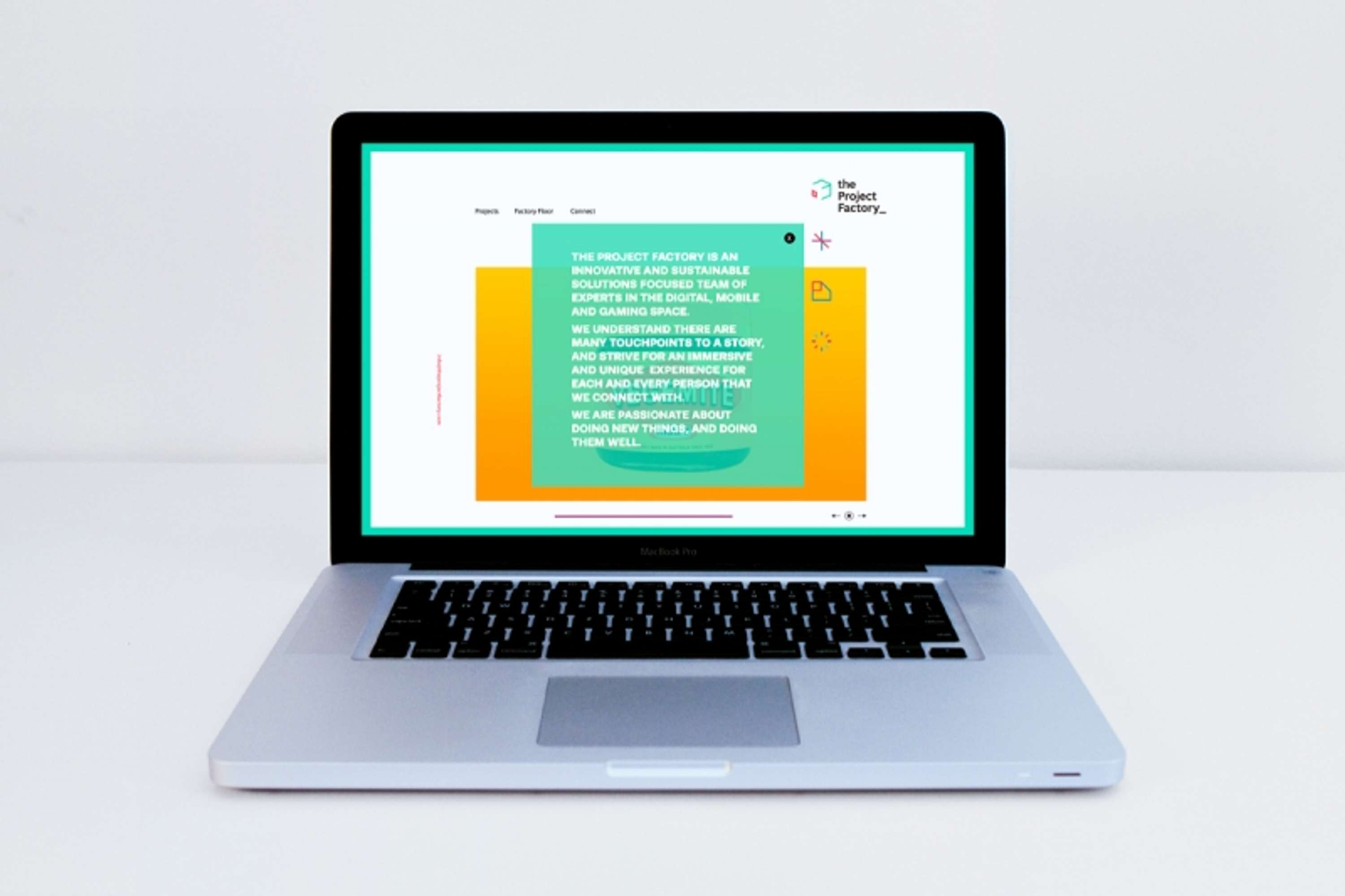
The Project Factory is a digital production company that specialises in innovative and sustainable solutions across the online, mobile and gaming space.
The brand refresh needed to align with a professional tone, as well as showcasing the company's creativity and diverse thinking. As the name suggests, the client also wanted to be seen as producers of a high volume of good quality work.
After a great workshop session with the team, we determined three important points about the identity;
1. It needed to be progressive to reflect the attitude of the company
2. It needed to blur the line between professional practice and fun.
3. It needed to be flexible to cater for each facet of the target audience.
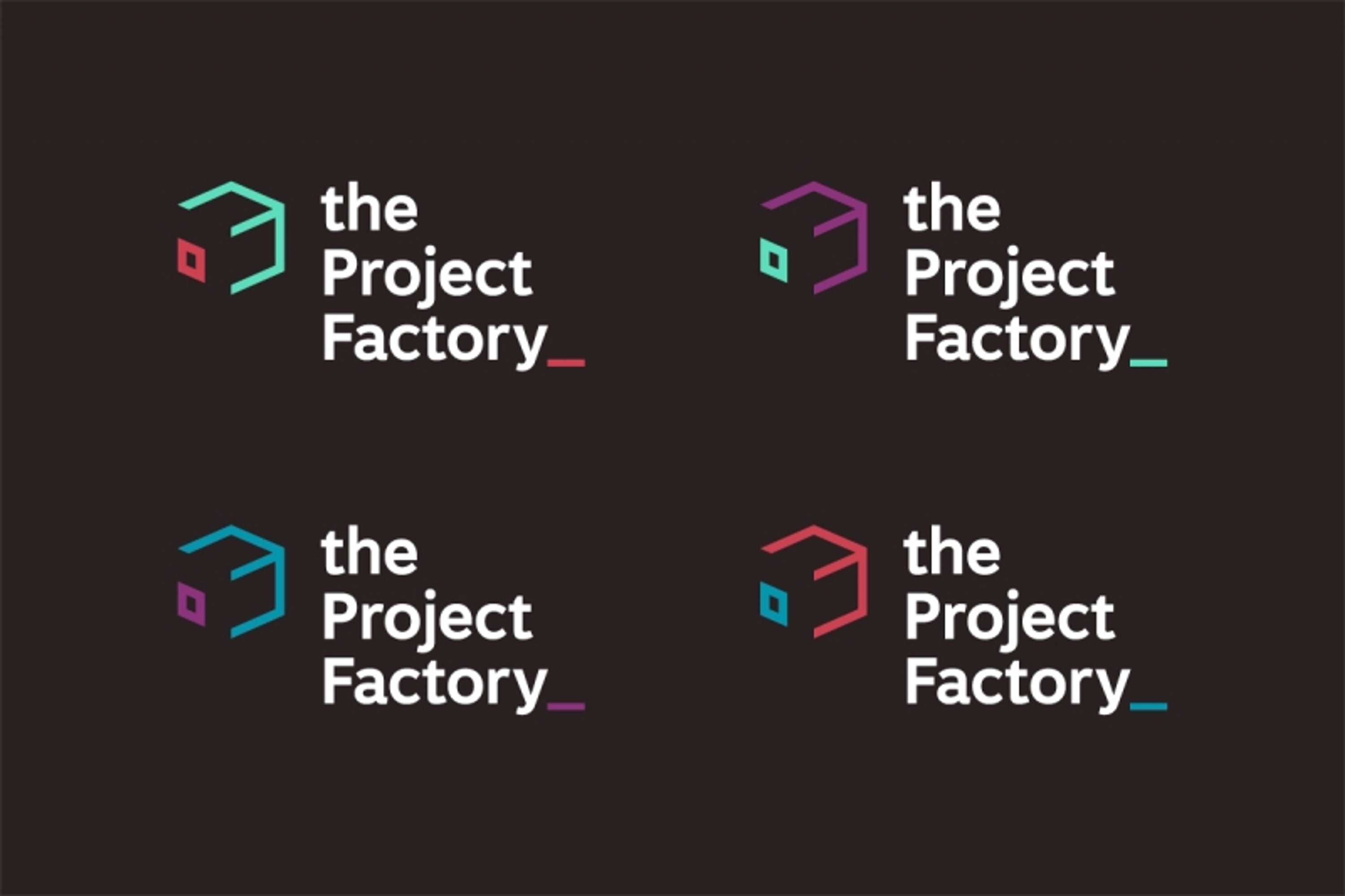
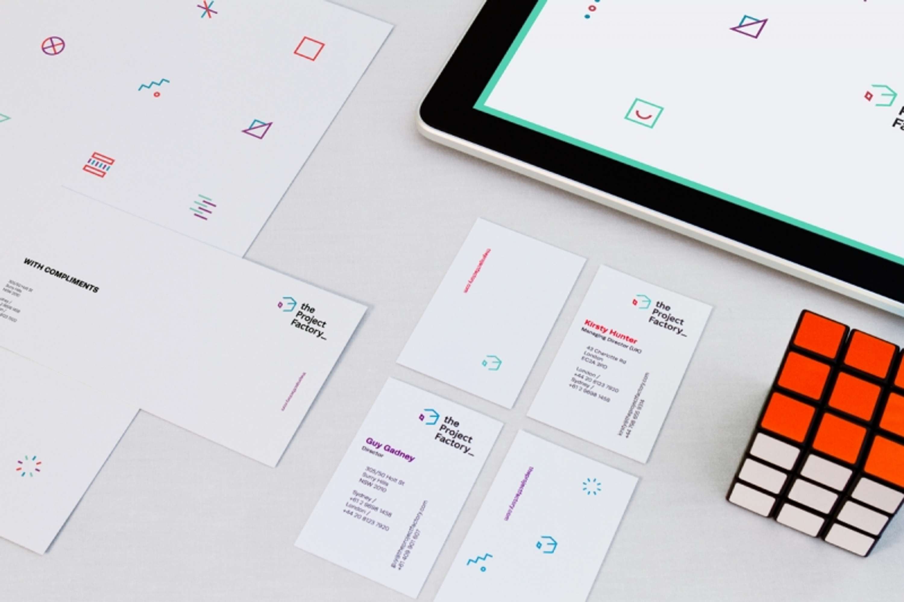
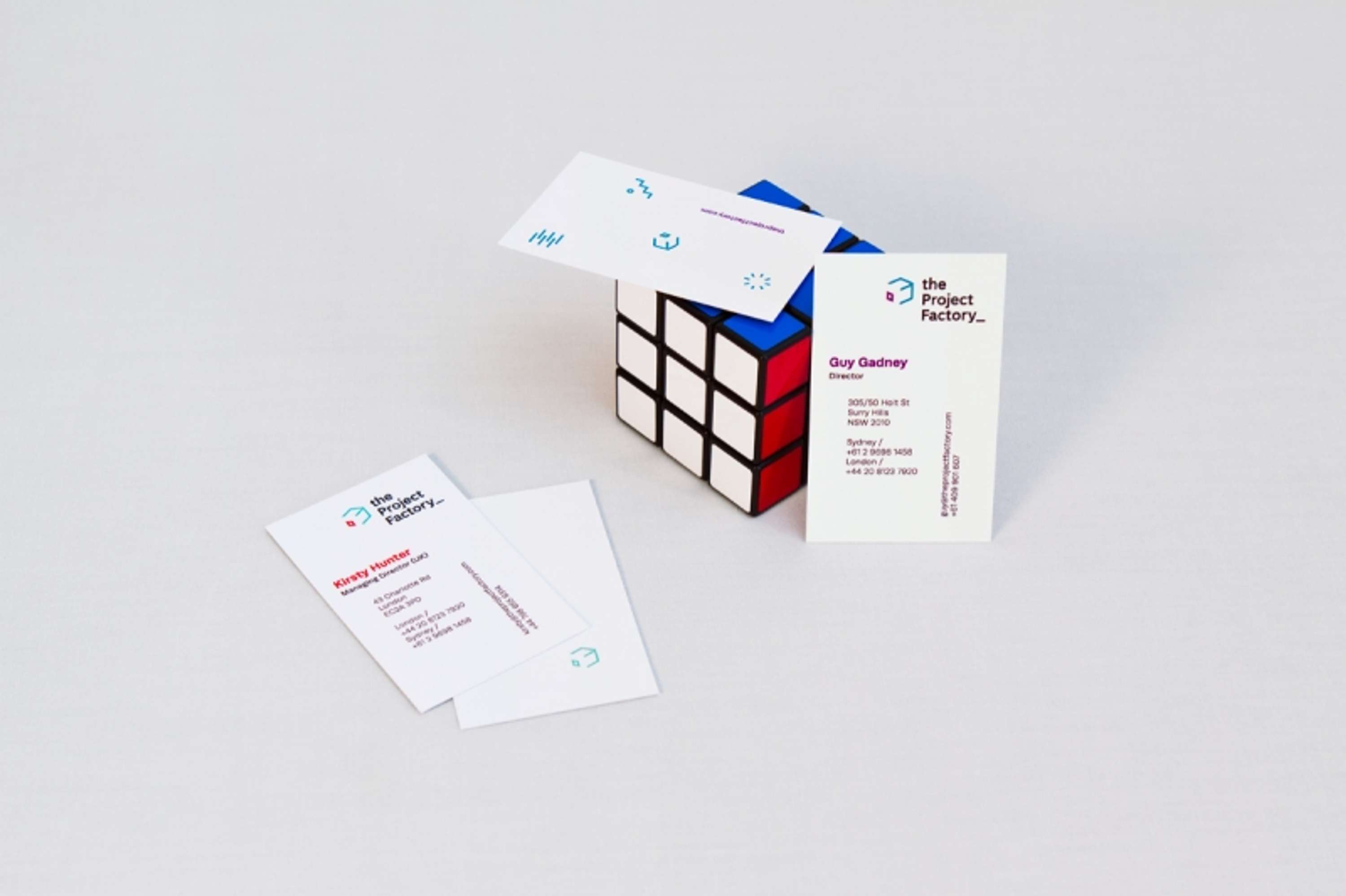
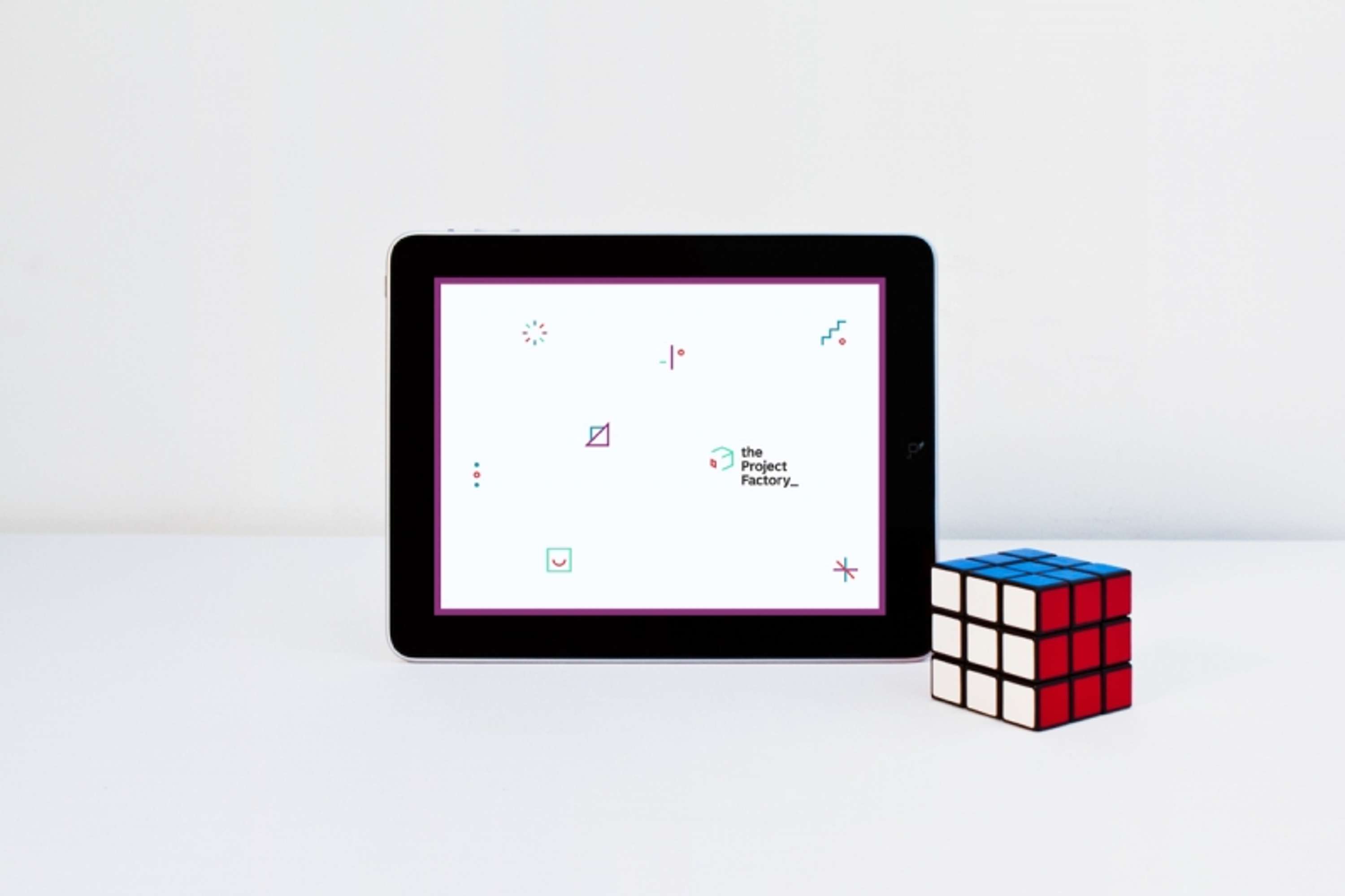
The new brand is inspired by a rubix cube, introduced to reflect the communication and connections that the company has to offer, as well as alluding to a basic iteration of anything digital; the pixel.
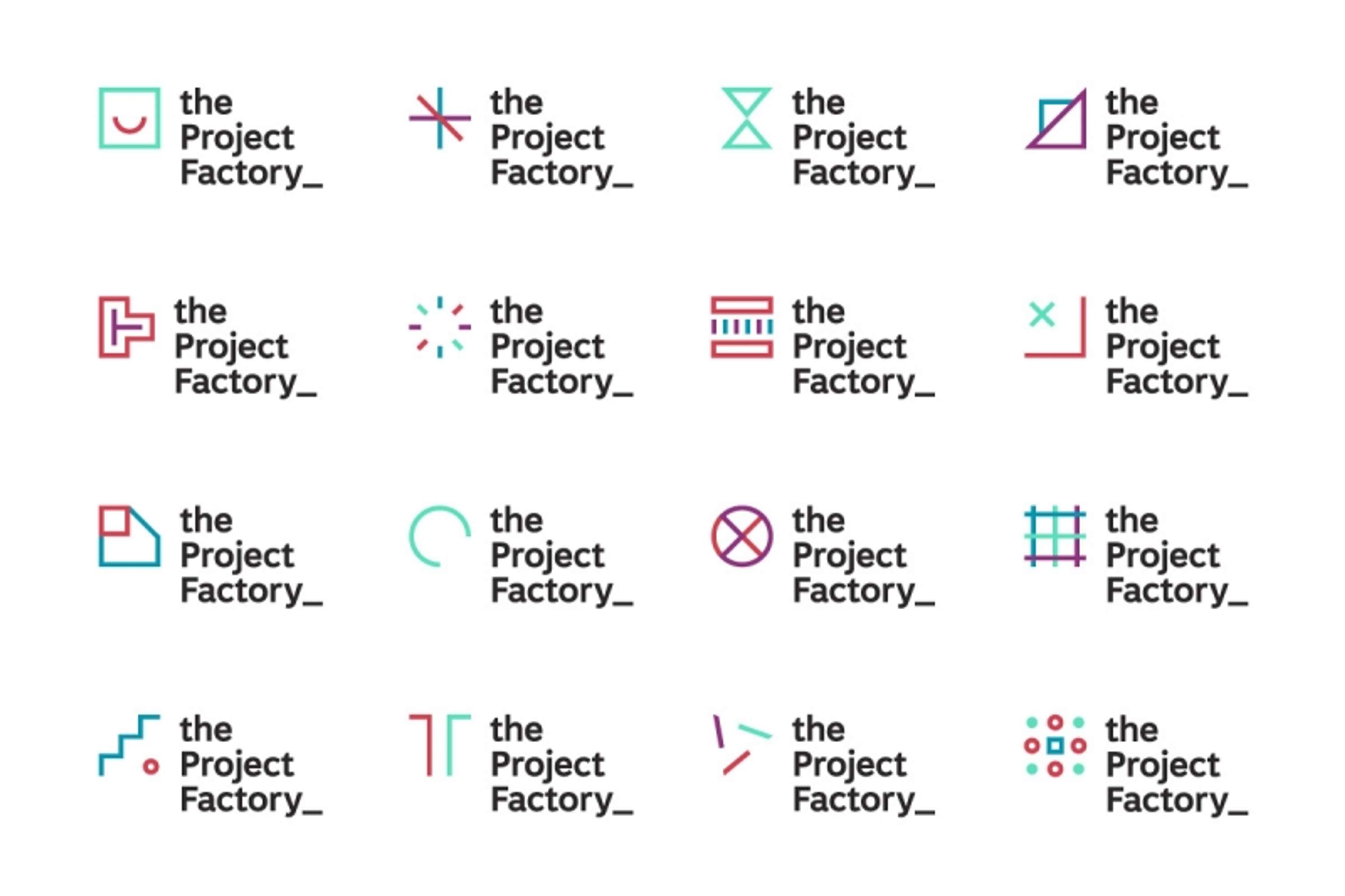
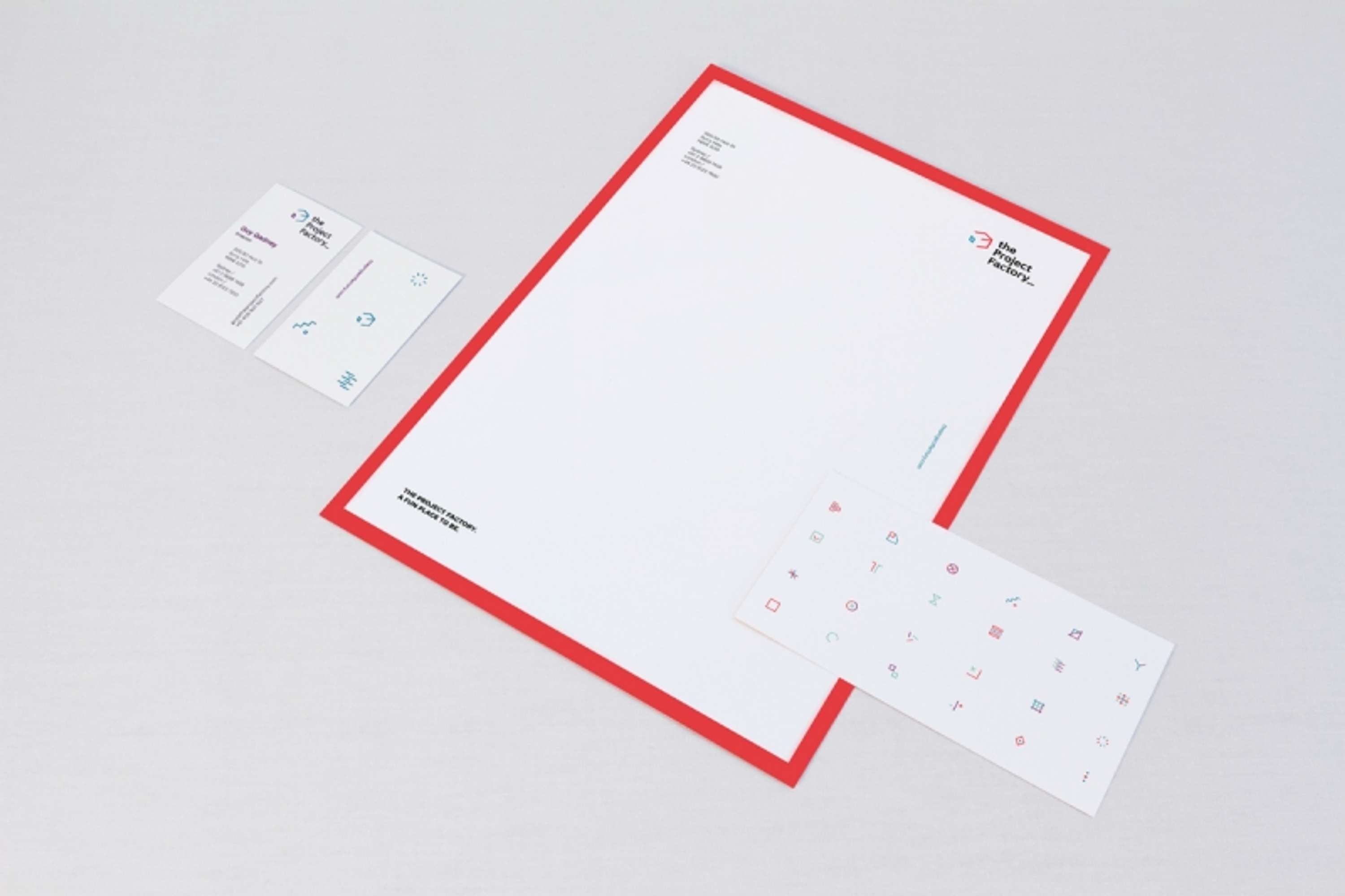
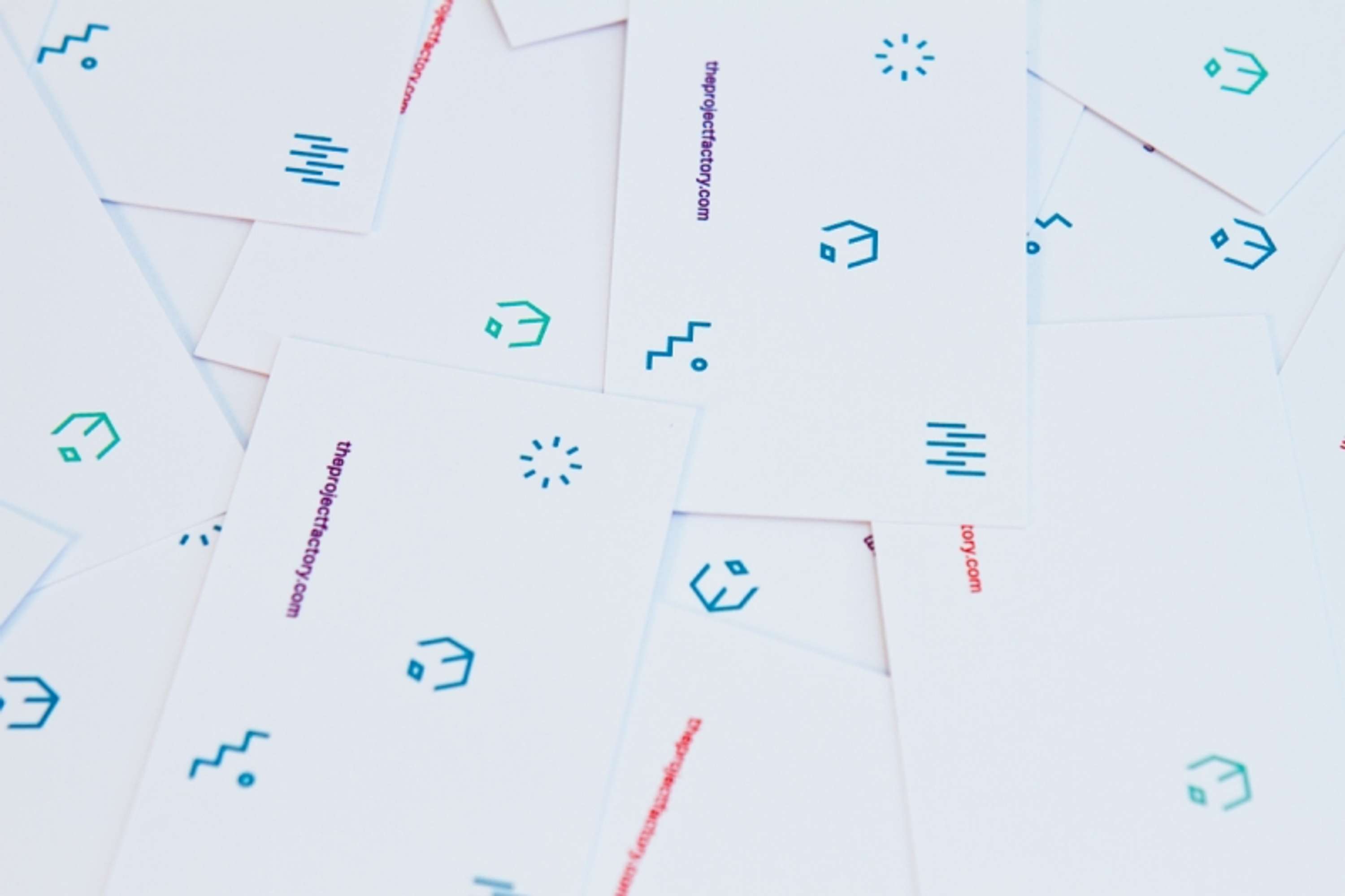
Included in the brand upgrade was an asset suite comprising of 24 symbols. The symbols act as a metaphor for the cogs of the factory turning, and are utilised across the collateral in a variety of ways to give a point of difference.
A kinetic nature was brought into the fold, giving flexibility to applications across an online and digital context.