Brief in brief:
With an ambition to reposition Apetina as a cooking cheese brand, Arla Foods briefed Bulletproof to create a contemporary new brand visual identity and packaging design that would drive reappraisal, inspiring ‘casual creative cooks’ (those who enjoy experimental cooking and love entertaining in the kitchen) to become more inventive with their cooking habits and start introducing Apetina into their cooking repertoire rather than just using it in the salad bowl.

Our thinking and doing:
We had licence to be bold and disruptive from the get-go in order to shake up the category and change the mindset of our target consumers. Through the established lighthouse identity, our rallying cry was ‘Let’s Play in the Kitchen’. This grounded our product firmly in the cooking arena, while giving us the ability to be playful and expressive.
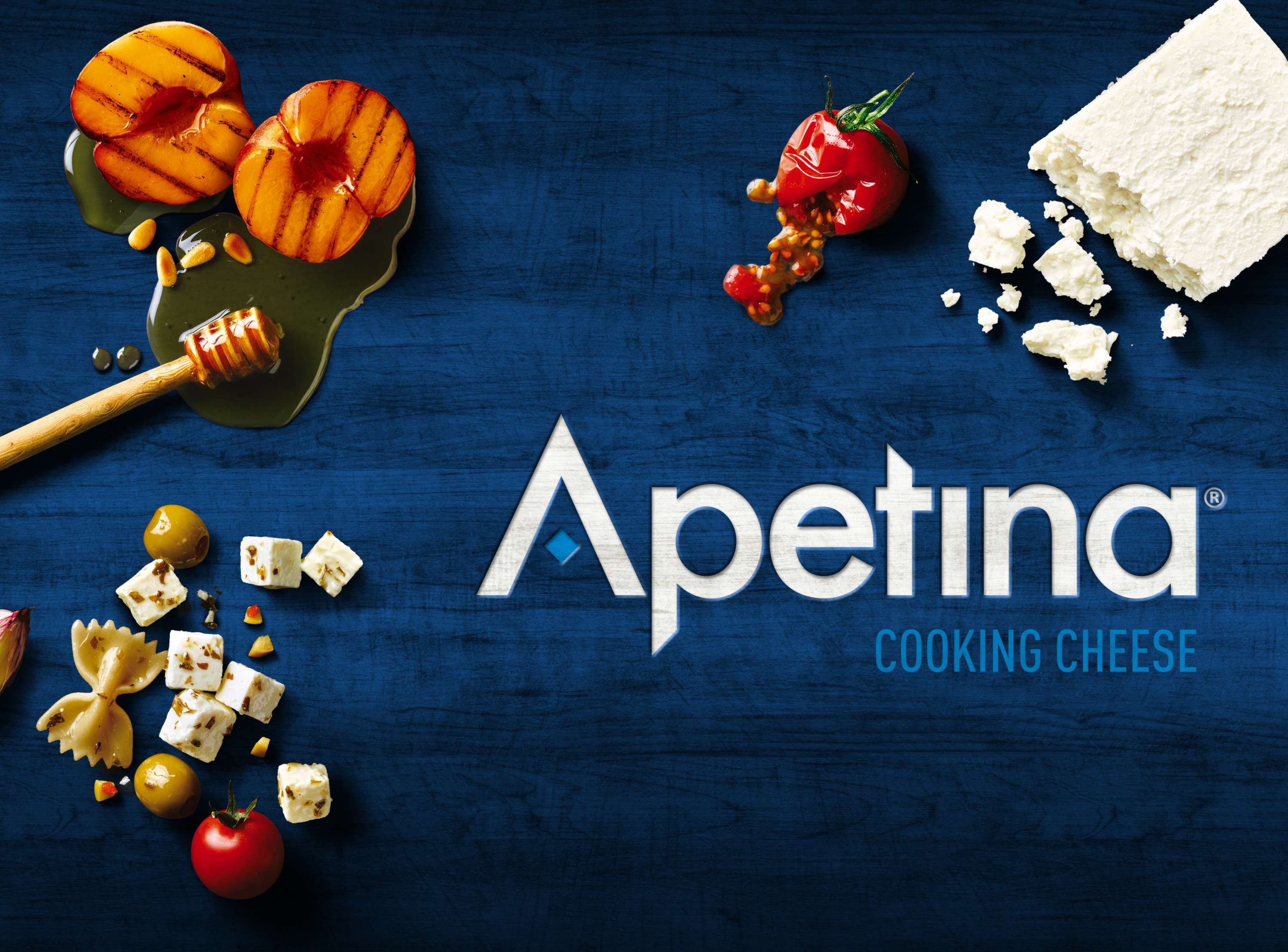
The current cooking cheese category is an ocean of cold blue and white, with lacklustre photography focussing on salads and unappetising white cheese. Our aim was to shake up the status quo and dynamically bring to life on pack the exciting culinary opportunities that exist when cooking with Apetina.
Taking centre stage in our design is the new Apetina diamond device, which frames an array of delicious, fresh ingredients chosen to complement each variant, alluding to the exciting variety of recipes that can be created with each cheese.
The sumptuous photography is shot top down and captures a real moment within the cooking process without showing final or perfect dishes. This encourages individual expression through culinary experimentation, while ensuring our offer remains attainable. The packs also feature supporting copy on the lids and sides to reinforce the front of pack recipe suggestion.
The brand mark has been simplified and locked up with the new Apetina diamond device, forming a consistent and ownable equity the brand can use on and off-pack moving forward, while ensuring portfolio harmonisation for the 60+ SKUs. A fresh and bold, dark blue colour palette set on a natural wooden texture finishes the design to give maximum shelf impact in store and add natural culinary cues.


