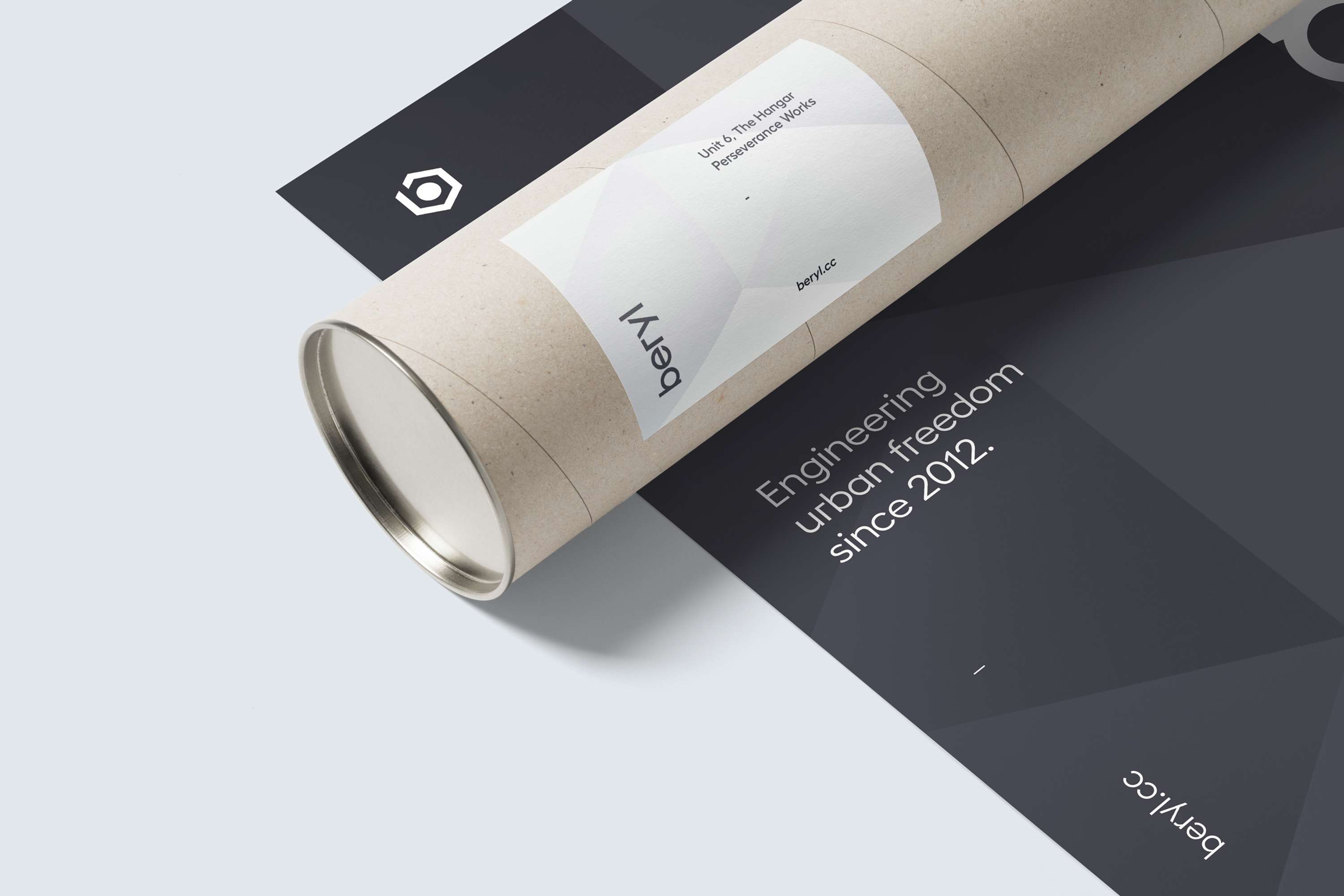
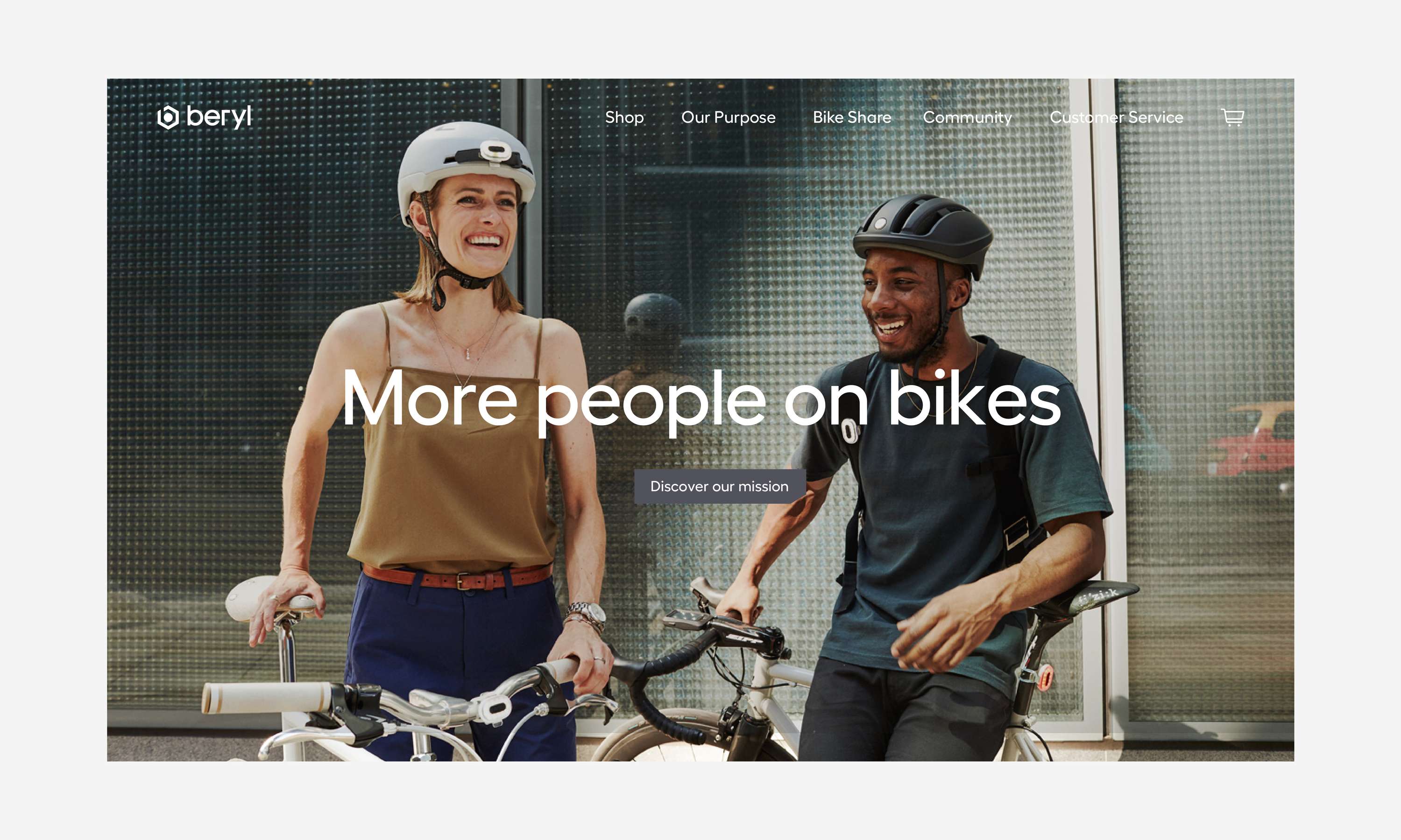
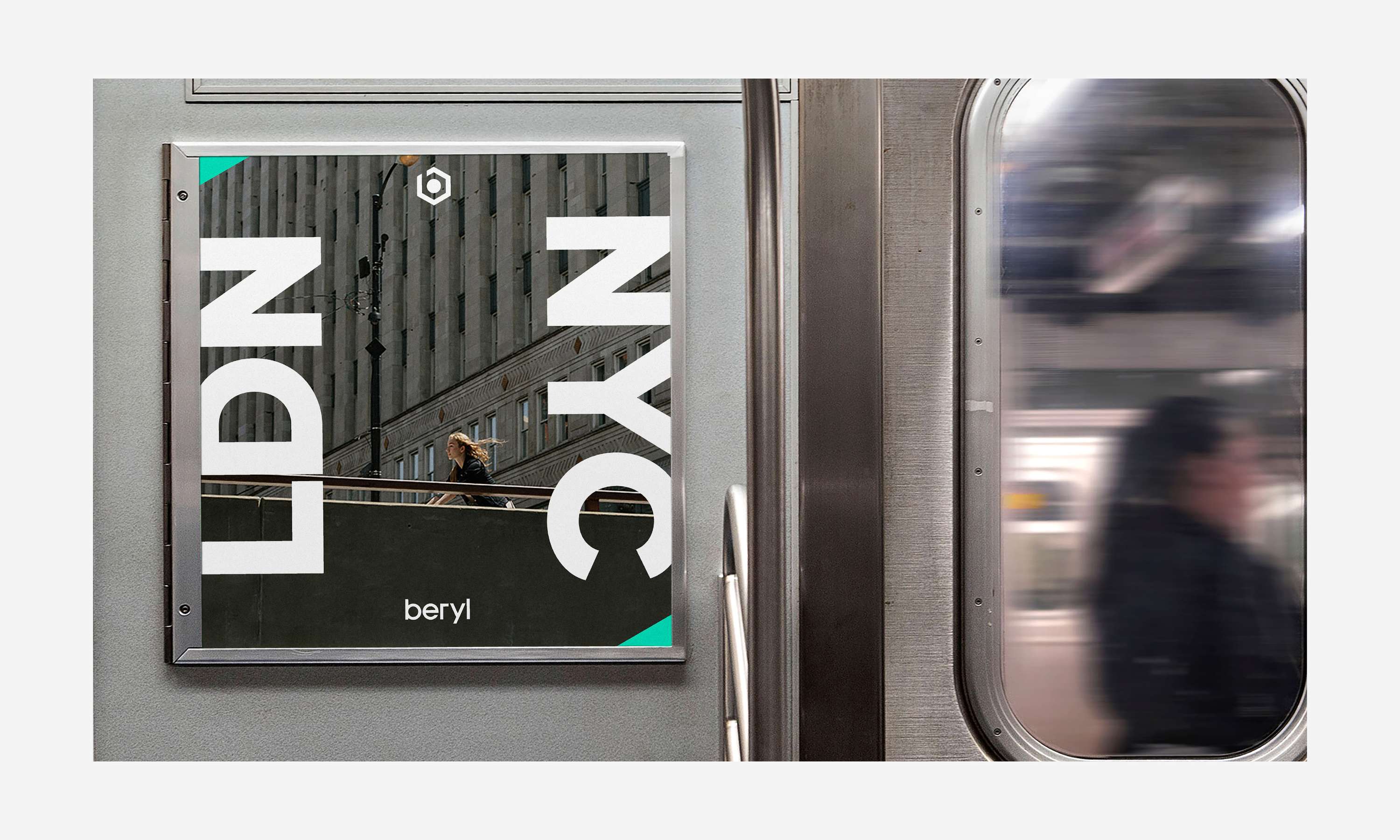
Beryl Visual Identity

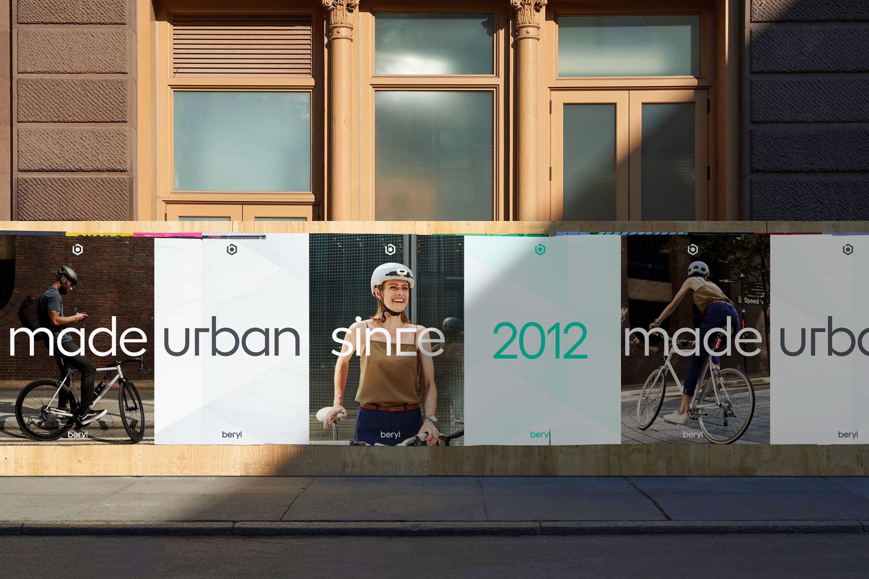
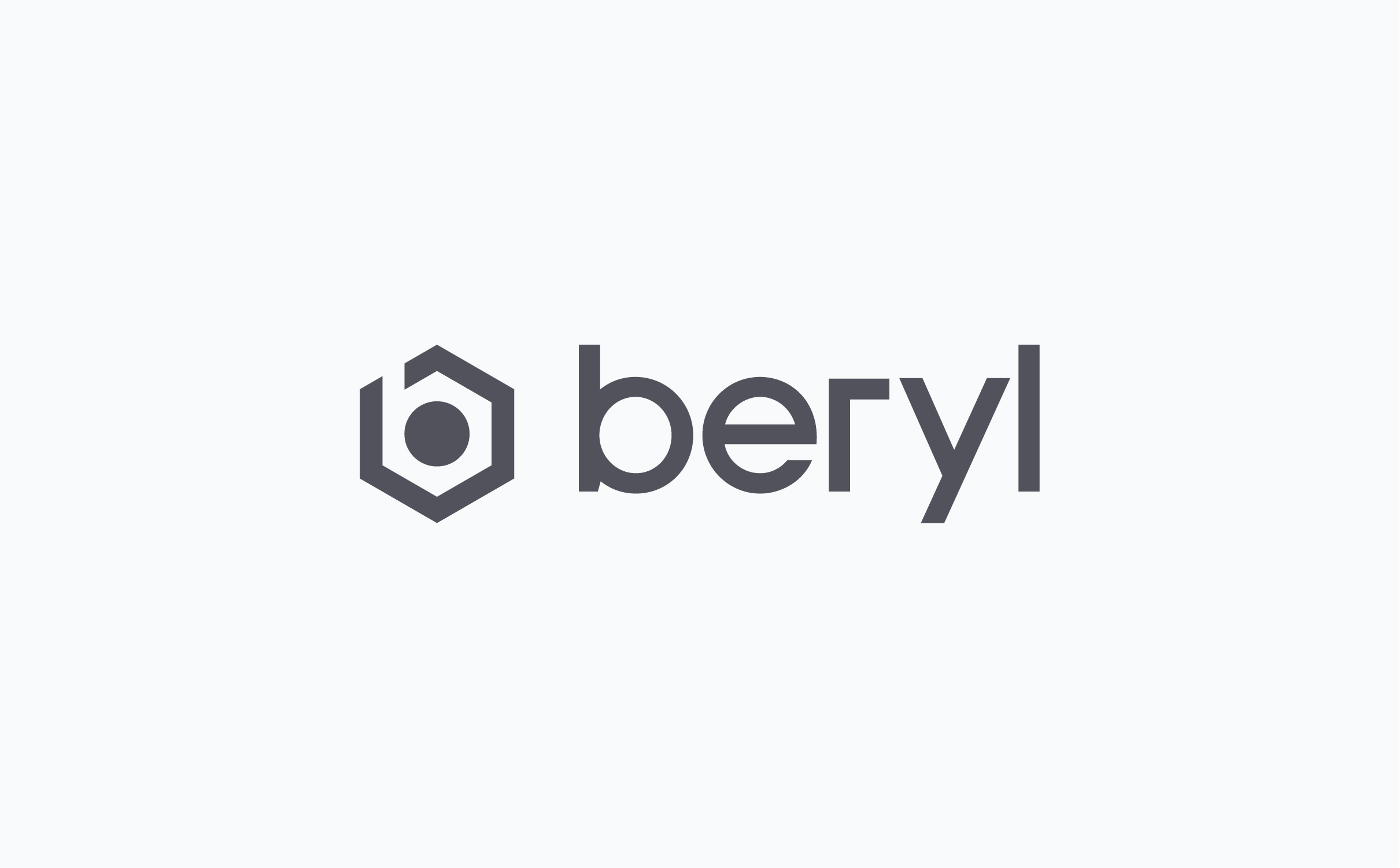
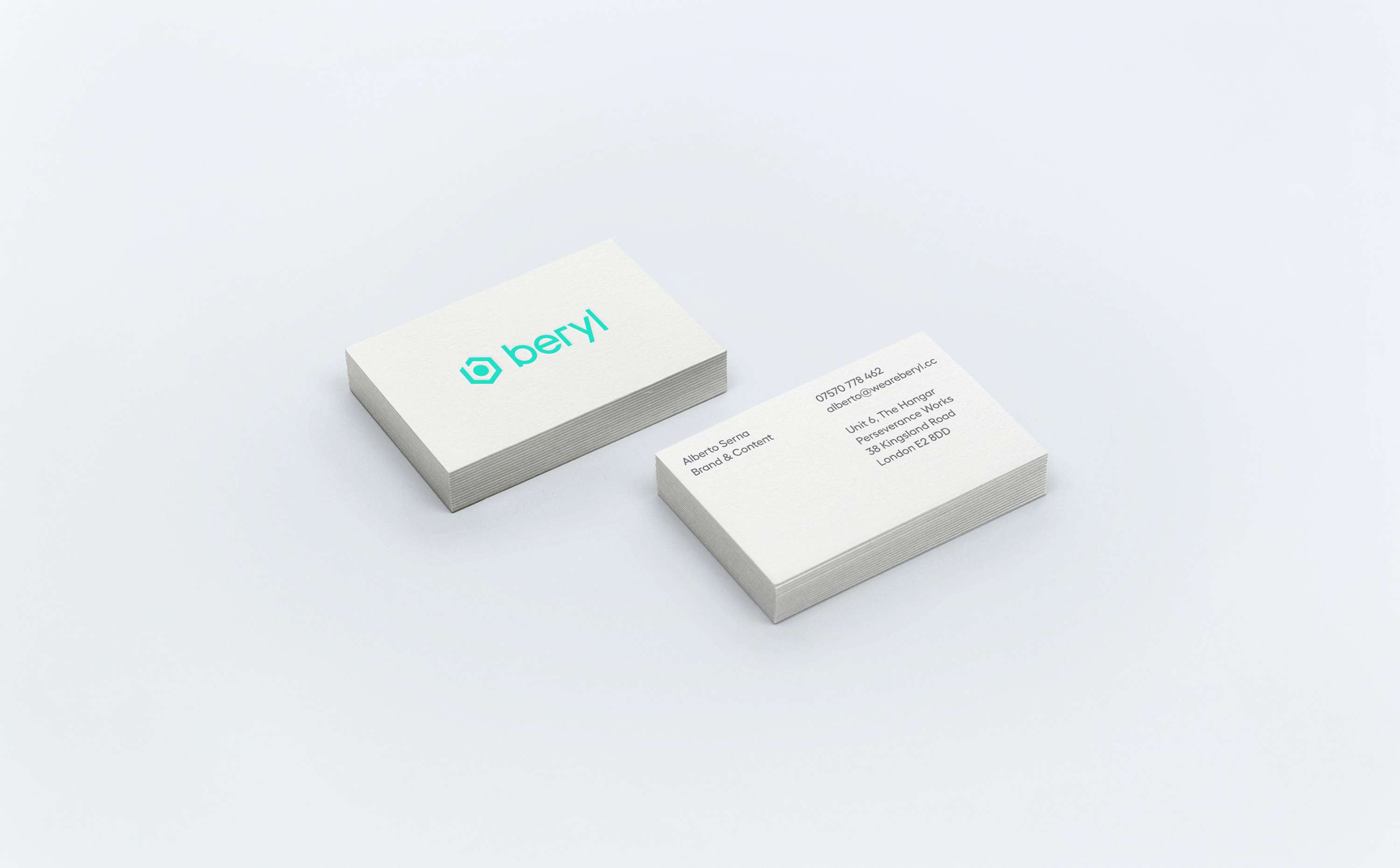
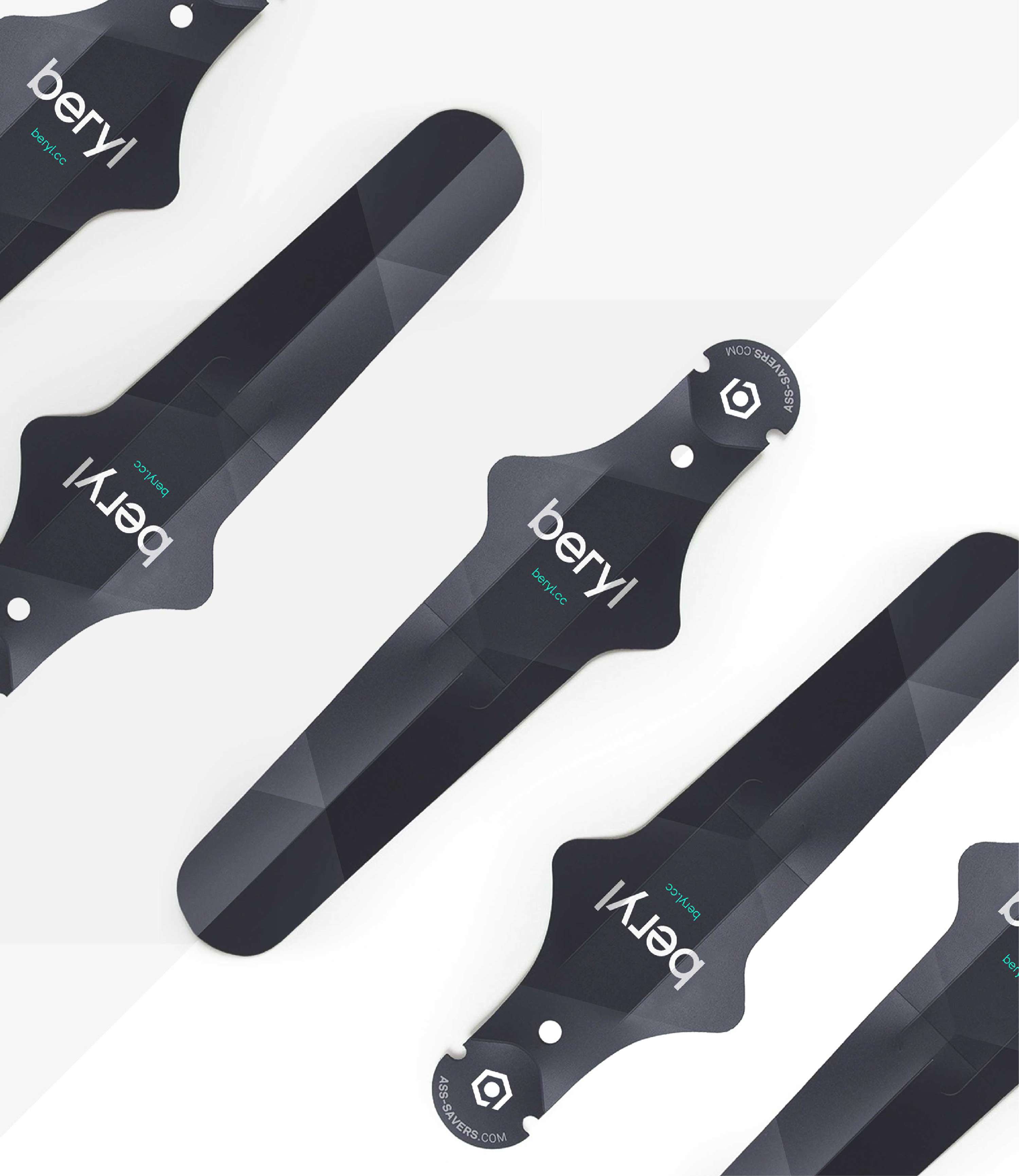
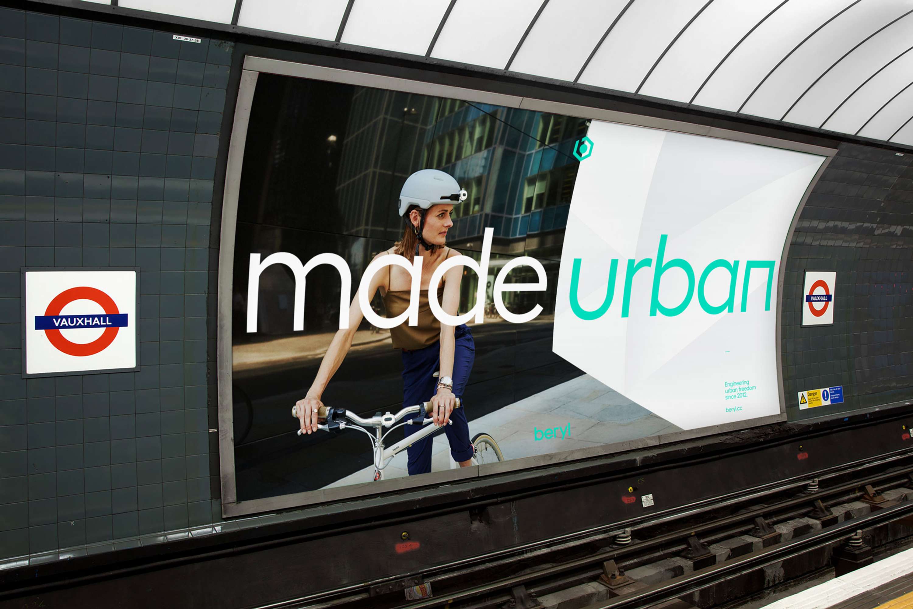
In early 2018 due to a trademark challenge Blaze renamed to Beryl. This was followed by a brand refresh based on the existing Blaze positioning and visual style. I co-managed the renaming process, and additionally led the rebranding from a strategic, creative and visual point of view, guiding and collaborating with internal teams and creative studios. The new brand identity was inspired by the new name - Beryl, a precious green gemstone. This opened up a world of visual possibilities making new connections with Beryl's identifiable green laser light colour, seen on bikes on city streets around the world, and providing a solid framework that is based on the hexagonal structure of beryl crystals. The stone also represents quality, durability, transparency and beauty, attributes Beryl had always wanted to align with their brand and products. But most importantly, it is also multi-faceted, like the Beryl team, with so many ways to inspire more people to get on bikes in cities - from consumer products to bike share technology to content and more. I was responsible for introducing the new brand identity to the Beryl team and ensuring it was implemented, adhering to the guidelines across different parts of the business. - Created in collaboration with design agency Point Studio.