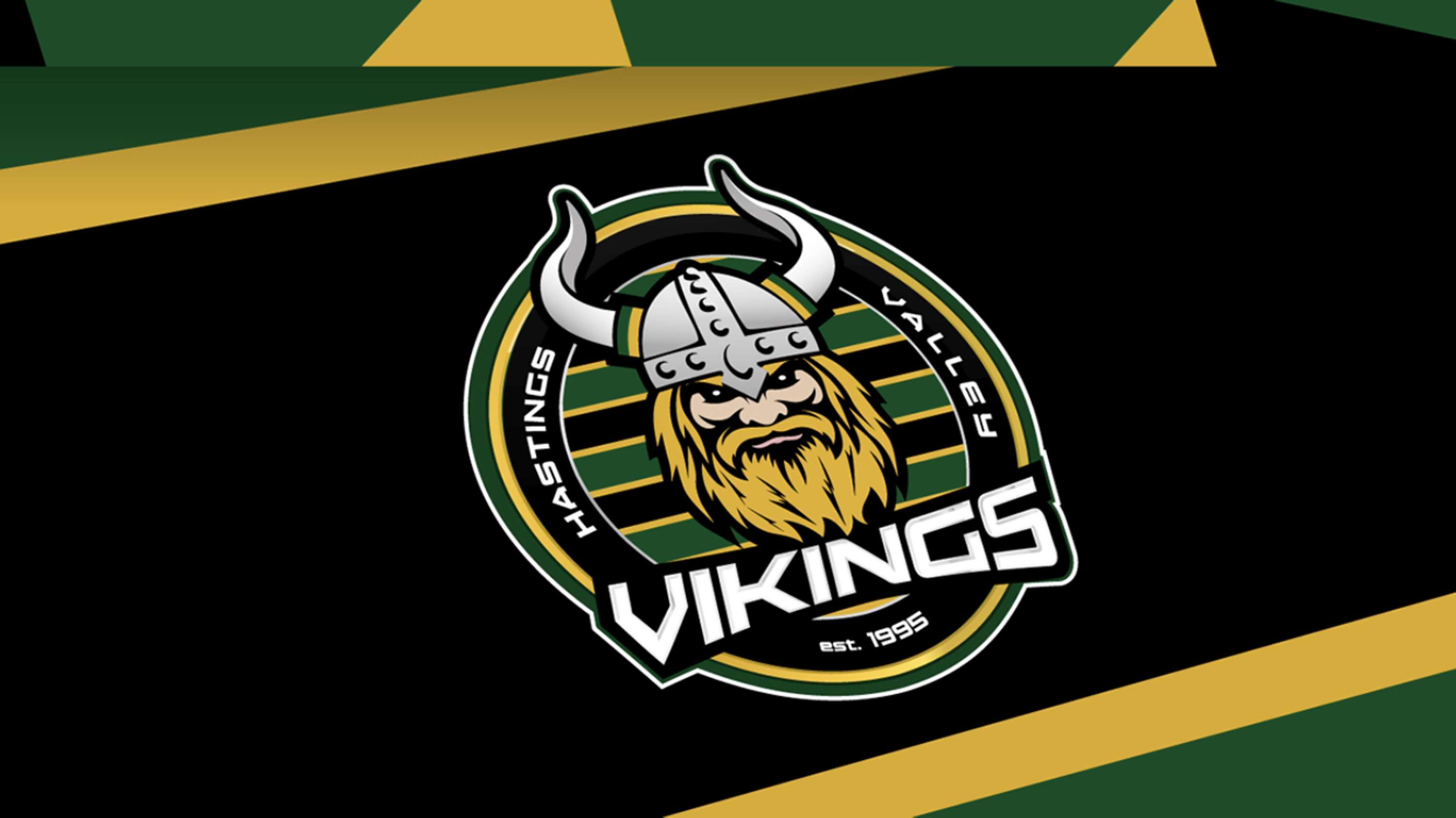
Hastings Valley Vikings RFC: Redefining a badge

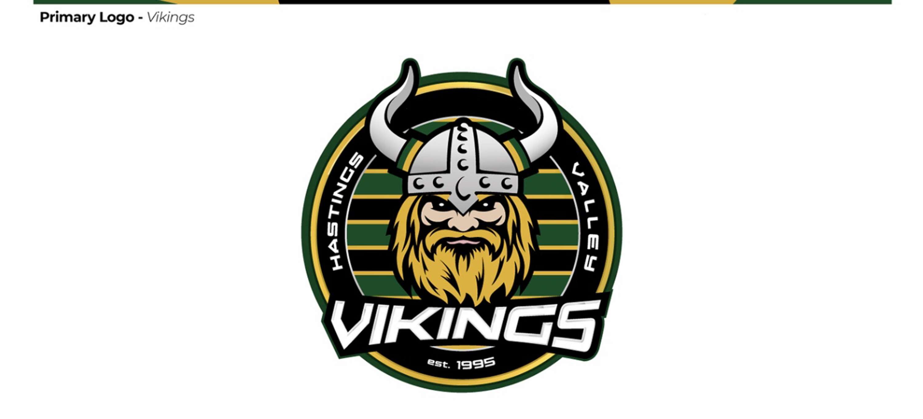
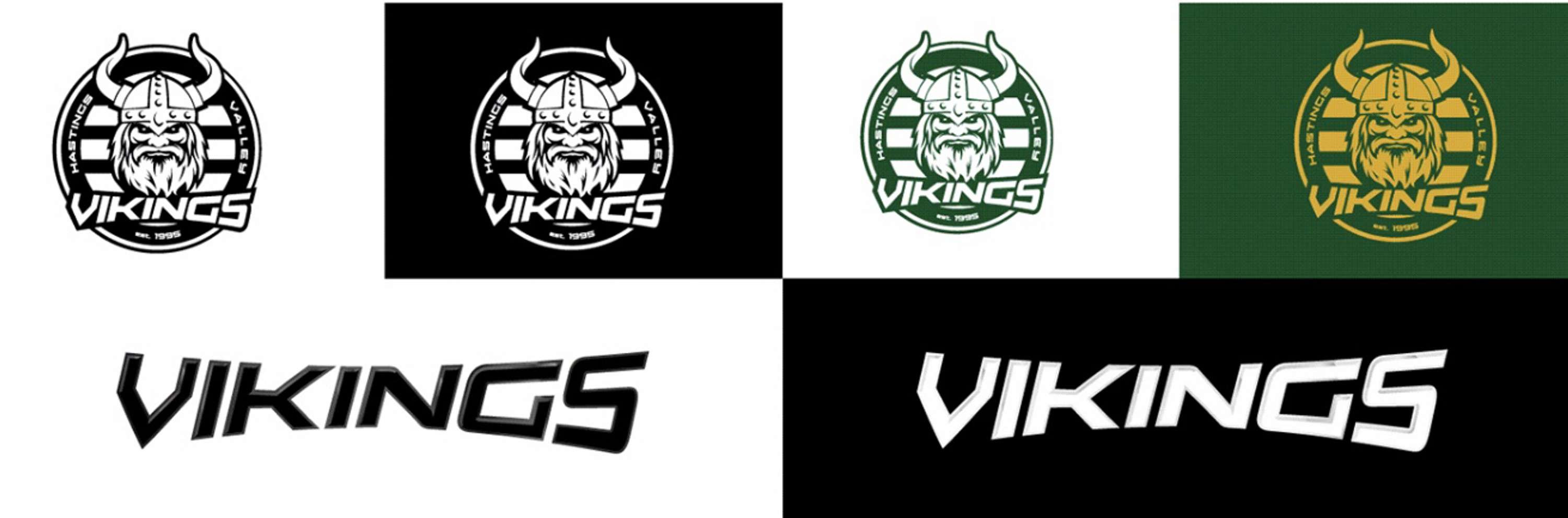
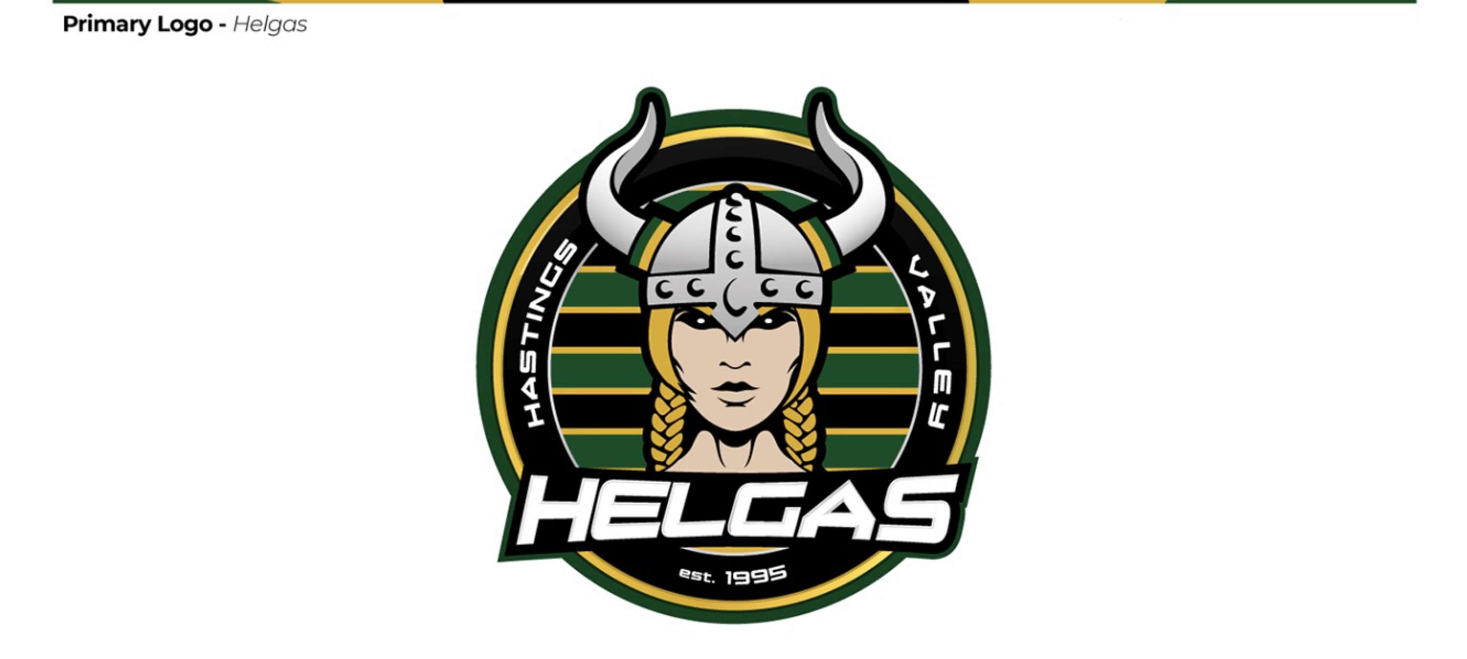
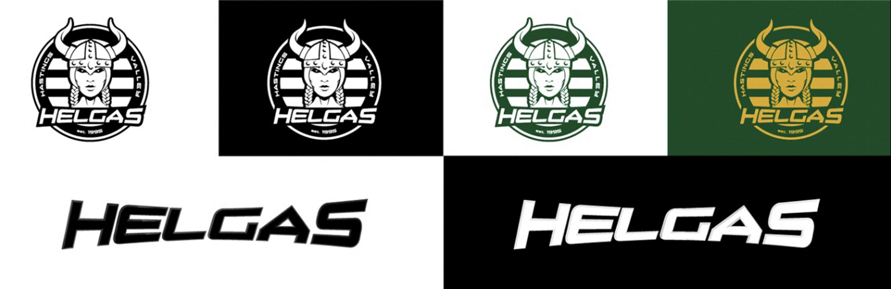
25 years after their conception, a new badge was needed to celebrate the growth of the club. From one team came many; From Men to Women, from girls to boys, their family grew. And with their growth comes a need to have badge to be proud of. The Viking - a new identity The brief was simple enough; give us a new logo befitting of a modern day sports club. It has to show strength and be a symbol of who we are as a club. My research and early development lead me to create an emblem logo with a ‘mascot’ character at its heart: the Viking. This would also be supported by a bold typographical title built into the logo. The Helgas With the expansion of female team sport over the last decade it has become essential to brand women’s teams appropriately without being patronising or lazy. It’s not always necessary, but when presented with the challenge, it’s important to get it right. It is no longer acceptable to just repurpose a logo pink or to cram ‘ladies’ into an existing club/team logo. For me, it only devalues a brand and feels like an after thought. I also feel the term ‘ladies’ is a little outdated and uninspiring, but I understand certain teams have heritage where it has value. Playing for ‘the badge’ can be a powerful thing, so it’s imperative to create a sense of pride and belonging. Ahead of a very successful 2017 Women’s European Championships, Weiden & Kennedy Amsterdam completes a project for Nike and The Royal Dutch Football Association (KNVB) to rebrand ‘Leeuwinnen’ (Lioness), tweaking the lion on their emblem from male to female; a simple but powerful symbol. Following suit, the Football Association for example. The Lioness have their own unique identity within the England family and is branded brilliantly. When considering the Helgas logo it was important to create something of their own. The solution; introduce a female ‘Helga’ mascot into their own emblem whilst adhering to the brand creative.