Soohyun Jeong
Caught between high street tack and pallid designer collaborations, in 2015, London's accessories industry is conservative at best. That's why we need designers like Soohyun Jeong, who is pumping revitalising originality (with a lashing of darkness) its way. But it's not London that Jeong's work interrogates, it's her native South Korea and the penchant the fashion scene there has for projecting backwards-looking body image ideals. Jeong's recent collection "Pearls", for example, scrutinises the country's plastic surgery epidemic. "In Korea, it's quite rampant to judge people by their appearance," she says. "It's really serious - it even effects your job interviews." As it stands, she reminds me, around one in every five Korean women have had some form of plastic surgery.
Conversely, balancing pleasing-to-the-eye rose-gold colours with clear chokers and strings of pearls, on the surface, Jeong's work could be considered conventionally beautiful. But it's the details that shock. "I wanted to make my jewellery function as jewellery - to still be beautiful and not hideous", she says. "But when they look closely, they will see that there is something really odd and awkward." Many of the pieces were made from plaster cast moulds Jeong made of her facial features. One necklace is a gold-moulded pair of lips bound with linkages that look suspiciously like syringes. Even Jeong's chokers look a little tight on Rollacoaster's models, nodding to South Korea;s enforced beauty stranglehold. Brutality and beauty, the Central Saint Martins BA Jewellery Design graduate says, are parallels that wrongfully cross over. "Without reason, they just break down their nose and cut out their flesh," says Jeong, her face scrunching at the thought.
In Jeong's work, details are buried within details. For a line called "Pearls", mud is wrapped in shimmering beads; the ugly sludge behind the shimmer. "First there is some dirt that goes into the shell," she explains. "Then, to protect itself, the shell will cover the dirt." From ruin to the runways and back again: Soohyun Jeong is taking a closer look.
Mayu Ren Ishii
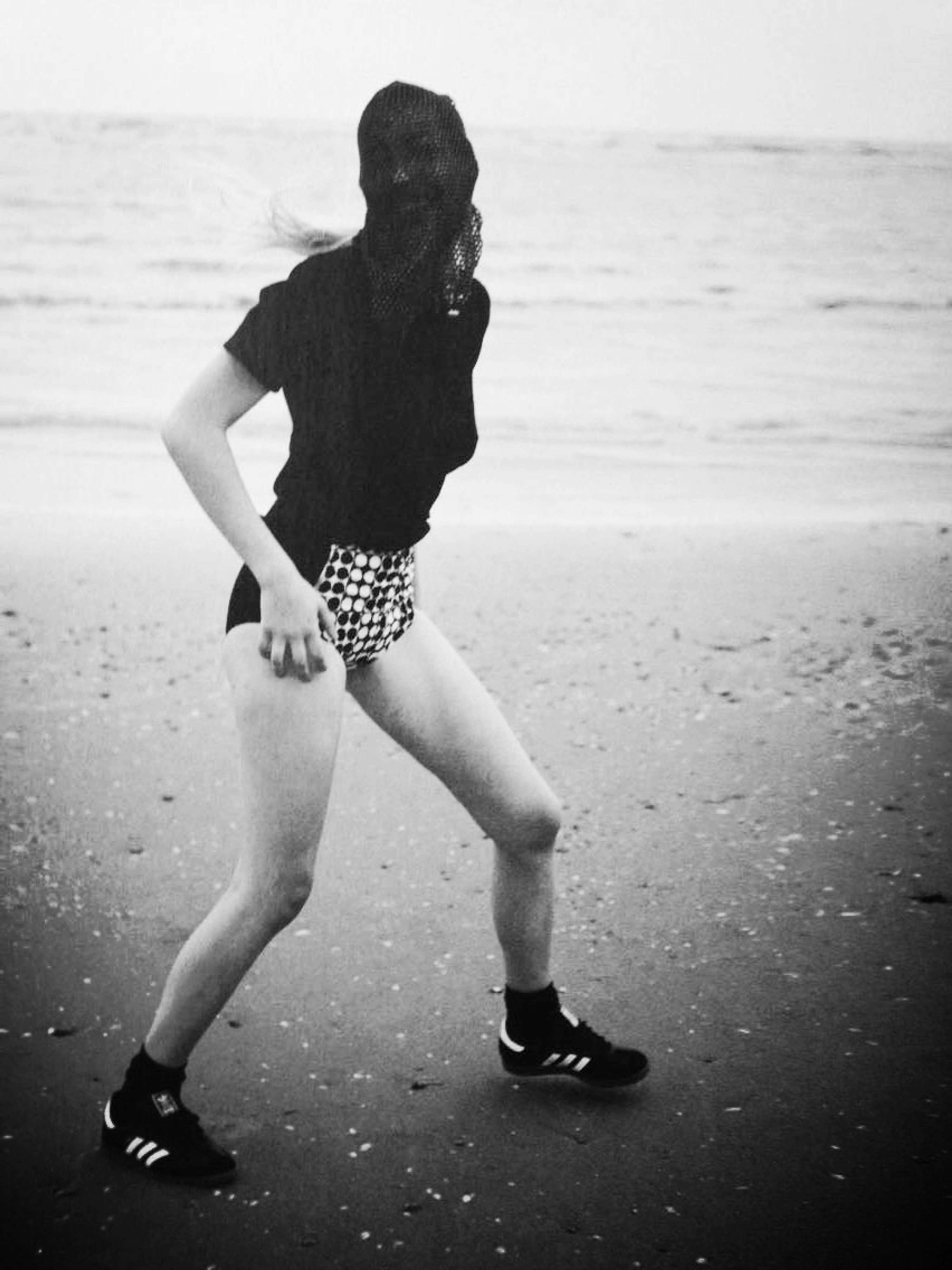
The 2013 film Innocence is a cult psychological thriller about a prep-school plagued by a mysterious suicide epidemic. It laid the touchstone for graduate Mayu Ren Ishii's industrial, wire-mesh fashion artworks. "I focused on youth, girls and working out their body language," she says. The steel dress frames she worked on for her final Central Saint Martins collection - the chillingly titled "The Little Brides of Christ" - recall medieval chastity belt designs gone fetish. "I actually went to a covent school myself, but it wasn't as strict as the ones I'm referring to," she comments. "I'm referring to the 50's. Innocence really isn't a covent film, but it has similar ideas in it."
The collection is compromised of four latticework frames, each representing different stages in the life of a young, blindly obedient pupil. One is a bloodflow-constricting pencil dress shape, another is a dress held up by a choker-like neck clasp. "They're not allowed to touch their bodies, they even have to wear capes in the shower," she adds of the destructive conditions the collection addresses. "They are meant to be schools that make the girls a role model for the Christian faith - they are portrayed as an ideal education. But I wanted to show the dark side of what they might be doing to the girls and how they think." The preservation of innocence is a vibe she continues to explore in a floral decoration-inspired line currently in works.
Even from the start of her academic foray - from her days as an Interior Design student to formative months as an apprentice at Mary Katrantzou - Ishii wasn't a conventional rings 'n' things accessories fanatic. "I've probably only made about one ring, and all the other pieces have been sculptures for the body," she says. "I've just never been interested in making rings of necklaces." One of her previous works was a sash made of tightly compressed slices of leather. The imaginatively titled "Leather" was hardly going to be picked up by a beauty pageant organisation - but it did explore the tradition's suffocating standards.
"My 'Leather' collection was material based. I wanted to find a completely new way of working with leather, even trying to make it look like a different material," Ishii explains. "I went back to thinking about what leather actually is - it's the skin of an animal. The skin is the largest and one of the important organs, and without it the living being would die. I wanted to create a piece that covers the vital organs of the human body; the heart, the lungs, liver, and kidneys. The white parts of the piece represent those whose vital organs. The piece is kind of like an armour, that is strapped to the body. The death of another becomes protection for the living."
Li Fansze
Despite her commercial collaborations - projects with the likes of Topshop and Swarovski - Li Fansze's roots are hard-wired into the underground. Her jewellery works are cartoonish, oversized and asexual - think thick, pink snap-hook braces dangling from the ear, car seat belt-esque shoulder cable bracelets. "I like making and wearing things on the body, combining that as a statement rather than something very decorative," Fansze tells Rollacoaster. As well as an attraction to bold statement pieces, Sze's fascination lies in the beautiful simplicity and functionality of Japanese construction wear. "They have all their equipment on a belt, it's really chunky and doesn't look like workwear. It's very appealing," she says of the culture.
Fansze's 3D-printed graduate collection "Attachments" drew on this workman suit aesthetic: her male models wore crisp white suits, their jewellery styled with an off-the-shoulder femininity. Is her work intentionally gender-fluid? "It is unisex, but when I dressed a boy for my final images, it looked feminine," the Hong Kong born designer says. "My pieces are really masculine - with women's traditional jewellery; that kind of [brings] it all back." This conscious ricocheting between gender ideals is deliberately playful. In fact, it's meant to be funny. "The idea of menswear compared to womenswear; it's much more about functionality, more practical," she says. "So there's a real irony to it."
Last year, she worked on Zeebag, a sustainable bad line with Zimbabwe-based mental health initiative, the Friendship Beach Project. In 2016, and beyond, she'll continue to dabble with accessory design. "I'm kind of interested in bags, the functionality rather than just pure jewellery," she explains. Sadly, Fansze also plans to leave London for Japan's burgeoning contemporary jewellery design scene. But until then, she'll keep pushing the play button.
Iona Judd
"Warlord" Iona Judd's newest line of gold garms, is a haunting, black-as-molasses tribute to humankind's inhumanity. Inspired, by Liberian warlords Charles Taylor and Laurent Nkunda, the collection compromises the kinds of rings and aviators you might see on captors, as well as the latticework of a P.O.W.
The idea for "Warlord" came to Judd after a visit to Richard Mosse's Infra exhibition at The Photographer's Gallery last year. A photo series from the Congolian conflict, it captured scenes in crisp, pink-hued infrared. "[Taylor and Nkunda] did these terrible, terrible things - one being the sale of blood diamonds to fund guns for children," Judd explains of the research she did into Mosse's stomach-churning accounts. "[In the Infra series] Laurent Nkunda poses for photographs that could have been out of the pages of Vogue - they are unbelievable. He's standing there wit his cane and is dressed in a crisp white suit wearing sunglasses, and that really disturbed me." Honing in on Nkunda's blasé, almost glamorous image (which was carefully executed in the media at the time), Judd's collection explores the uneasy dichotomy between power and luxury in war.
"A lot is quite disarming in the way it looks," she tells me, placing one of the collection's blinged-out gold watches on the table in front of us. "The garnets in the watch are supposed to represent blood diamonds and on the medals, they represent blood splatters. If you take it away from the concept, it could stand on its own as an item. I think in a way, that is a strength, that you can just dismember it from the body of the collection."
"Warlord" isn't all horror and misery though - it's more a comment on the statement-making accessories we've become obsessed with in the West. "[They're worn by people] not necessarily to draw attention to themselves, but to have fun with what they're wearing," she observes.
Understandably, Judd is relieved her days spent mining the annals of a bloodied, sadistic struggle are over. But the BA CSM grad wanted to keep pushing her craft to new, more wearable and practical areas. "My interest [in jewellery] has been completely reignited," she reflects. "It's funny, I thought that when I was done at Saint Martins I'd be really done with the whole jewellery thing; the last year was so draining. But since having left, I've had so many ideas and things I want to do relating to it. I think it's really important that I get an understanding of how the real world works, too - the business side."
Photography: Anna Victoria Best, Fashion: Ashlee Hill