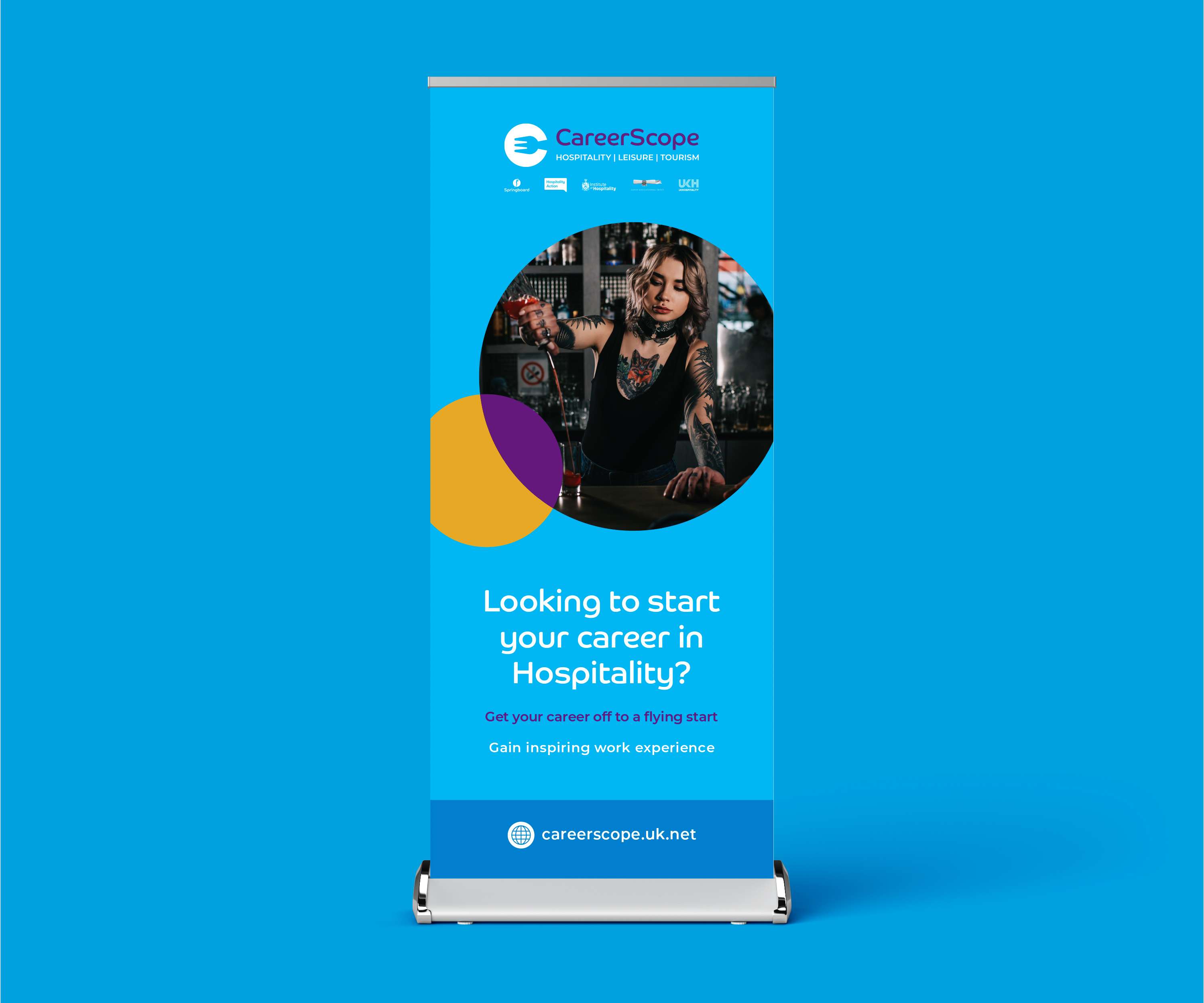
Springboard Re-Brand

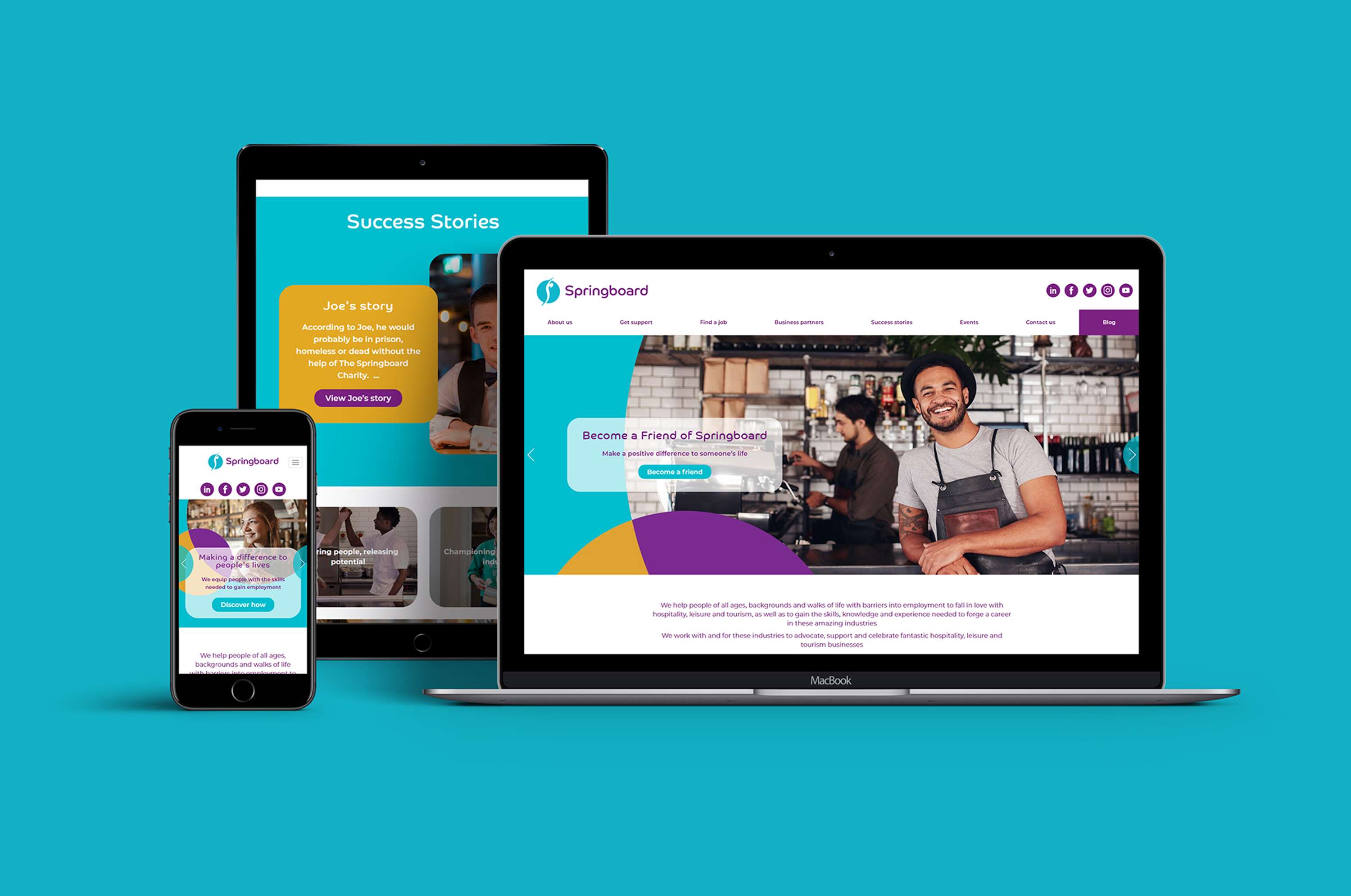
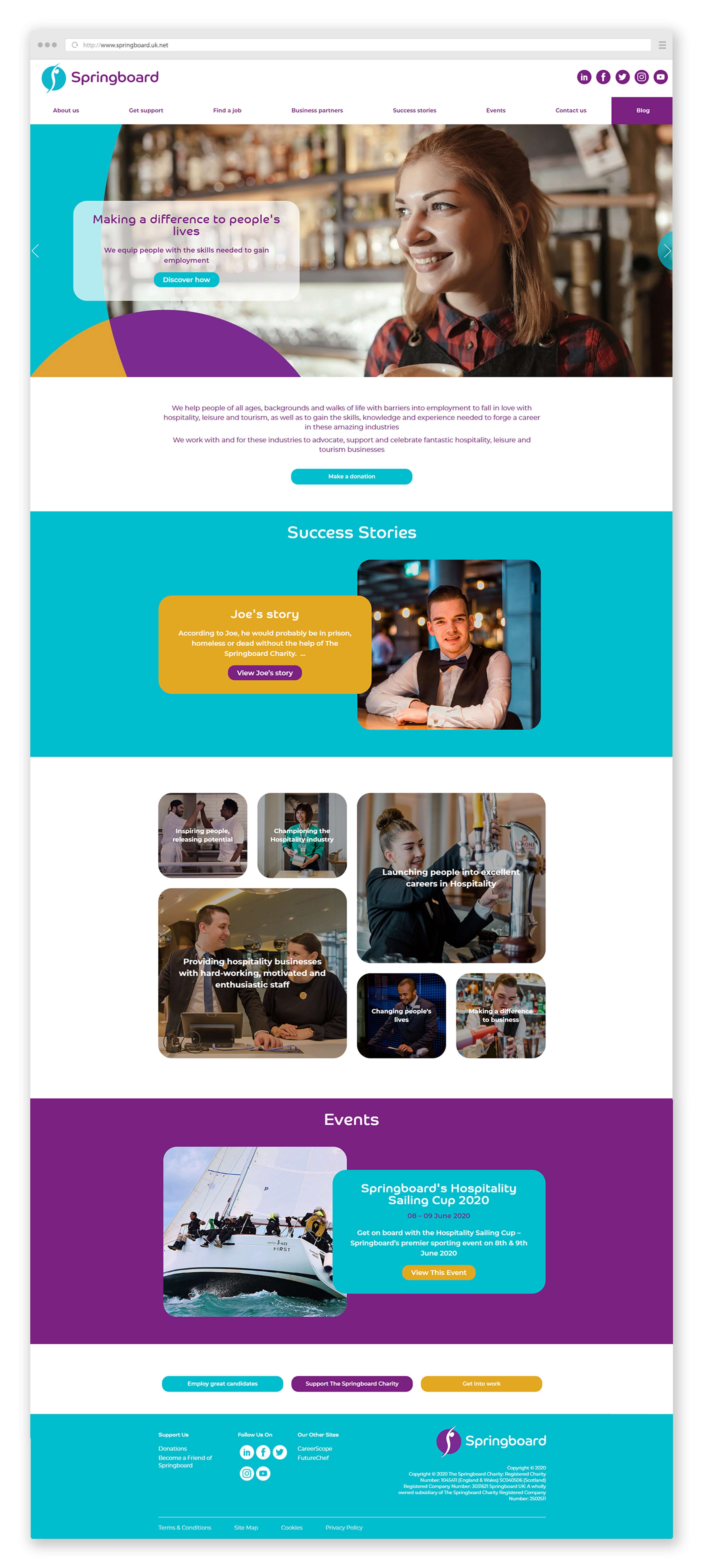
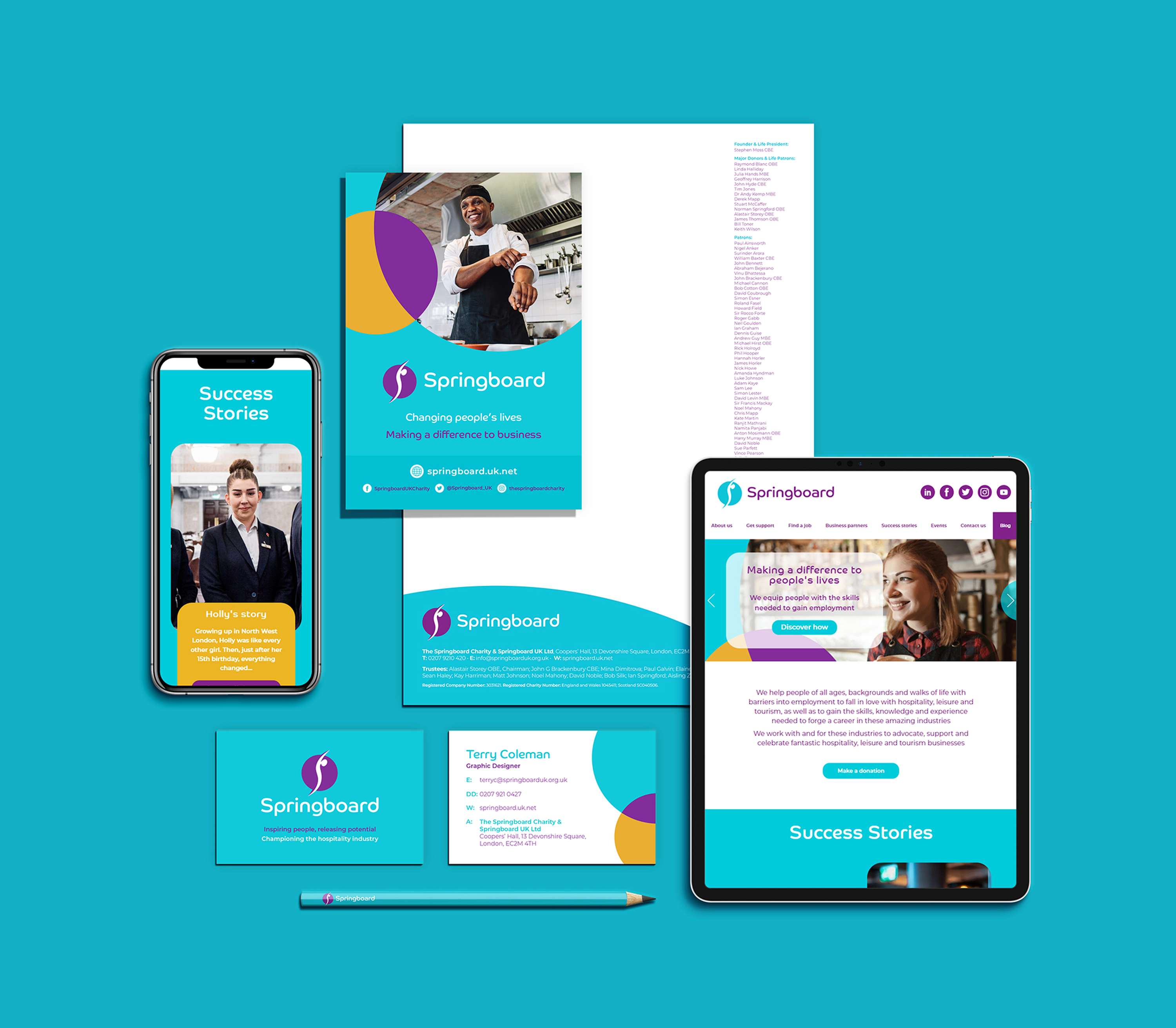
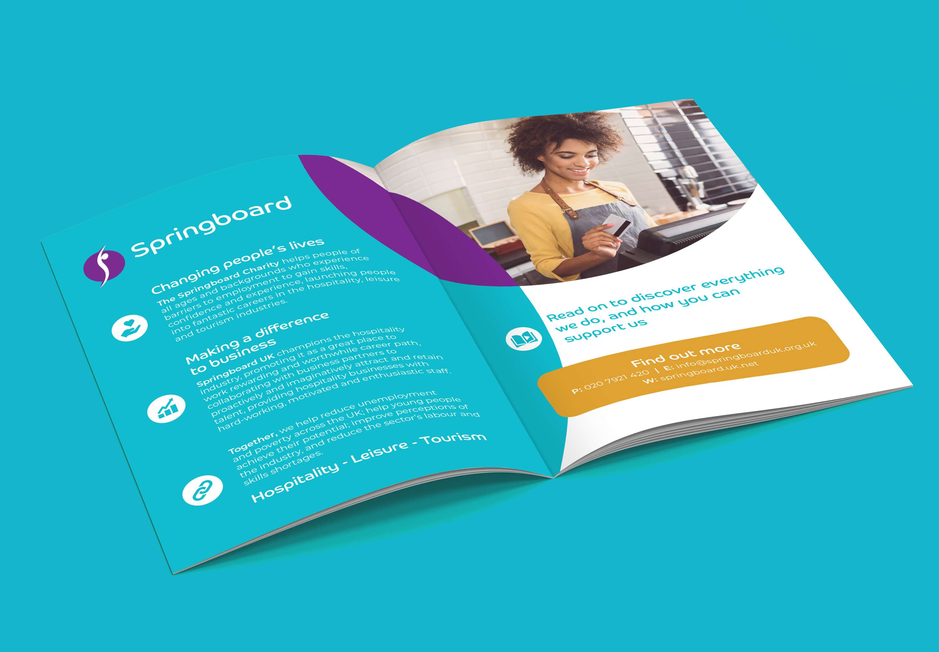
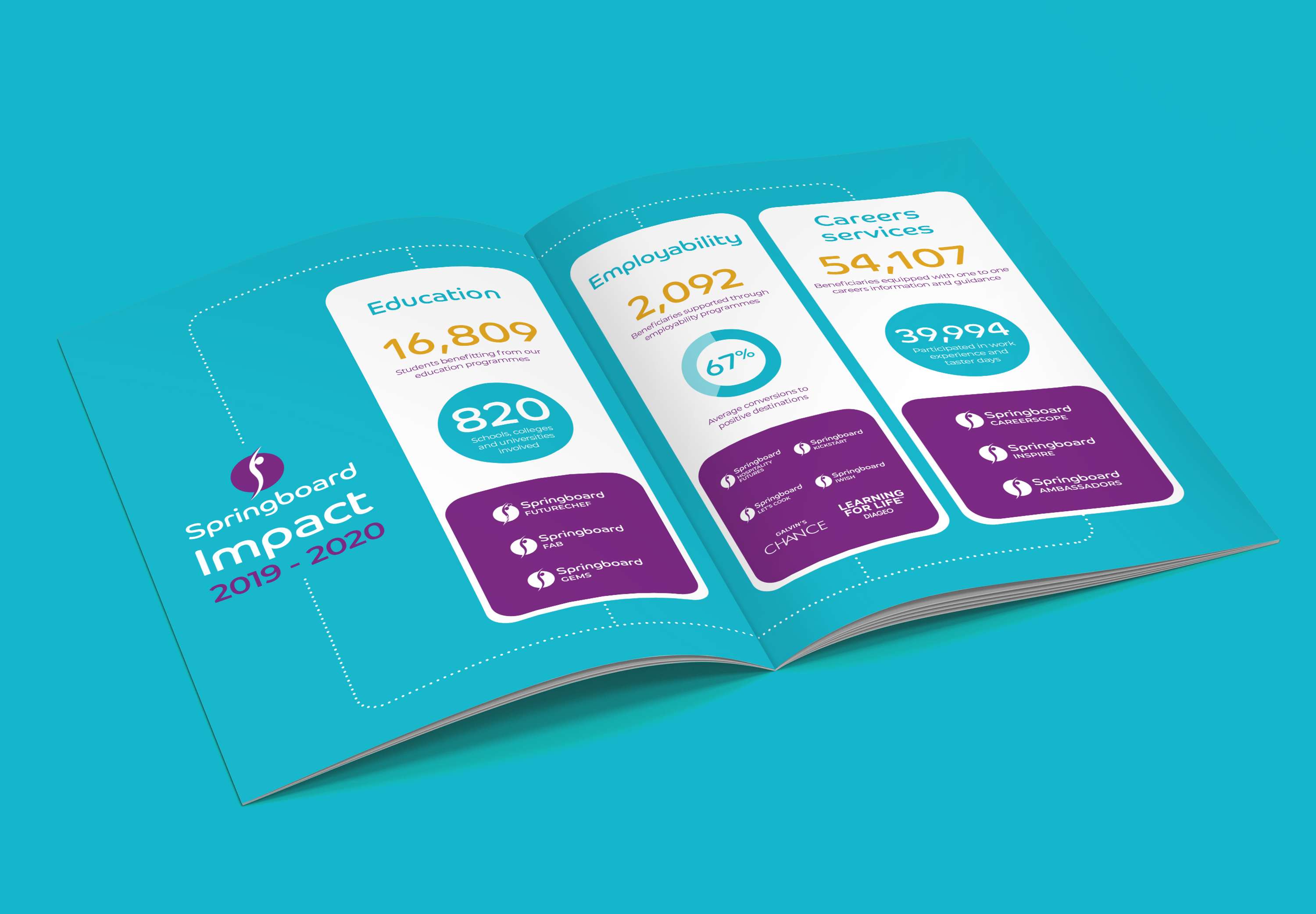
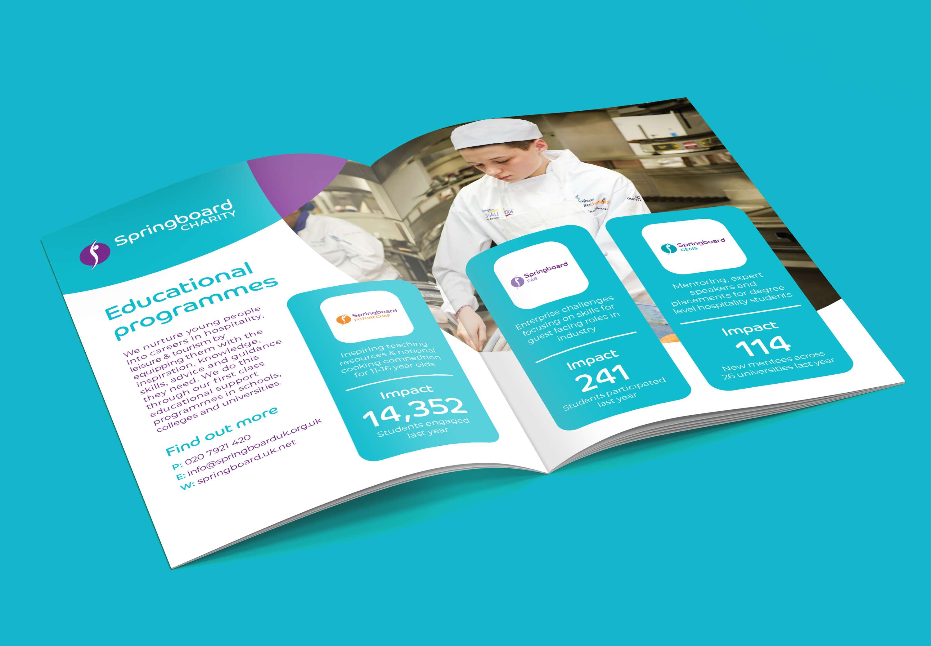
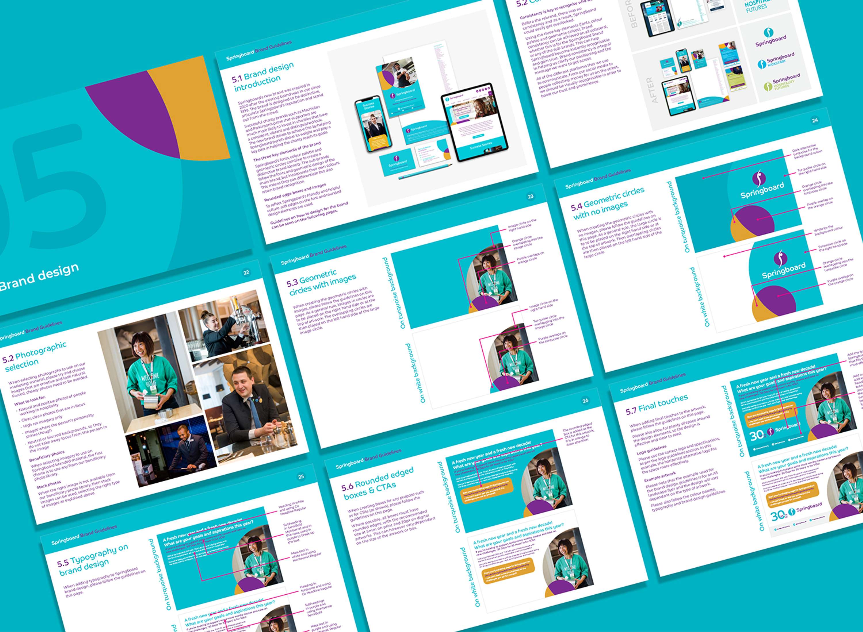
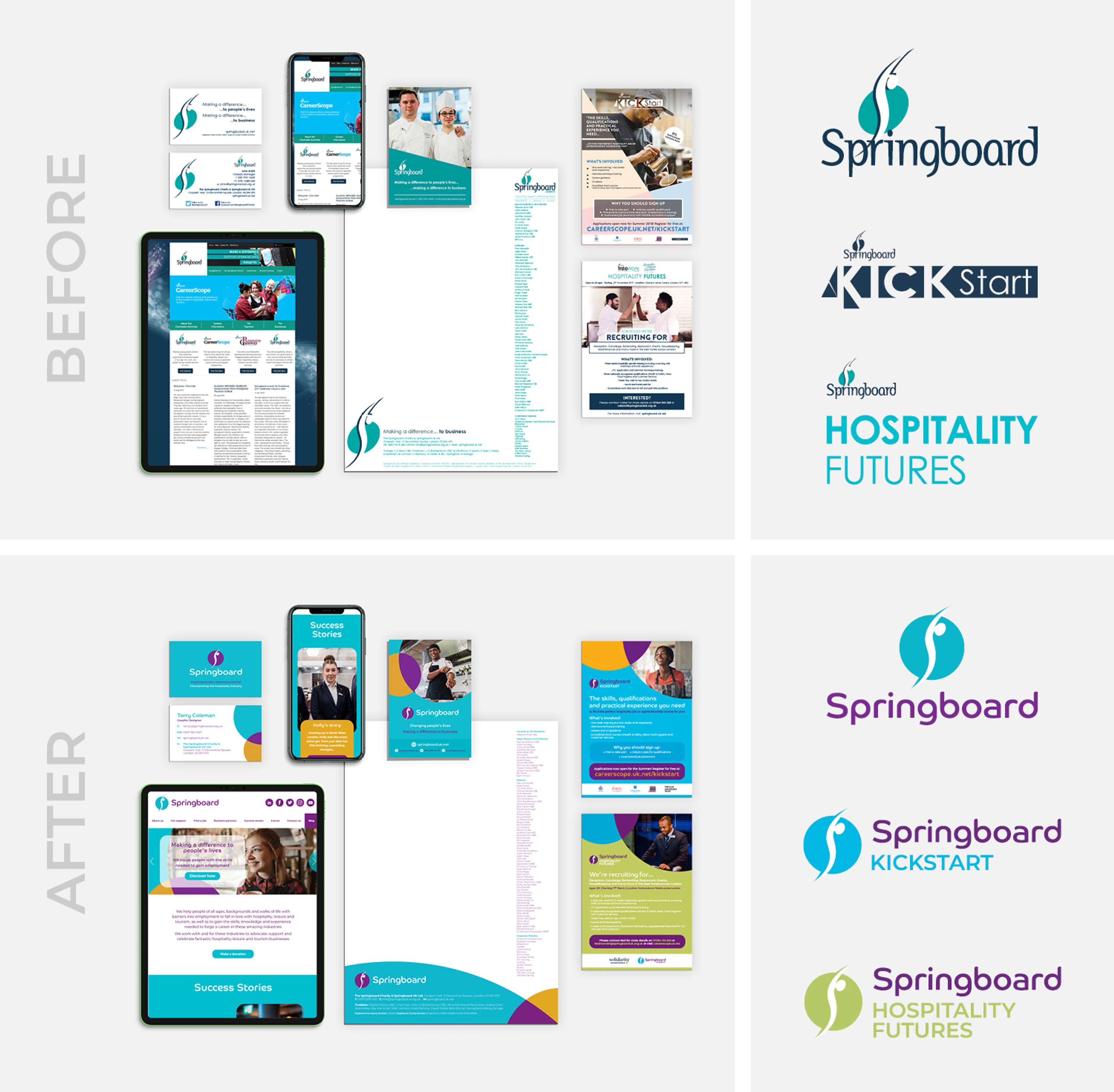
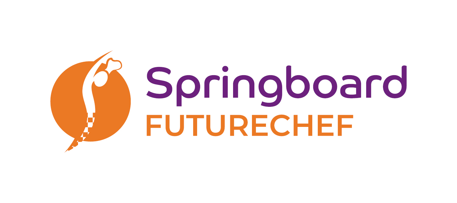
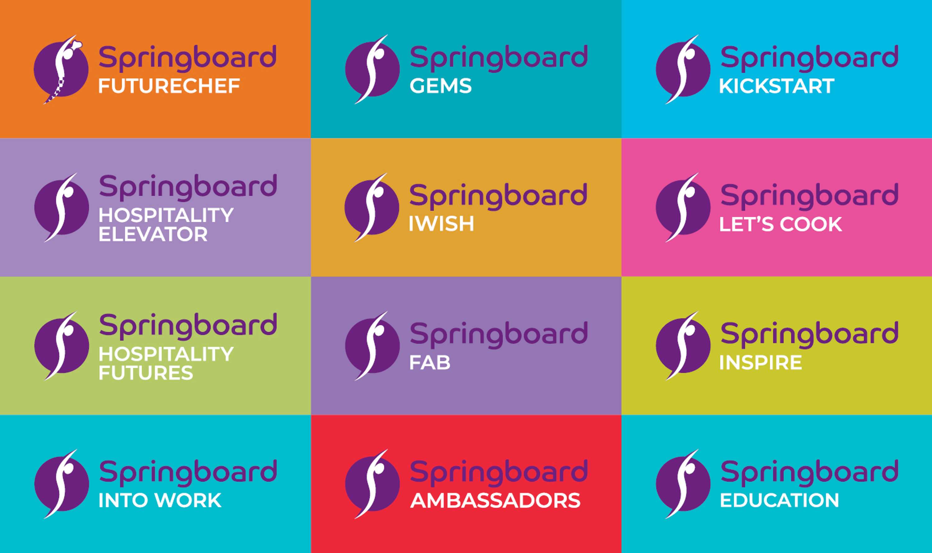
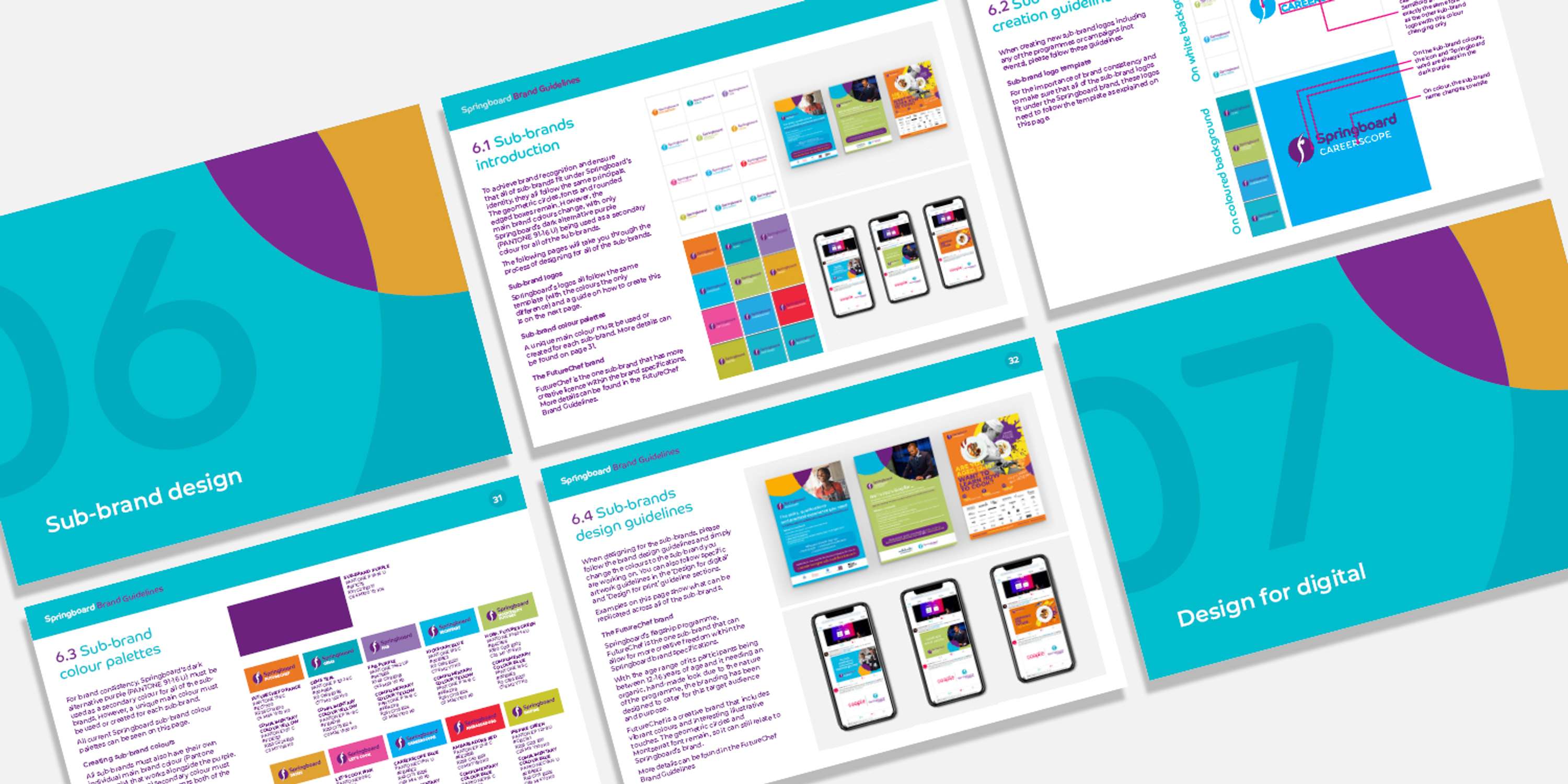
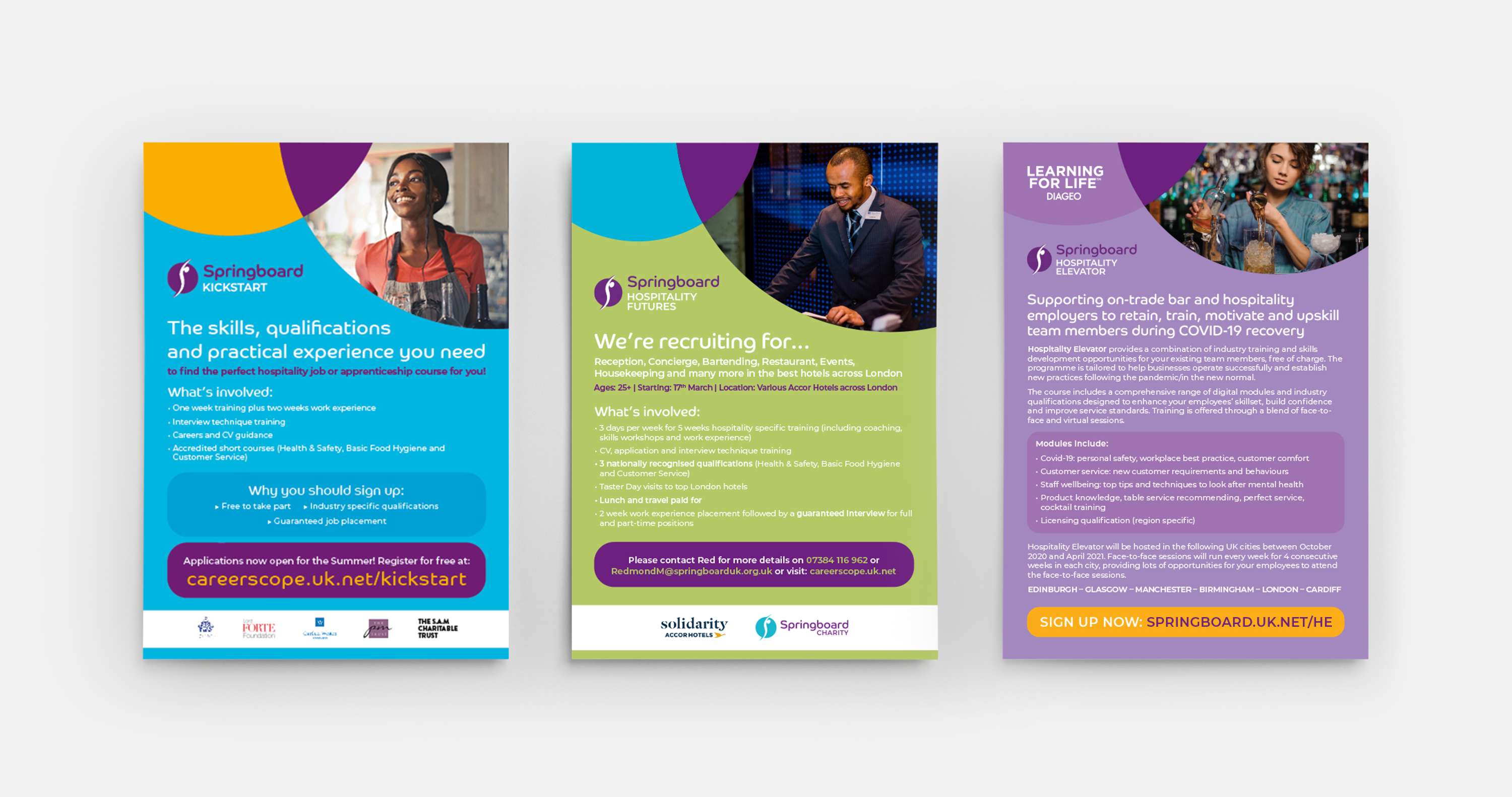
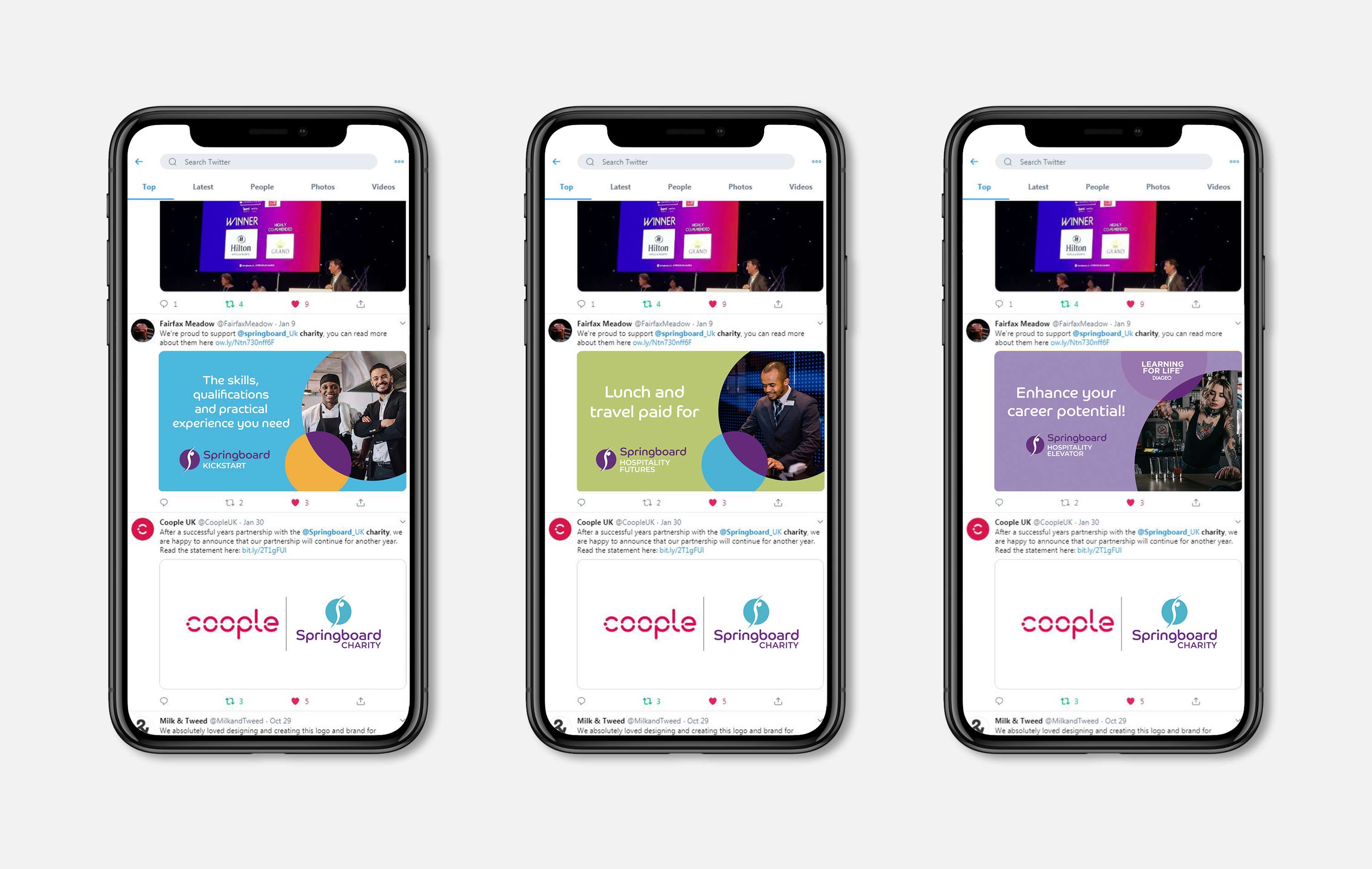
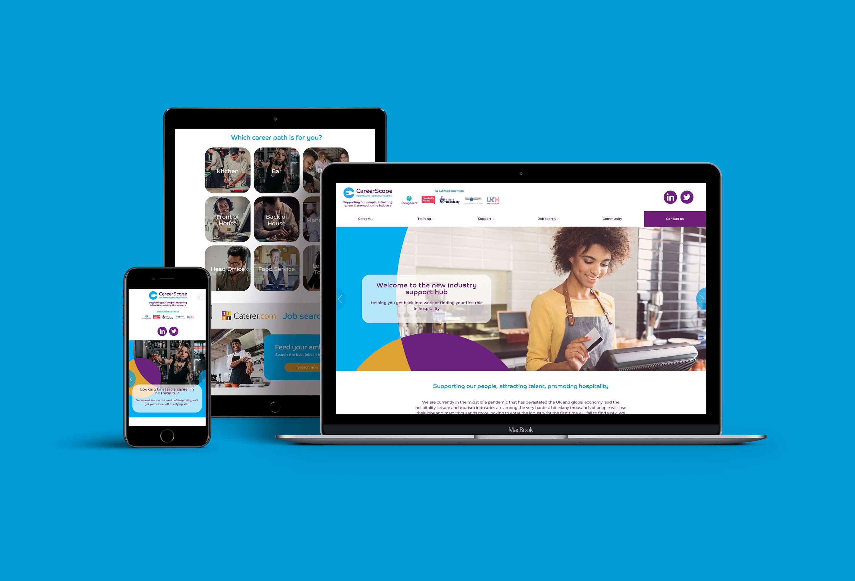
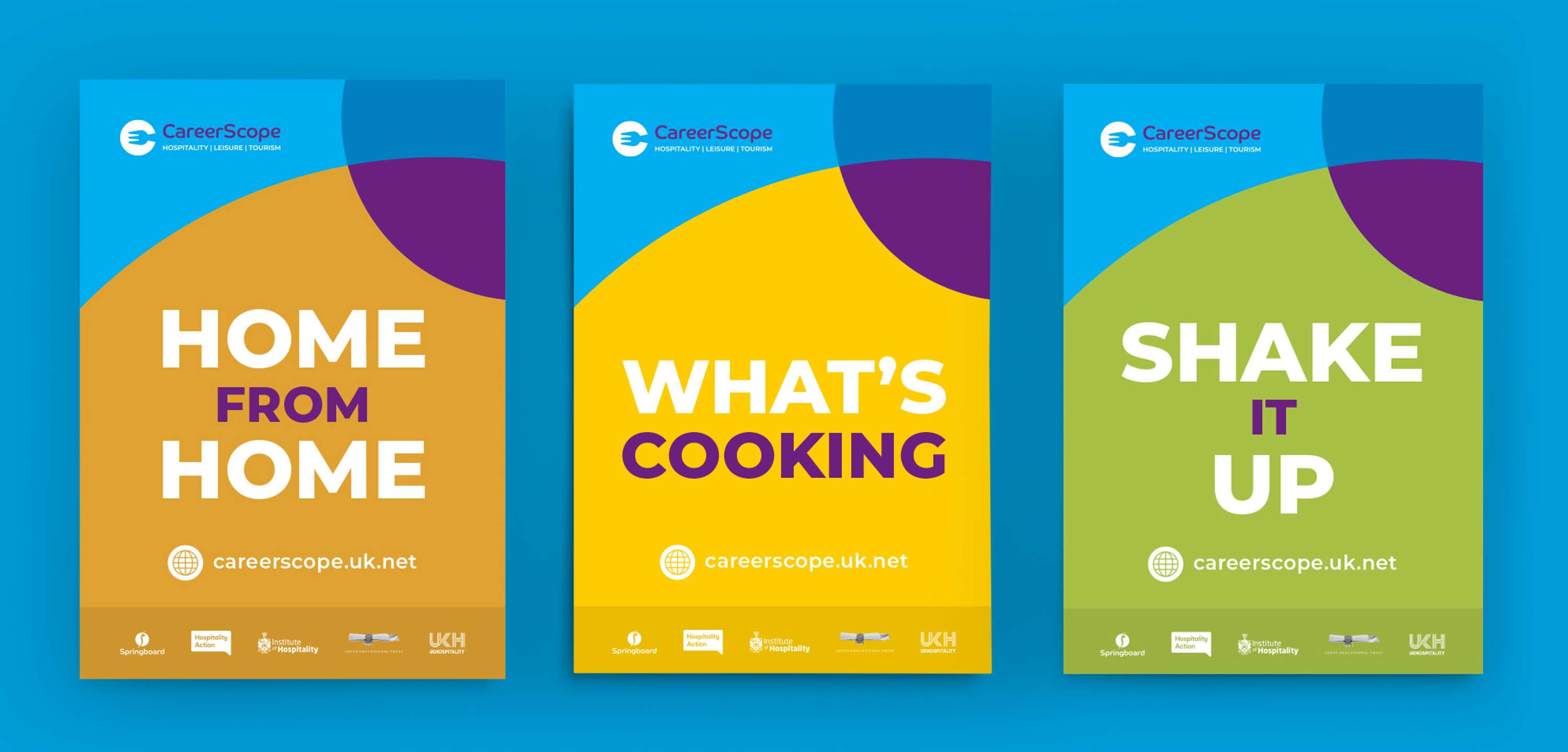
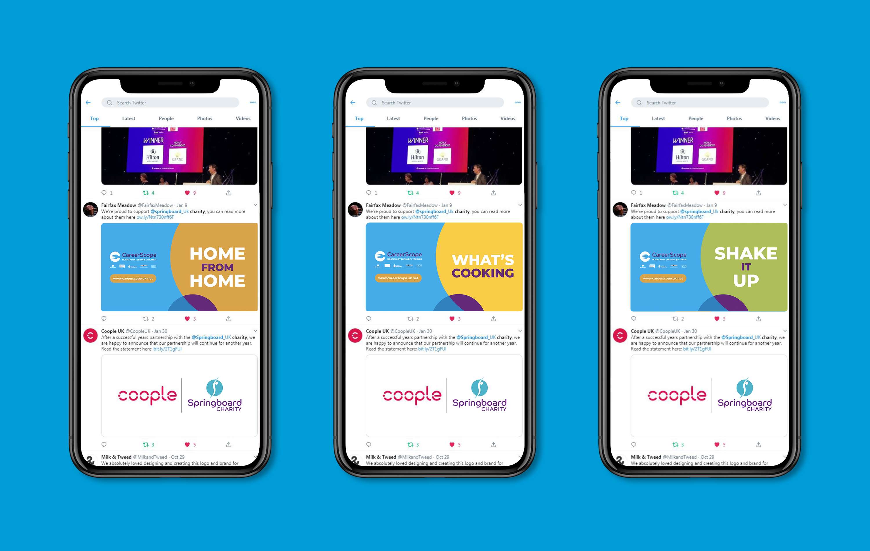
The Springboard Charity & Springboard UK are two distinct organisations, working interdependently to reach the shared goals of promoting the hospitality industry and helping unemployed people get into work. In March 2020, I was solely responsible to lead and deliver a full re-brand for Springboard, after the existing branding had been in use since 1999. The previous branding was very out-dated, did not reflect Springboard’s personality and lacked consistency, resulting in Springboard often getting overlooked and hindering its growth in a competitive market. The new branding is designed to address these issues by being a modern, distinctive and vibrant version of the existing branding to help it stand out from the crowd, while maintaining brand consistency across sub-brands too, so that Springboard can become instantly recognisable and gain prominence across the industry. Every detail of the new branding has been thought out carefully. The colour palette encompasses Springboard’s mission; the typography is modern and flexible; and the rounded edges and geometric circles allow all of the sub-brands to fit under Springboard’s identity, while all having their own individual colour palettes. The flexibility of the branding allows it to be expansive and cater for each of the different sub-brand target audiences. This re-brand project involved updating all of Springboard’s existing print, digital and web assets. It also included creating a Wordpress template to use across all websites, 12 distinct sub-brands and brand guidelines. This was one of the largest and most challenging projects I have worked on and I am proud to have delivered a brand that the charity deserves and can play a key part in helping Springboard reach its goals.