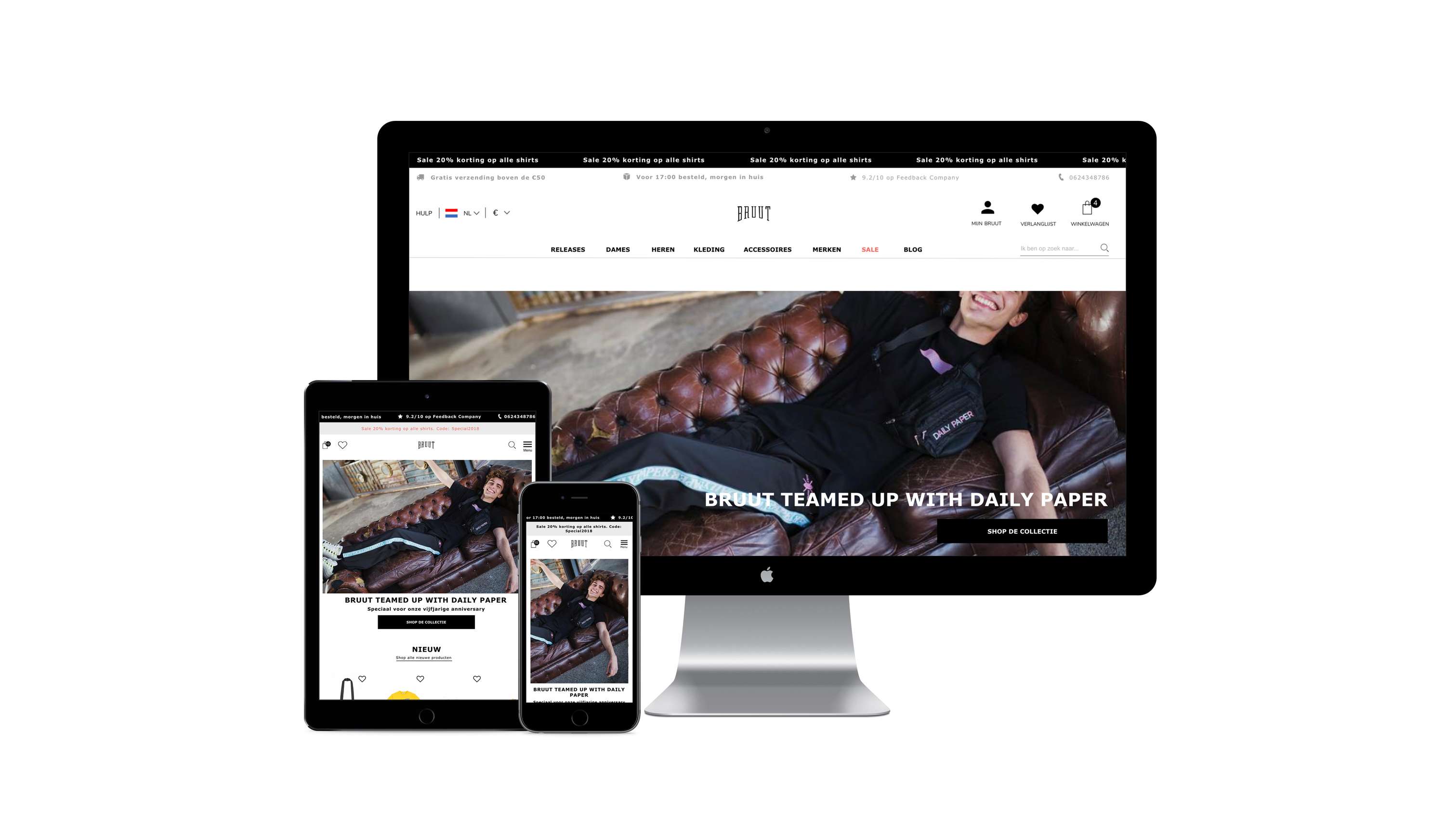
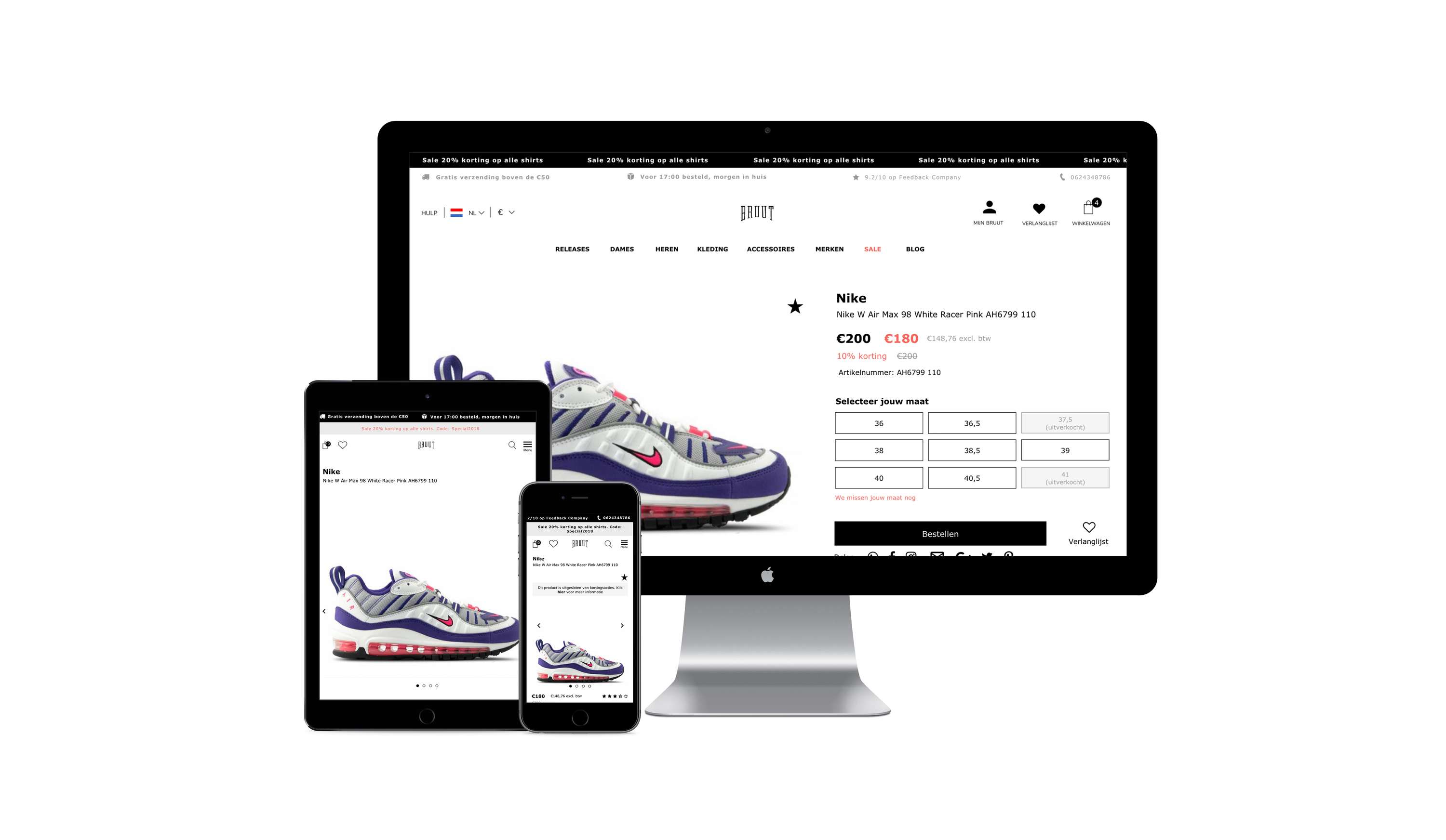
A new online store for Bruut
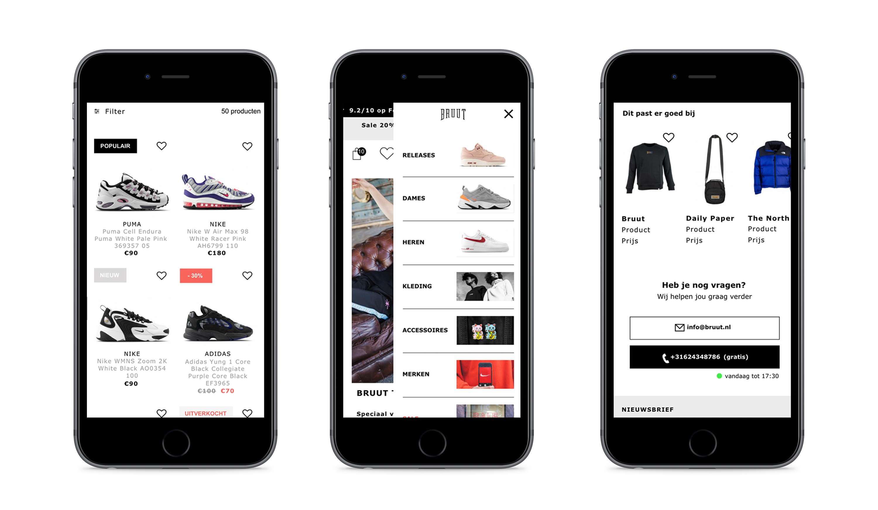
During the last semester (September till Februari), I was an UX/UI intern at a sneaker store called Bruut. In that period I was responsible for creating a new design for their webshop. The goal was to create an webshop with a clear and minimalistic layout, that fits the company's vision and is mobile first. First I started off with a Heuristic Evaluation by Nielsen. Secondly I did a target audience research, where I interviewed some participants. During the interviews I let them test the current webshop, whit a usability test that I created beforehand. I also did a competing company and company research. With the use of all the gathered data, I created the user needs and requirements. The user needs and requirements I used, are the base of the new design that I made. While designing the webshop, I clustered as many content as possible, so that the information stayed clear and understandable. One of the obstacles that came forward, while testing, is that there's a lot of information that can cost confusion and discouragement. That's why I also came up with solutions that only showed the information that is needed at that moment. The layout is clean, quite minimalistic and mostly consist of black, white and grey tones. I used some color, based on the association of colors, using color theory.


