Hundreds of exciting new products, services and organisations now choose Belgravia as their exciting base to operate from.
Research showed that the district was considered too expensive, too elitist by much of the visiting public. Old preconceptions of limited shopping, eating and drinking options are entirely out of date. The area is now bursting with things to do, see, eat and drink…
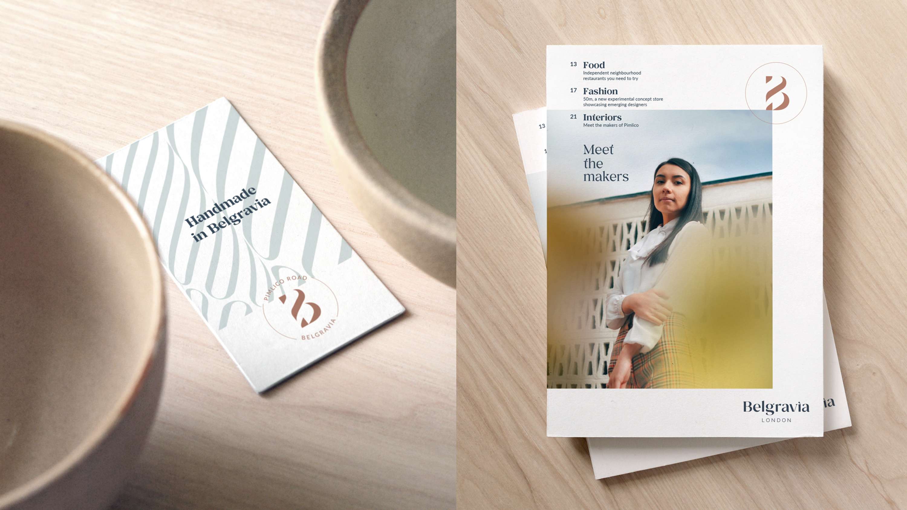
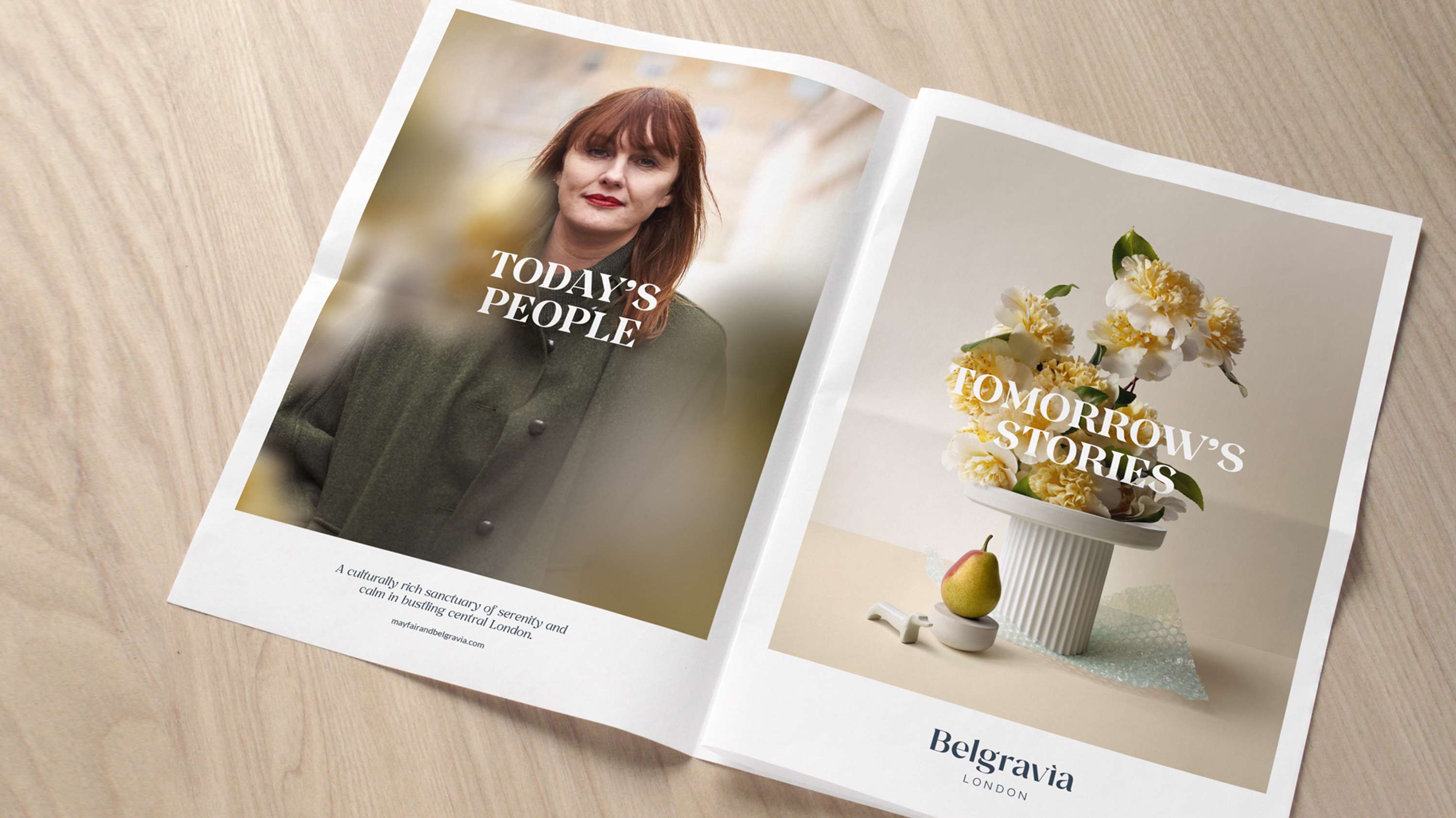
To reflect the newly revitalised area and to more obviously widen the appeal of the area — a progressive visual and verbal design system has been developed to enable very different parts of Belgravia best connect and communicate with a global public.
From the fine food and fashion of Motcomb Street, to the timeless elegance of Elizabeth Street. From the distinguished design district of Pimlico Road to the more radical remix of Belgravia found in Eccleston Yards. We’ve created a new strategic position for them all — underpinned by a brilliantly flexible visual and verbal design system.
A MISUNDERSTOOD DISTRICT OF MANY OFFERS
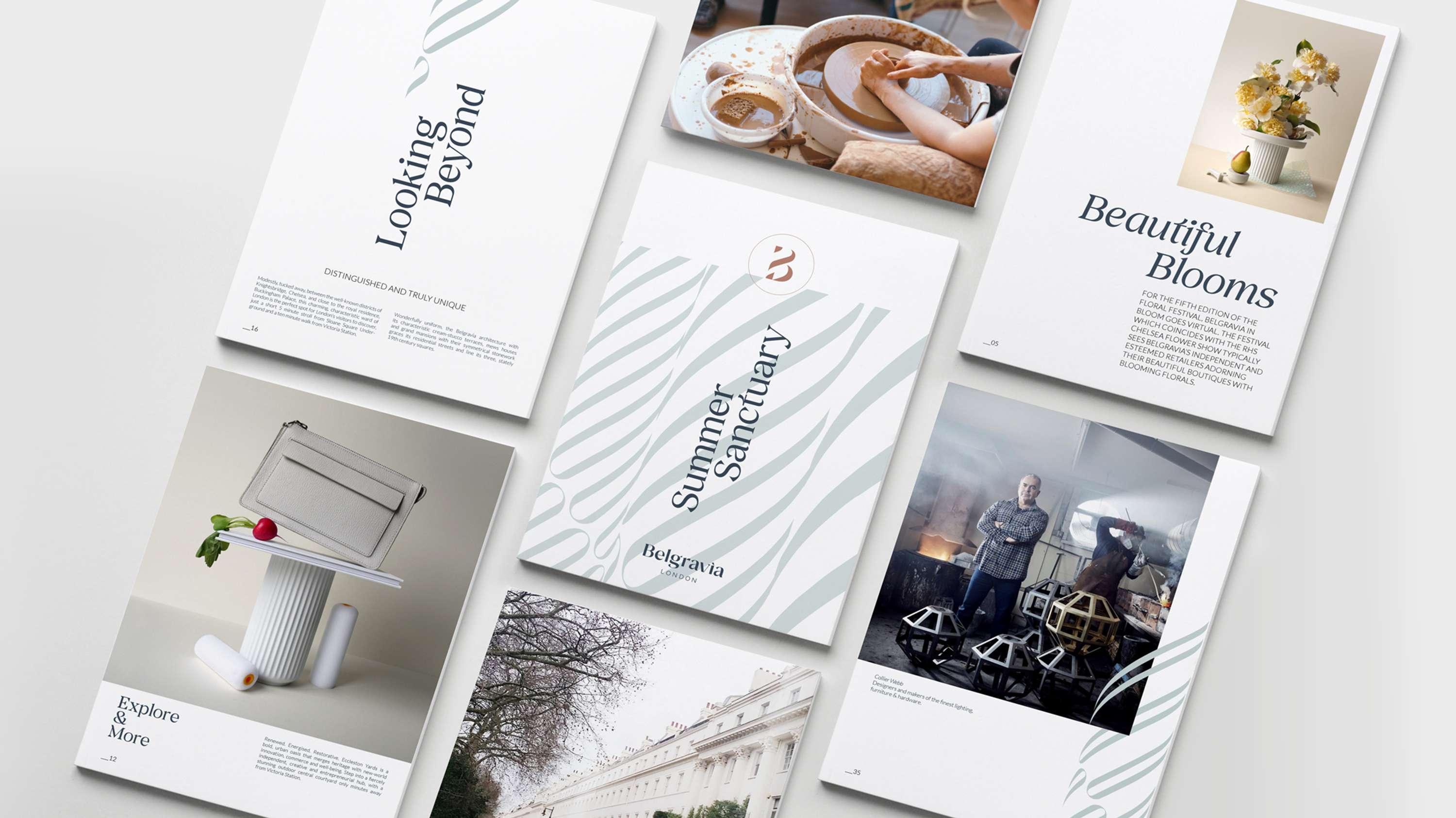
There are many parts to Belgravia — each with a very different offer. The task here was to develop a design system able to accomodate a multitude of stories that change rapidly. New typography, colour systems, iconography and photographic approaches have been developed ready to be deployed over the coming months and years.
Apart from residents and frequent visitors, Belgravia, while a long standing part of London, is less well understood than its successful history would suggest. The new brand work sets out to better explain and define the district to the new visiting public both locally, nationally, and internationally.
Belgravia’s beginnings started around 200 years ago, when Richard Grosvenor, 2nd Marquess of Westminster asked Thomas Cubitt to design the estate in the 1820’s...
A VISUAL, VERBAL & STRATEGIC OPERATING SYSTEM…
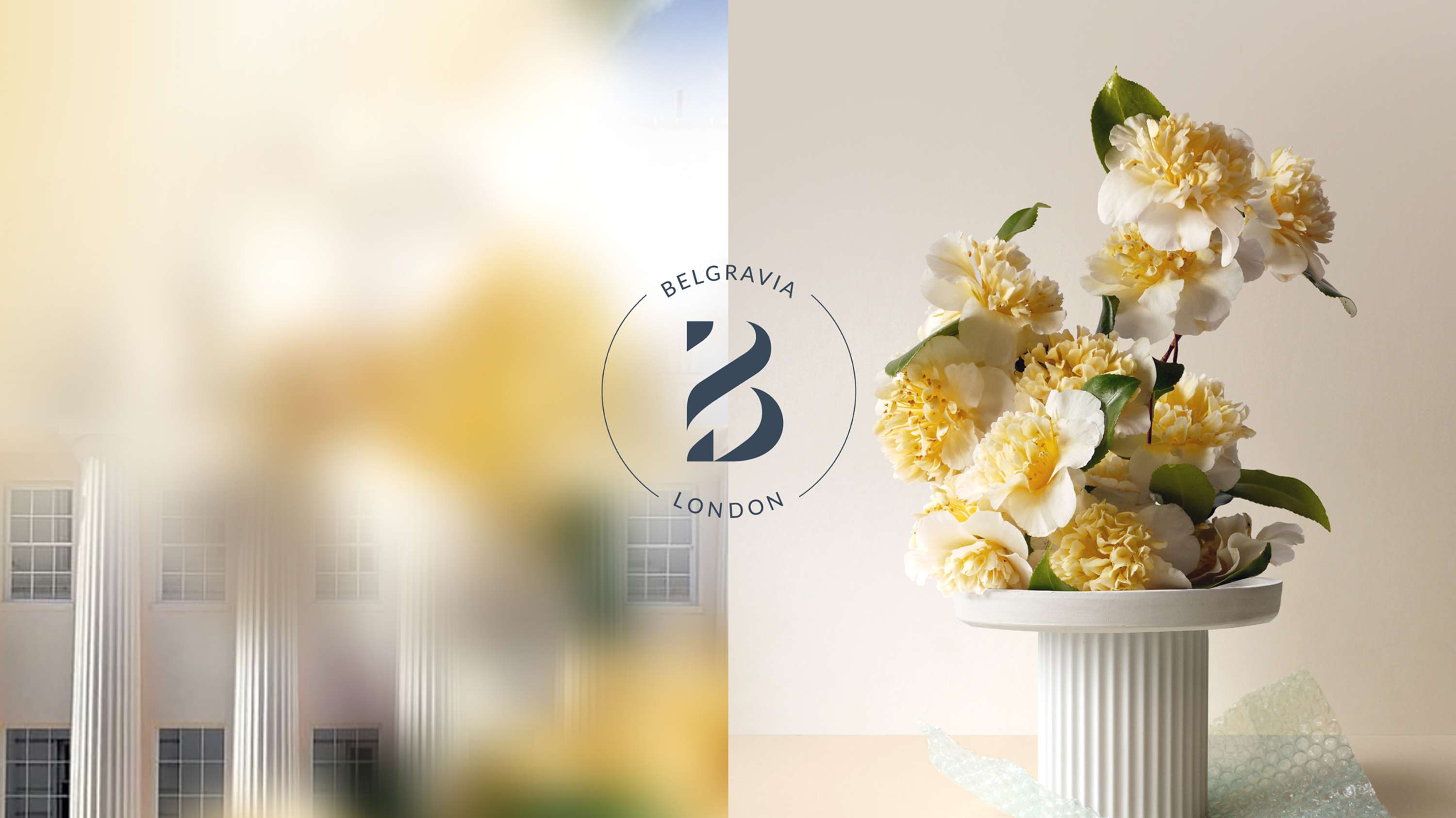
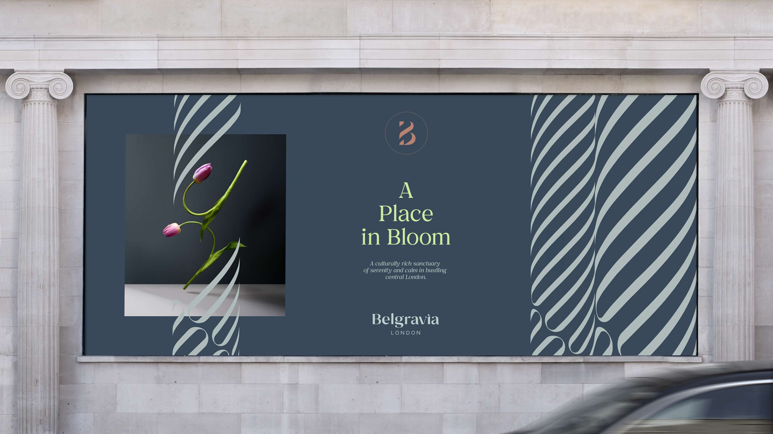
New visual assets include bespoke typography, colour systems and the signature theme of columns — seen throughout the stucco fronted streets of Belgravia.
All of these elements have been designed to be combined with seasonally changing photography and illustration to help the many stories of Belgravia be told at scale, speed and significance for what promises to be the most exciting period in its 200 year history.
The beautiful colonnades found on almost every Belgravian street are a visual signature we made central to the new branding theme.
CREATIVE DIRECTOR, SOMEONE.
200 YEARS OF PROGRESSIVE THINKING
Belgravia is home to a 200 year history of revolutionary thinking & creativity continues — and is now more open to everyone.
The areas confidence comes from centuries of experience.
Chopin performed his first concert there in 1848. Mozart loved Belgravia so much he chose to live there. H.R. Stokes the stationer has been on Elizabeth Street for 150 years.
It’s no surprise it’s home to the world’s elite, seven national embassies and the most desirable brands on the planet.
Visitors too can be confident of a rewarding experience.
It’s not trend based, but is elegantly up-to-date.
It doesn’t panic and react, it observes and evolves.
Belgravia’s sense of quiet confidence led us to creating a brand that is sophisticated, stylish but not ‘shouty’. The beautiful architecture and surroundings do much of the talking. We simply provided a flexible design structure to support it.
BEYOND THE SIMPLY BEAUTIFUL
Belgravia’s streets are the envy of the city, the country, and the quintessential view of ‘what I think London streets look like’ from a global perspective. (Blame Mary Poppins!)
With a timeless street layout, seamless design (even the house numbers are painted in a certain way) the æsthetic is outstanding. Better still, it’s all on a human scale — made for for walking, talking, shopping, eating, drinking & entertaining.
Low levels of traffic and increasing areas of public pedestrian spaces. Beautiful curated places to shop, entertain and enjoy all year round. Unusually unencumbered by ugly clashes of building styles and the visual clash of commercial advertising.
(…and that’s without even mentioning the world famous Belgravia in Bloom)
We connected with a great team at Grosvenor, working across each of the destination brands within Belgravia. Bringing the exciting new strategy to life with such a striking new visual identity has been a real thrill.
ACCOUNT MANAGER, SOMEONE.
FOUR MAGNETIC AREAS, ONE WORLD CLASS DISTRICT…
The new system is designed to both unite the key attractions of Elizabeth Street, Ecclestone Yards, Motcomb Street & Pimlico Road — while enabling them to tell their own specific stories.
The streets all support very different communities and offers. From high fashion and dining to cosy lunch spots & spas — state of the art design and craft to new inventive multi-use spaces.
This was no small undertaking. Create a compelling new brand for the most beautiful of London’s districts — keep it flexible — yet inject enough structure to support 200 years of development. Oh, and inject a little extra charm in the form of an Italian Greyhound… SomeOne excelled in all departments — creatively over delivered, on time and under budget. You really can’t ask for more than that from your agency partner while undergoing digital transformation — and a pandemic!
GROSVENOR BRITAIN & IRELAND.
