Alien Mag branding 2020
Alien Mag is a Dutch-based online and offline platform that is focussed on empowering and inspiring POC women from multiple backgrounds, by sharing stories and creating events.
Alien Mag is a Dutch-based online and offline platform that is focussed on empowering and inspiring POC women from multiple backgrounds, by sharing stories and creating events.
As their freelance graphic designer I occasionally hop on projects when needed. In 2020 I did the rebranding for the platform. This because Alien Mag is working on making serious steps forward, and needs a branding image that represents Alien Mag in the best way possible. On this page I will show the new branding image, mostly for the Instagram page, and a few graphic designs.
First steps
Before the designing process started, I asked the owner about blogs and platforms that she liked based on their use of design. That gave me an idea of what kind of style she prefers. There were a few things that we picked out and started with experimenting. I suggested that we place the logo on every post, to create a brand awareness to the public. If people, for example, share one of the posts on their page, other people will see where the post originally came from, and that will create more awareness.
The branding
The new branding consists of bold yet playful designs. The boldness is needed, because Alien Mag is here to make the statements that needs to be heard so that the important conversations can be held. To keep de consistency going, I documented everything in a branding guide voor AM.
I also experimented with an icon instead of the full logo. I made it by combining the letters ‘A’ and ‘M’. The icon can be used to create brand awareness in a compact way that is not too much in the forefront.
The templates on the 2nd and 3rd row on the most right, and on the 3rd row on the most left are inspired by de designs from Xavira. Xavira was an intern at that time at Alien Mag, who made some templates for us. Two designs were picked and intergrated into the new branding.
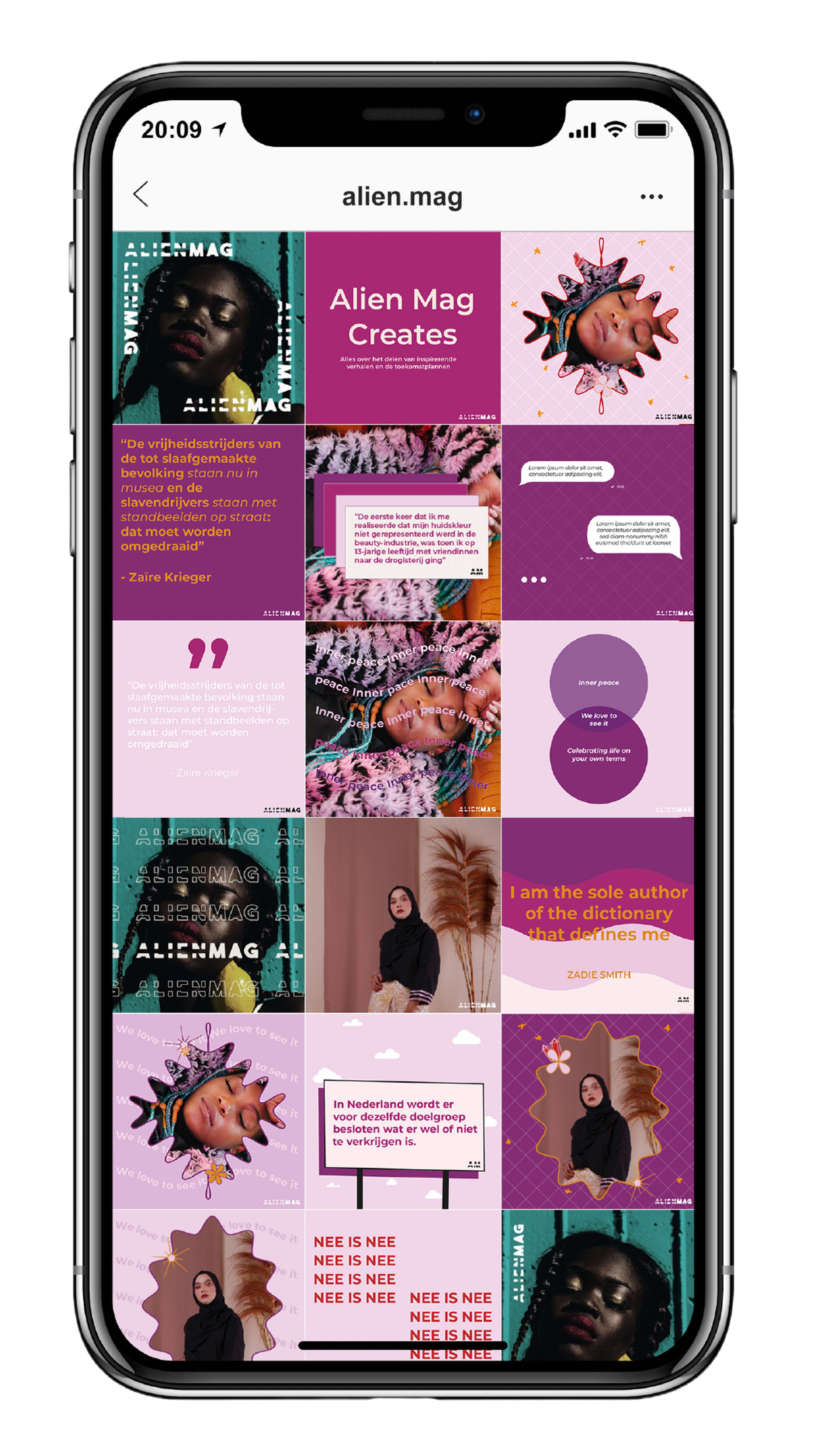
You are a gem, we love to see it
During the creating of the templates I figured that it would be great to design covers that can be used to create a spotlight for women. Every now a then, AM highlights a woman of color for various reasons to celebrate her. Creating special covers for that occasion would be a great way to make that moment even more special. For the covers I got inspired by phrases that I often see on social media. The gem illustrations came from the phrase “you are a gem”. The flowers came from the phrase “Give her her flowers”. “We love to see it” is a phrase that is used to celebrate and motivate to keep doing that you do, and be you.