Barbican - At The Barbs
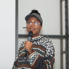
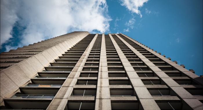
Campaign brand identity design for Barbican's new 5 part podcast series 'At The Barbs'. Working with illustrators to make irreverent caricatures of the host and guests using a contrasting visual language of the monochrome Brutalist modernist building with the vibrant fluid characters. As the podcast aimed to bring new perspectives on art and culture, a fluid liquid-esque lock up was designed as well as a secondary fluid element, used within Barbican’s new brand refresh where the lock up is sliced to show visual a duality. Assets were developed to launch the podcast via OOH, on digital medias.


