Date March 2015
Role Lead UX/UI Designer
When I first took the brief from King, they had the biggest games in the world under their belt although no one knew who they were as a business. They wanted to be seen as a serious competitor within the tech industry, not just from an execution point but also lifestyle, diversity and culture.
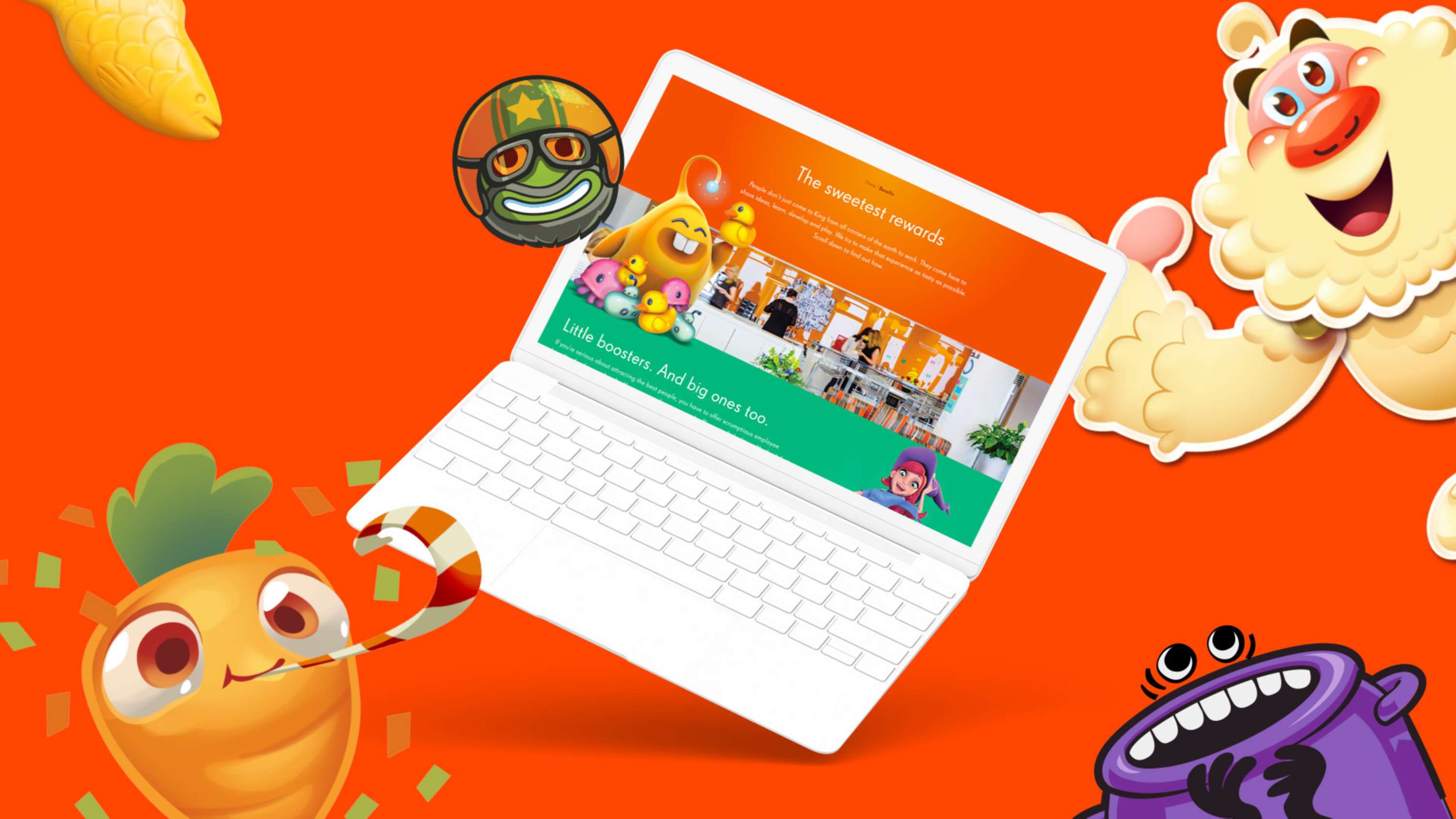
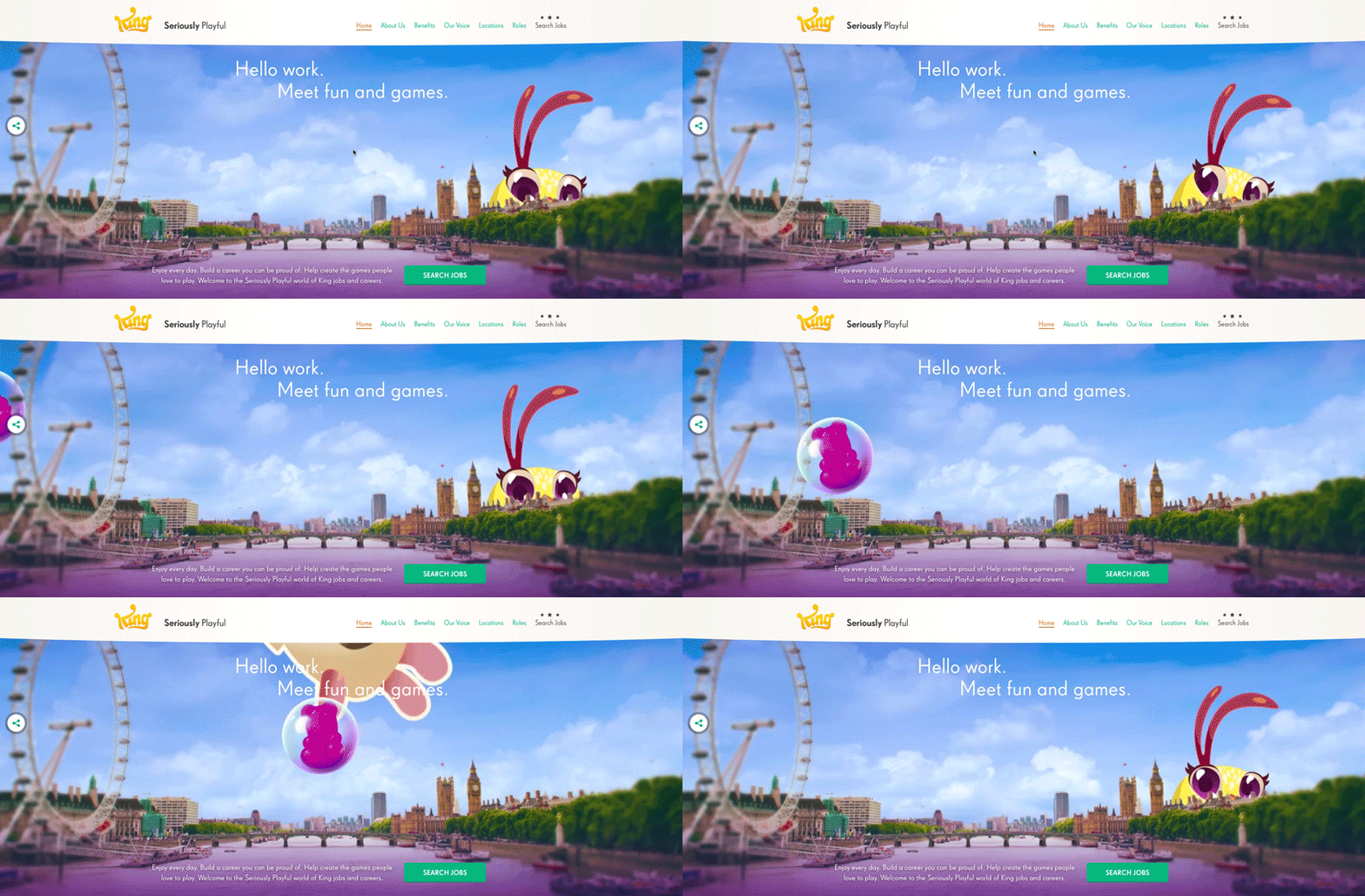
The sitemap was developed with all seven global offices in mind. Six homepage header videos were produced (one for each office) and the closest one served up to users depending on their Geo-IP location to personalise and create familiarity with the brand.
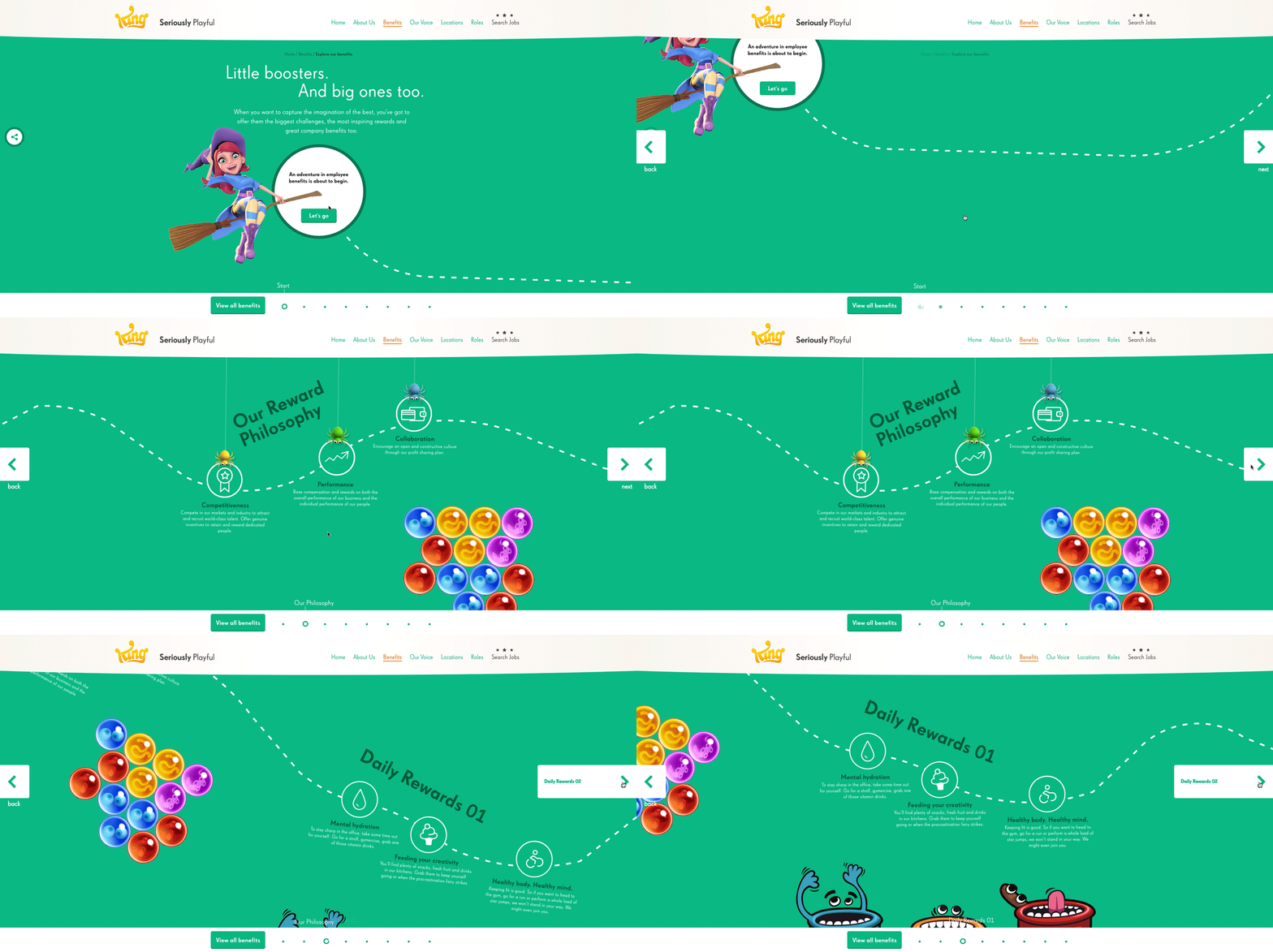
When the head of Global Employer Brand suggested that a requirement was to make traditionally “dry HR content” immersive, I immediately got to work on displaying the benefits. A scroll path animation was designed to take the user on a journey that was visually engaging.
View it here:
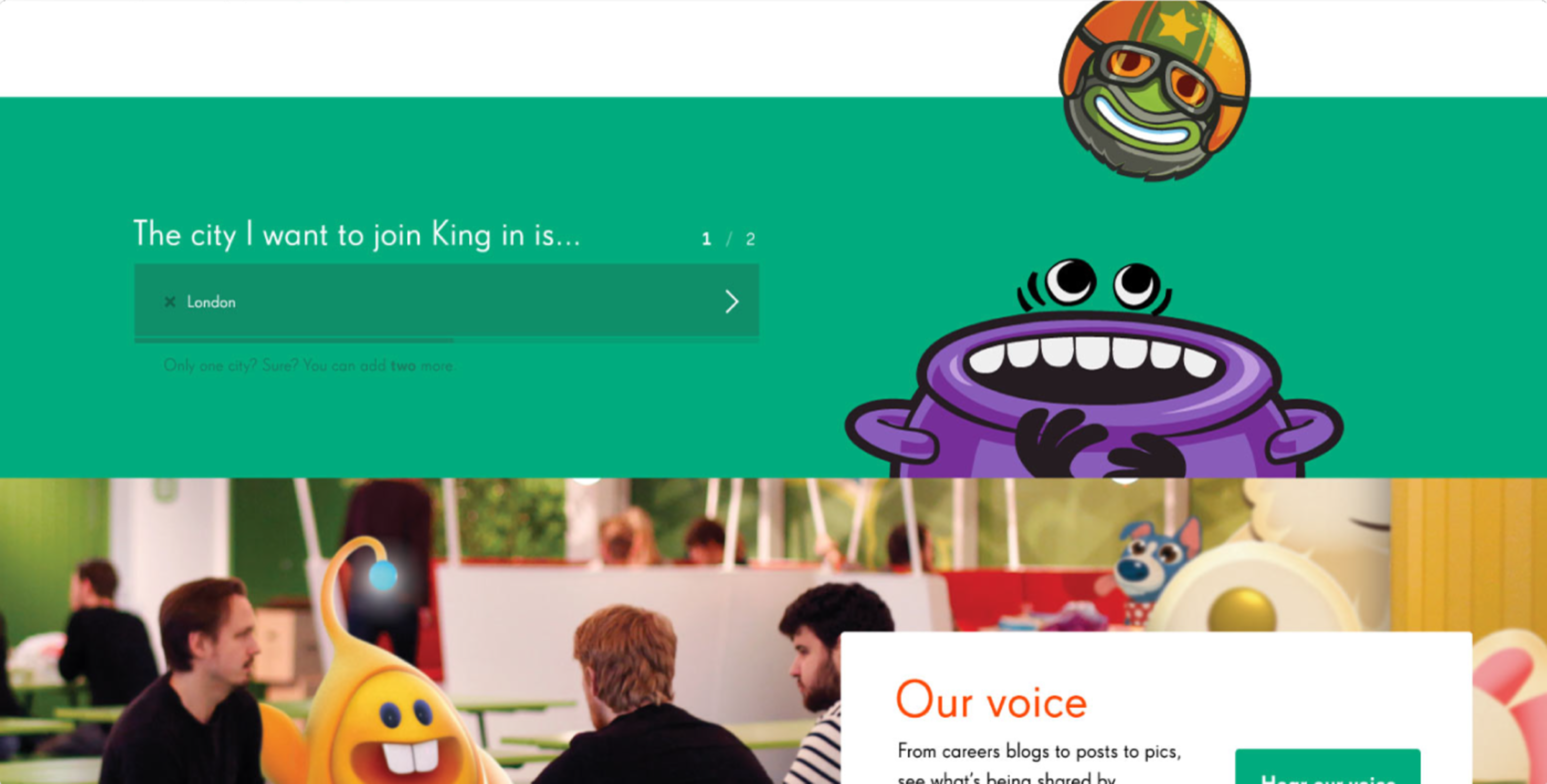
Cross-industry naming conventions are an issue within the tech industry. Using the brief from the client, I designed a solution that would focus on core attributes, not buzzwords. I designed a solution that would make King stand out against competitors.
The user would enter a few details of their requirements and skills which would then directly integrate with the application system.
Agency Pink Squid
Copywriting Amy Taylor
Designer Simon Taylor
Motion graphics Zkhin Li


